I had one hell of a hard time deciding what to write about. I considered writing about specimen books or lettering manuals, flea markets or abandoned factories, house numbers or old advertising signage, puns or portmanteaus or the state I go into when I draw type at night; things that capture me completely and fill me with deep joy and sometimes make me feel like I have little pink hearts bubbling out of my ears.
But I also love just looking: at tiny, unremarkable, mundane things; and even weird or bad design that only makes limited sense outside its target audience. And, I may not be part of that audience, especially when I’m traveling (which I love for this reason, too: an outside look at things). I often get a kick out of the amazing, impenetrable kind of bad we often overlook.
So I decided to write about Sant’Anna.
Wait what?
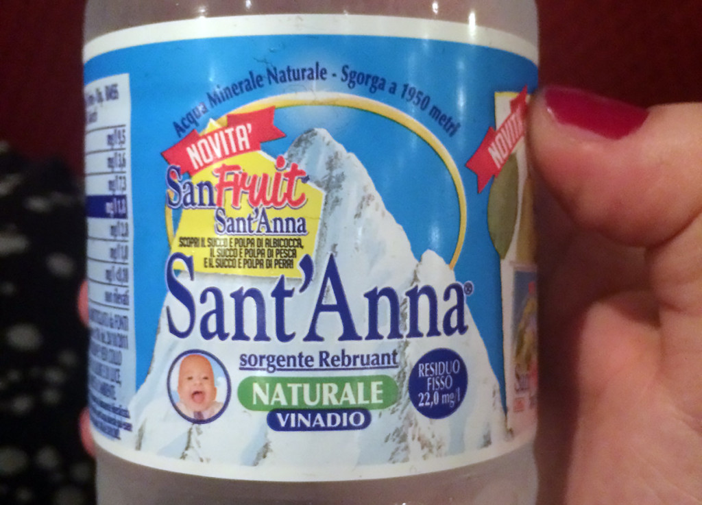
In Italy last summer, I picked up a bottle of water. I think it was just the normal brand of water around there, but then foreign (and barely Italian-literate) me started looking at the label, and it was weird:
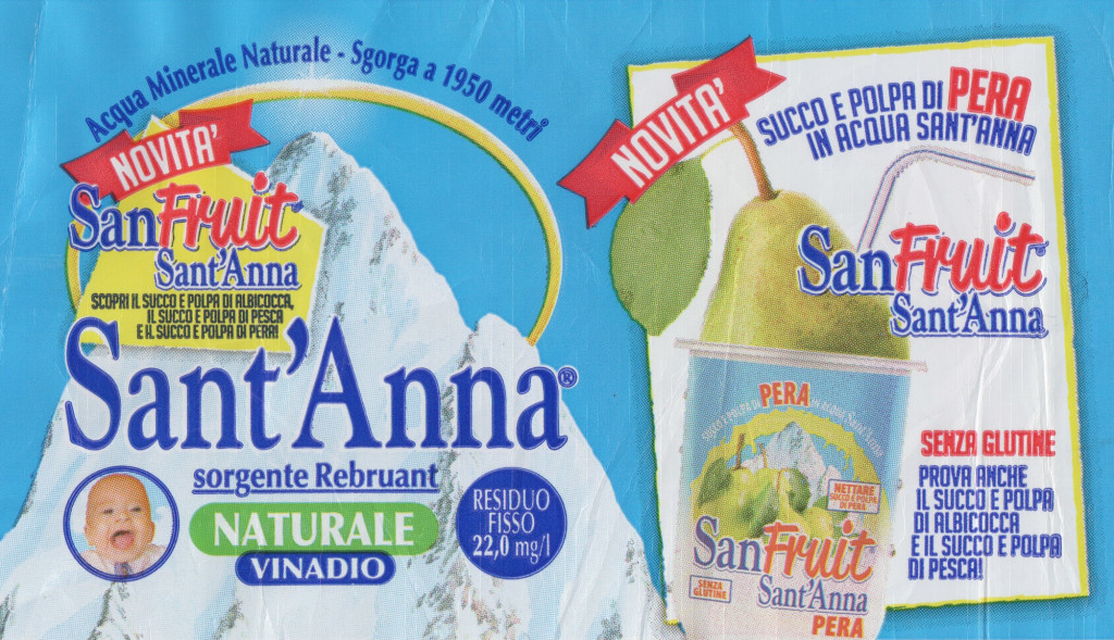
Ok we have a mountain. So far that’s pretty much standard issue for mineral water, but this one has a glossy yellow swoopything around it which, as I learned from some native folks nearby, really is supposed to be a halo, because that’s a holy mountain. Well, ok.
We have typical markers of Design For Probably Rather Cheap Things: bright primary colors, an arrangement that’s just a bit too messy, and four different typefaces in various tortured stages of mechanical compression (yes, that is — or once was — Goudy Old Style, in a wild mix with Optima, Reklame Script and Big Noodle Titling). There’s also an obligatory table with lots of very compressed and barely legible information, seeing poor old (Sub-)Optima gradually holding in more and more of its breath then getting all tangled up in the coarse background halftone. I know squooshing and stuff is hip now, but this really is sincerely, unapologetically bad.
More fundamentally, there’s the question of communicating (um, visually) what the content of this bottle even is. The label is most of all excited about something called SanFruit, which this is not. References to this “Novità” easily take up half the space that remains outside holy mountains and supercondensed tables, and they get the brightest colors too: the only yellow (in excitedly nonorthogonal shapes) besides the mountain’s halo, and the only bits of red on the entire label. On another jolly tilted background box, we even get a “creative” illustration of a pear smushed into something like a yoghurt cup, with a straw sticking out of it. Aha pear to drink. Pear juice something. Well, I kind of wanted water. Is this water? Or pear juice something? (It was water. Just a teaser, the pear. Very loud teaser.)
So much joy, or excitement, or, well, something
It is “naturale” (I was at this point not sure if that implies no pear or no carbonation). That is proudly printed on a green background, not because green has any role really in this layout but I guess that must just be the color to use for this word, and hey the more the merrier. There are some blue words that I don’t know what they mean, and we get 0.0002% sodium, which, percent of what?, but ok I get the point that it’s very little. What I still don’t get is, WHAT IS THE DEAL WITH ANGRY BUSINESS BABY. I just don’t know. Is it actually screaming? Or maybe yawning? Is this supposed to be joy? Does this perhaps imply that this water is ok to use for baby food? Or wait, is this some kind of holy baby to go with the holy mountain? Is this perhaps a very young, crossdressing St Anna? So many questions.
Honestly: As much as I admire good design and am invested in its relevance, part of me secretly hopes that stuff like this never stops being made. At least as long as it’s in cute and innocuous places like this, where the confusion it causes doesn’t cause any damage except a brief giggle-induced cramping of the abs. And I hope that all of us visual creatures never stop looking, really looking at things and wondering and finding joy in small finds. Even if they’re terrible.