When I first heard about Alphabettes, the name immediately had my attention. As an appreciator of all things punny, I was intrigued. I soon found out it was a place where both women and their opinions were encouraged, and they gathered to talk type. They had lived up to their pun.
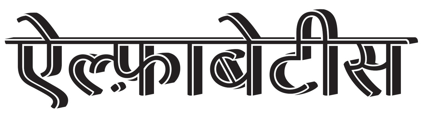
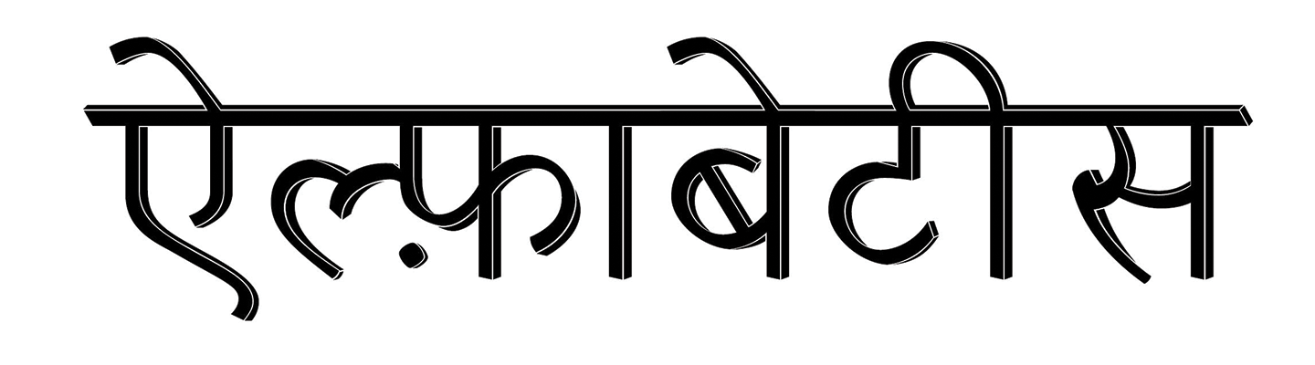
While I was savouring this wonderful name and going through the website, I couldn’t help notice the potential for another wordplay. The Hindi word for Daughter is बेटी (beti). It sounds a lot like “bette”. I relished the idea of Alpha bette doubling as “Alpha daughter” in Greek/Hindi. To make it sound more like the plural “Bettes” I pluralised the Hindi word बेटी (beti) using English rules to make it बेटीस (betis). If you’ve spent extended periods of time with me, you might be aware that punning is a serious sport for me and I sometimes tend to go overboard which is why I sat on this pun for about two years. It took me a while and a bit of encouragement to go public with this idea. When I finally wrote to the Alphabettes they green-lit this multilingual pun idea for their header swiftly much to my delight and relief.
This headers design origin story begins in a low contrast typeface I was working on. After a particularly frustrating day of trying to get low contrast right, I tried to imagine what its display weight might look like. One of the explorations led to adding a dimension to the design. As I worked on the design, I realised that if I did it correctly I could add contrast as well as dimensions to it, so that’s what I set about doing.
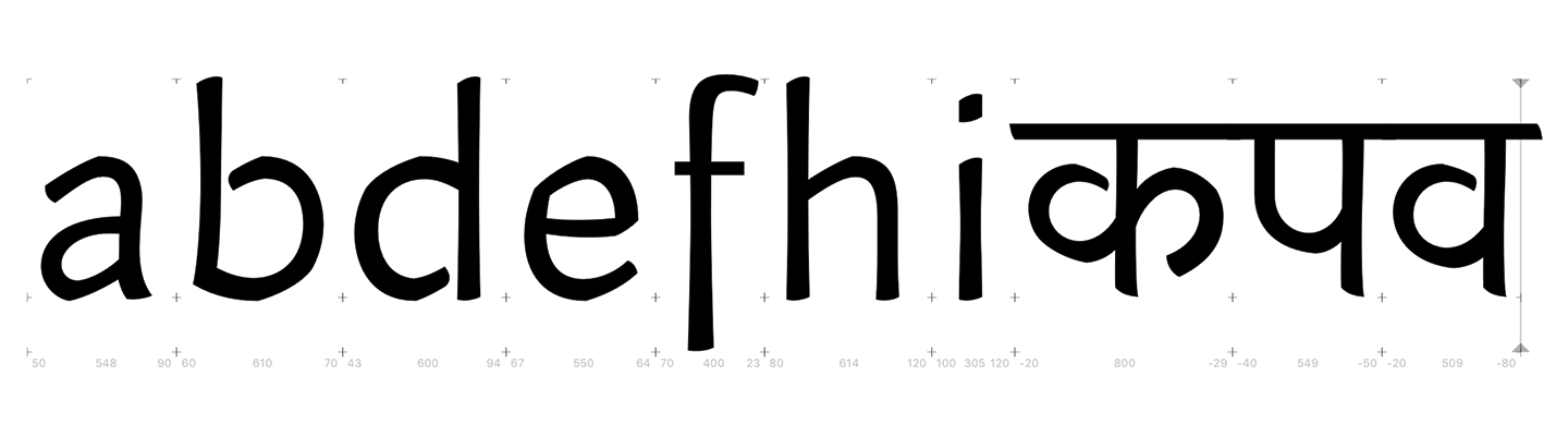
The basic low contrast design that was drawn initially
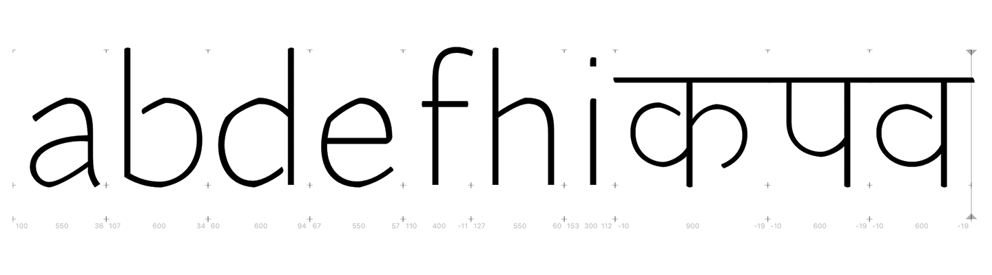
Initial Low contrast light display design to which the 3D effect was added
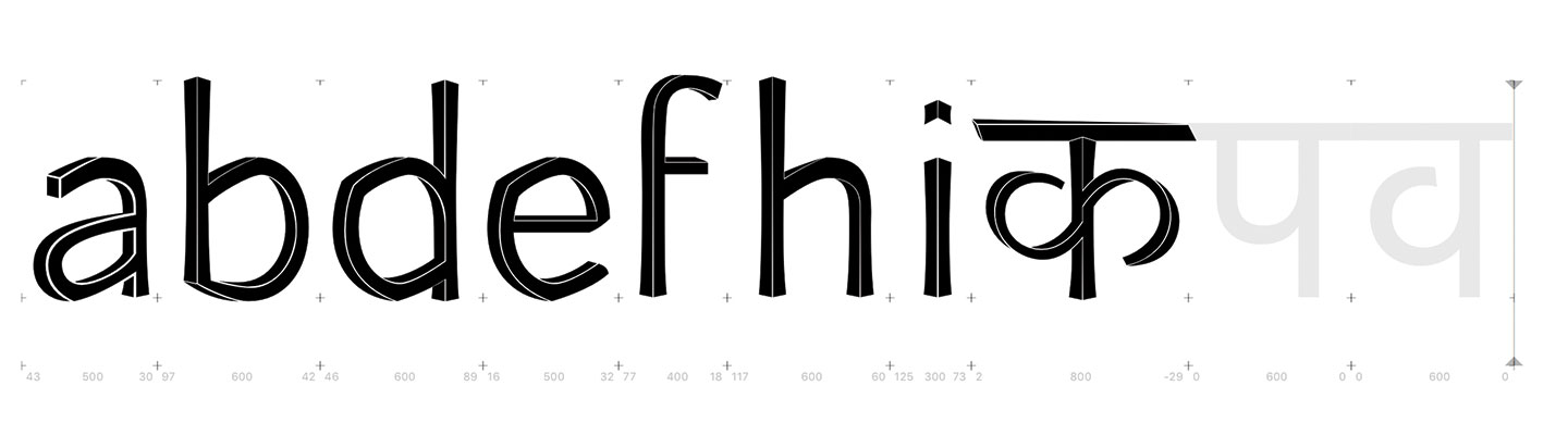
The first draft of the 3-dimensional design
The Alpha”beti” header idea got approved at the same time as I started working on the Devnagri display and I decided to use it for the Header design. Since I was building the contrast according to traditional writing models for the Latin, I flipped the angle of viewing the dimension so that it would build contrast as in traditional Devnagri designs. Devnagri being a connecting script already comes with challenges of its own but that problem was compounded as this design had gaps in-between that also made it look faux inline. This made it harder to get them to connect smoothly as the gaps only appeared intra-letter and not in between them.
First design draft shared with the Alphabettes
Above is the first draft I’d shared to convey the idea. This was when I was still designing a typeface. Now that I was to work on it as a piece of lettering, I could focus on making it the best version of itself. The Matras especially were very tough. I also struggled with the angle of the dimensions, especially wherever there was a curve. As you can see in the image below it was a gradual progression to its final state. What were once weak shapes with too many ideas stuffed in them grew into a stronger, more considered design. This progression was greatly aided by lots of feedback from Kimya Gandhi. Her suggestion of pushing the shadow deeper really helped add that extra punch.
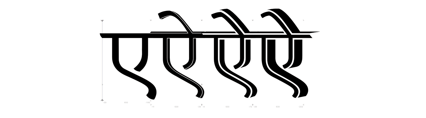
A snapshot of some of the stages of evolution of the design
This Greek/Hindi/English wordplay, written using the Devnagri script was fun for both the type and pun designer in me. Since this project focussed only on the letters needed to write एेल्फ़ाबेटीस, I had to resort to tiny bits of cheating (a.k.a lettering) to get it to work. Especially if you look at the Shirorekha (headline) the ends are not finished. The point where the Matras and headline meet are also pre-constructed and do not just line up. One would ideally need multiple alternates for each letter with a Matra to make this into a typeface. Writing feature code to get this design to actually work might end up being more layered than the design itself but I shall worry about that another day. For now, no feature code was harmed in the making of this header. This process of lettering a word while designing a typeface behaved like a focussed test document and has helped me clarify my ideas for the design. I now have a variety of letters, Matras and half form as a springboard for the remaining the design. For now, what you see below is where my design stands while it completes its two-week residency as the website’s header.