
We are Alja Herlah and Krista Likar, enthusiastic and passionate type designers from Slovenia. As members of the TipoBrda society, we got the opportunity to organize a type design workshop. Type Days 2017 – a one week long workshop – was already the 31th type design workshop organized by Tipo Brda in Slovenia. It took place in Ljubljana in the House of Reading and Writing, Vodnikova domačija Šiška. This year, we invited a guest mentor Adam Katyi, Hungarumlaut, who shared a lot of valuable tips and guidelines he learned while studying at the Type and Media program in The Hague.
Day 1: Sketching
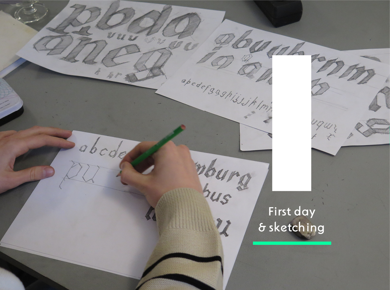
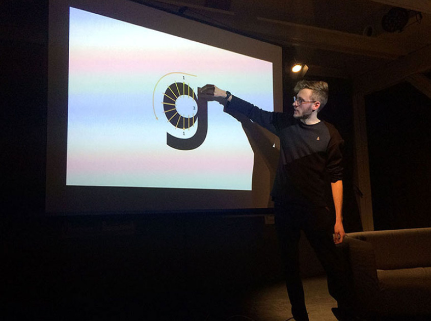
We gathered for breakfast, everybody introduced themselves, and Adam Katyi presented the timeline of the workshop. Professors Domen Fras and Lucijan Bratuš, mentors of past workshops, also came to visit us for a morning coffee. Adam started the workshop with a presentation, introducing us to the theory of the stroke. He put the focus on the contrast of the strokes and other important parameters.
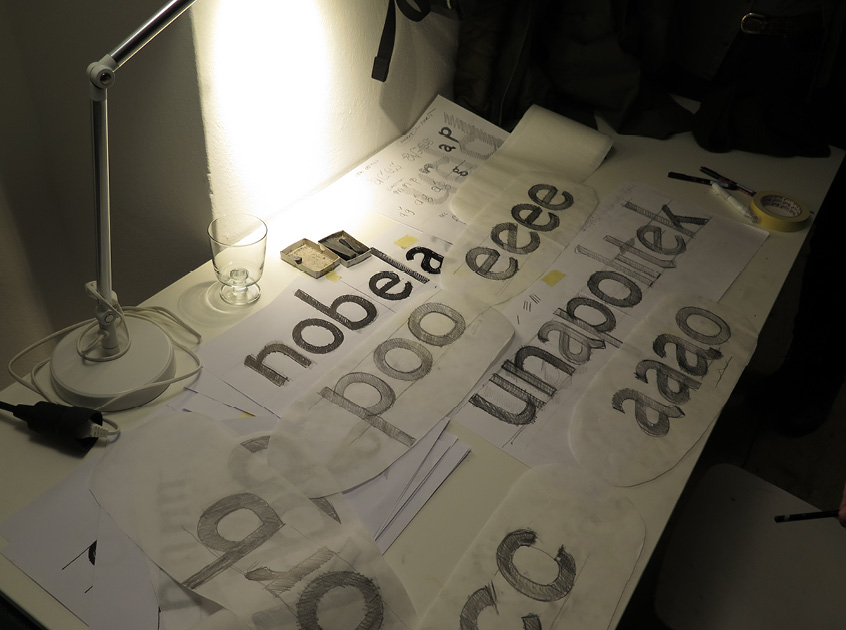
He drew sketches showing transitional contrast starting with a parallel pen and continuing with black markers. With only two letters drawn, n and b, and the help of transparent paper he ended up with a nice set of characters. Each of participants got a pile of paper and started sketching. We used transparent paper to copy every couple of sketched letters, each new letter more detailed. By the end of the day, each participant got a brief idea of how their typeface would look like.
Day 2: Visiting NUK and more sketching
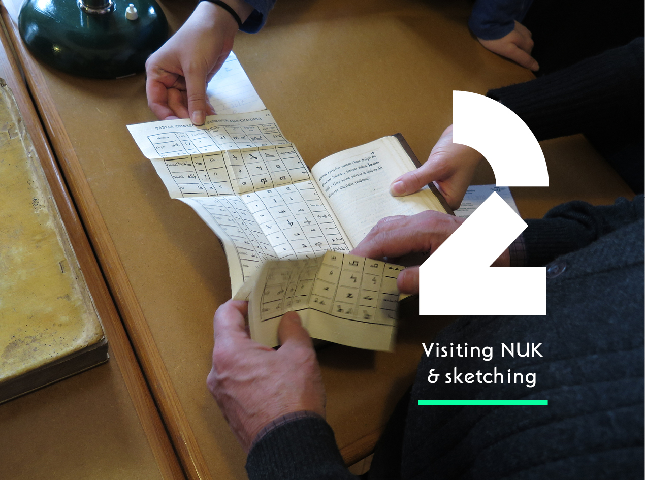
We met in front of the National and University Library (NUK) in the center of Ljubljana. The building is also important from an architectural point of view. Jože Plečnik, the greatest slovenian architect, besides being an inspiring architect, also had a big influence on graphic design and typography. The typeface we were using for Type Days 2017’s visual identity is actually a revival of his lettering for the book Makalonca, digitized by Lucijan Bratuš.
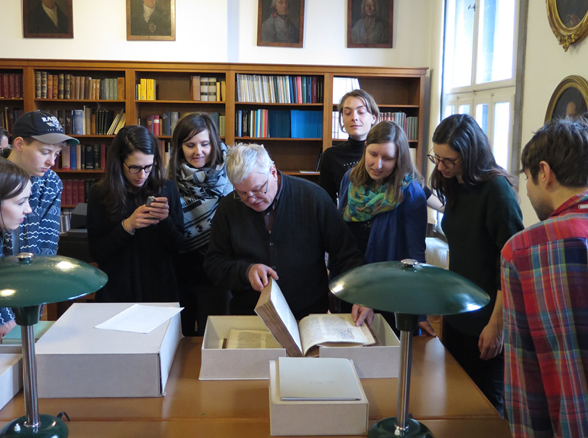
In the Department of Manuscripts, Professor Lucijan Bratuš showed us manuscripts up to 700 years old. NUK houses some of the earliest printed Slovenian books. He pointed out the development and the importance of these books in 15th century. Seeing our heritage in manuscripts and early printed books was an unforgettable experience. After lunch, we returned to our work place and continued sketching, trying to develop more pronounced characters for our typefaces.
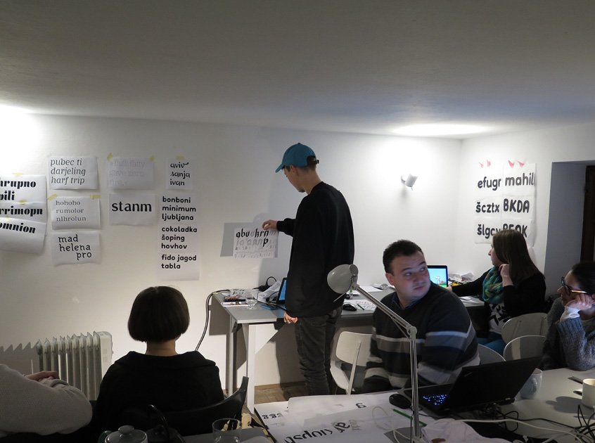
Day 3: Digitizing, open doors, Adam’s lecture
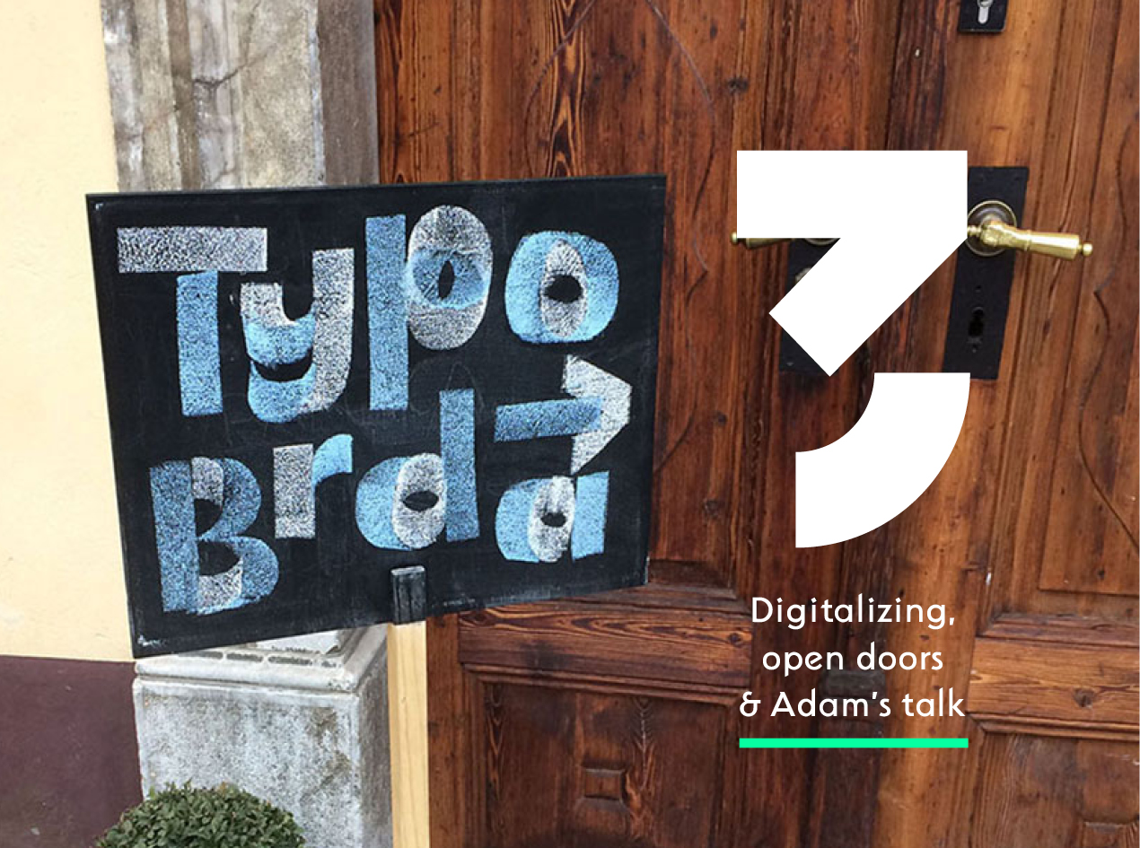
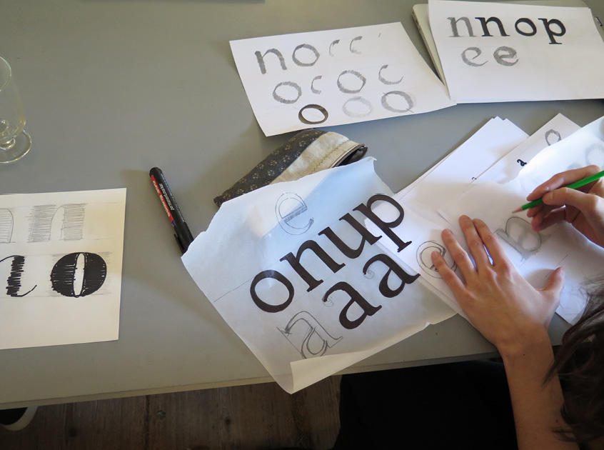
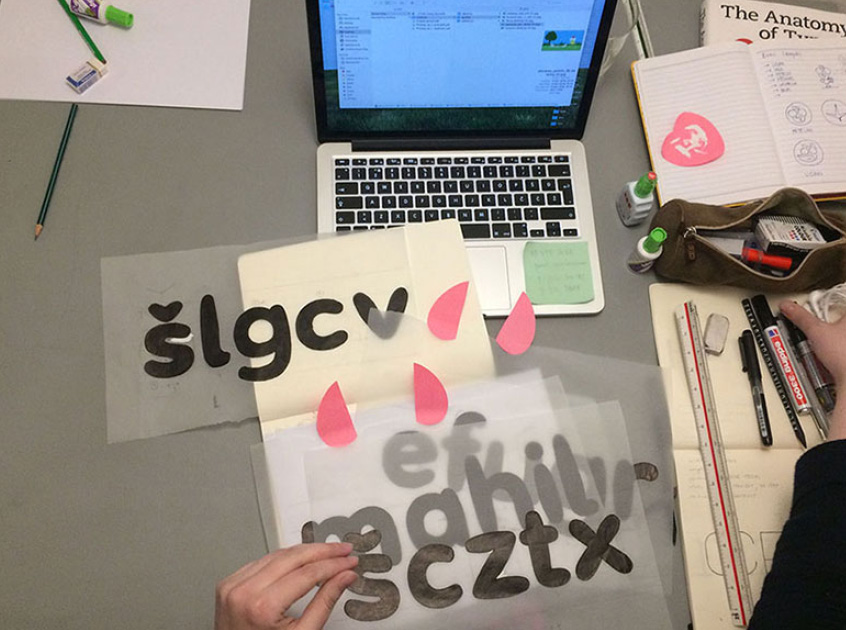
After breakfast, Adam gave a lecture about working with Bézier curves. He showed us basics on how to draw curves with extremes and how to handle nodes. Just by drawing the letters n and p, we can get parts of letters (components) we can use to develop several other characters. We scanned our sketches and digitized them. By designing the letter n we can continue with letters h, m, i, u, l and a we can use some components to build other, more tricky glyphs.
We opened our doors to the public at 6pm, showing our first prints of our digitized letters up on the wall. Each of participants presented their idea behind her⁄his typeface to the visitors and Adam gave a presentation titled “A day of a type designer” about the story behind his latest typeface Mohol. His main message was to have fun while designing your typeface, even if it is not a real project, you never know, maybe someday it will be useful.
Day 4: Digitizing and corrections
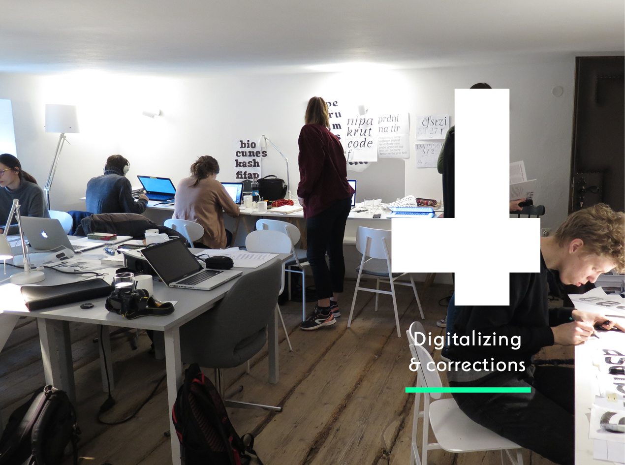
On Thursday we continued digitizing and developing our typefaces. Basically: designing, correcting, coffee break, designing, correcting, coffee break … and so on …
Day 5: Finalizing, corrections, designing the final poster
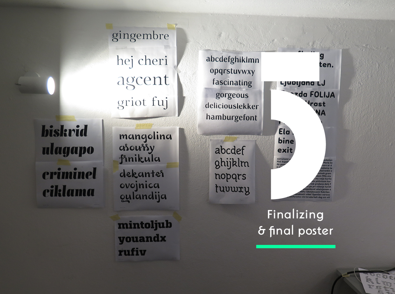
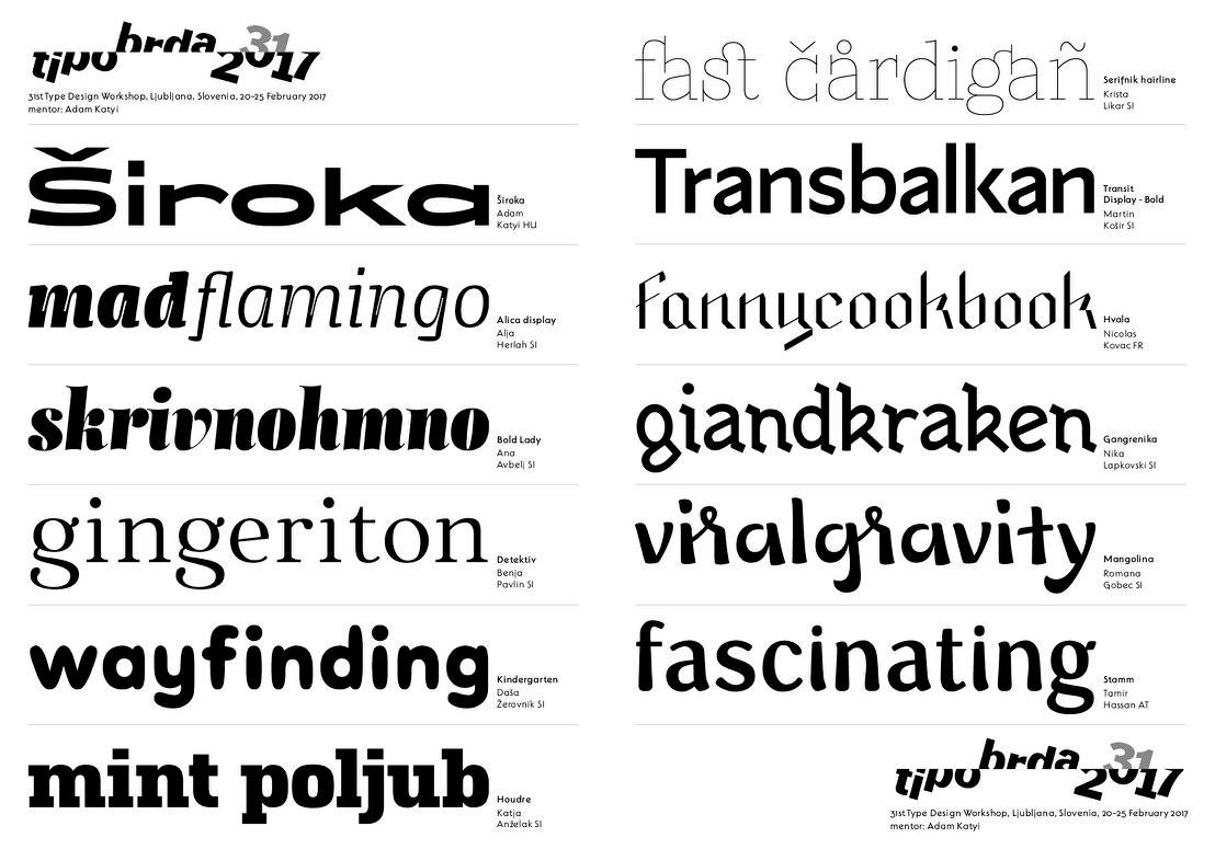
Friday was a bit hectic! Everyone rushed to finish their fonts and design the final poster for the exhibition. The goal was to show your most beautiful letters and present your typeface in the best possible way. After the busiest day of the week we treated ourselves with a well-deserved drink at Kino Šiška.
Day 6: Type walk, visiting TipoRenesansa and final exhibition
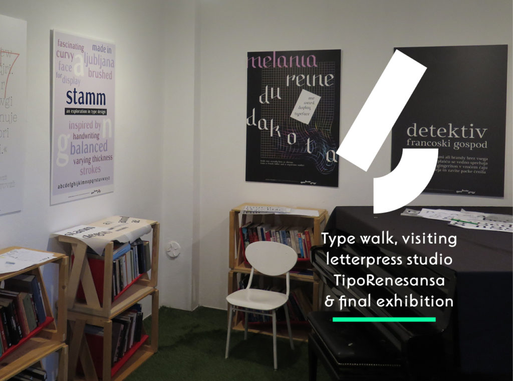
On our final day, we gathered in the center of Ljubljana for a type walk. We made a nice circle around the city center where Lucijan showed us a few interesting typographic signs and places. After that we visited the letterpress shop TipoRenesansa. The founder, Marko Drpić, explained the scope of the studio which involves everything from calligraphy, letterpress, linocut, engraving to amazing historic printing equipment his studio possesses. His great knowledge about typography was a big inspiration for all of us.

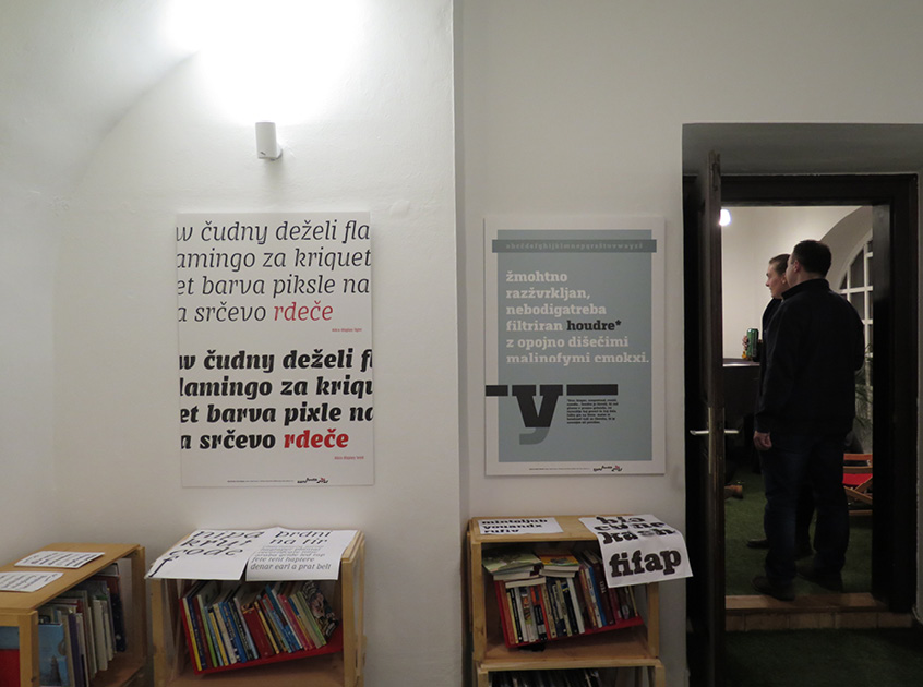
Back at the studio, our final posters were waiting for us and we prepared the exhibition under Lucijan’s guidance. During the opening ceremony each of the participants got a goodie bag, full of goodies from all over the world. We finished an amazing and inspiring week with a small laidback party.
Paricipants
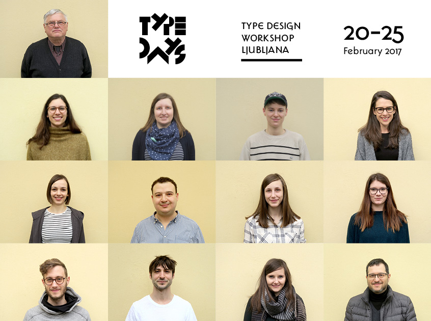
11 participants from Slovenia, Austria and France:
I. prof. Lucijan Bratuš (leader of the first TipoBrda workshop in 1997 and founder of TipoBrda society)
1. Benja Pavlin
2. Daša Žerovnik
3. Nika Lapkovski
4. Romana Gobec
5. Ana Avbelj
6. Tamir Hassan
7. Krista Likar (TipoBrda team)
8. Alja Herlah (TipoBrda team)
II. Adam Katyi (mentor)
9. Nicolas Kovac
10. Katja Anželak
III. Prof. Domen Fras (participant of earlier workshops, later mentor and organizer of workshops)
11. Martin Košir (missed the mugshot photoshoot)
You can find more about produced typefaces and final posters on TipoBrda website, about social regarding things on FB and Insta.
We would like to thank the Alphabettes (Indra and Jesse) who responded to our request to provide things for the goodie bags and for posting this story on the Alphabettes blog.
Photos: Lucijan Bratuš, Adam Katyi, Alja Herlah