
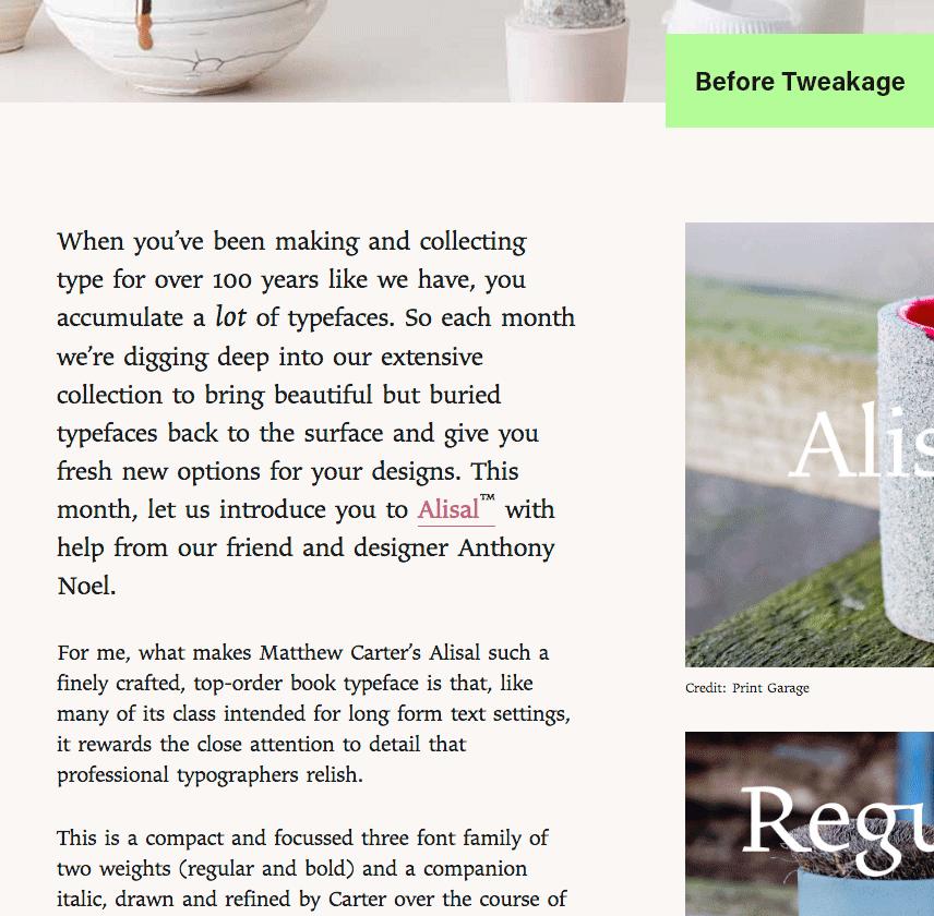
Today a newsletter came through my inbox from Monotype showing Alisal in use. Immediately, I had a few thoughts. First, “oh nice! Matthew Carter put some lovely details into Alisal about which I had forgotten.” Second, “too bad it is so sparkly in this setting.”
Because of the sharp angles and straight sides Alisal is quite lovely at display sizes. However at text sizes the shapes start touching, the words seem to be more words than lines of text, meanwhile all of this making it hard on the eyes. This is where one should consider changing the settings to suit the medium.
I understand that typography is a matter of opinion and seriously subjective. And fair enough that many people wouldn’t even notice…yada yada yada…how boring. But it is a typographer’s job to pay attention to the the so-called boring details. As a typographer I live in the boring. I live for the boring. Content might be king, but the minutiae is the queen at his side making sure everyone understands and can read the message!
Now for some of you I’m about to commit sacrilege. I can hear you saying, “Mess with Matthew’s settings? Perish the thought!” Therefore, please avert your eyes or close the window.
(Image credit: part of aforementioned email from Monotype.)
All I did was open Google Chrome* and turn on the developer tools. Then I scrolled down until the text was highlighted and adjusted the CSS until I felt that it was enough improved to demonstrate my initial thoughts. In this instance I added .25px of letter-spacing and subtracted -2px of word-spacing. Very minor tweakage but I feel it improves the reading experience. The letters in the smaller text aren’t banging and blending into one another and there aren’t word spaces large enough to disrupt the eye.
This is neither a tutorial nor the perfect solution for every typographic problem. There are many books and online resources that go well beyond what I’ve written above. Both in explaining and demonstrating how to achieve great typography. While this is only a friendly reminder that the type is there to serve the text and should sometimes be adjusted. Not because the design is bad, but because not every setting will suit the typeface straight out of the box.
*Web typography is a lot less predictable than print and no setting is guaranteed to look the same in every browser or email application. However, this doesn’t mean we can be lazy in our typographic duties.