
I was excited to see a new book face designed by Sjoerd Hendrik de Roos of Lettergieterij Amsterdam (aka Tetterode). We’re all, of course, still reeling from the incredible success of his Hollandsche Mediaeval just a few years ago: That text face (the first one designed by a Dutchman since the days of the great Fleischmann!) is quickly shaping up to be near-ubiquitous in books printed here in the Low Countries.
If you like Hollandsche Mediaeval, you may well enjoy this new face too. And if you don’t — maybe because of its cheerful roundness, its Art Nouveau-like detailing, or simply because IT IS EVERYWHERE — you may be relieved to hear that this face will not follow its predecessor as a bestseller; simply because it’s not for sale. De Roos designed it exclusively for the Hague-based private press De Zilverdistel, working closely with his client, Jean François van Royen.
Like De Roos who has been looking to rejuvenate the craft, Van Royen is not exactly known as the biggest fan of the printing of our time (“ugly, ugly, ugly!”). Client and designer looked instead to the aesthetic that’s been coming out of private presses in England — those ‘carefully crafted’ books made by bearded people that take inspiration from the roots of printing in the Italian Renaissance and strive for clear, ‘pure’ typography with sturdy, humanist, often custom-designed types. While it is no secret that De Roos is heavily influenced by William Morris (the godfather of private press hipsters; he had a very big beard) it is telling that he has admitted disliking his Golden Type, finding it too mannered. De Roos’ own design is less fashionably rough-hewn than others sprung from this movement; it’s clear and readable, and it has a distinguished, almost elegant air. It appears to revive the idea of Jensonian types but smoothen it for today’s readers, rather than indulging in the eccentricities, warts and dirt of the 15th century — to which surely no-one would seriously want to return.
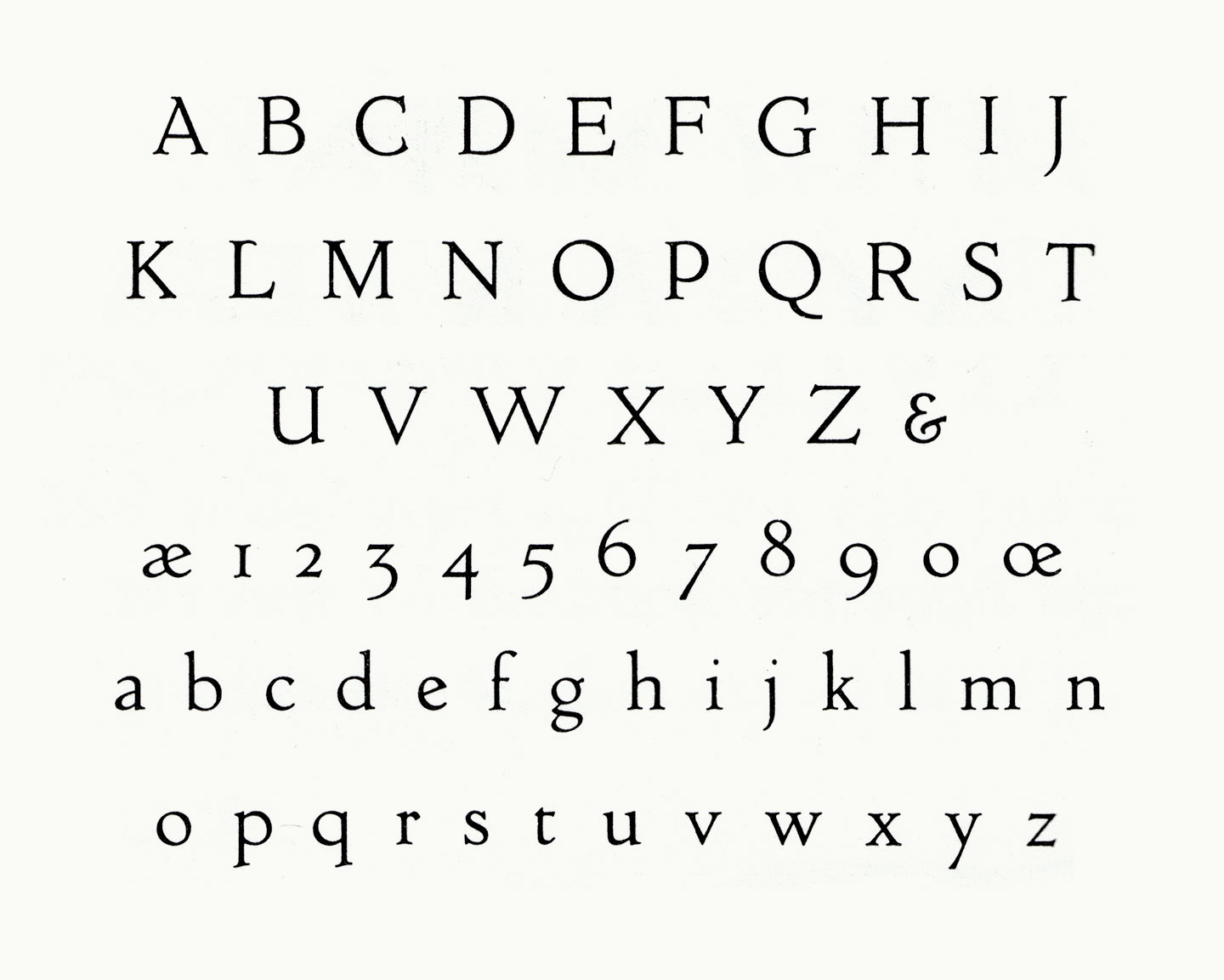
In this case the client was especially impressed with the types used by the famous Doves Press, and reportedly asked for a similar design. (Is it mean to point out that Holland would surely also supply ample choice in bodies of water, should this font eventually need to be disposed of?) While the intended similarities are easy to see, Zilvertype arguably feels more contemporary — and less Renaissance-y — than its English model. The spacing is tighter, counters are bigger, and the overall shapes are more homogenous. And the placement of the i-dot is a little bit less silly. Again, there’s a lot of roundiness; the fullness of the curves, as well as the cheerful nature of characters like the ‘e’, clearly echo De Roos’ earlier work — in fact, he himself has reportedly referred to Zilvertype as a reworking of Hollandsche Mediaeval! Indeed it shares a similar ductus; but it feels more serious and grown-up, with sober details (compare the top of the ‘a’ — hell, all of it), stately caps, and overall much more generous proportions.
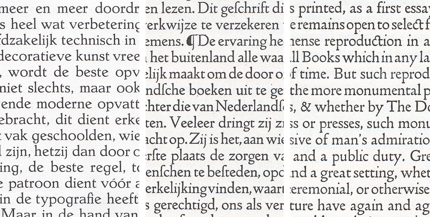
Zilvertype corps 15 (center) is shown here between its predecessor Hollandsche Mediaeval (left, enlargement of 12 point cut) and its model, the Doves type (right, same size as Zilvertype)
The fact that this is a custom design, cast only in one size (15 points) and one style for handsetting, excused De Roos from many usual constraints of drawing type for his foundry: He was free to ignore the stupid standard line that has been marring so many designs, and define more graceful proportions. He was also able to include proper ranging figures instead of the standard lining ones.
We are sad about two things: That the client ran out of money and did not commission italics; and that the rest of us can’t use this beautiful face. But we look forward to the surely beautiful publications that will be produced with this fine font in The Hague, a city that something tells us might just go on to build a great typographic reputation. 😛