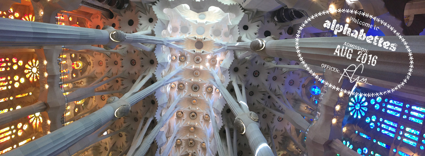
The grand view inside Sagrada Famíla
Of the many cities I’ve visited over the years, Barcelona never ceases to amaze me. It’s forever seared into my brain as the dream city of Art Nouveau — where I saw the celebrated 19th century architect Gaudí’s La Sagrada Família and realized the imagination has no limit. As a creative working in the commercial sector, I’m all too familiar with compromising great ideas by bits and pieces as they come to fruition. But Gaudí had an extraordinary ability to turn his dreams into reality.
Gaudí: The Peak of Modernisme
Like many, I view Barcelona as the city of Gaudí. With all its Modernisme influences, it’s a city full of dreamy Catalan Art Nouveau, of which Gaudí stands at the peak. As Martin Filler said in The New York Review of Books, Gaudí was one among an extraordinary generation of local architects who embraced Modernisme, the distinctive Catalan variant of Art Nouveau which drew heavily on the Romantic revivalist renaissance movement of mid-19th century Spain.