
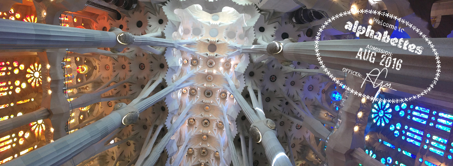
The grand view inside Sagrada Famíla
Of the many cities I’ve visited over the years, Barcelona never ceases to amaze me. It’s forever seared into my brain as the dream city of Art Nouveau — where I saw the celebrated 19th century architect Gaudí’s La Sagrada Família and realized the imagination has no limit. As a creative working in the commercial sector, I’m all too familiar with compromising great ideas by bits and pieces as they come to fruition. But Gaudí had an extraordinary ability to turn his dreams into reality.
Gaudí: The Peak of Modernisme
Like many, I view Barcelona as the city of Gaudí. With all its Modernisme influences, it’s a city full of dreamy Catalan Art Nouveau, of which Gaudí stands at the peak. As Martin Filler said in The New York Review of Books, Gaudí was one among an extraordinary generation of local architects who embraced Modernisme, the distinctive Catalan variant of Art Nouveau which drew heavily on the Romantic revivalist renaissance movement of mid-19th century Spain.
La Sagrada Família
Of the many astonishing buildings he created in Barcelona, my favorite is La Sagrada Família. Regardless of religion or culture, the awe that I feel at the grandeur of the place when I walk through it is unparalleled. The first time I walked in, I was blown away — seemingly impossible pillar supports, restrained flow of light, and the irresistible feeling that I was in a stone forest. At a glance, the integrity of the architecture, with its pillars that look like celery sticks, seems impossible. Of course, it’s construction was the result of careful mathematical planning. Construction of the Sagrada Família commenced in 1882 and has yet to be completed (the plan is for it to be finished in 2026). Supposedly, Gaudí himself acknowledged that the project would be one that he could not see finished in his lifetime, and would be one for future generations to continue on. Thus, the portions of the building have been constructed in wildly varying styles. An architect named Francisco de Paula del Villar y Lozano started the project a year before Gaudí took over, and it has been under seven architects since. Just like the many fingerprints it has, the structure sometimes feels like a peculiar array of architecture styles mashed into one. The three facades of La Sagrada Família make a good example — The Nativity facade has a traditional, realistic, ornate, naturalistic style, while the Passion facade is unmistakably cubist, with harsh angles jutting out all over. The last facade, Glory, has not been revealed, but is expected to be the most striking of all, and will also be stylistically different from the rest.
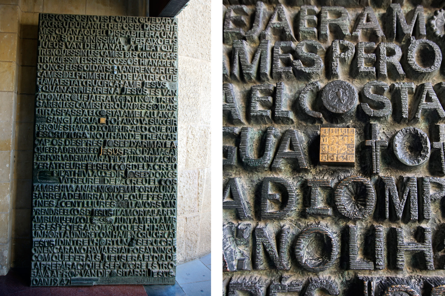
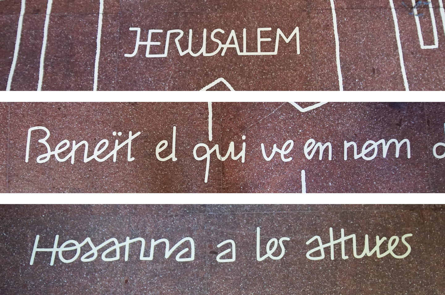
I visited La Sagrada Família for the first time 7 years ago, and again last November. When I visited last November I was a much more educated letter enthusiast, and I noticed a peculiar and funny aspect of the building. There is so much lettering everywhere, and all of it is different.
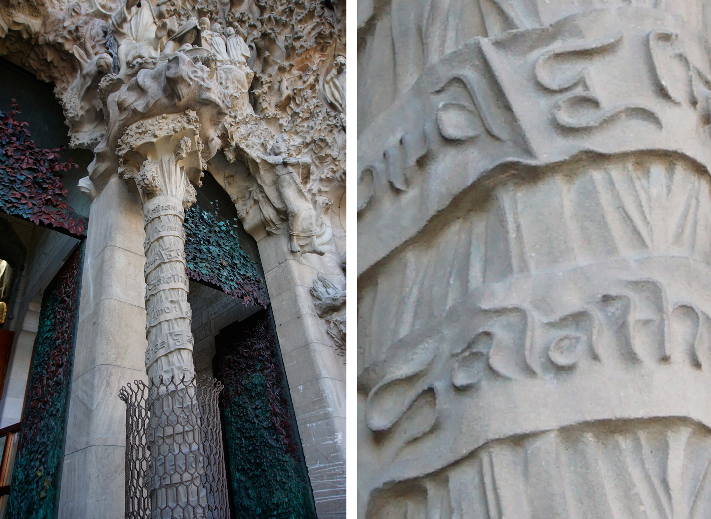
Swirling romans on the pillar of the Nativity Façade

Stoic textura blackletter in the Rosary Portal
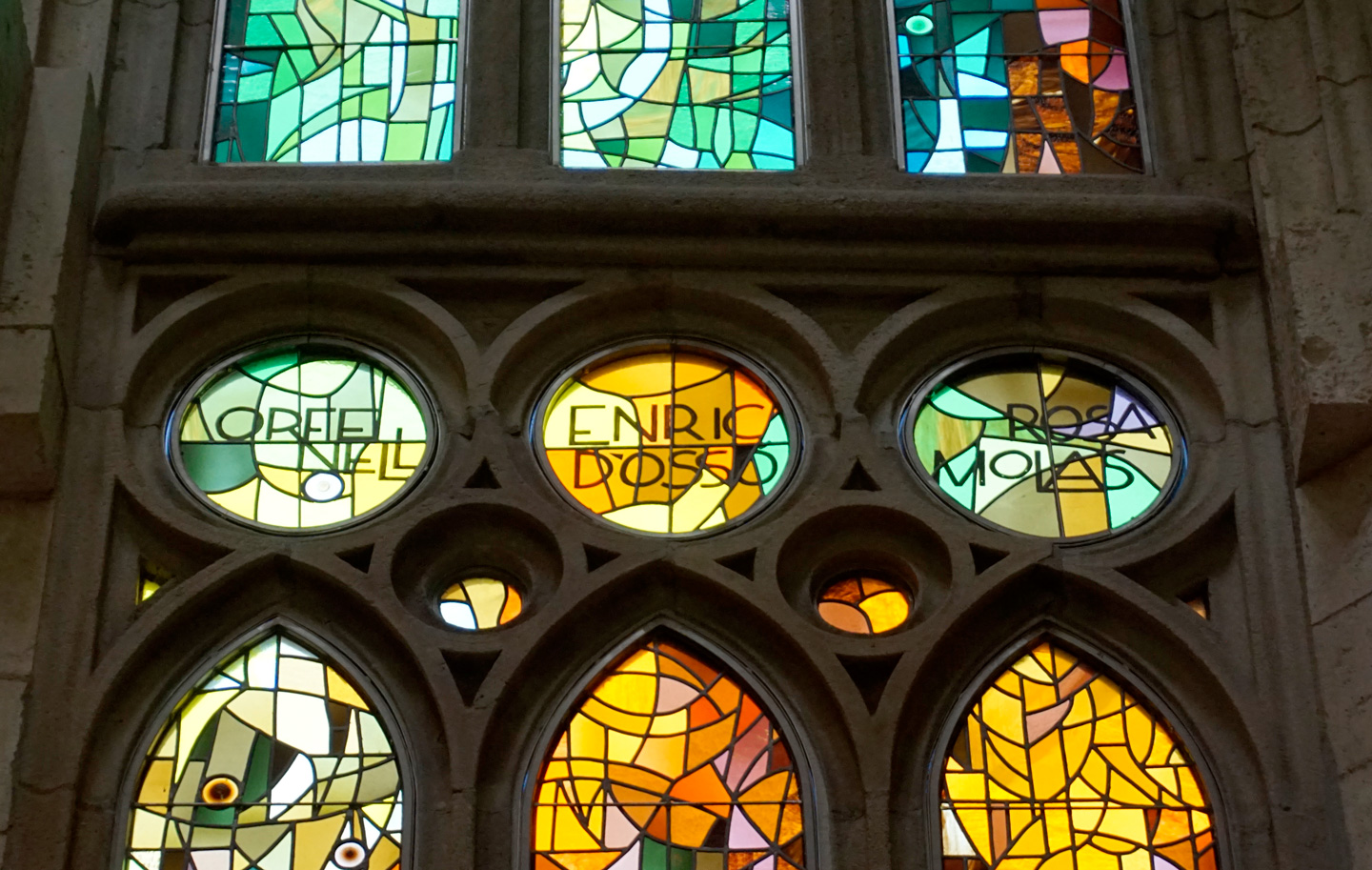
Art-Deco style sans-serifs on the stained glass panels made by Joan Vila-Grau
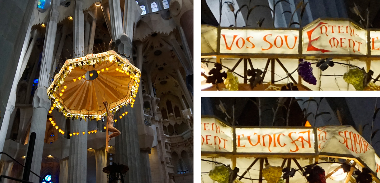
On the Nativity Facade the pillars have snaky-looking romans; stoic Textura blackletter dominates the Rosary Portal; and there are Art-Deco style san-serifs on the stained glass windows of the main chamber. Just like the architectural and sculptural styles of the facades vary dramatically, so do the letterforms on all different parts of the building. The lettering artists weren’t specifically credited (as is the case most of the time), so it’s difficult to determine who was responsible for creating these letterforms. One could assume that individual craftsmen, such as the stone mason or stained glass artist, were responsible for the letters in addition to the rest of their craft. However, it is entirely possible that someone else drew them up. Either way, there are many beautiful and quirky letters scattered throughout La Sagrada Família. Not all of them adhere to a period-specific style; and we will probably never know more about the intentions behind them. However, we can admire them for all the special charm they inspire in La Sagrada Família.
Built up roman capitals on the side of the Tower of Jesus
Raised romans on the door of the Glory Façade
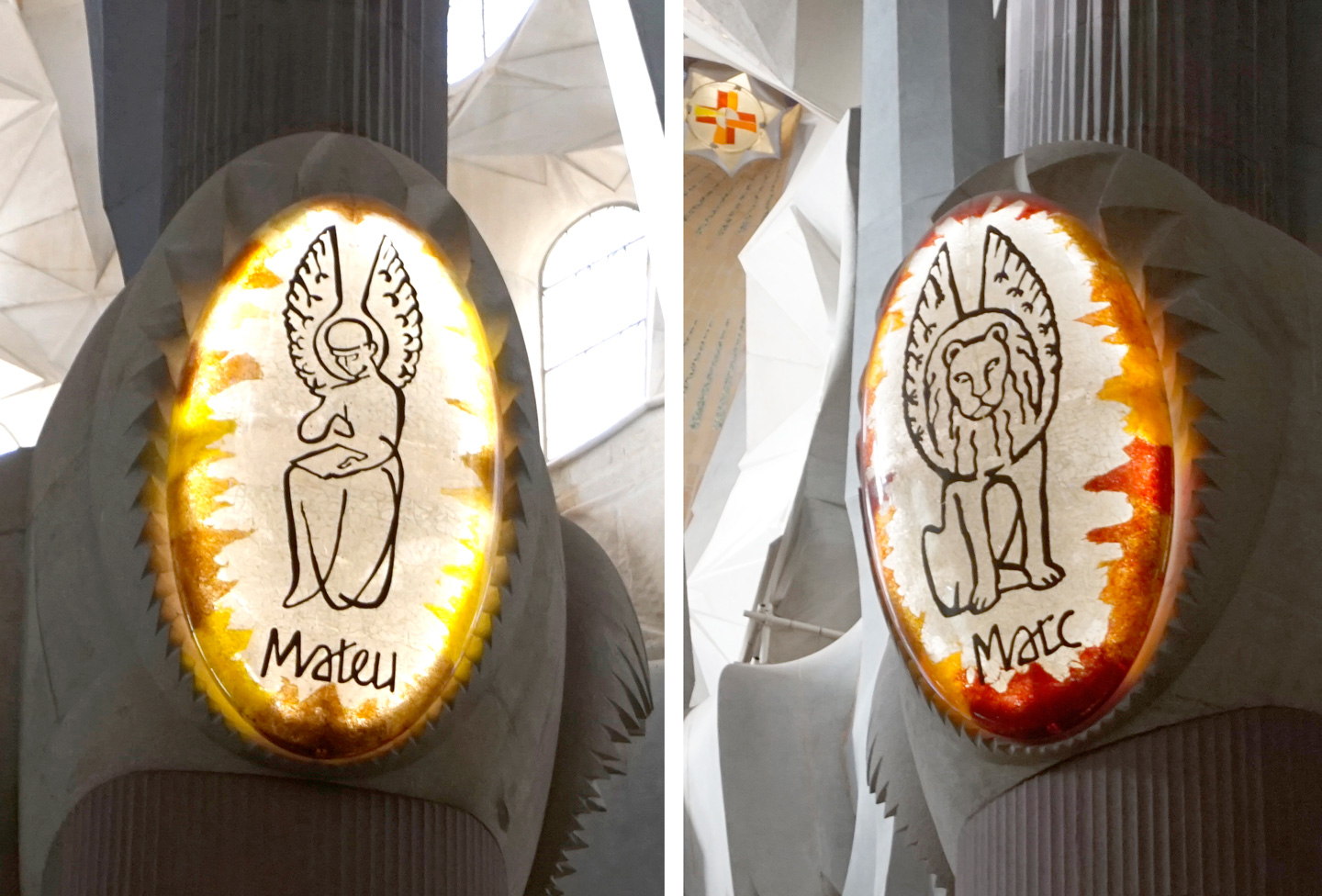
Angular script on the pillars of Sagrada Famíla
A panel full of roman capitals on the Nativity Façade
Other Gaudí Buildings and Signs in Barcelona
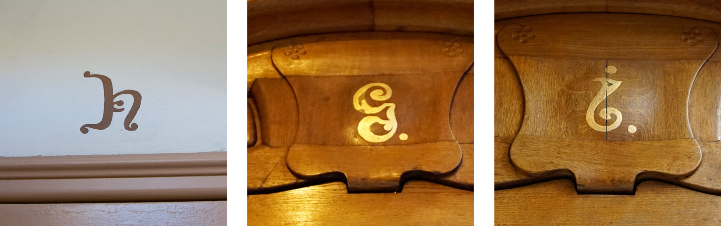
La Sagrada Família might be the most elaborate out of all the Gaudí buildings in Barcelona, but Gaudí took a lot of care in choosing the letterforms he wanted in all of his projects. Most of them had an Art Nouveau inspired look to match his Modernisme aesthetics, and were carefully adapted to fit in with the materials and style of its surroundings. For Park Güell, the letterforms were constructed with ceramic mosaics to match the overall material used in the park buildings. Palau Güell has a sober, almost intimidating looking metal G mounted on top of an iron gate. On the contrary, Casa Batlló has friendly, round-looking art nouveau-esque uncials painted on the doors to match the overall organic feel of the building.
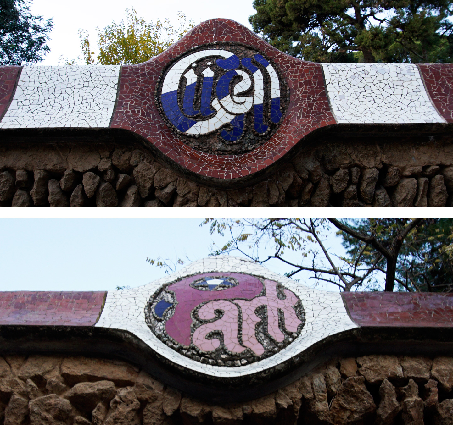
Ceramic mosaic letters in front of Park Güell

Iron-wrought ‘G’ on the gate of Palau Güell
Art-Nouveau style letters on the doors of Casa Batlló
As is fitting for a city full of Modernisme, there are lots of gems to be found in the street signage of Barcelona. There seems to be a lot of decorative gothic, monoline script, and just creative ways to apply roman capitals that make for so much eye candy.
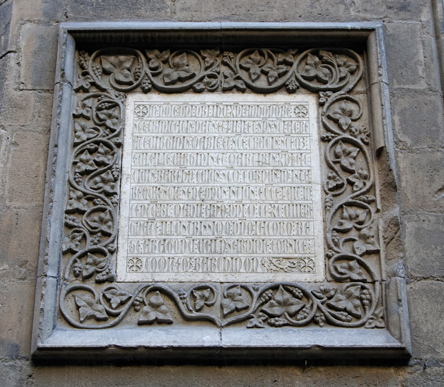
Gothic capitals found on the side of an old cathedral
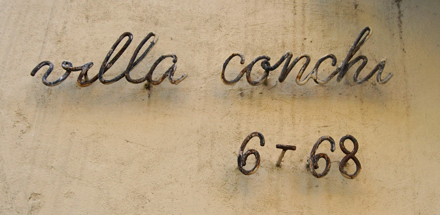
Monoline script found in the neighborhood surrounding Park Güell
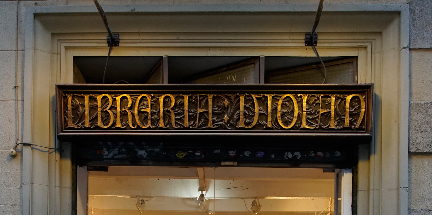
Storefront for a frame shop in Barcelona
As with my previous visit, I left Barcelona full of inspiration and appreciation for things I never expected to find. In the city of dreams, you never know what delights you’ll come across.
This post is part of Greetings from, a series in which Alphabettes share typographic curiosities from around the world. Look out for a passport stamp in the photos to spot posts from the series, or read them all here.