
I grew up in Germany so I know my Reclam books intimately. In German literature class we spent months diligently analysing every sentence of Mann’s or Remarque’s novels. The books were severely worn by the time we were finished with them. Those almost empty covers really just asked to be doodled on, their spines were torn, and the dog-eared pages were covered in ink and chocolate stains. But Reclam’s design withstood all abuse; the format, material and the (now) iconic yellow covers will always reveal their true identity. That is why I love paperbacks.
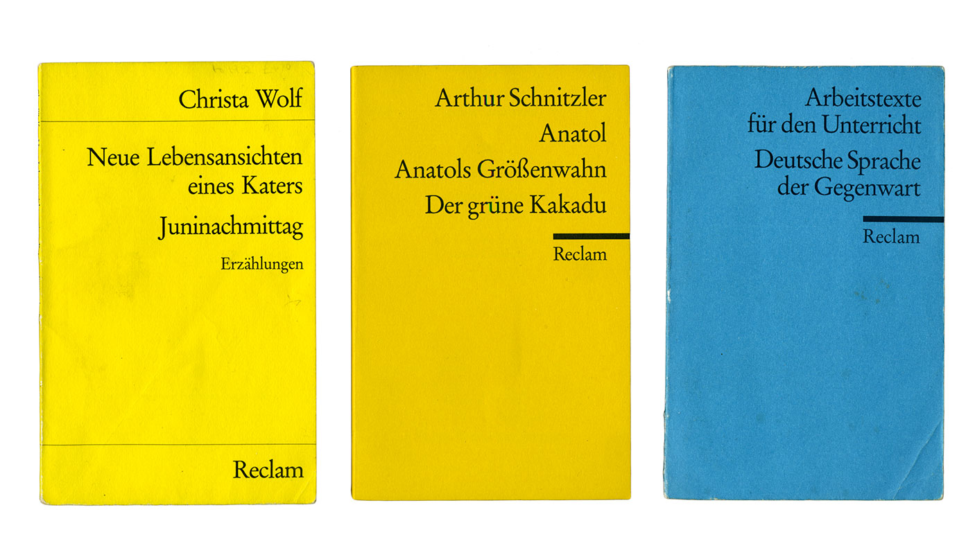
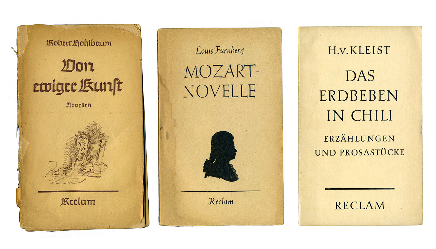
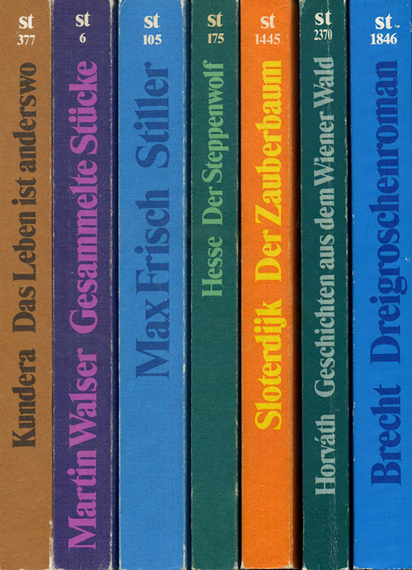
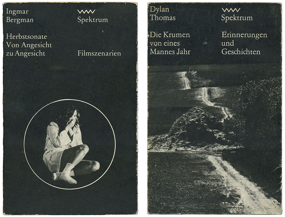
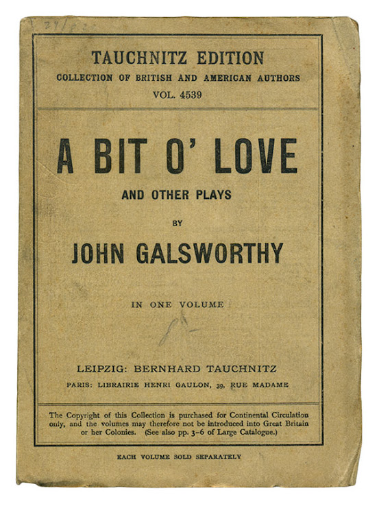
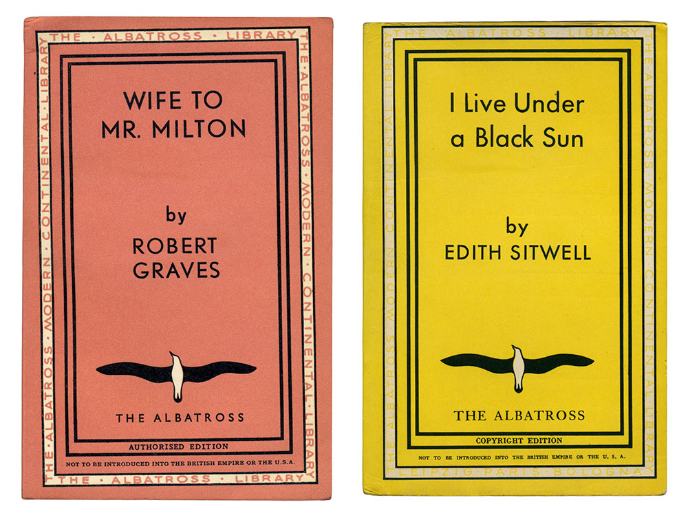
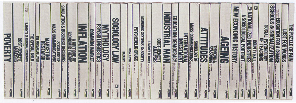
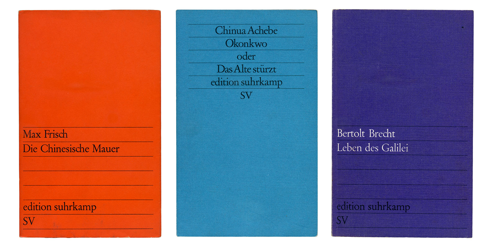
Paperbacks are by definition inexpensive and humble but their fragile bindings can carry most influential literature. Though, what I especially admire are the concepts their designers came up with to achieve a uniformity that can give a series a clear identity.
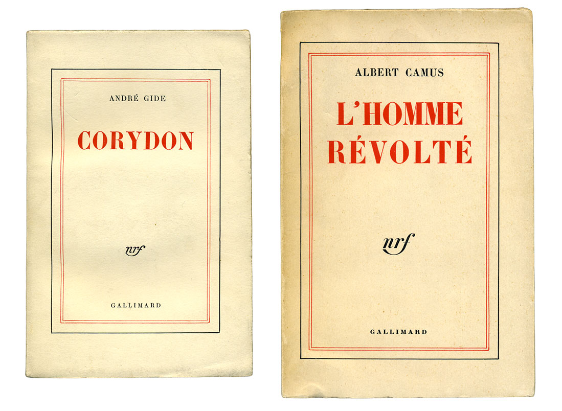
Here’s a sneak peek of my favourite part of my book shelf:
Also, it hurts considerably less to fall asleep on a paperback than on a hardcover.
If you liked these pictures you might also enjoy the following articles and books: Lynda Relph-Knight’s interview of Derek Birdsall and his book Notes on Book Design (I nicked the Penguin spine picture from it); everything related to Tauchnitz and Albatross on the Paperback Revolution blog; John Morgan’s Gallimard Blanche collection; Penguin By Design by Phil Baines. Some of the designers of above books are known to me, others aren’t. Get in touch if you want to nerd out over paperbacks.
Join us and declare your love for a vaguely type-related or typographic object by posting on Instagram or tweeting at us @alphabettes_org with the hashtag #letterlove!