Bette(r) Birds

2020 has been a bit of a grind, to say the least. Every morning we wake up to devastating news about the decline of our planet, the various threats to our health, racial injustice, inequality, police brutality, politics, wars, the economy, J. K. Rowling being an idiot. But against all odds, there are some things that keep us going even when everything around us starts to come crashing down.

And it appears that when it comes to self preservation my natural instinct is to go out and look at birds.

Illustration of a coot with annotations and a speech bubble saying 'coot'

Coots actually have way larger feet than this.

Continue reading

Typographic Potential of Variable Fonts

This article is based on the presentation What The Government Doesn’t Want You to Know About Variable Fonts delivered at ISType conference in Istanbul. It’s a summary of my personal thoughts on recent developments that might have an effect on responsive typography. It is also a collection of references to inspiring projects and experiments some of my colleagues have been doing. It touches on a few concepts I found necessary to explain but it shouldn’t be considered an in-depth report on those. Continue reading

Mayakovsky: ROSTA windows

ROSTA windows were Agitprop posters created by artists and poets like Cheremnykh, Mayakovsky, Moor, Nuremberg, and Volpin for the Russian Telegraph Agency (ROSTA). They were usually displayed in windows and often painted with cardboard stencils rather than printed.

This is a selection of Vladimir Vladimirovich Mayakovsky’s posters designed for ROSTA from the book:
Duwakin, W. (1967). Rostafenster. Majakowski als Dichter und bildender Künstler. Dresden: VEB Verlag der Kunst


Continue reading

Emoji Ambivalence

In December 2015 I spotted an unconventional SKULL AND CROSSBONES ☠ [U+2620] on a passing truck transporting explosive goods in Gujarat, India. Needless to say I immediately demanded a whole set of emoji based on it, and needless to add nobody volunteered.

So here I am, a year later, trying myself as an emoji designer and simultaneously exploring possibilities of bringing this font to life. And that, I discovered, is a bottomless pit if I’ve ever seen one.
Continue reading

Connecting The Dots


Almost to the day five years ago Bruno Maag asked me in a job interview about my five year plan. Just out of university with just a few freelance type design assignments on the horizon I told him truthfully that I didn’t have a plan for the following five minutes, let alone months or years.

This seems like a good occasion to catch up with some people who graduated and started their careers in type design at the same time. Elena, Kimya, Marina, Sol and I will talk about our past five years, about our careers, where we come from, where we are now, what we wish someone had told us five years ago and when the things we learned started to fall into place. Continue reading

Language as Design Criteria? Part III

During the research for my dissertation, Language-specific type design, I came across some inventive ways to deal with a language’s idiosyncrasies. Excessive use of diacritics and the resulting jaggedness of written language is one of the challenges typeface designers face frequently. This is a small selection of ways designers tried to master it for some of the Slavic languages in the past.

Preissig Antikva, Vojtěch Preissig, 1924

Preissig Antikva, Vojtěch Preissig, 1924

Continue reading

Language as Design Criteria? Part II

The lack of aesthetic compatibility between Latin uppercase and lowercase letters has long been a topic for discussion among type designers. The mismatch is particularly apparent in written German in which the first letter of all nouns is capitalised (see Part I for more background). In the 1920s and 1930s, experimental proposals to harmonise German were put forward. Attempts ranged from reformations of spelling and grammar, to designs for universal alphabets which tried to connect the various languages of the Latin writing system. This is a very brief introduction to some of those ideas.

Bayer’s proposal for a universal alphabet

Herbert Bayer’s proposal for a universal alphabet, published in Offset, no. 7 (1926)

Continue reading

Language as Design Criteria? Part I

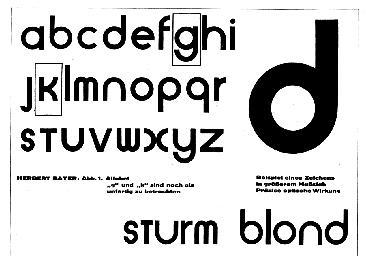
A recent conversation on TypeDrawers about cultural preferences in typography threw me right back to 2011 and the months before I submitted my dissertation for the MA in Typeface Design at the University of Reading. Back then I attempted to find out if there are typefaces that suit some languages better than others and whether or not we can draw conclusions from their designs.

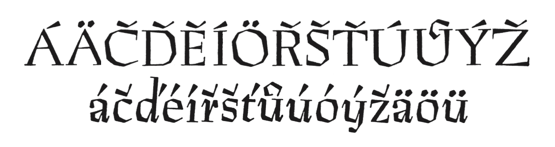
I was inspired by Ladislas Mandel who said that the designer ‘needs to analyse the characteristics of his supposed reader socially and culturally and choose shapes accordingly’ in order to achieve high legibility [1]. Richard Southall also touched on the topic in his article ‘A survey of type design techniques before 1978’ [2]. In his opinion, one makes different decisions on the fitting (spacing and kerning) of a typeface depending on the language the test document is set in.

I was left wondering if, for example, condensed typefaces are especially suited to typeset languages with a high frequency of long words. Or, if languages which make heavy use of diacritics require a lowered x-height. Should language be design criteria?

Antykwa Półtawskiego

Antykwa Półtawskiego by Adam Jerzy Półtawski was designed for use in Polish

Continue reading