
At Juliasys Studio we’ve been working for some time now on a digital handwriting style for the “NIVEA” brand of Beiersdorf AG. “NIVEA Care Type”, as we are calling the new OpenType font, is understood to be the imaginary handwriting of the NIVEA brand persona, the “NIVEA Woman”. Care Type on product packaging and in marketing material has the function to subtly present the NIVEA Woman personality in the look and feel of the brand. Care Type is to be used prominently but at the same time sparingly, “with caution”.

Figure 1: A century of typographical metamorphosis on the legendary NIVEA tin
As the result of an intensive cooperation between Juliasys Studio and Beiersdorf Global NIVEA Brand Management the typefaces “NIVEA Care Type Latin” and “NIVEA Care Type Cyrillic” are now internationally in use on numerous, partly newly introduced NIVEA care products. And other product lines will follow. Besides the Regular further weights are in preparation and currently being tested as lettering on packaging. In the foreseeable future Care Type will become a full typeface family.
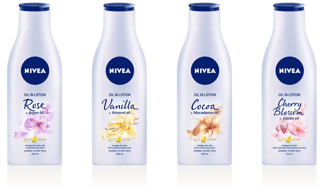
Figure 2: NIVEA Care Type on mockups for a new product line
Both the Latin and the Cyrillic Care Type contain over 2000 glyphs (among them about 1500 ligatures) with coding for automatic contextual substitution. Amounts like these are not a rarity for modern connected script fonts, and OpenType coding is not a secret science any more. So the main focus here will instead be about the preliminary work prior the actual design – were we used methods from handwriting-psychology and -analysis to determine the style of the typeface.
“In one way or another handwriting always expresses our inner nature, provided that it is not calligraphy”, noted German philosopher Leibniz already in the 17th century. His kindred spirit Hegel later compared handwriting with the human voice as the “individual determination of language”. — When we look at a handwritten text or hear someone speaking we get an impression of its creator. Our impressions do not always fully coincide if there are many of us, but to a certain level we usually do agree even if we are objectively a bit off-side.
Doing the kick-off workshop starting our project two main questions were: What are the personality traits of NIVEA’s persona, and how can these features be visualised in “her” handwriting style? The NIVEA Woman has been in discussion at Beiersdorf already for some time. Briefly summarised she can be described as an authentic, lively and dynamic personality, not hesitant or even frail. Her basic attitude is positive, she is open toward people and to new experiences. She is not an actress, image building is not for her.
Our next task was to translate this personality description into the elements of a handwriting style. Here we come to handwriting-psychology. Many of us are familiar with the term “graphology”, which became popular in the late 19th century. Handwriting-psychology evolved from this as a scientific discipline which researches the relationship of personality traits and handwriting features. Being scientific, its results have to be repeatable and independent of the examiner. The Swedish handwriting psychologist Teut Wallner defined handwriting as “the visual result of an individual writing act, a psychomotor track of individual movement.” This track consists of different variables which depending on their markedness and coincidence can give hints about personality traits of the text’s originator. Some of the variables – like slant of letters, their width and interspacing, length ratio between upper/lower extensions and middle zone, etc. can be measured quantitatively, others are recorded qualitatively.
For our project Wallner’s qualitative “impression-characteristic” (Eindruckscharakter) method seemed especially applicable. In this method handwriting samples are described using 150 pre-tested expressions grouped in 24 semantically distinct subsets. A team of examiners selects – individually – the most fitting ones, and afterwards the results are brought together in a single protocol. Significant clusters in subsets are seen as indicators for character features.
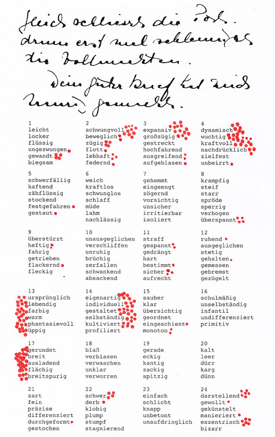
Figure 3: Strong clustering of “impression-characteristics” selected as descriptions for the handwriting test-sample on top
In our workshop we first checked how similarly the participants perceived given handwriting probes and then moved on to the NIVEA Woman’s personality. Each participant chose 10 impression-characteristics she considered most appropriate for the envisaged handwriting style. The terms selected were highly consistent within the group. Obviously the impression-characteristics primarily chosen were most important for us. But also avoided subsets had significance – since they contained terms to stay away from.
Most frequently chosen were:
1. expressions of movement: energetic, dynamic, flowing, lively
2. expressions relating to clarity: precise, well-balanced, uncluttered, clear
3. expressions relating to individuality: sophisticated, individual (but words like distinguished or offbeat were not chosen)
4. expressions relating to strength of will: steadfast, determined, confident
5. the expressions warm and light implying friendliness and easiness
Of course these selected impression-characteristics left lots of room for interpretation. But they did provide a necessary frame for developing the NIVEA Woman’s handwriting style. A glance at samples from Wallner’s Atlas of Handwriting (“Handschriftenatlas: Eindruckscharaktere”) and the corresponding impression-characteristics give hints for visual solutions.
I. Impression-characteristics of movement: energetic, dynamic, flowing, lively
Emphasis of movement is a predominantly emotional aspect in the handwriting act. Movement of the pen mirrors temperament and vitality of the originator. Handwriting psychologists interpret movement in writing as an intuitive, subconscious expression of individuality. A quick stroke of the pen indicates that the writer’s thoughts are preoccupied with what is being written and not with the visual appearance of the text.
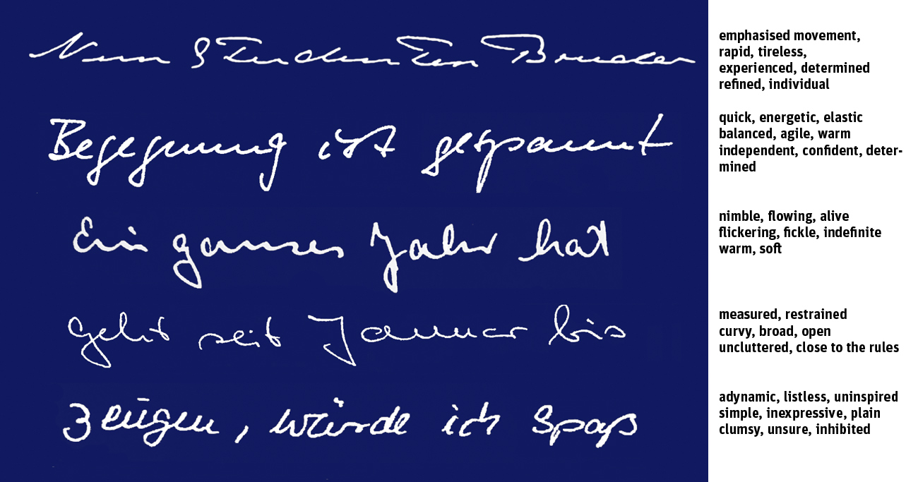
Figure 4 top to bottom: Handwriting samples with diminishing emphasis on stroke movement; on the right: corresponding impression-characteristics (Wallner, Handschriftenatlas)
The uppermost sample in figure 4 is clearly the one with the highest writing speed. An indication of this is its strong slant to the right. But a slant alone is not necessarily tantamount with fast movement – as we can see in the lowest example which has a slant to the right but the pen stroke is cumbersome and faltering. In contrast, the fourth example shows a steady flow in spite of a slight slant to the left. Flattening of the medium zone is a second indication of quick writing pace. Concurrently the medium-height letterforms are often reduced to thread-like structures. Typically enough the workshop participants didn’t select the word “fast” but lively, energetic, dynamic, flowing. These impression-characteristics do not really fit to the uppermost sample, but well to samples 2 and 3, which besides showing quick writing pace preserve clear forms in the medium zone and thus are well readable. The examples show that the handwriting of the NIVEA Woman needed a fine balance between stroke-speed and form-clearness. So the next impression-characteristics to look at are those connected to the letterform composition.
II. Impression-characteristics related to clarity of letterforms and readability: precise, well-balanced, uncluttered, clear
Contrary to the largely subconscious role movement plays in handwriting, the shaping of characters is the conscious component. It aims at creating a readable text with a potential reader in mind. Yet, clearly shaped letterforms – besides making texts readable – can also indicate a lack of individuality. This is often the case when the letters are scrupulously created following rules once learned in school, and no personal handwriting style evolved.
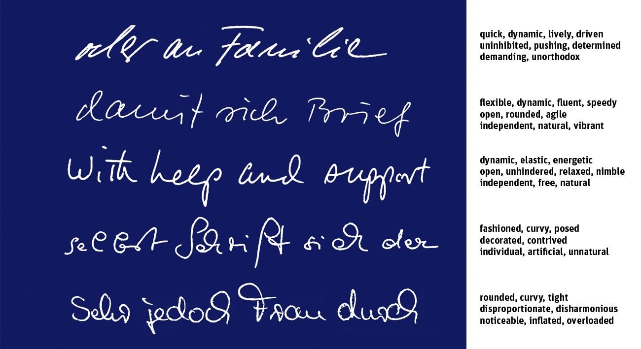
Figure 5 top to bottom: Handwriting samples with diminishing stroke speed and concurrent increase of emphasis on shape; on the right: corresponding impression-characteristics (Wallner, Handschriftenatlas)
The readability related-terms selected by our participants, precise, well-balanced, uncluttered, clear demonstrate a team-player attitude of the NIVEA Woman. She aims to be understandable, shares her views. She is an individualist but not a solitary mind. The second and third sample of figure 5 are apt visualizations of this. Here the movement and form aspects are well-balanced in the word images. In contrast, the other examples: The first one is one-sided in its focus on speed. Sample four emphasises form, but the shapes look quite artificial with signs of deliberate decoration (indicating not natural but intended individuality). And in the lowest sample the letterforms seem crowded, the words overloaded. Here the impression we get is not one of conscious decorating like in sample four but one of clumsiness and naïvety.
III. Impression-characteristics relating to strength of will: steadfast, determined, confident
In handwriting-psychology special attention is paid to the word beginnings and their endings. Oversized first letters (figure 6, samples one and two) are seen as indications of high self-esteem or even self-centredness if they additionaly are elaborately designed. Similarly, increasing character sizes at the word endings – which is more seldom (sample three) – can be signs of a strong will and perseverance. Beginning strokes and especially stretched-out end-strokes (sample four) are generally considered as expressions of vitality – if they are quickly written and appear only sporadically. On the other hand, when they appear with great frequency at both ends of the word they are more of a deliberate demonstration of harmony than express inner vitality.
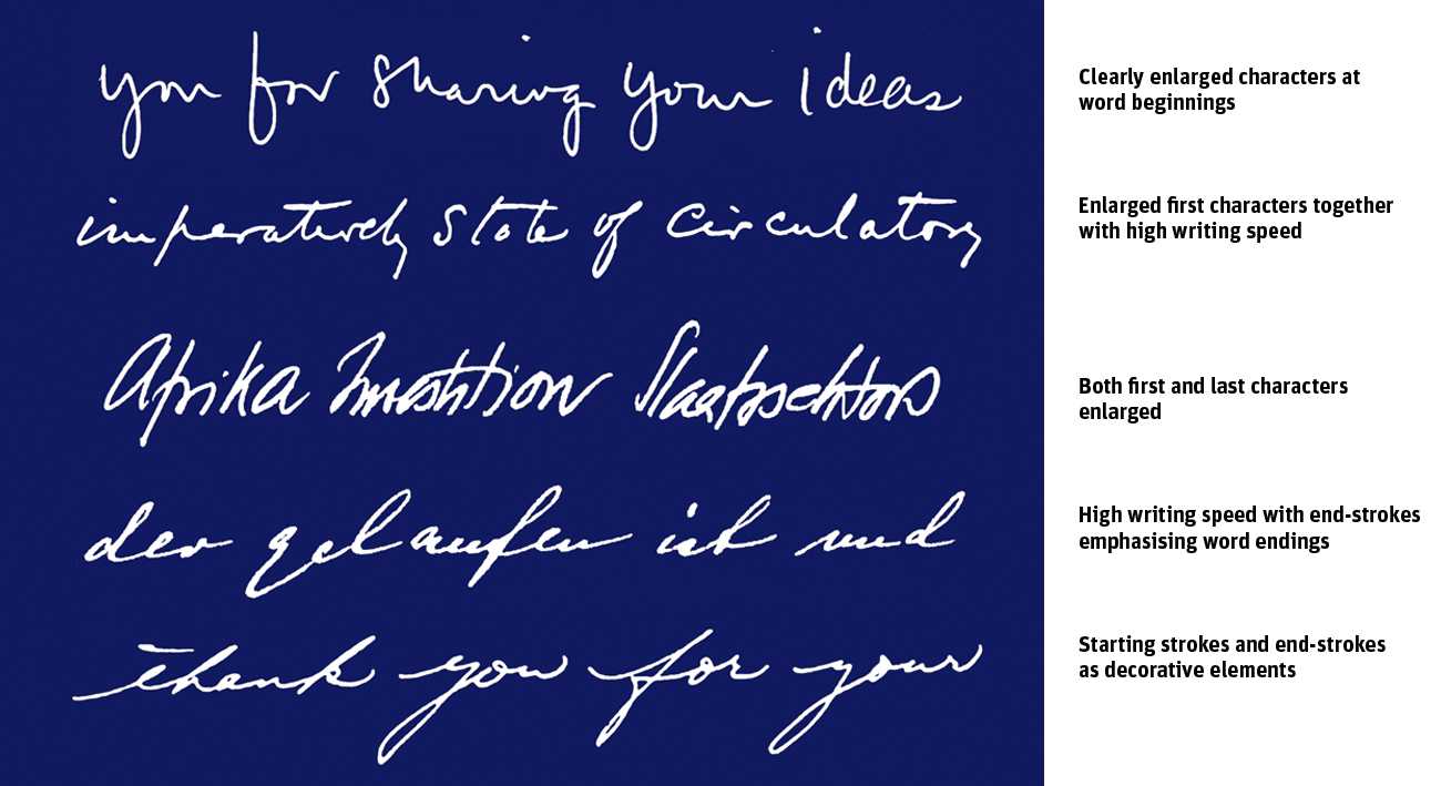
Figure 6: Handwriting samples emphasising word beginnings and endings in various ways
However, one always has to keep in mind that a handwriting style is never defined by its originator alone but also by the model and rules according to which writing is taught in school. These vary from country to country and change in the course of time. Connecting the characters in handwriting was the norm 30 years ago, but with today’s prevalence of digital appliances the school syllabus in many regions includes only the disconnected model. Similarly, elements like beginning- and end-strokes might be considered either as natural letter components or as an intentional stylization – depending on the writer’s age and cultural surroundings. When developing NIVEA Care Type we had to keep these differences in mind, since NIVEA products are sold all over the world and to many age groups. Since the word beginnings and endings are of special importance for the writing style we created a range of alternate glyphs exactly for the characters in these positions. Font users themselves can decide which one to use – checking in each case how much emphasis is needed and which end-strokes they want.
IV. The impression-characteristics sophisticated, individual, warm and light
Handwriting can reflect individuality and sophistication in different ways. A general definition might be: an interplay of stroke-movement and form-image that evolved from the once learned model toward a distinctive personal style. As important characterizations for NIVEA Care Type our workshop participants also selected the terms warm and light – the NIVEA Woman as an individualist, but at the same time approachable and easygoing. Figure 7 contains handwriting samples of different well-known personalities. All of them combine individuality and movement with good readability. These examples were sources of inspiration but could not serve as guiding images for Care Type, since the font had to meet further requirements for its planned use on package labelling: Care Type had to be very space-efficient and exceptionally well readable small sizes.
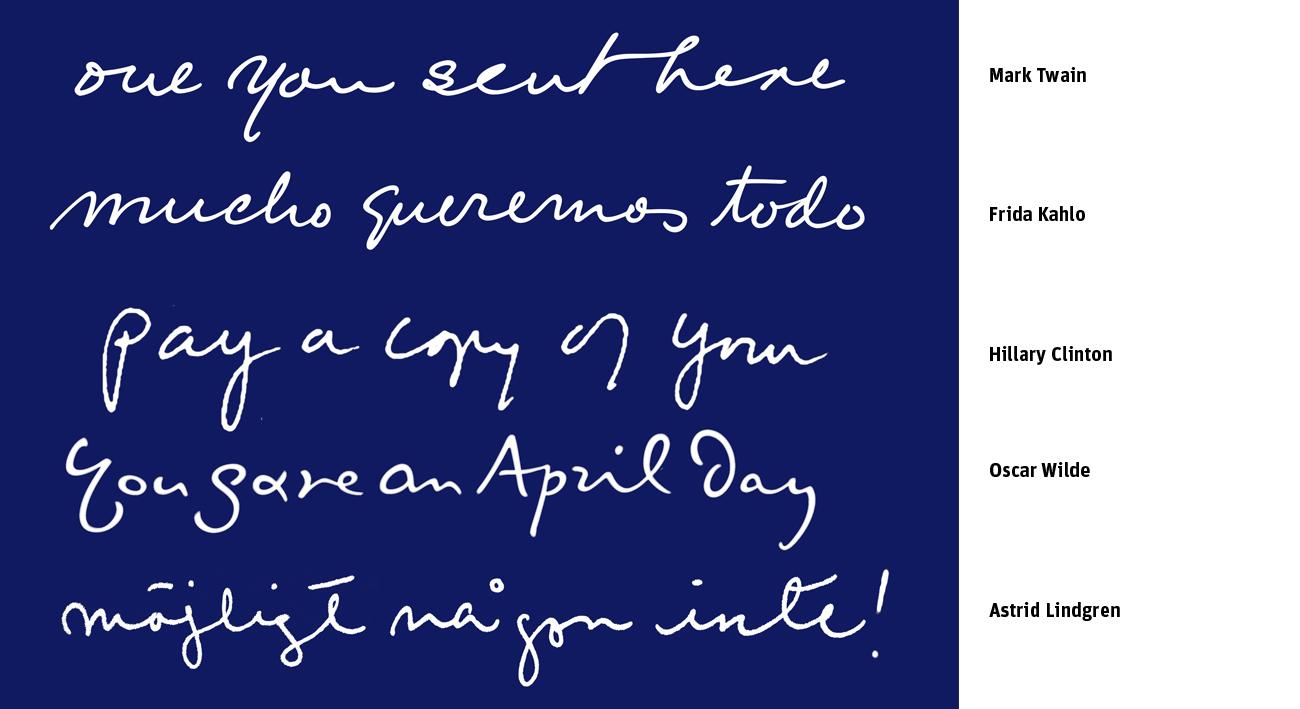
Figure 7: The handwriting of persons most of us are familiar with: Individual does not mean poorly readable.
The NIVEA Woman’s handwriting and the requirements of package labelling
Figure 8 shows some draft letterings for Care Type. All of them aim to combine legibility in small size with the selected impression-characteristics. If we compare with the examples of figure 7 – our drafts have a significantly higher medium zone and correspondingly less character spacing and width. After discussions and feedback from different sides we decided not to develop the lowest sample further, because it is rather spacious and not readable enough. Sample 1 convinced in its balance between speed and clearness of form. But we found the strong shading in its stroke not very fitting to natural handwriting. This makes it look somewhat too calligraphic. As a result we decided to modify and integrate some of its letterforms in sample 2, which became the main prototype for Care Type. Here, we felt the selected impression-characteristics were well illustrated and expected the style to work well for packaging. Subsequently numerous NIVEA-typical slogans and product names were designed as lettering. Only afterwards did the elaboration of the real font begin.
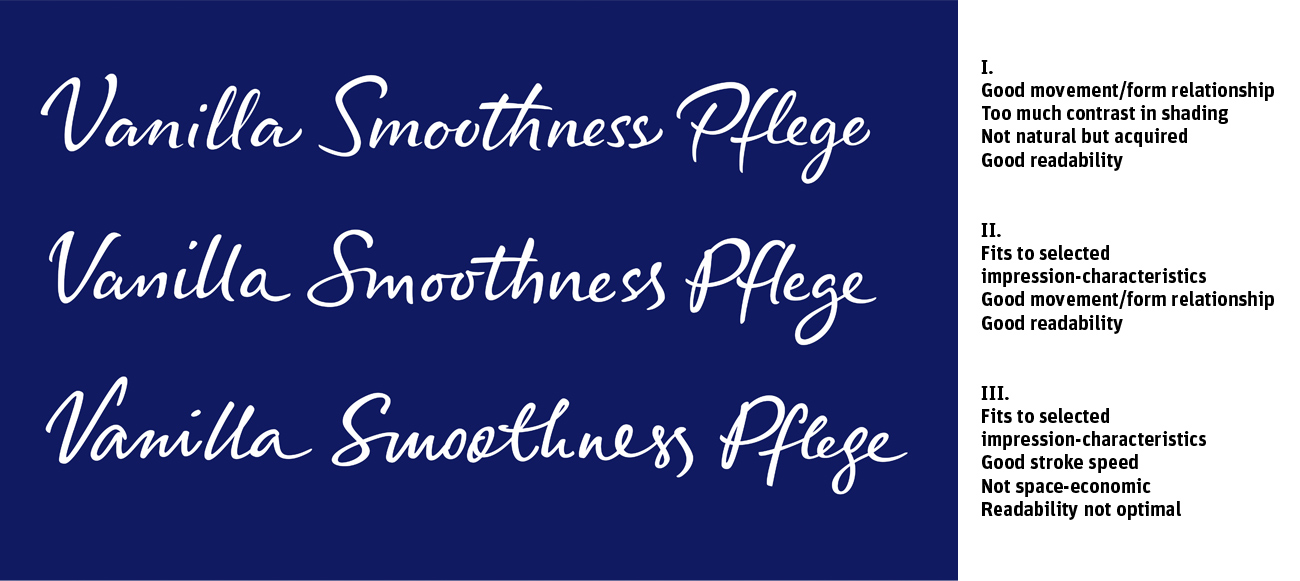
Figure 8: Lettering drafts for NIVEA Care Type

Figure 9: In comparison the final NIVEA Care Type
Using and not-using of OpenType possibilities
The over 4000 glyphs of NIVEA Care Type Latin and Cyrillic are a prerequisite for highly diverse, natural looking word-images. Most alternate glyphs and ligatures are inserted context dependently and automatically by OpenType coding. But some alternates, among others those for emphasising the word beginnings and endings are excluded from this to avoid exaggerations. Figure 10 shows the glyph types contained in a word without optional editing and figure 11 some of the possibilities for optional editing.
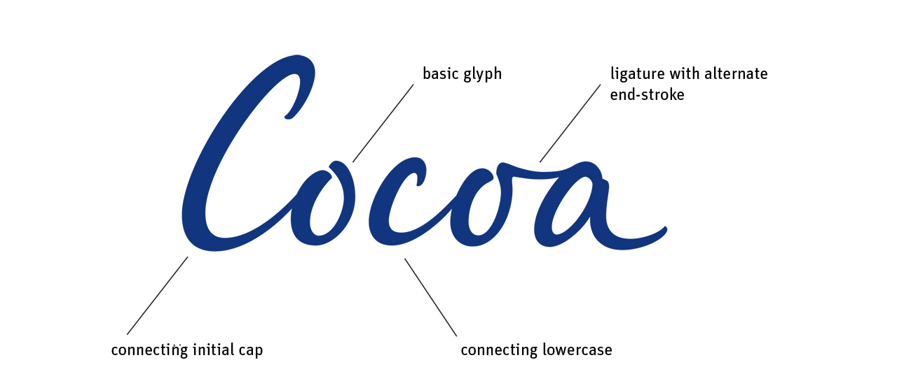
Figure 10: Typical glyph-mixture in a “Care Type word”
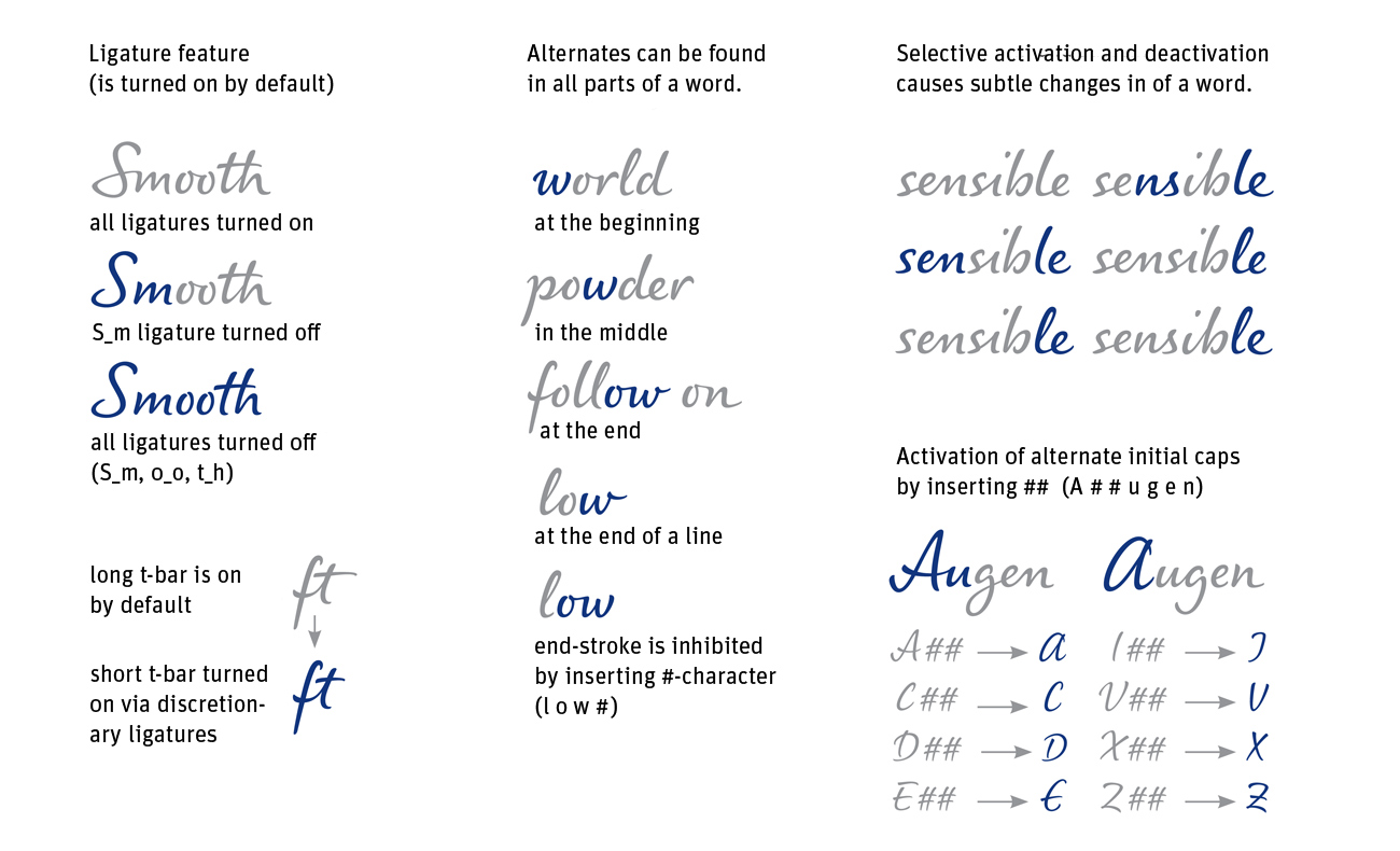
Figure 11: Optional editing of alternate glyphs in words
The NIVEA Woman is polyglot …
NIVEA Care Type supports over 100 languages with Latin and Cyrillic alphabets. Below is a selection of those languages in which Care Type is in use at present. So far the Regular weight is the norm, but depending on the product kind and background effects on labels also Light and Bold are needed. Currently we are making these as lettering, and after a testing phase they will be added as fonts to the NIVEA Care Type family.
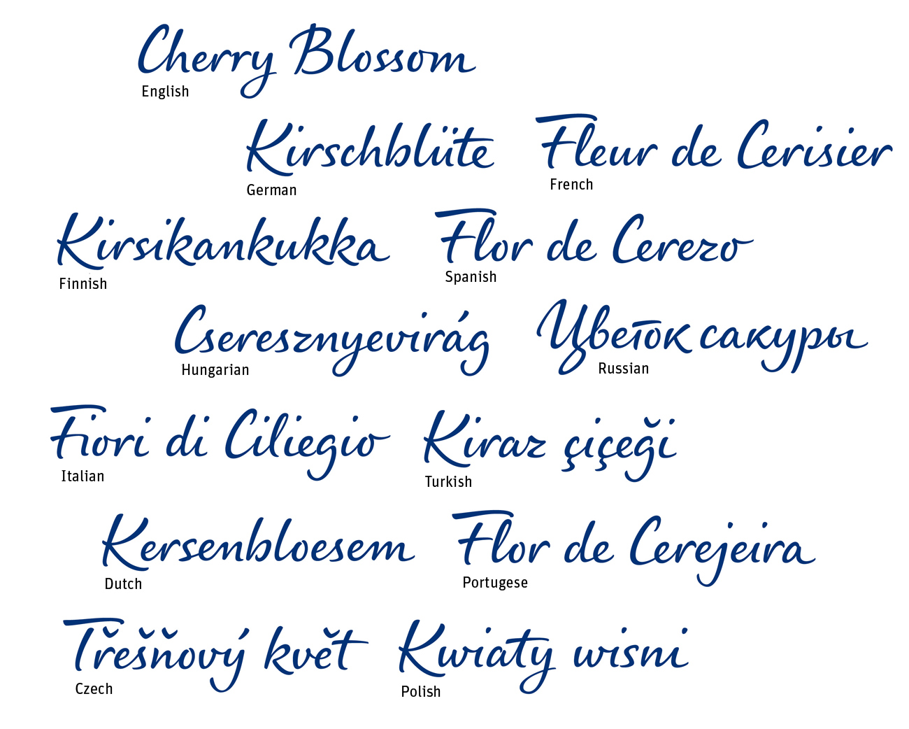
Figure 12: Care Type is in use in most European languages
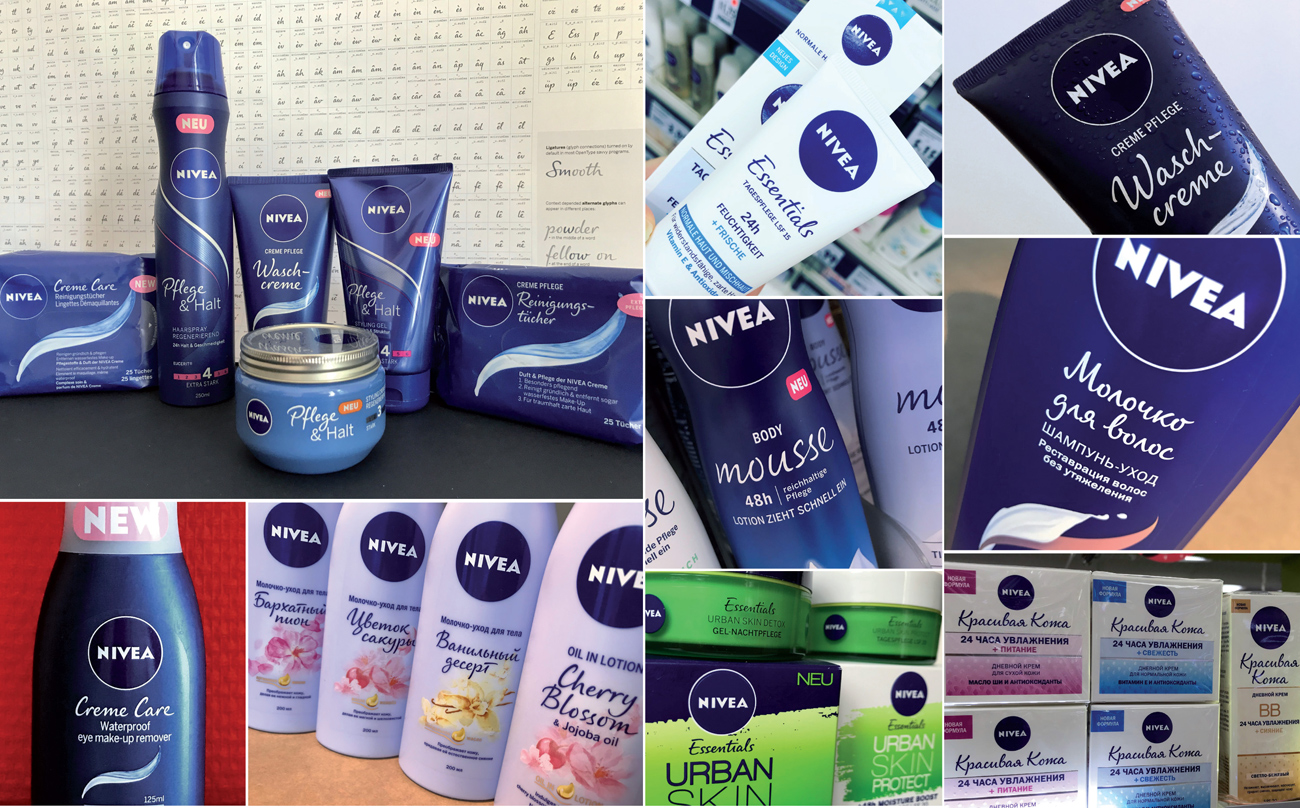
Figure 13: Application of Care Type in different product lines
Tailoring digital handwriting – in retrospect
Although there are thousands of handwriting fonts on the retail market, it was obvious for us from the beginning that the NIVEA Woman personality could be visualised convincingly only with a tailored typeface. Besides the stylistic reasons discussed in this article there are also technical ones. Available handwriting fonts very seldom contain the full character sets needed for an international brand. Extended Cyrillic and Greek are almost never included. Further developing such restricted fonts is time demanding and usually leads to poor compromises. In contrast, a method of tailoring in continuous cooperation with the client and associated design agencies gave us a chance to test and improve our results in an early phase. As especially positive we experienced the making of drafts in lettering that could be used in practice well before completion of the fonts. Like in real handwriting, words typeset with a handwriting font can sometimes be more and sometimes less attractive to look at. In part, this is dependent on the glyph sequences, which can be rhythmic and full of variety but also uniform or even monotonous. Since Care Type is used predominantly for product labels, and their visual effect is comparable to that of logotypes, final adjustments are often essential. In this, we at Juliasys Studio are continuing to cooperate with Beiersdorf’s associated agencies to assure optimal results.
I can only say “wow” to this — extremely well researched fundamentals and thoroughly carried out design work.