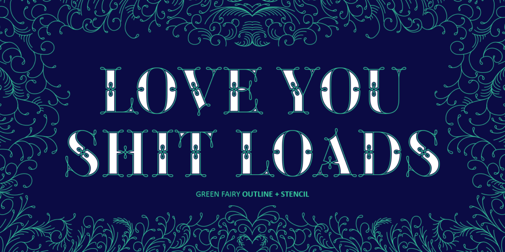
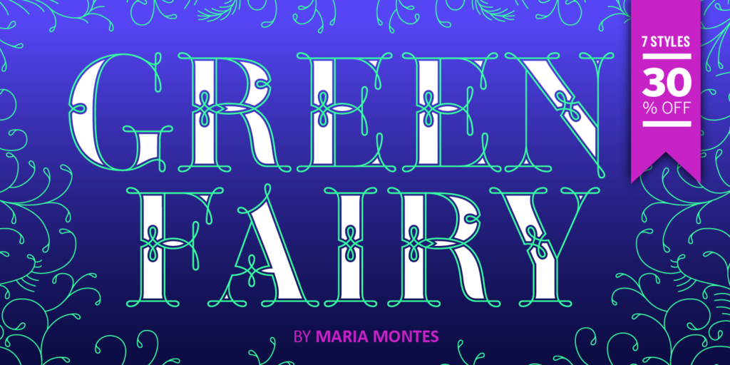
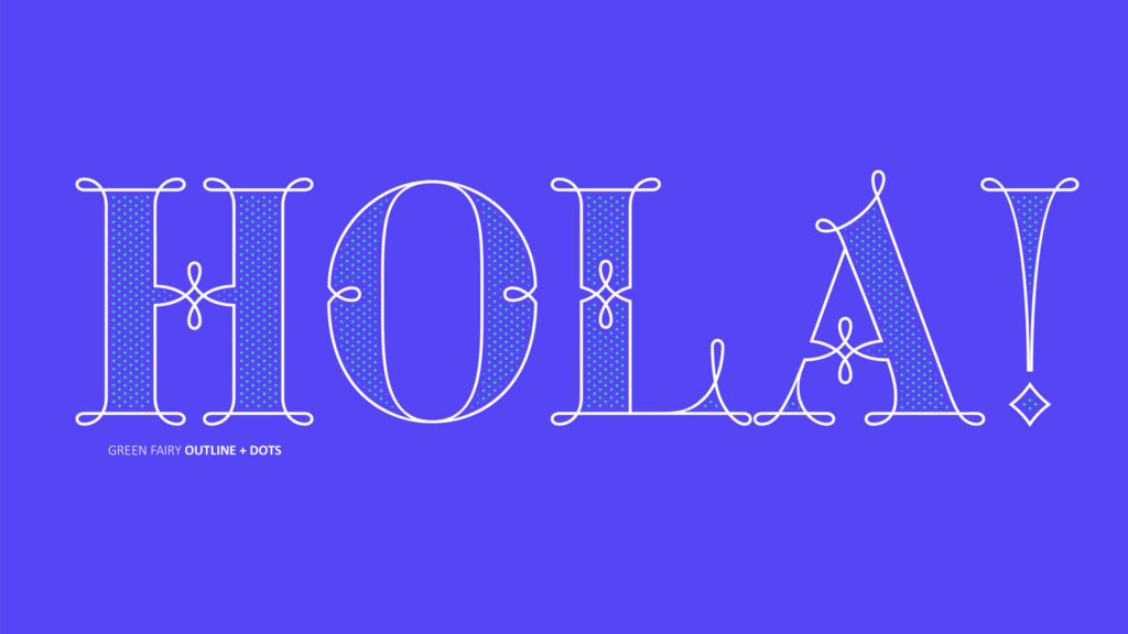
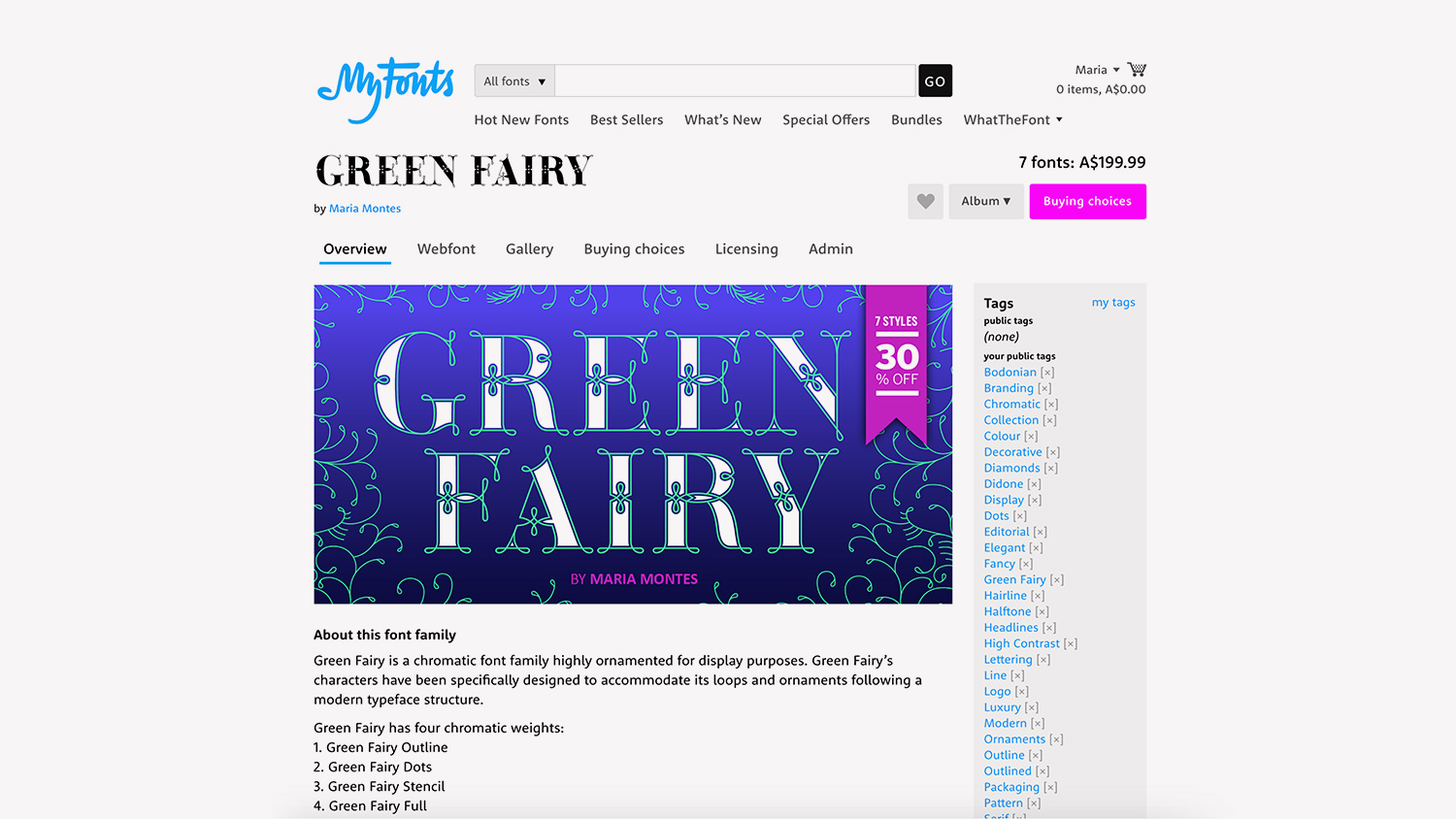
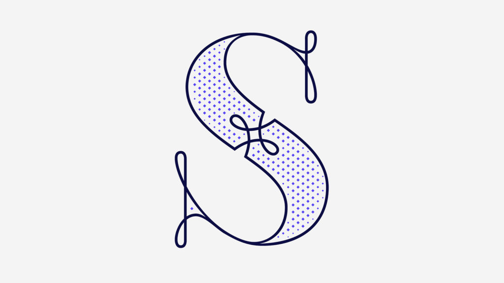
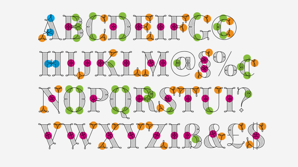
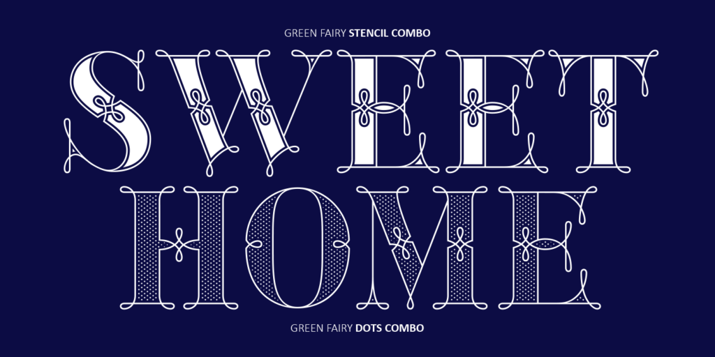
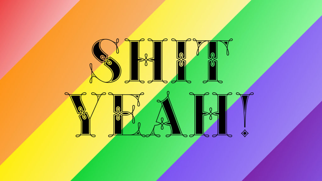
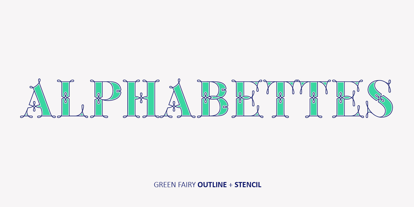
Green Fairy is a chromatic font family highly ornamented for display purposes.
Green Fairy’s characters have been specifically designed to accommodate its loops and ornaments following a modern typeface structure.
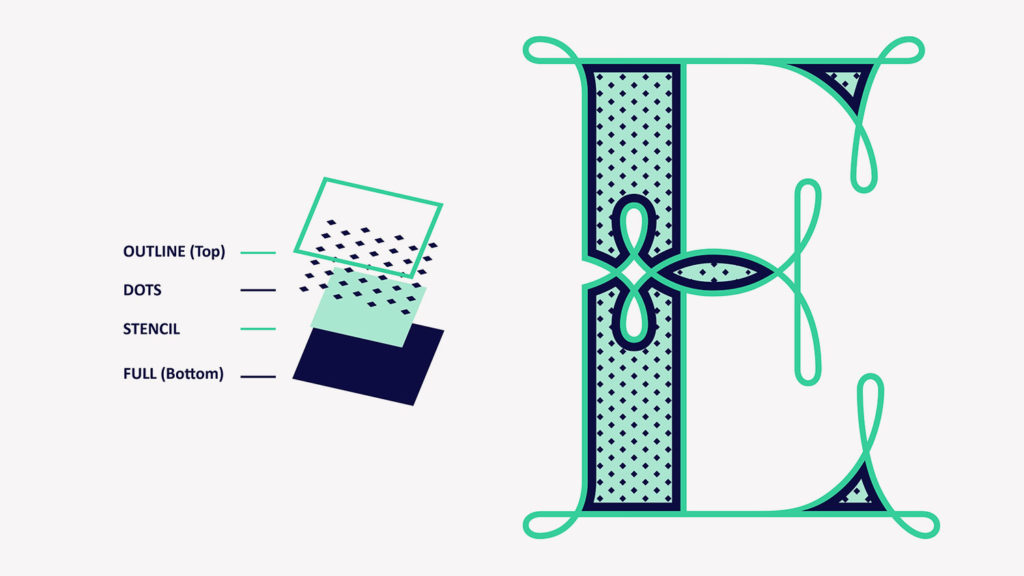
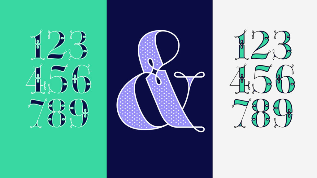
Green Fairy has four chromatic weights:
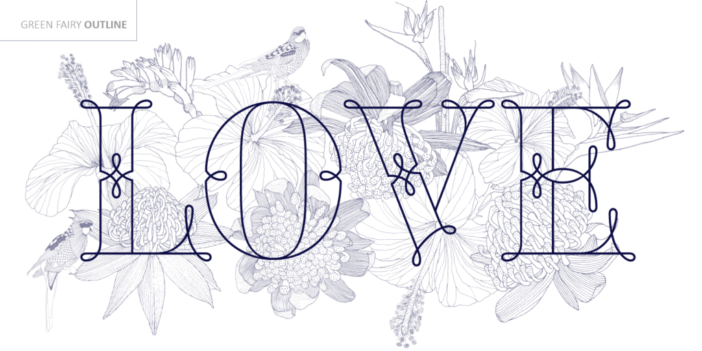
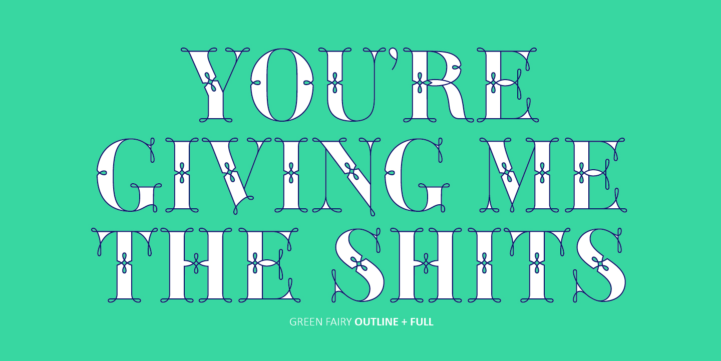
1. Green Fairy Outline
2. Green Fairy Dots
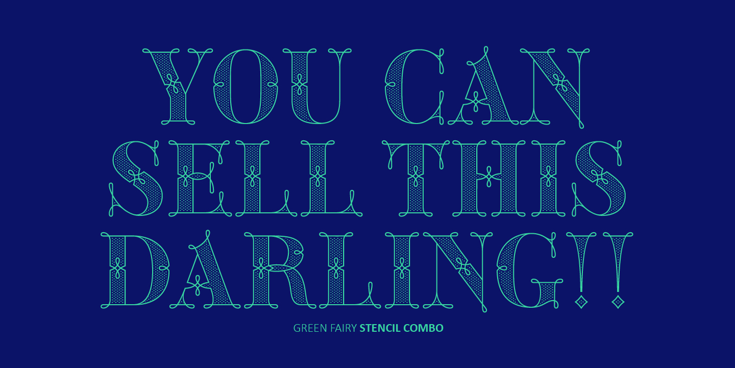
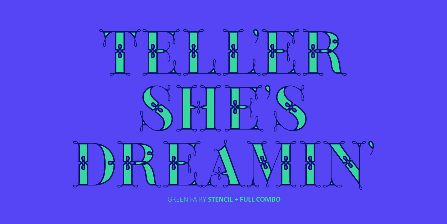
3. Green Fairy Stencil
4. Green Fairy Full
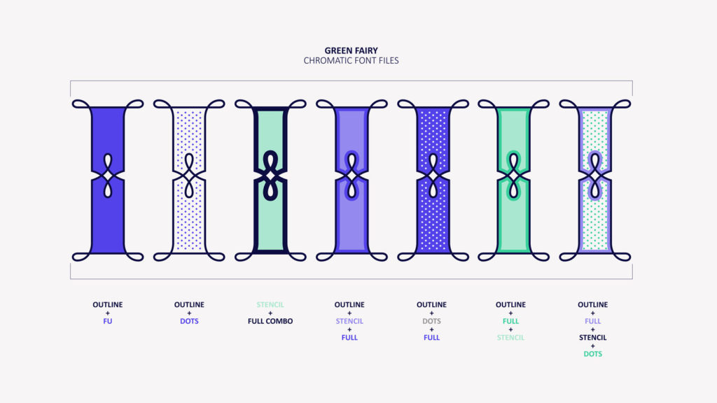
The Outline weight has been created as the base or structure for the other styles. You can combine these weights as well as add colours to obtain multiple effects and type styles.
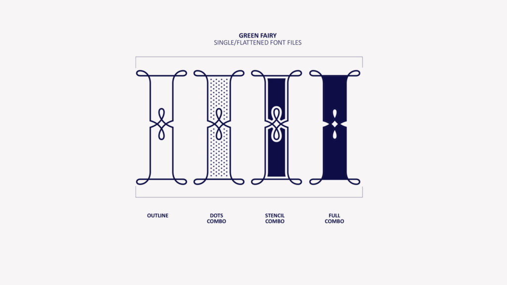
Green Fairy has also three combined weights (combos) to simplify your workflow, for these occasions when you only want to use one single colour in your font:
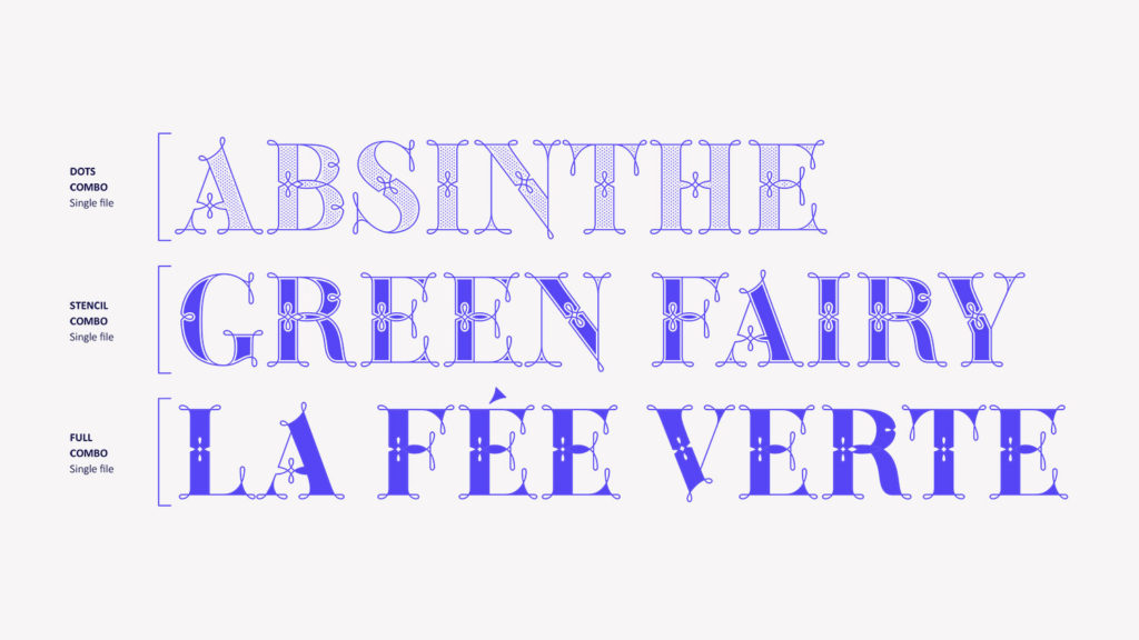
5. Green Fairy Dots Combo
6. Green Fairy Stencil Combo
7. Green Fairy Full Combo
Green Fairy Origins
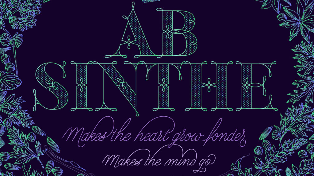
The origin of this typeface is the lettering I designed in 2015 as part of my illustrated cocktail artwork called “Absinthe. La Fée Verte” (The Green Fairy).
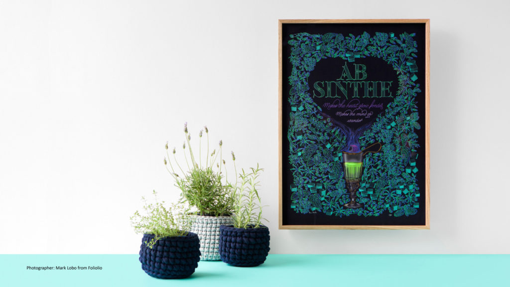
Originally, this lettering only featured eight letters “AB·SINTHE” vector drawn in Illustrator.
Right after creating the full-colour artwork, I designed a fountain-letterpress print version in collaboration with Ladies of Letters, A.K.A. Carla Hackett and Amy Constable from Saint Gertrude Fine Printing.
At the beginning of 2016 —and thanks to the project @36daysoftype— I found the motivation, and most importantly the deadline, to draw the rest of the twenty-six letters of the uppercase alphabet.

I started 2017 having my first two calligraphy courses sold out, so I took this amazing opportunity to devote myself to Green Fairy for nine months straight.
I purchased the font software Glyphs and I started to re-draw all twenty-six letters of the uppercase alphabet again, followed by the numbers…
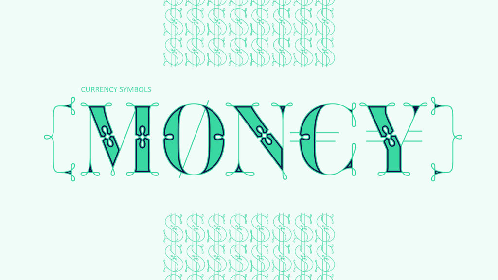
… currency symbols, diacritics, punctuation marks as well as spacing and kerning.
Green Fairy is the result of an intense nine-month-full-time personal investment and I couldn’t be happier with this release! The font is now available commercially at MyFonts.
Production Process
Green Fairy was born as one weight, but quickly turned into a layered/chromatic font. Things were going more or less fine till I arrived to the Dots weight:
1) I started drawing squares following a grid;
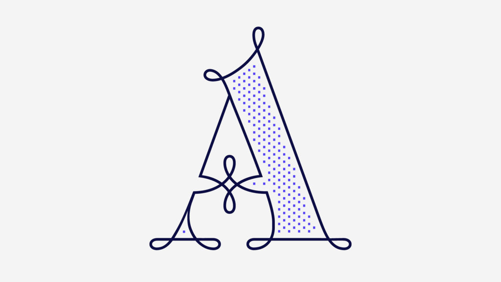
2) Then, the squares turned into diamonds following the same grid;
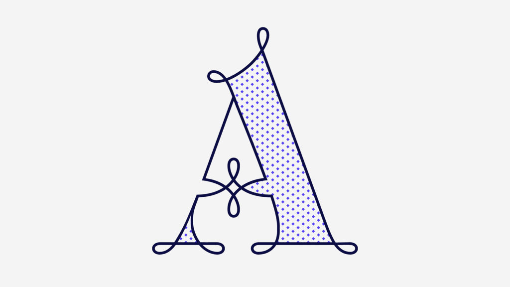
3) Then, the grid wasn’t working so well on the round letters so I tried randomising the position of the diamonds but it didn’t work;
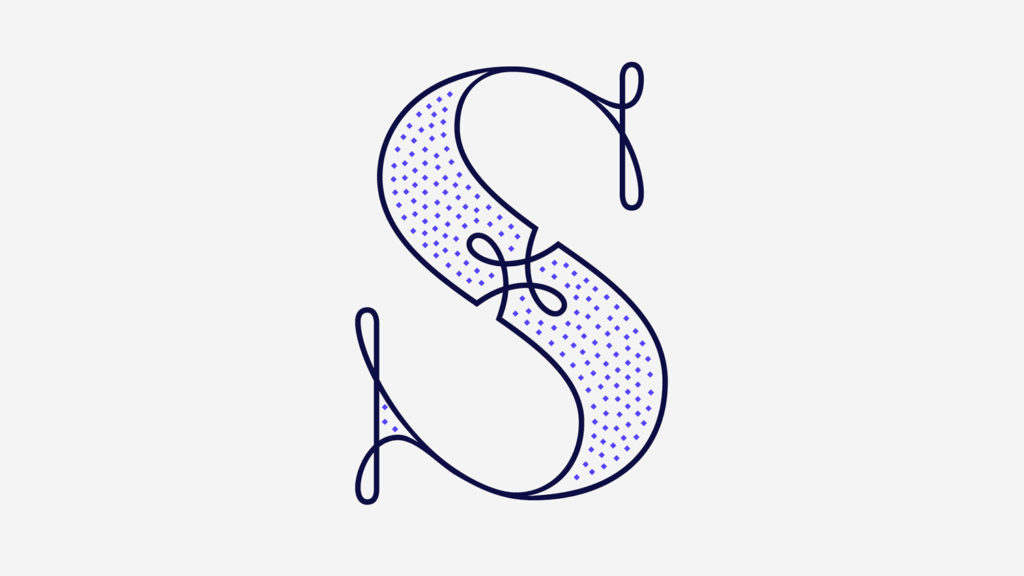
4) So I went back to the grid, and this time scaled down the size of the diamonds creating a visual half-tone effect.
I spent over four weeks working on the Dots weight and I felt like I was in the middle of a very long tunnel and I couldn’t see the light at the end.
I encountered many other problems along the way but by June 2017, I felt I was back on track again.
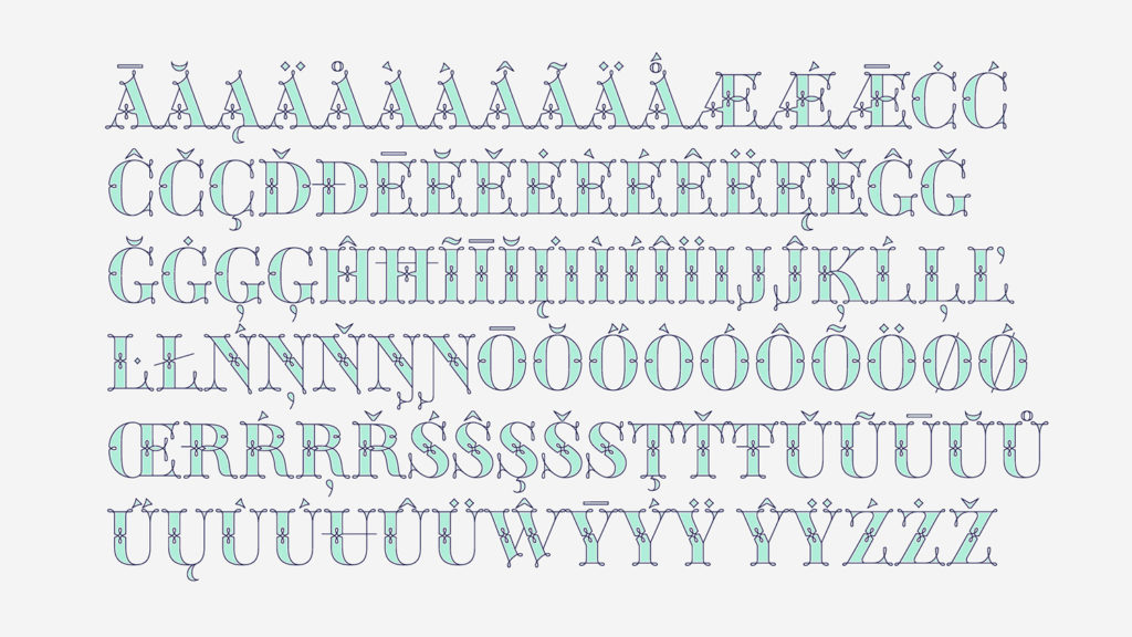
I kept working, tweaking, re-drawing and re-adjusting, and then the diacritics came on board… And then more re-drawing, re-tweaking, re-adjusting and then numbers… And then spacing, symbols, and currencies… And then more spacing, kerning, contextual kerning for triplets…
In September 2017 I told myself “that’s it, I’m going to finish it now!” But guess what? More re-tweaking, testing, hinting, testing, rendering, testing…
Publication Process
This font has been one of the toughest projects I have ever worked on. It has tested my patience and determination, and I have been on the edge of quitting multiple times, but as I promised to some of you a few months ago, I was not going to give up.
When I talked to my parents about this font, I knew they will not understand the tasks involved so I told them I was sort of “publishing a book”, so that they could picture the magnitude of the project.
In September 2017, I submitted my font files to a font distributor. I was extremely naïve about the whole process and I’m going to share it with all of you.
On my submission email, I remember stating: “I’m giving a talk in four weeks time, and I would like to know whether you are interested in publishing my font or not before my talk, is that possible?” And the answer came back to me pretty quickly…
“Sorry Maria, we are not going to be able to give you an answer within four weeks. In fact, the regular timeframe for an answer is going to be longer than usual, so expect delays”.
Nine weeks after my submission date, I received an update from the font distributor saying that the answer will now come by end of January 2018… Five months after my submission date!
At that point, I started to realise that this wasn’t like publishing a book —which I have never done anyway. Instead, this was going to be more like applying for an Australian visa and getting granted, which I have done four times and I know very well how it is; and the long waits and stress that goes with it.
November was a tough month for me. I lost faith on this project, and all my hopes on getting an answer before the end of the year.
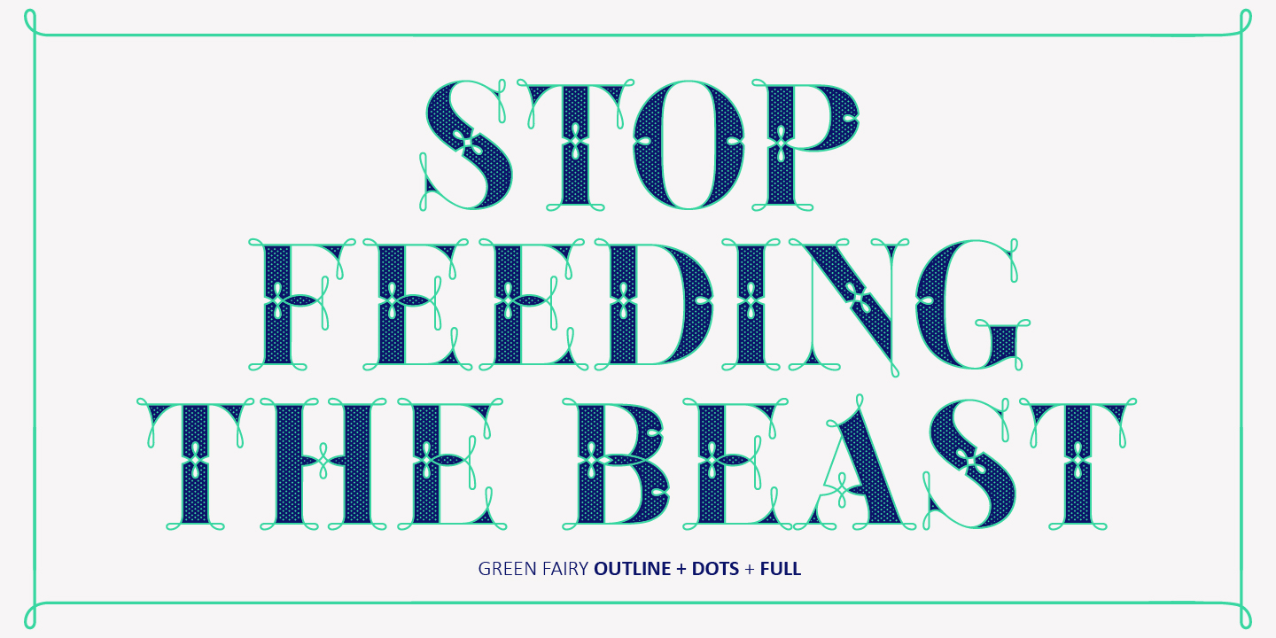
At this point, the most challenging part was the internal dialogue with myself. Listening to my own inner voice telling me that I won’t be able to make it, that it is too hard, and that is a total waste of time. This time I pushed through and “stopped feeding the beast”, but it is not always like that.
By the end of February, after six months from my submission date, they said yes! I have been granted as a new font foundry called Maria Montes.
In March 2018 I signed the contract, and in April I submitted all my font files, marketing material and my type specimen… And finally this month, my Green Fairy Font is out in the wild!
For those of you not familiarized with typeface design, it is extremely time consuming and it requires a lot of hard work, focus and determination.
This font is a personal nine-month-full-time investment, and I wanted to share the whole process in case it may help to some of you.
This font, would probably have never happened without the extra push of these amazing women.
In 2016, I was invited to be a member of Alphabettes, an international and supportive group of women kicking ass in the type design world. Being part of Alphabettes has been an amazing experience so far.
Listening to females voices in the industry means a lot to me, they encourage my work and build my confidence.
Here in Australia, I also have a small but supportive type design community. These friends of mine have released commercial fonts in the past or are currently developing typefaces:
And they all have helped me in one way or another in the last seven years. As you can see, we are six of them, and myself.
If you know of any other Australian woman who has published a font commercially, or whose currently developing typefaces, please let me know as I would love to learn more about her, as so far I haven’t found any yet.
My Green Fairy Font could not have been possible without the help of these generous professionals:
Jose Manuel Urós, typeface designer based in Barcelona and my teacher twice in the past; Jamie Clarke, freelance letterer and typeface designer who has released a couple of chromatic fonts recently; Troy Leinster, Australian full-time typeface designer living and working in New York City; Noe Blanco, full-time typeface designer and hinting specialist working for Klim Type and based in Catalonia; And Nicole Phillips, typographer currently living in New Zealand.
To all of you: “Thank you very much”