
Detail of page 109 of the Lettergieterij “Amsterdam” voorheen N. Tetterode type specimen, 1910.
“Wait! What is this? Is this an alien script or something?”
That was me looking at the book Non-Latin typefaces at St Bride Library, which displayed a page from the Lettergieterij “Amsterdam” specimen with the Buginese script.
“People can read this?! What the…” (5 seconds later…) “That’s it, this is the project for my typeface/dissertation!”
Buginese, also known as Bugi, is the language of the population in the province of South Sulawesi, Indonesia. This language is often written using the Latin script but traditionally, the Buginese script, also know as Lontara, was the common writing system. That was until the 19th century, when the Dutch colonized Indonesia and the Buginese script (amongst others like Javanese and Balinese) was displaced.
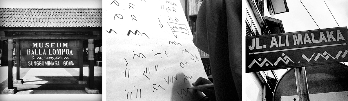
Instagram pictures: #buginese #lontara
Today it is considered to be “under increasing threat as a living script” 1 but it is still present in traditional ceremonies, street signs, personal notes and is even taught in some schools. Now my task was to figure out how scripts that are considered endangered can develop the necessary support for their implementation in contemporary technologies. To make it even more interesting, I soon discovered that not much research had been done about this mysterious script. Game on!
I started my research by visiting the Special Collections at the University of Amsterdam and requested my first material: “Stalen Stempels En Matrijzen Van Boegineesch Cijferschrift” from 1883. For the record, I only speak Spanish and English (so I think), so no idea what I had just requested. A lady brings one folder. I opened it and found just one sheet of paper which looked like NOTHING even remotely close to the Buginese script.
“Excuse me, I requested this but I’m not sure it is… OMG! OMG! Never mind!”
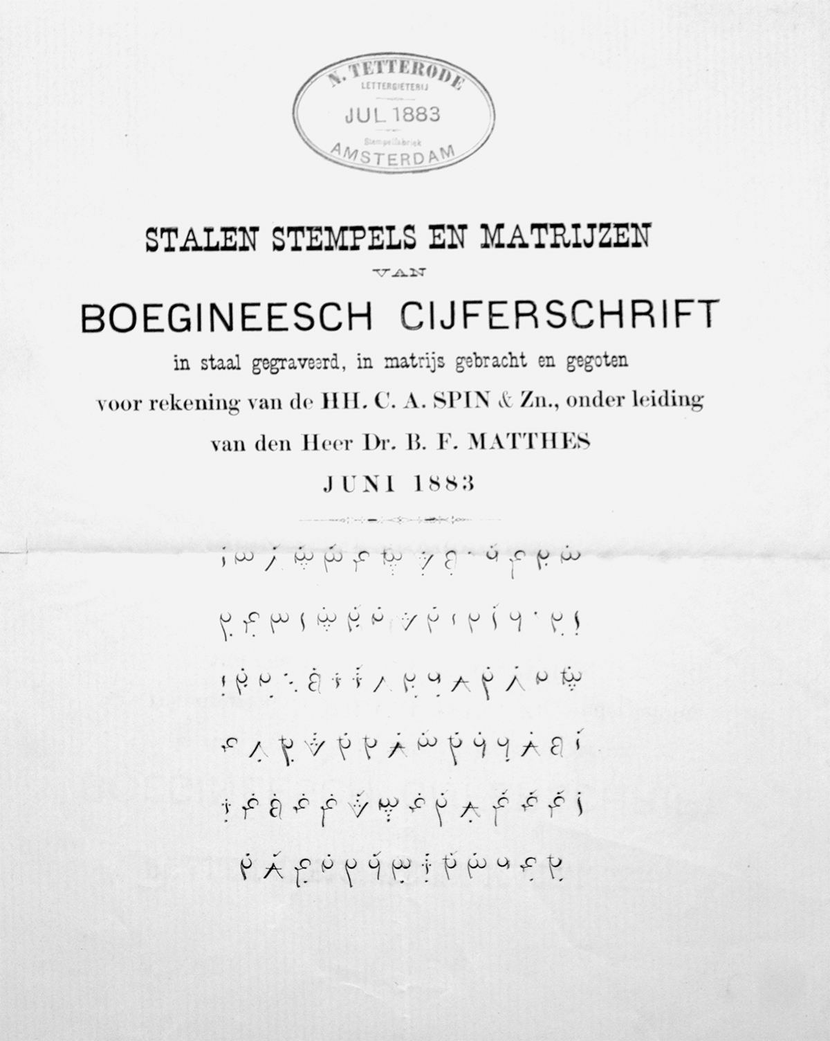
Stalen Stempels En Matrijzen Van Boegineesch Cijferschrift, 1883
Yeah, cipher Buginese. I remember now reading about it, but haven’t seen any example of it. Long story short the Bugis had developed an encoded version of their script so that they could send secret trade messages. Each character had an equivalent shape in the cipher script and to make it even more interesting, the shapes were inspired by the Arabic numerals. Fascinating.
Detail from the book Boegineesche en Makassarsche Poëzie. B.F. Matthes, 1883
Next stop was the Imprimerie Nationale in Douai, France. I got to see the punches engraved in 1845 by Marcellin Legrand, under the direction of E. Dulaurier and of course, some amazing specimens. A couple more stops: Monotype for the Lontarak for phototypesetting and the British Library for some manuscripts. Now I had enough material to start the design process.
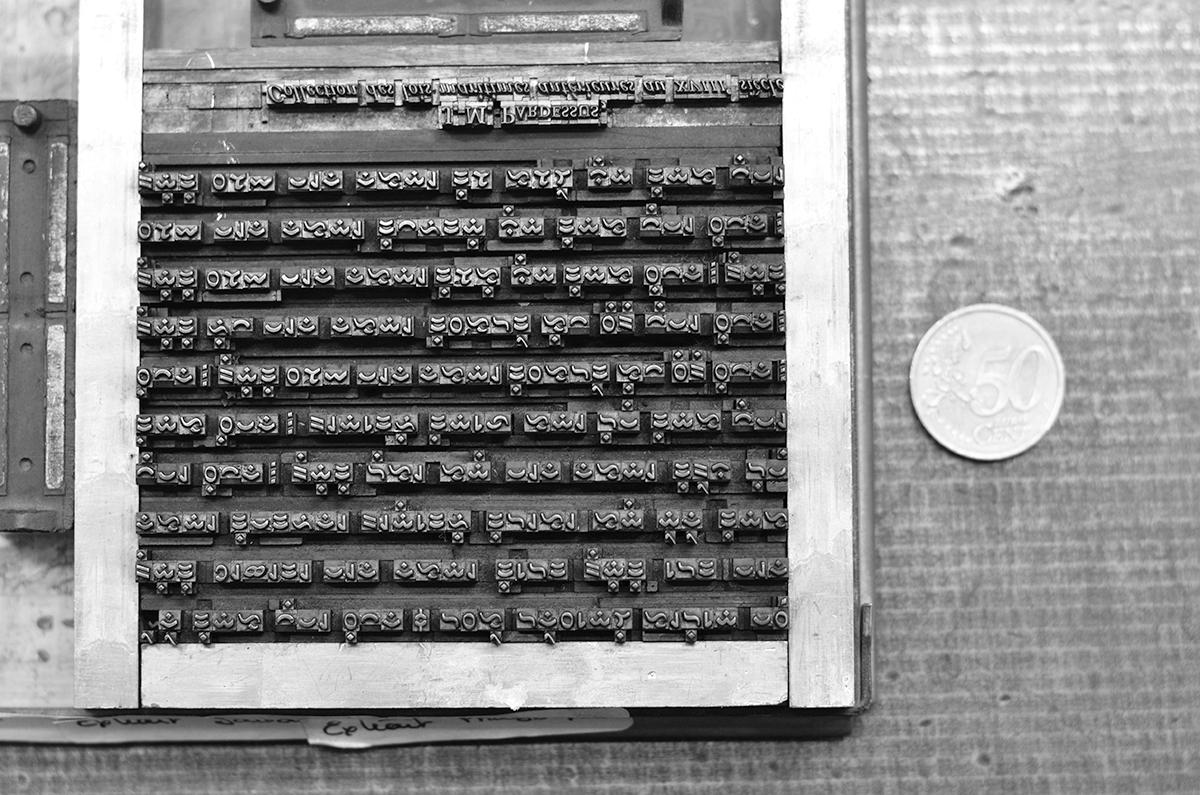
Detail from metal type. The punches were engraved by Marcellin Legrand in 1845.
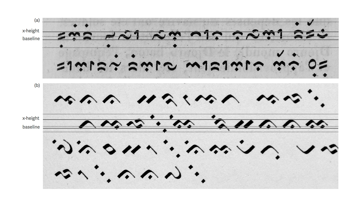
(a) Detail from the Collection de Lois Maritimes Antérieures Au XVIII Siècle, Proeven van oostersche schri en, page 474. (b) Lettergieterij “Amsterdam”, 1910, page 107. The dotted line shows the different alignments of some of the characters.
Understanding the alignment and position of the dots was important. Rumor has it (this is just a theory) that the Bugis represented their beliefs in the shape of the script, and because they were really good sailors, the shape of the characters resembles ocean waves, so each corner represents a wind direction 2 . With this idea in mind, it was easier to understand why the space around the characters in so prominent. Also, as the example above shows, depending on the design of the typeface some characters align on the baseline and others go above or below it. This made it hard to understand the typographic conventions (as apparently there were not many). As expected, a lot of iteration went into getting the right shape, but I needed some help from a reader.
Early sketches of the Pistachio Buginese typeface.
Yeah, I needed to find someone who can read the “I’m almost dead script”. But then, serendipity to the rescue. I manage to find the only person in the UK who can read Buginese: Dr. Ian Caldwell, associate professor of Southeast Asian Studies at the University of Leeds, who kindly helped me with this task. He stated that my first design looked “like very well written forms, not like a typeface”. This, as I suspected, was because of the problems with the alignments, so instead of strictly following the conventions of other typefaces, I designed the characters and aligned them to the baseline depending on the width and the counter of the shapes. This made for a more even texture, and the rhythm of the text improved.
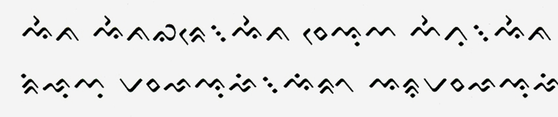
While analyzing typefaces I also found that there were variations on where certain vowel marks were placed. The most notable is the “yi”, because the position of the dot changes depending on the typeface. For this, I analyzed all possible combinations and defined a rule for the correct placement of the dots.
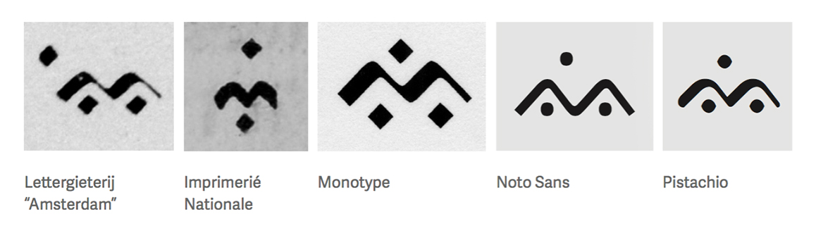
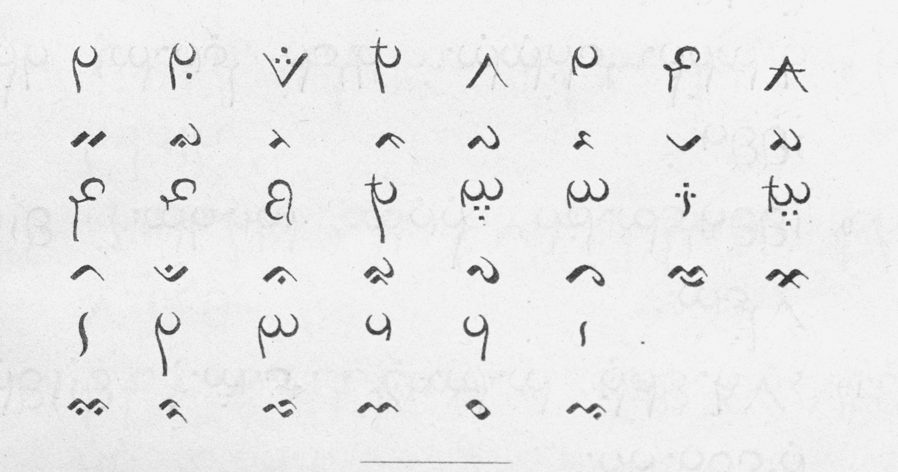
Variations on the positions of the marks for the “yi”, depending on the typeface.
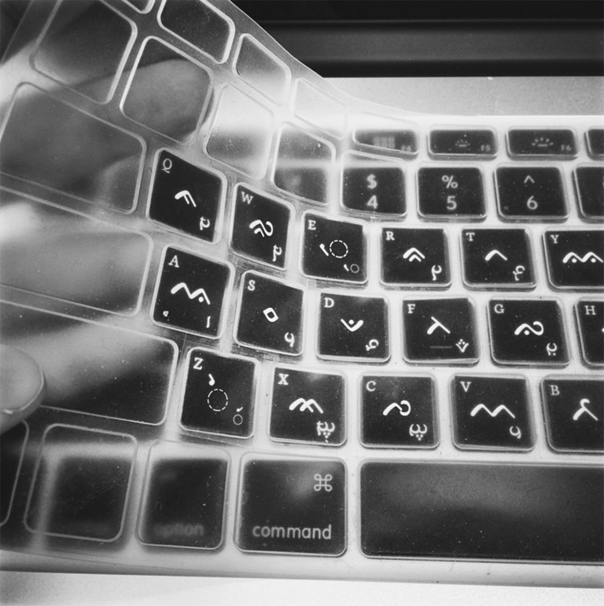
Handmade Buginese keyboard!
I even had to figure out how to create a keyboard layout so I could type it! And of course, an actual keyboard for my Mac. I cut by hand each key and paste them into a transparent keyboard. I’m still in the process of finishing the research for it, so this layout will soon change. I also managed to designed the cipher version of Pistachio Buginese, but there is no Unicode for this so I had to treat the characters as a stylistic set.
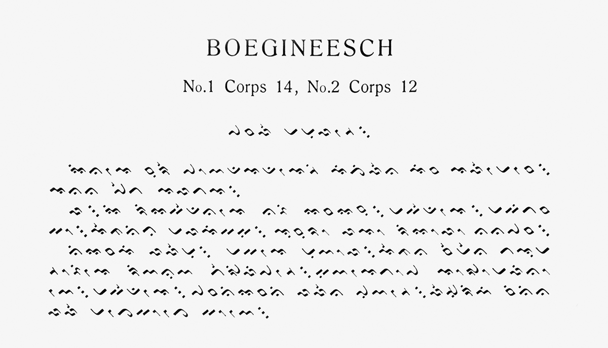
As for the posted header, this is the transliteration of the word Alphabettes. In this script, each consonant has an inherent vowel sound “a”. The diacritic marks represent the rest of the vowels (“i”, “u”, “e”, “o” and “ae”), so every syllable is represented by an independent symbol, either with a diacritic or without it. The vowels are positioned above, below, before and after the characters, modifying the inherent sound of the vowel “a” in each consonant. It reads: a-la-pa-ha-bae-te-sa. Not perfect, but if anyone finds a better transliteration let me know. ✌🏼
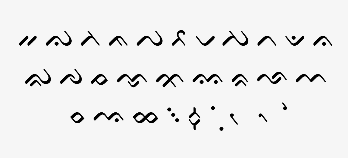
Pistachio Buginese character set.
Pistachio Buginese is part of my MATD project, you can check the specimen over here: http://typefacedesign.net/2015/Pistachio.pdf
1 scriptsource. 2014. “Buginese Script”. Accessed December 26, 2014. http://scriptsource.org/cms/scripts/page.php?item_id=script_ detail&key=Bugi
2 Nurhayati Rahman, “Sejarah Dan Dinamika Perkembangan Huruf Lontaraq Di Sulawesi Selatan”, Makassar, 4 Feb. 2014