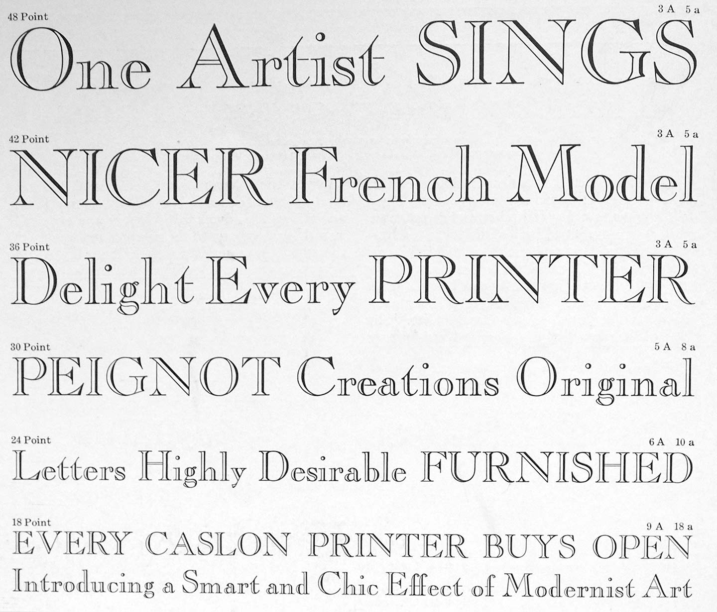
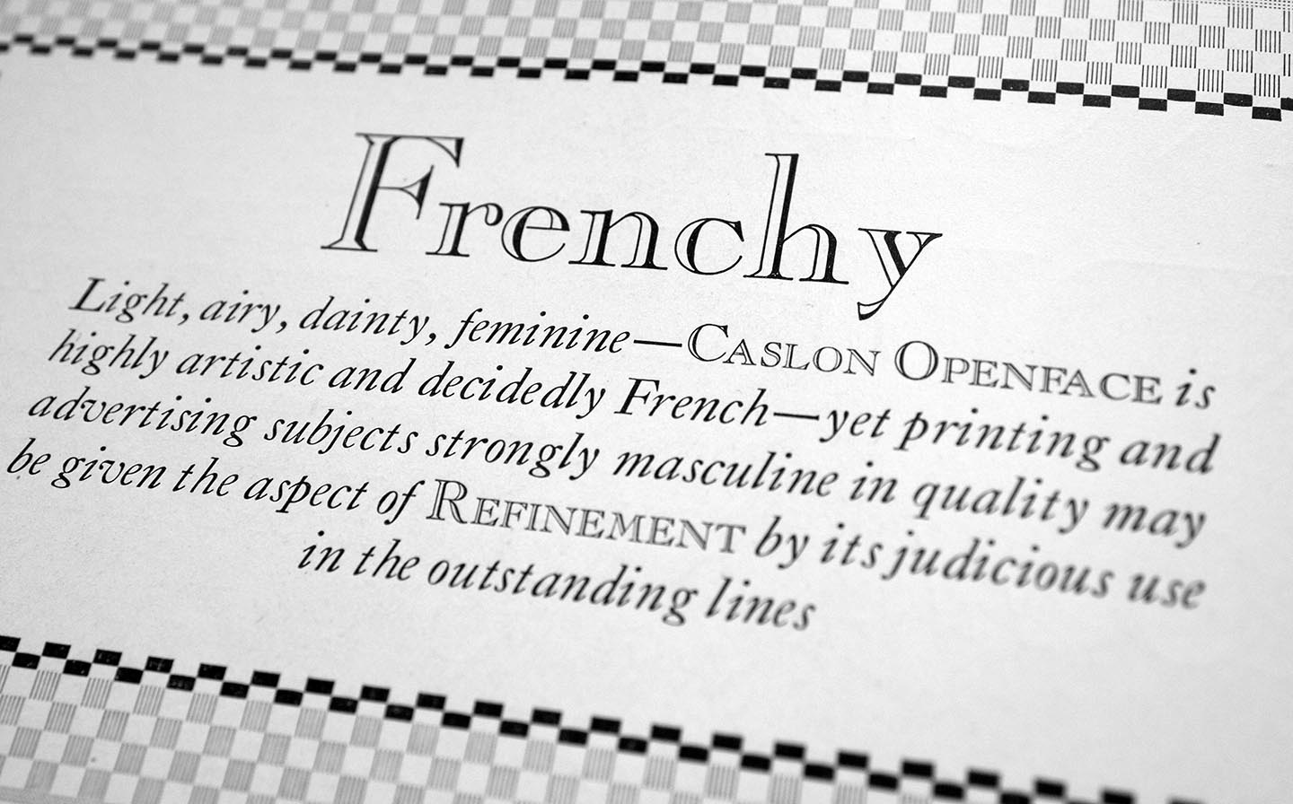
It’s talked about everywhere — typefaces are expected to be available in large series these days, not just a handful of fonts. The good folks of ATF-division Barnhart Brothers & Spindlers listened and added an open/inline variant to their popular Caslon Series (as others are doing, too). According to BB & S’s marketing material, it’s “light, airy, dainty [blah…] and decidedly French”. This is a fun stretch as almost all of us would think of Caslon as decidedly English. Compared to Caslon’s Inline, Caslon Openface features many totally different letterforms and has a much smaller x-height.
Upon closer inspection we can smell the rat: this particular design originated at the G. Peignot (God rest his soul) & Son foundry in Paris, where it went under the name Le Moreau-le-Jeune. So, fine, frenchy. “Placing it in the Caslon group of types is taking a liberty — but it assuredly ‘belongs,’ and answers the long-felt need of an openface letter of refinement and character for use with Caslon Oldstyle and Caslon Oldstype Italic”, the foundry admits upon request. Well, let’s give them that they adapted it to the US point system and measures, and made it available in a wider range of sizes and thus more versatile.
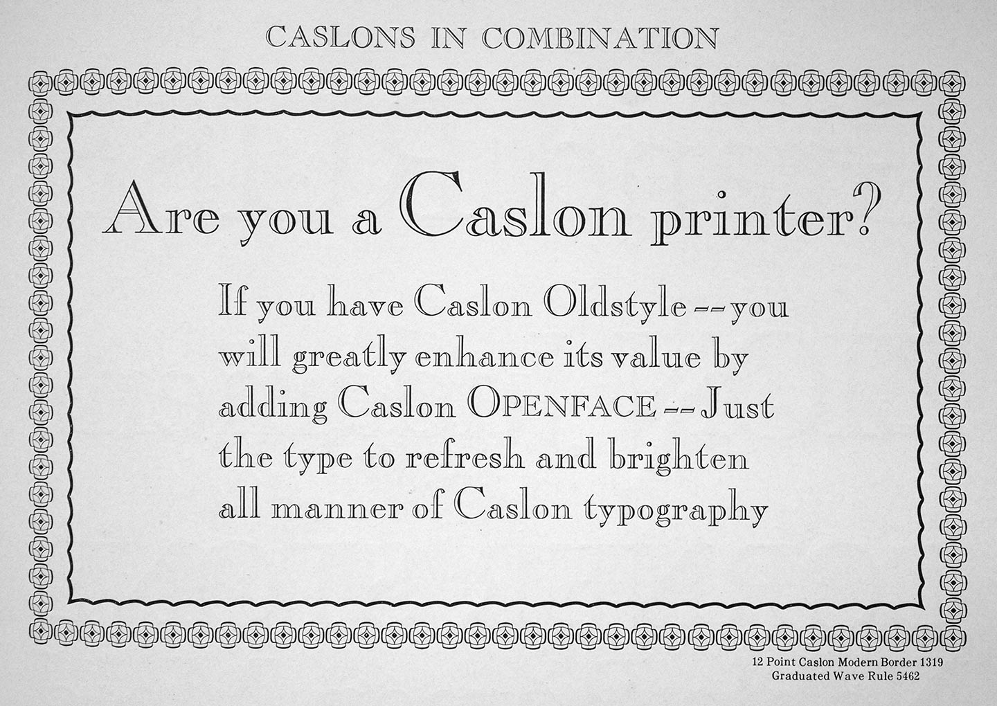
Yes, Caslon Openface is a great typeface for your casual jobbing type needs — invitations, stationary, banners, posters, or similar work — and an essential addition for every user of Caslon Oldstyle or Bitstream Engravers’ Oldstyle 205. What I can’t get over is that BB & S lower themselves to the level of dummy cell phone texters and use a double hyphen in place of an em-dash in their marketing material, worse, for a decorative typeface with a swashy hyphen. 🙄