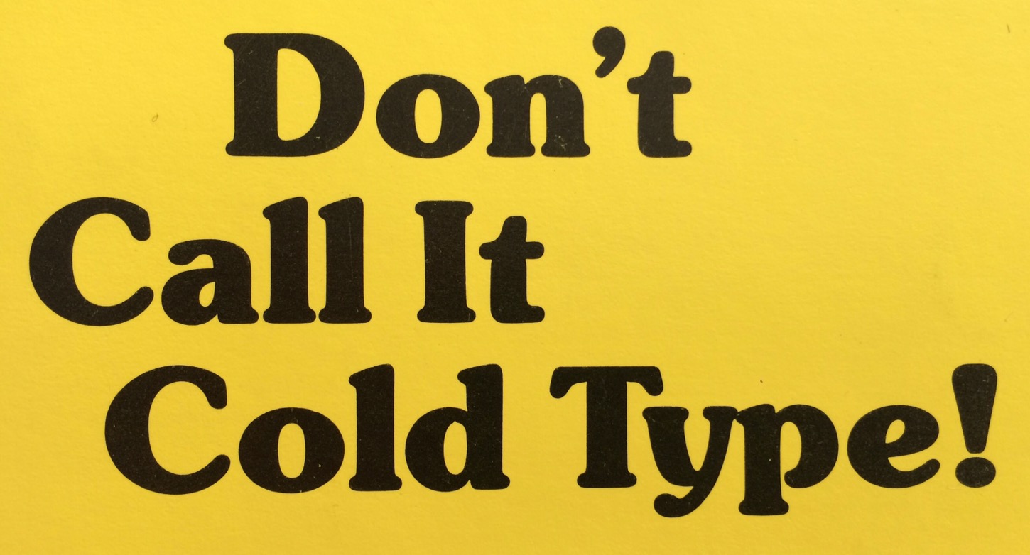
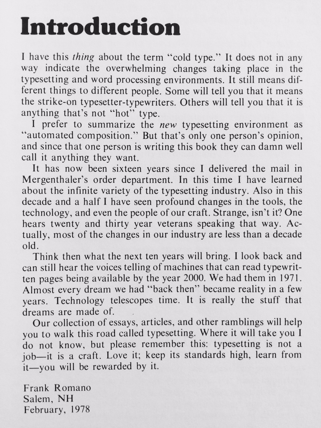
I learned about the term ‘cold type’ quite late into my fascination with phototypesetting. And when I did it was straight from its biggest critic, Frank Romano, author of a book with the title

The term had been popular in English (only) in the 1960s and ’70s amid the changes from the then prevailing mechanical ‘hot’ metal typesetting, like Linotype or Monotype, that involved live typecasting, to ‘cold’ photographic systems and computer-based typesetting. But my qualms are more about what cold refers to in relation to hot here.
In the common sense it means typesetting without the casting of metal. Now that all composition and design is done with cool digital tools, we hardly ever have to differentiate between this anymore. What I would love to make clearer though and distinguish between is the difference between foundry type and hot metal typesetting. Especially non-native English speakers tend to throw all metal type into the hot metal melting pot, but nein:
– Foundry type is traditional metal type of individual sorts (letters) for hand composition, once cast by a type foundry but usually used cold, then taken apart again and reused.
– Hot metal type refers to typesetting machines that involve a casting unit that compose and cast individual sorts or a line of type on the fly, e. g. Linotype, Intertype, Monotype or Ludlow systems; hot to luke warm when handled right after casting and molten down again after use.
It gets real balmy though now that most metal type used in letterpress print shops these days is actually cold ex-hot-metal Monotype for hand composition.
So maybe we should not use the thermal terms at all and be more specific in what we mean. Or at least only use hot metal for the mechanical typesetting systems. Or only when we’re referring to genuinely hot typesetters.*

Romano’s book is fun to browse and read, especially now, 39 years later, but also nothing to drop everything for. The proud colophon in the light of the dismal production quality is especially “entertaining”.

This post was sparked by the promise of “hot typesetters” in an interview with Briar Levit about her film Graphic Means.

I guess ‘hot type setters’ would also not have passed the editor. Hot metal type typesetters?


What about Hot Metal Typesetter? 🙂
That would be perfect. Sorry for the hyperbole.
I must admit I had a little trouble following this article. Just goes to show how confused hot vs cold type is — and it is truly perplexing. My understanding (and I am fairly certain of this) was that the terms hot and cold type first were used to distinguish between foundry type (cold when set, as Lynn says) and type cast “in-house” on Monotype, Linotype, Intertype, Ludlow, or other such systems. And yes, as Lynn says, a big feature of such casting machines was that such type was melted down after use, as opposed to foundry type, which was distributed. That’s actually clear enough, but at some point people started referring to hot type as any metal type (foundry or line/sort cast) and cold type as anything set photographically or digitally. That is a very different thing, since it lumps foundry type and Monotype, Linotype, etc., in one group, when in fact the original purpose of the hot and cold terms was to distinguish between foundry and other metal type. There are many problems with type terminology, as we all know — this is not the only one. For example, font used to mean one size of one style, such as 12 point Garamond italic. 14 point would be a different font; and 12 point Garamond roman would be a different font. But on computers font means an overall style, such as Garamond (incl. roman, italic, bold, etc.), in any size. Personally I do not mind that, since think that it’s just about universal usage now. But speak to someone holding on to earlier terminology and they would say that definition of font is wrong. Shall we discuss u/lc, leading, kerning (a hugely different term nowadays, compared to metal type), etc., etc., etc.?
Yes, that is exactly what I mean (well, the first part of your comment). Sorry that I didn’t articulate it more clearly.
As for ‘font’ then and now – my understanding of ‘font’ is one instance of a set of typographic type. So in metal type, one font/set was one size (that could very well differ in the amount of glyphs/sorts according to the fonting scheme), in phototype times it was one disc or one strip of negatives, similar to today where it is one file – one embodiment of the typeface – not one style necessarily. The same type style (italic, semibold, bold, etc) can be available in different font formats (OTF, TTF, WOFF) or different character-sets. Thus, I think the term “font” doesn’t say anything about the content but is just the name for the container.