
Rudolf Koch began experimenting with pre-Fraktur letterforms he named ‘Maximilian,’ after Emperor Maximilian, an early benefactor of Gutenberg, during the years preceding World War I. Ultimately these experiments in forms — mainly swashes that occupied awkward white space in an otherwise-orderly block of blackletter in the typesetting of prayer books — led to the creation of Koch’s Maximilian Antiqua. Notably, I could find no evidence that Koch explored opportunities using simple .calt features, but more on that later.
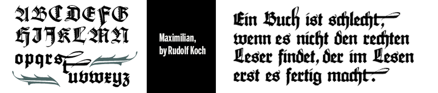
Maximilian
While Maximilian Antiqua was technically released between 1914 and potentially as late as 1917, and not 1915 as this article suggests, maybe we can gimme a break because everyone was kinda busy getting drafted and fighting in World War I at that time, Koch included.
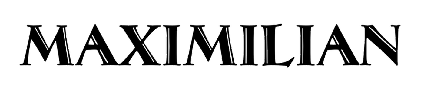
The typeface is a simple set of Roman caps intended to compliment the original ‘pre-Fraktur’ cuts of Maximilian. But by ‘simple,’ I certainly don’t mean minimal. There’s a lot of complexity in the shapes, a tremendous amount of contrast and variation between thick and thin strokes, fluted stems of varying angles and widths, wildly expressive serifs, and an inline stroke, to boot.
I chose this as my favorite font of 1915 because the individual shapes have such presence on a printed page. They’re large and gangly and conspicuous, with crazy different serifs and terminals, pointing your eye in several directions at once. I like it because I suspect we wouldn’t appreciate such a thing if it were made now. We want and expect too much regularity, a toned-down, easier-to-market product — expectations perhaps we once reserved for text faces, but now apply even to the most expressive of displays.
I think we (I) accept these sorts of shapes if they stand alone as lettering, and balk at what purpose these shapes serve as a typeface. Because surely, since we could have all those lovely contextual alternates, lowercase and small caps, (anachronism be damned!) the Yen and the Euro — if we’re going to make something digital, we assume we should put Open Type to work for us. We get that little rush of surprise when dead spaces are managed for us, and if they’re not, we wonder why they aren’t. Or wonder why ‘they’ didn’t hire a damn letterer to do the job.
Indeed, digital versions of Maximilian Antiqua are mostly relegated to the free-font-download pocket of the web these days, though it’s not to say that it’s because they’re poorly made. They’re probably just not much in demand. There is this black hole dedicated to blackletter revivals, and CastleType’s version is a fun and faithful ode.
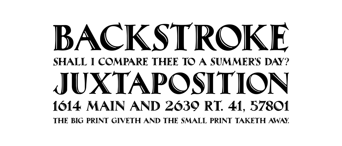
Maximilian CT