Type at the New York Art Book Fair at MoMA PS1

Every year, Printed Matter and MoMA choose a sticky weekend in late September to host the New York Art Book Fair at PS1. Between the insane crowds of mostly white people and the heat and the exhaustive, never-ending booths of vendors, everyone leaves traumatized. Which is why it took me six years to go back. But I did, for the love of typography.

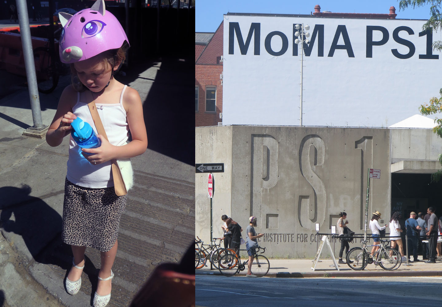
I took my intrepid companion, a seven year-old Goth kid who’s really into personal expression, named Francesca. She rides on the back pegs of my bike, and as we came over a small bridge in Queens, we took in the Manhattan skyline and its wavy heat currents. I said, “isn’t living in New York City great?!” … to a native New Yorker, who was like “sure.”

Continue reading

Review: ‘Carol Twombly: Her brief but brilliant career in type design’

Oak Knoll Press, 2016

Perhaps it is because we live in an age where styling and self-promotion shape how and whether we revere design, that the austerity of this book, and indeed, Carol Twombly’s life and career, feel so other-worldly. Which is not to say that Twombly is somehow weird or that this book about her life and work is lacking. In fact, the book is very well-written and — dare I say it, (this is a type nerd book after all) — quite an engaging read.
Continue reading

Imaginary Alphabets

I launched a project nearly ten years ago now, when I was just beginning to bridge lettering into my graphic design work. It was called Imaginary Alphabets, and I started with an alphabet I called Lucattini. Lucattini’s is a small Italian restaurant in a laneway in Melbourne, Australia, where I lived at the time.

Lucattini's, Melbourne.

Lucattini’s, Melbourne.

Continue reading

Emperor Maximilian’s New Clothes

maximilian_caps

Rudolf Koch began experimenting with pre-Fraktur letterforms he named ‘Maximilian,’ after Emperor Maximilian, an early benefactor of Gutenberg, during the years preceding World War I. Ultimately these experiments in forms — mainly swashes that occupied awkward white space in an otherwise-orderly block of blackletter in the typesetting of prayer books — led to the creation of Koch’s Maximilian Antiqua. Notably, I could find no evidence that Koch explored opportunities using simple .calt features, but more on that later.

Maximilian

Maximilian

Continue reading

ECS Loves Vintage Italian Fashion

I’ve long loved the vintage femininity of mid-century European fashion. The silhouettes, the careful accessorizing, and most importantly, the thousand-yard glare beaming from a heavily-lined eye have always been an inspiration to me. An old friend of mine peddles these gorgeous pieces most weekends at the Brooklyn Flea, and one weekend, she brought a stack of these Italian Fashion magazines from the 50s. This one, Eva, is from 1951 and features a scripty lettering that perfectly matches the clothing’s aesthetic: custom, curvy, sharp and stabby at just the right points.

eva_cover cover_details

The cover features a few different lettering styles, but what mostly grabbed my attention was the script. It’s used throughout the issue, and creates a nice ‘voice’ for many of the headlines.

Continue reading

Creating a Future Free of Type Piracy

It starts with working with what you’ve got.

A couple of years ago, one of my graphic design students handed in a project that used the typeface Gotham. As soon as she handed it to me, I looked at her skeptically.

“You have a license for Gotham?” I asked, knowing that the least expensive license runs close to $200—which is not typically the kind of cash students in New York City, or even in the United States, tend to have to spend on school projects.

“Yes!” she declared triumphantly. She, like all my students, knew that I do not accept projects using pirated fonts; it’s stated clearly in my syllabus, and I assertively read this aloud on Day 1 each semester. She continued, “Professor ___ gave us all a CD of it!”

Continue reading