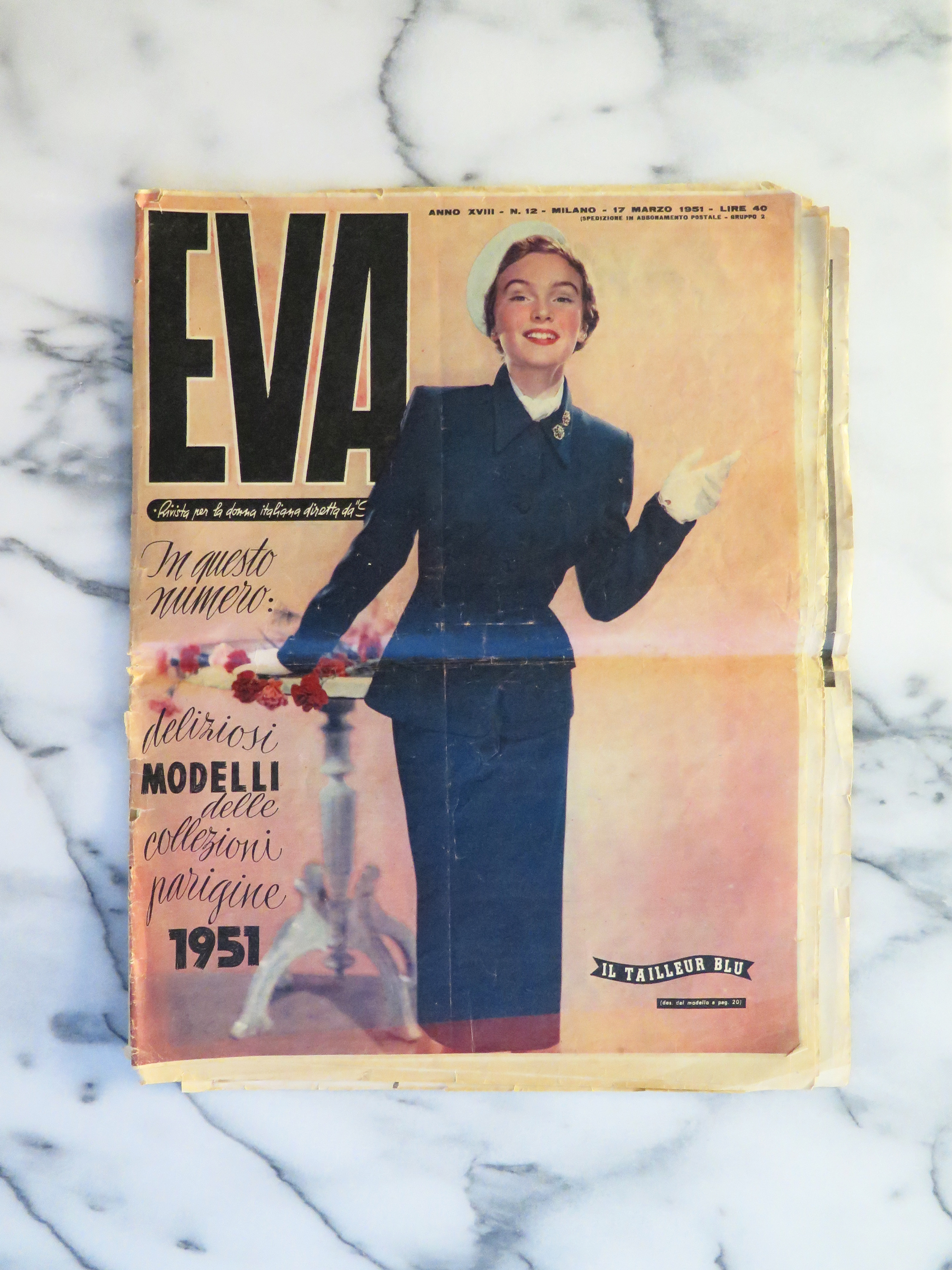
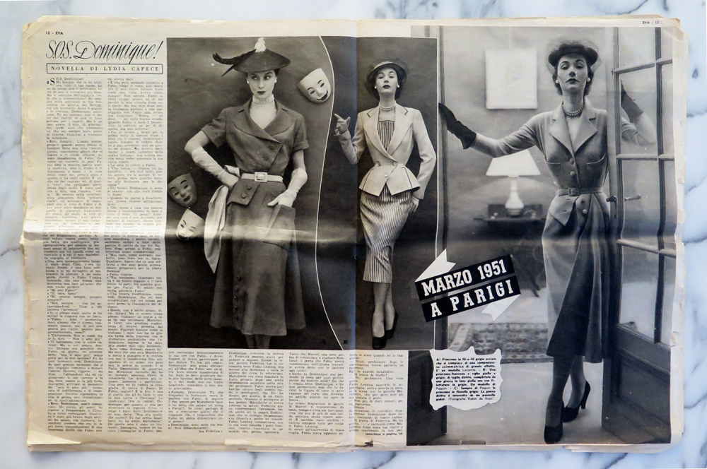
I’ve long loved the vintage femininity of mid-century European fashion. The silhouettes, the careful accessorizing, and most importantly, the thousand-yard glare beaming from a heavily-lined eye have always been an inspiration to me. An old friend of mine peddles these gorgeous pieces most weekends at the Brooklyn Flea, and one weekend, she brought a stack of these Italian Fashion magazines from the 50s. This one, Eva, is from 1951 and features a scripty lettering that perfectly matches the clothing’s aesthetic: custom, curvy, sharp and stabby at just the right points.
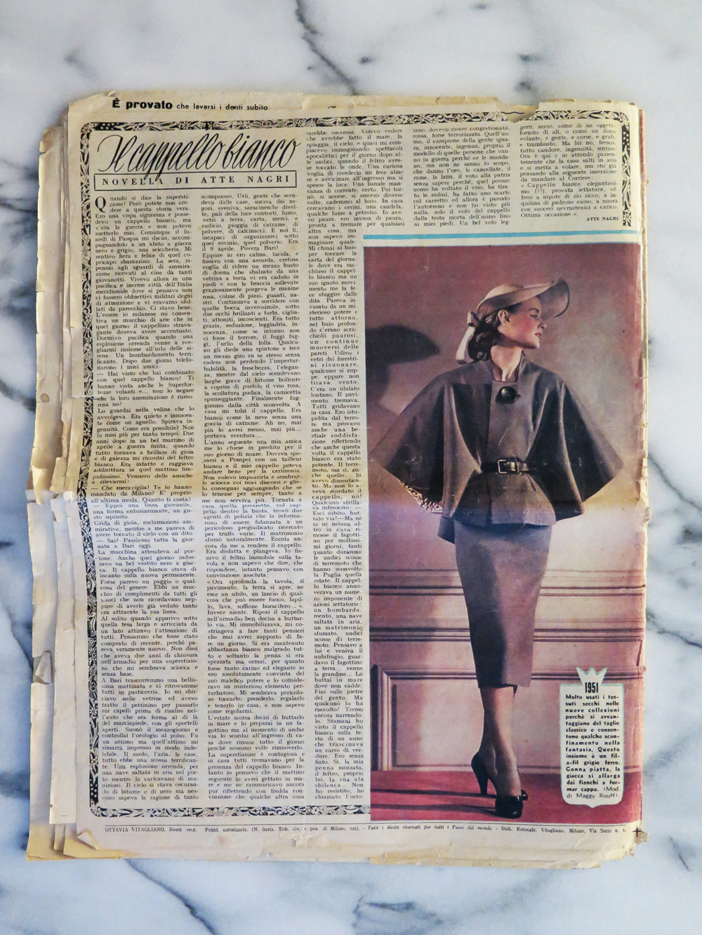
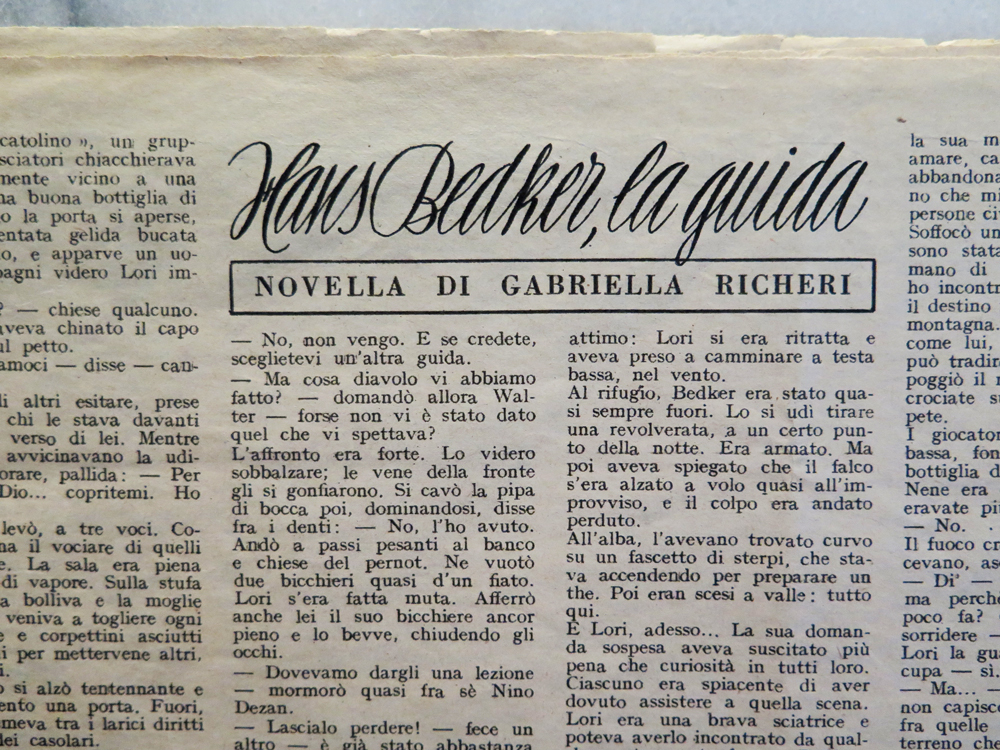
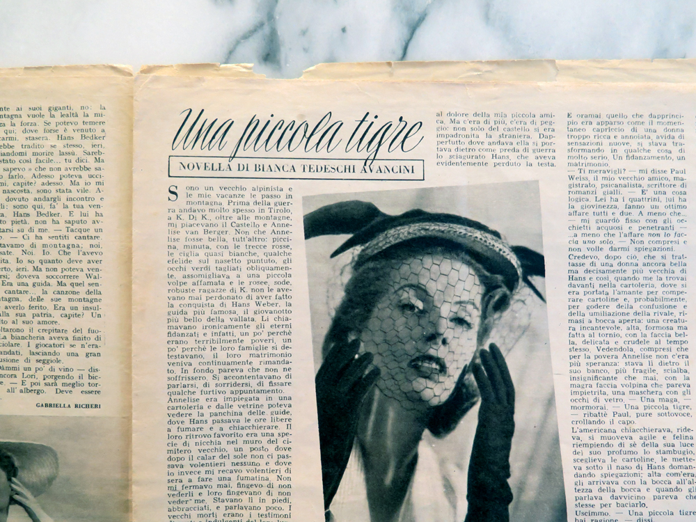
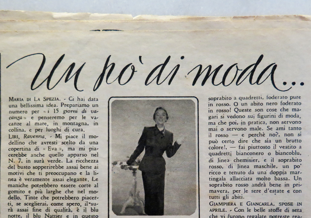
The cover features a few different lettering styles, but what mostly grabbed my attention was the script. It’s used throughout the issue, and creates a nice ‘voice’ for many of the headlines.
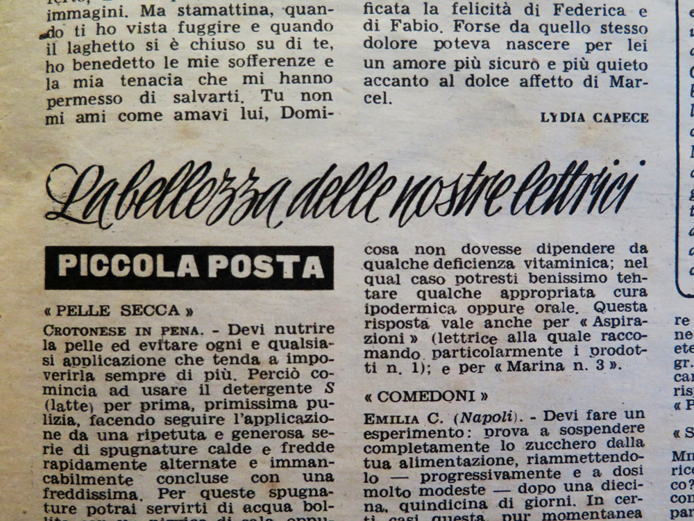
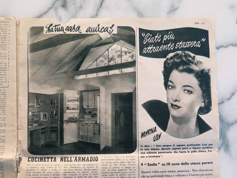
This one is a bit of a departure, but I really love the way the letters spread out here.
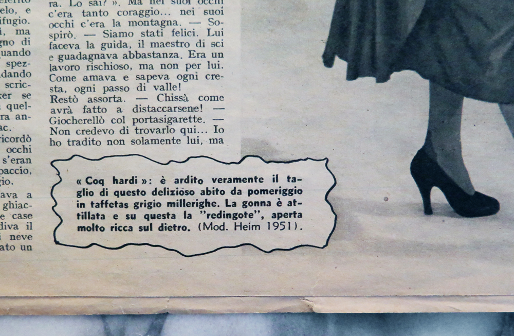
These custom shapes drawn around call-outs are a nice break from the multiple columns of text and the overall rigidity of the magazine’s grid.
I’ve also included some of the other lettering styles that appear courtesy of the magazine’s small ads. Look at this bitch and her white teeth and her convertible! No one’s messing with her!
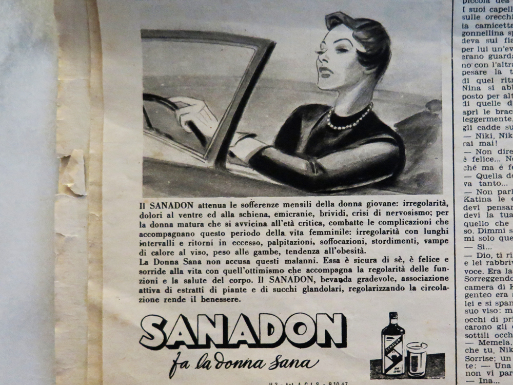
Compared to the headline scripts, I don’t love these ones as much, but they’re notable enough to include. They really have a presence and an expression to them that feels almost conversational.
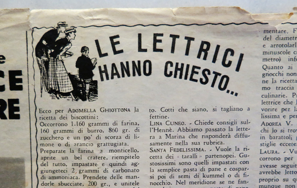
This one is just sweet: “the readers have asked…”
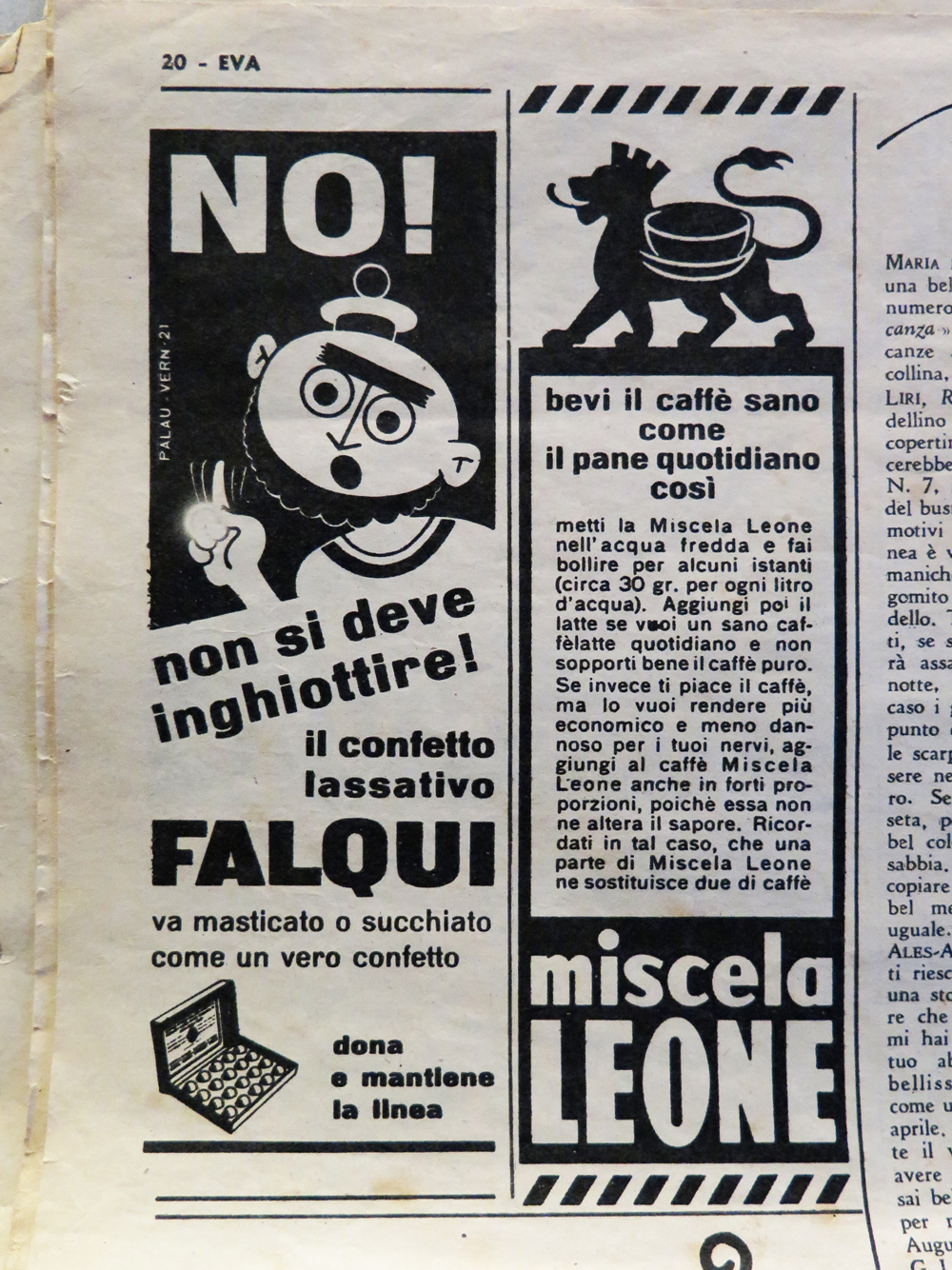
And this is just a reminder: “No! You should not swallow the candy laxative! Chew it or suck it like real candy.” That’s the way to get a 22″ waist, I guess!