Every year, Printed Matter and MoMA choose a sticky weekend in late September to host the New York Art Book Fair at PS1. Between the insane crowds of mostly white people and the heat and the exhaustive, never-ending booths of vendors, everyone leaves traumatized. Which is why it took me six years to go back. But I did, for the love of typography.
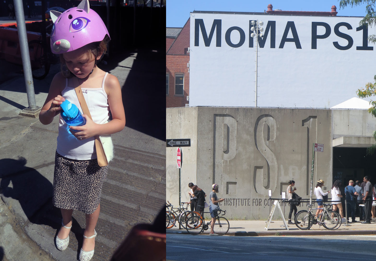
I took my intrepid companion, a seven year-old Goth kid who’s really into personal expression, named Francesca. She rides on the back pegs of my bike, and as we came over a small bridge in Queens, we took in the Manhattan skyline and its wavy heat currents. I said, “isn’t living in New York City great?!” … to a native New Yorker, who was like “sure.”
It was hot and smelly and overwhelming, so we headed first to the Sterling Ruby-conceived space that Gagosian carved out for itself. By all means the most compelling room (why didn’t other rooms think to make this an experience in color?), it was painted an intense and glossy red, with the artist’s posters, Was War Won hanging framed and stacked as a free gift to visitors.
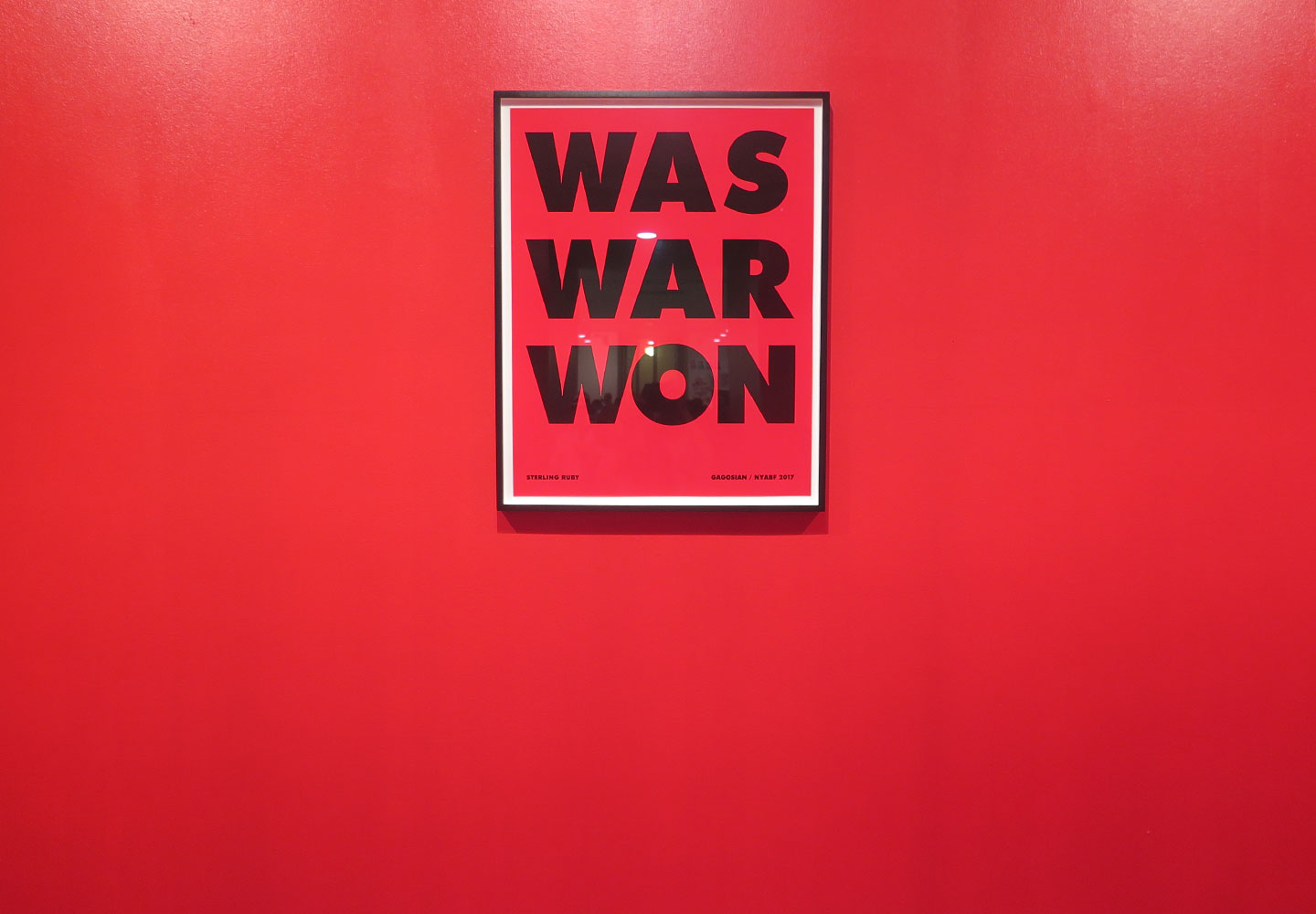
I confess, I didn’t take a poster. I love the idea, but I don’t love that particular cut or use of Futura, and I would stab something if exposed to that kerning for any extended period. It made me feel slightly sad for Paul Renner, and wondered quite a bit about type when artists use it. Still, I’m probably not the target audience, and the sentiment is spot-on.
My companion was getting whiney, so I let her take the lead, where we spotted some Portrait Condensed as well as the ever-excellent Monotype designer Juan Villanueva. We chatted (I think to the booth workers’ delight) super intensely for like two-and-a-half minutes about fonts spotted and what was good and bad. I pointed out an excellent book in the next room, designed by Berlin’s Hello Me Studio, that would have been a great opportunity for Klim’s new release, Untitled Sans.
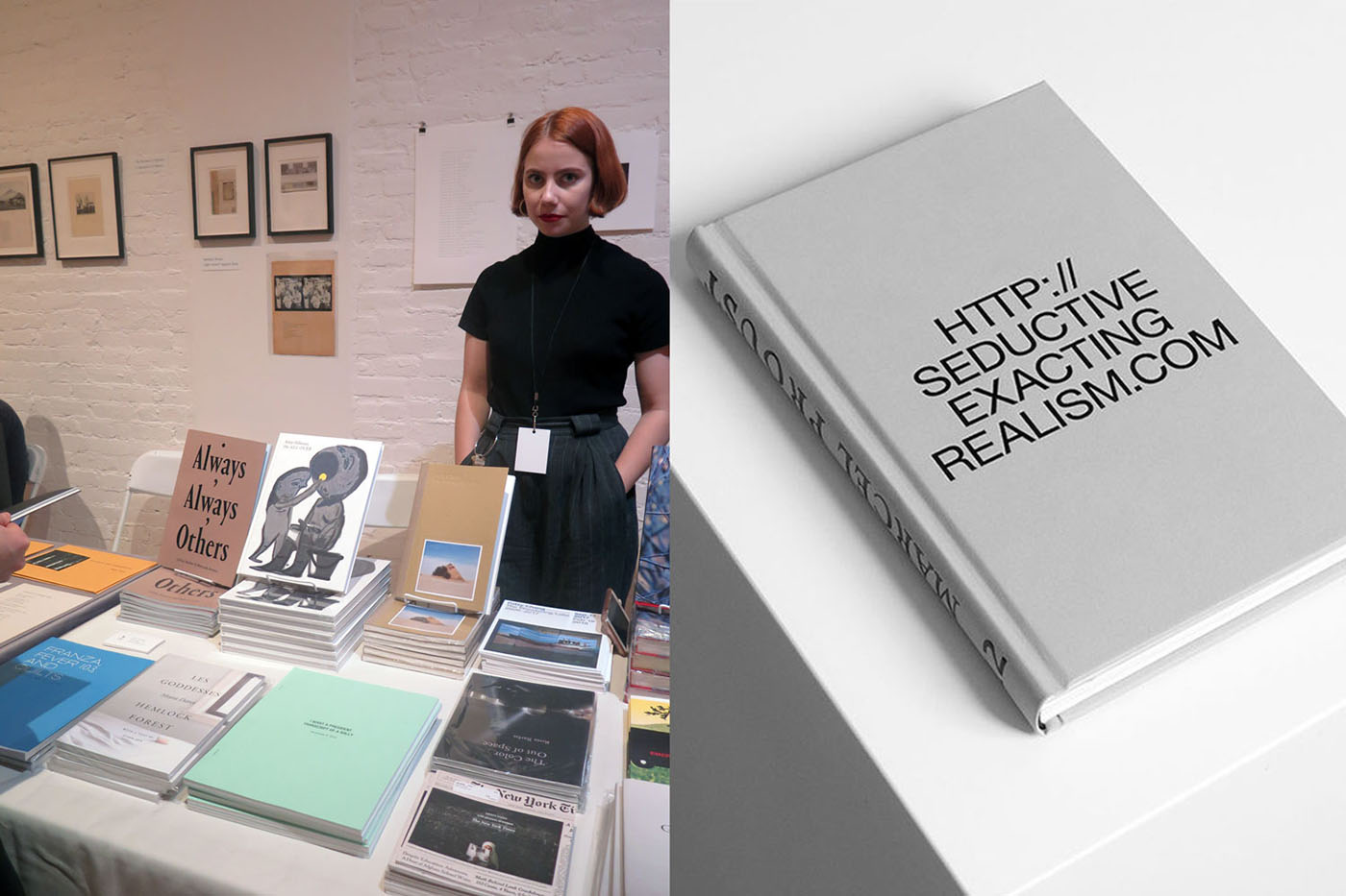
If you’ve never experienced the onslaught of stimuli that is the NYABF, then you may not understand why we could basically only handle about nine rooms of this stuff before I was, a: out of money, and b: so overwhelmed. PS1 is huge, each room has several vendors, and every vendor has a ton of things to look at. There are big and beautiful and luxurious art books, sure, but the really interesting stuff is quite experimental, and a lot of it is straight-up punk zine culture.
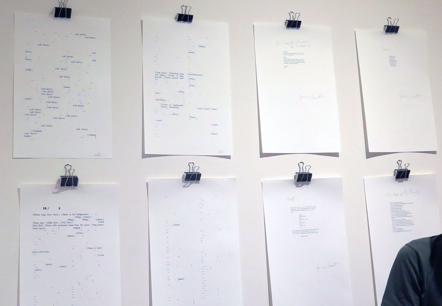
Pages from a printed novel that was a massive experiment in punctuation
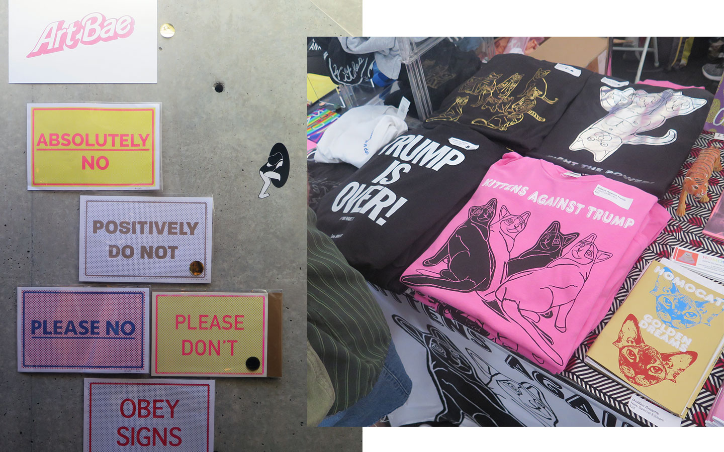
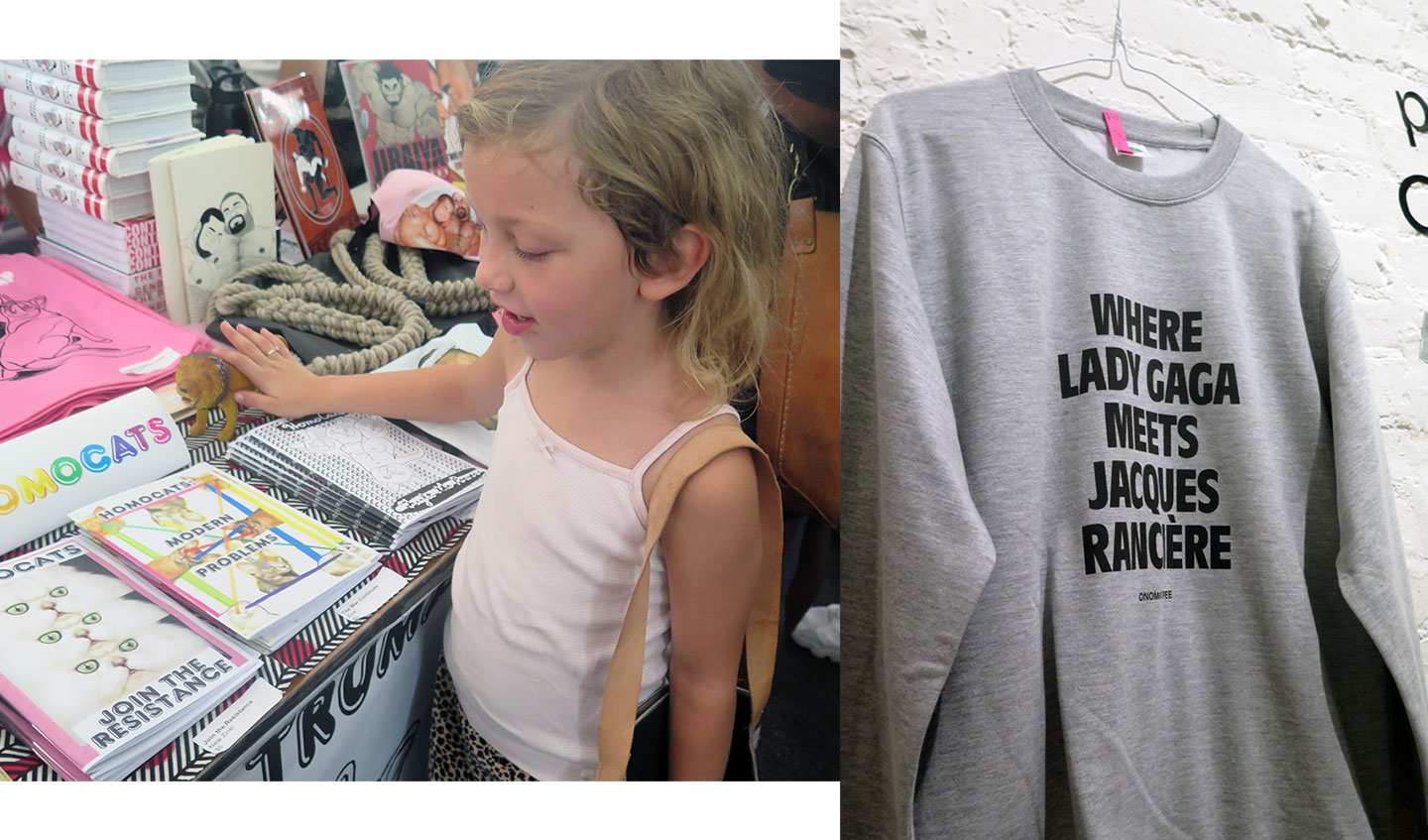
After passing through the dome, where we each bought occult pendants from Bogota from Heinzfeller Nileisist, we headed to where the heart of the fair truly lies, in the big, hot tent outside that was filled with zines, merch, rubber stamps, clothing, you name it. We could only handle two rows, but Kittens Against Trump was a hit with the cat lady I was with.
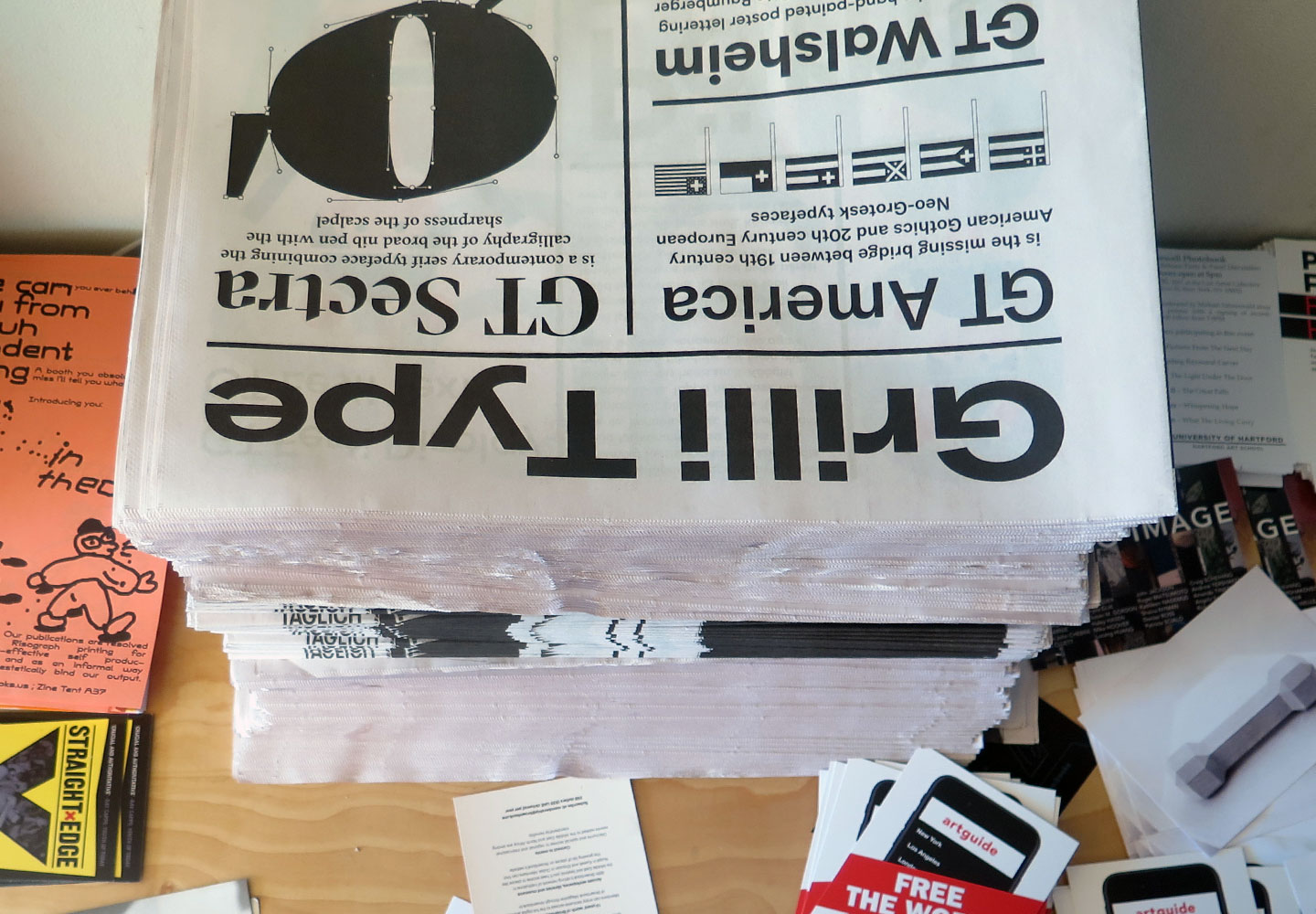
It feels like the kind of place where typography should have a presence that’s led by typographers and typeface designers, but for the most part, makers of type felt largely invisible. We did spot these great Grilli Type newspapers, and it made me wonder whether all the merch we get at type conferences wouldn’t be put to better use in places like this, where there are users galore, but no one really guiding them. We should all think about these kinds of things instead of operating within a type vacuum all the time.
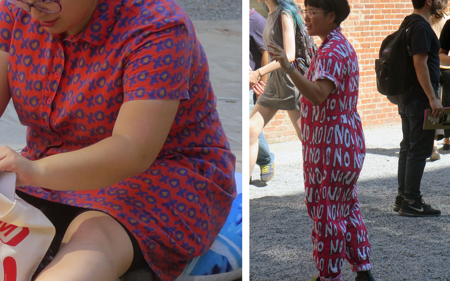
We weren’t there long, but we did start to notice a lot of typographic jumpsuits. It’s how you know you’re amongst friends.
