
I launched a project nearly ten years ago now, when I was just beginning to bridge lettering into my graphic design work. It was called Imaginary Alphabets, and I started with an alphabet I called Lucattini. Lucattini’s is a small Italian restaurant in a laneway in Melbourne, Australia, where I lived at the time.
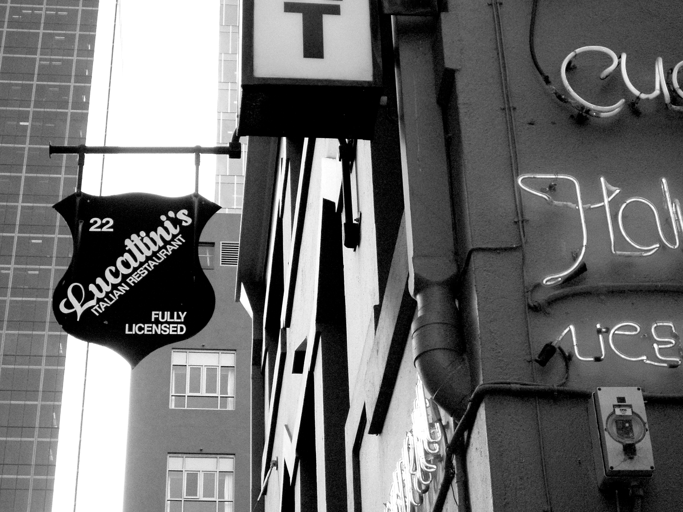
Lucattini’s, Melbourne.
In the printed piece I eventually created, I wrote:
Walking by Punch Lane in Melbourne one day this winter, I spotted a sign for a restaurant I’d never seen before. It was hand painted, with confident but elegant strokes; boldly upright, white on black.
As a script it looked so perfectly united—as if you’d never question the shapes of the letters or how they came to be standing next to one another. And I suppose this is what you want from a piece of lettering: for your word to look like one piece, as opposed to letters that just happen to be standing next to each other, like strangers in the bank queue.
When the word is a name, it’s even more important to maintain solidarity, don’t you think? After all, you wouldn’t want someone to look at your name and think, “jeez, wouldn’t his name be so lovely if not for that unfortunate ‘s’ hanging out at the end.”
I do realize of course that most people don’t have this kind of internal dialogue. But since I do, it was natural that once I passed this sign, I continued to think about it for the next several days.
So I went back and I took photographs of it, by perching precariously atop a very narrow cement bollard. I wanted to know what the rest of the characters would look like if a whole alphabet had been made from this lovely script. This is what I came up with.
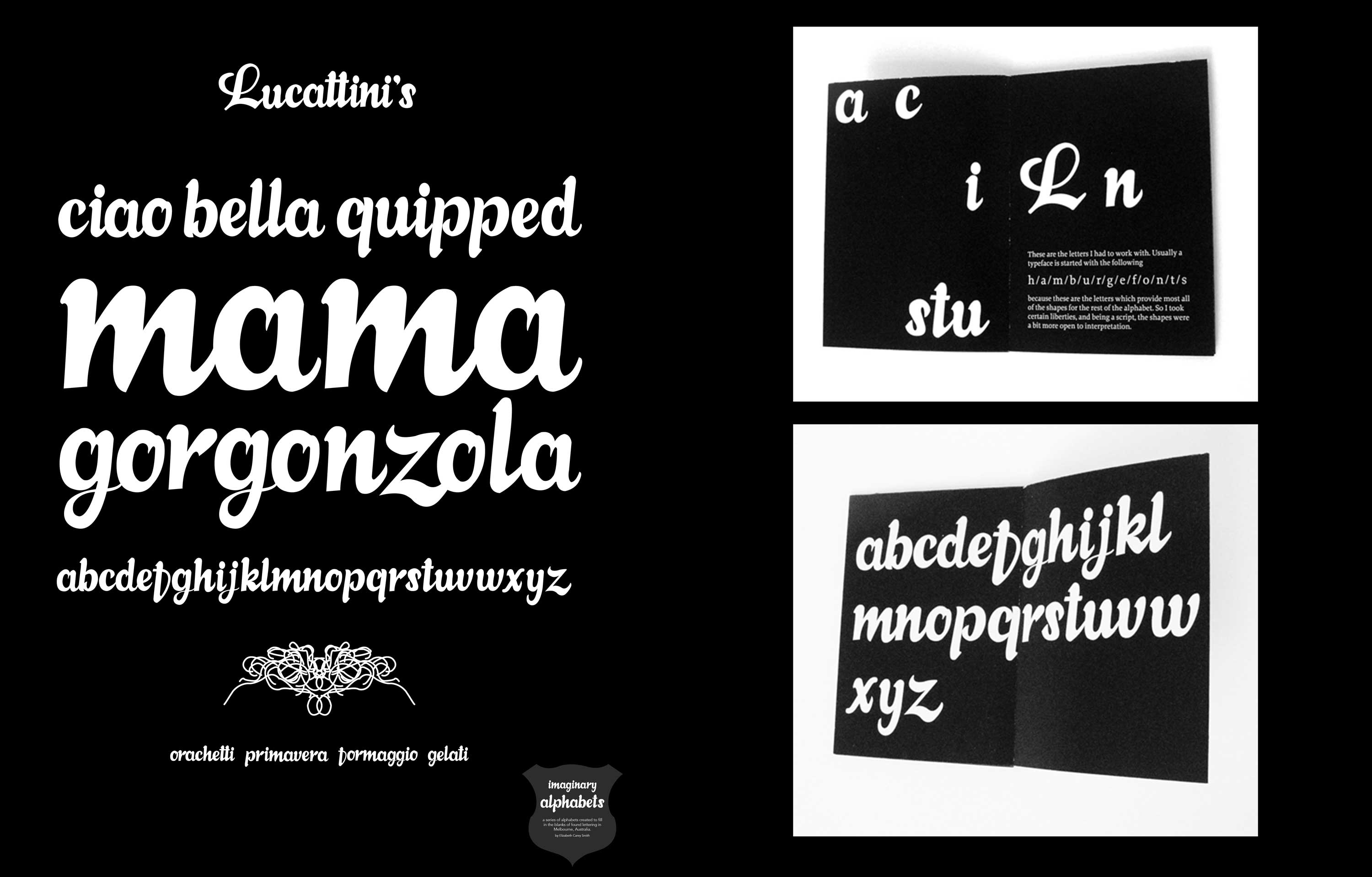
Final fold-out poster and interior booklet.
I had made Lucattini as a personal project, to explore crafting letters out of set parameters, and to have a self-promotional piece to send around to studios, since I was newly freelancing. It was positively received by the design community there, and I got up the confidence to continue the project as a series. What started out as a way to practice drawing letters became an outlet for my mental collection of vernacular lettering.
The next piece that had piqued my interest was some faded lettering on Smith Street in Collingwood, but after some research I realized that plenty of typefaces had already been made in this vein, so I went on another quest.
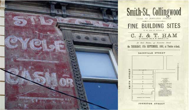
St. Leonards Cycles, Smith Street, Collingwood. And original lot sales materials for the area in Ye Olde Victorian Times.
During a weekend away in Healesville, I found this old sheet music in a junk shop in the country.
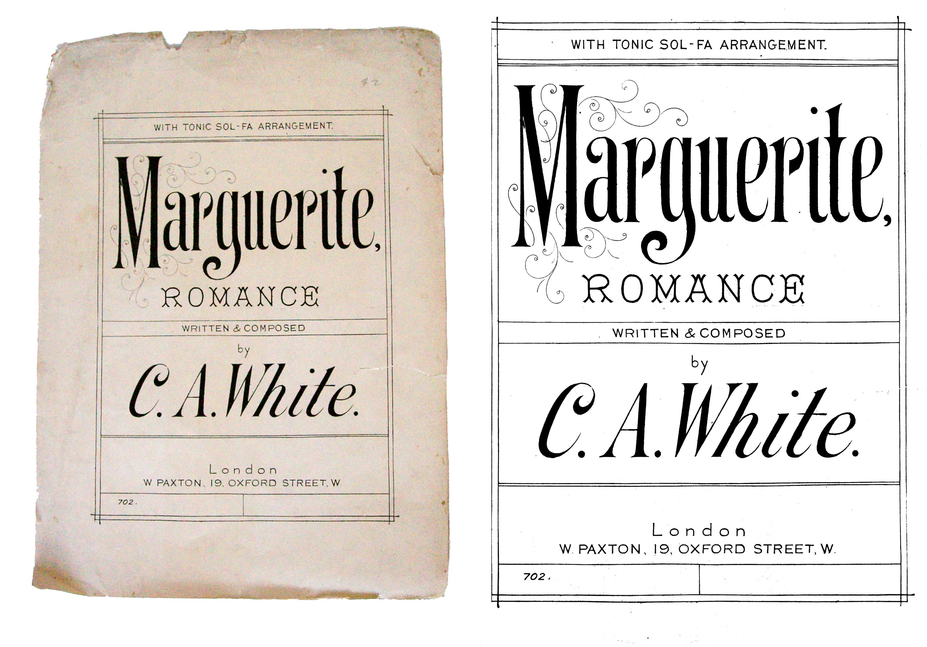
Marguerite…isn’t she jaunty?!
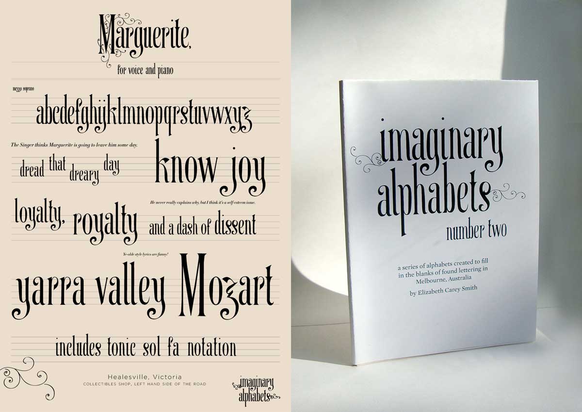
Full Marguerite poster and fold-out booklet.
I was very proud of these projects at the time, and I still am, even though ten years on and with a much better eye, I cringe a little. Over the years I’ve intended to take another look at them, normalize their forms, stick the nodes in the right places… but as most designers know, those intentions rarely get realized. And I can appreciate them now as they are, because I was putting myself out there even when things weren’t perfect. I don’t know that now, for instance, I’d have had the balls to make a z that was derivative of music notation.
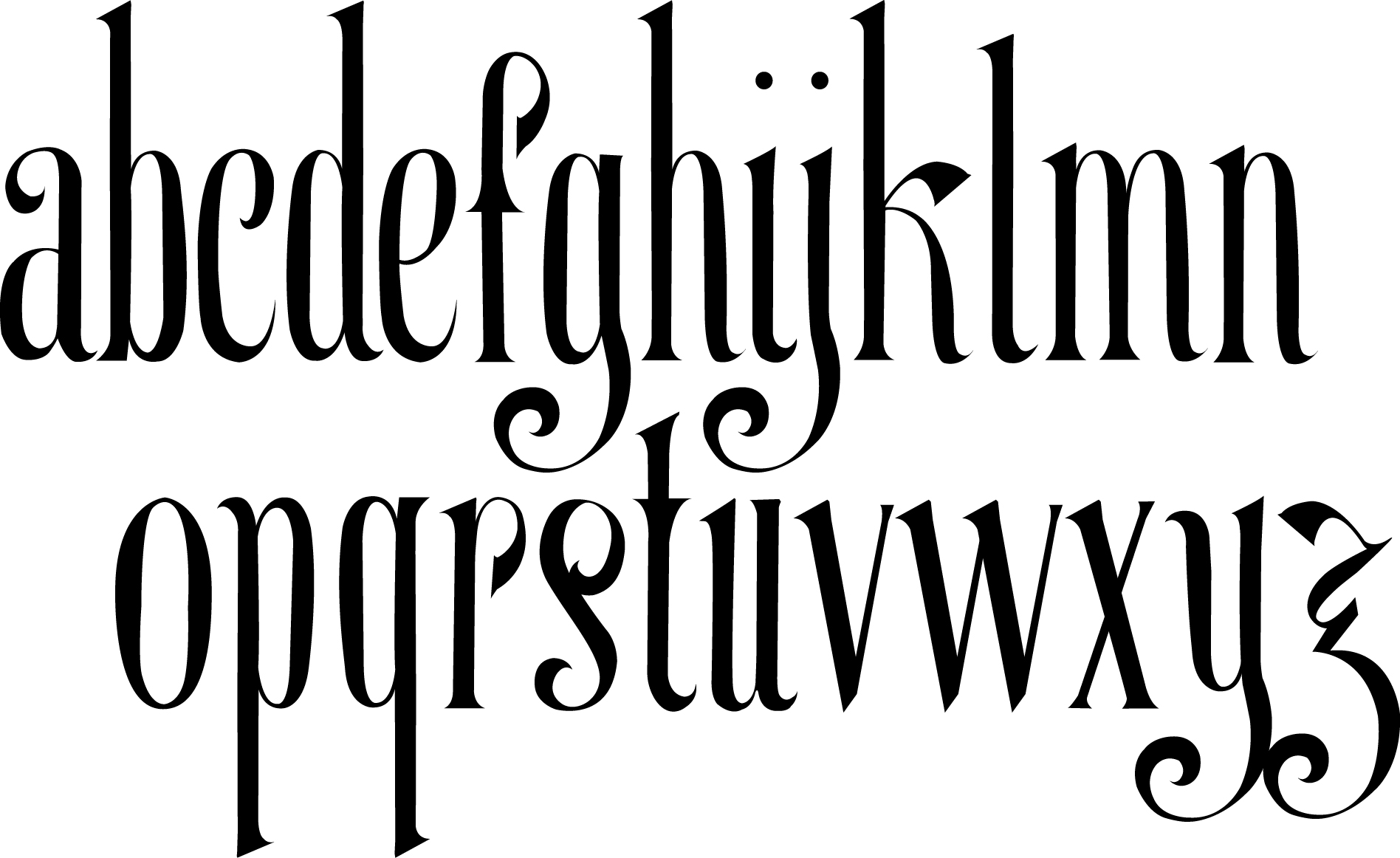
The full alphabet of Marguerite.
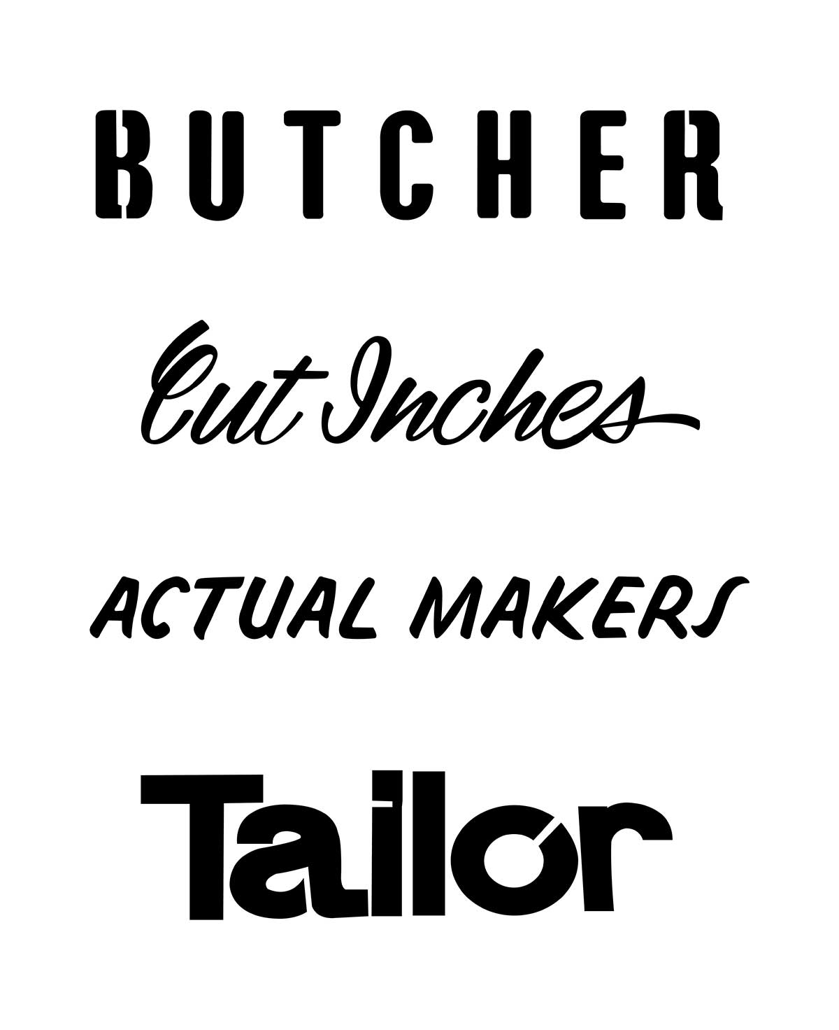
All the positive vibes I was getting off of these projects led me to a bigger endeavor: a small one-lady show of my collection of vernacular type. I focused on one suburb of Melbourne, a post-industrial area called Brunswick, and dedicated my thinking to how an area was defined by—and how it had morphed because of—its industry-specific signage.
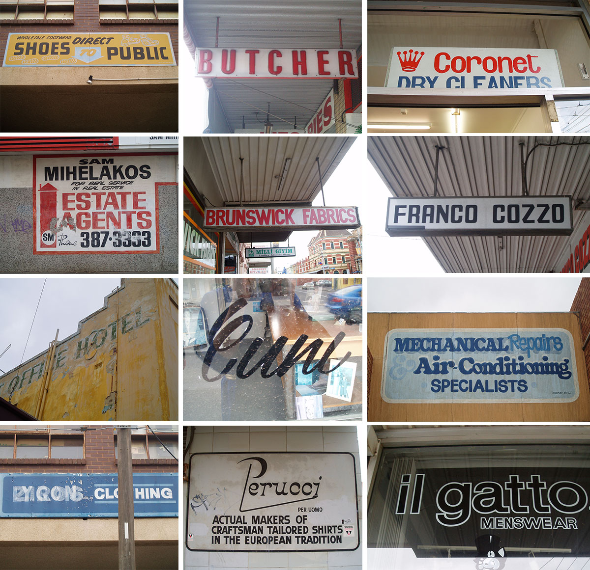
Brunswick signage, 2008–2009.
At this point, I went a little nuts. I was trying to say a lot, perhaps too much, and trying to illustrate as much of these forms as I could, all within a very tight deadline. Oh, and I’d also decided to move back to New York the day after the show was supposed to open, because I’m wild and crazy like that.
So many shapes.
And while I was doing what I could to preserve as many of these interesting shapes as I could, I also felt I needed to draw a full alphabet in keeping with the series.
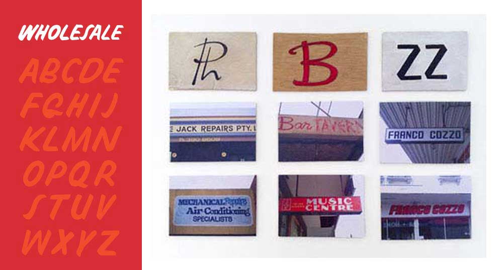
“Wholesale” was the alphabet; on the right are bits and pieces of lettering I captured from various signs.
Once I was back in New York, things died down. My three years away had created a distance I hadn’t anticipated, so to keep myself from wallowing too much, I started up my Imaginary Alphabets project again. I had spotted this sign one day, which, aside from being terribly condescending, featured some very funny and interesting shapes. They were stenciled and sprayed, but I’ve never seen a source, so I started an alphabet.
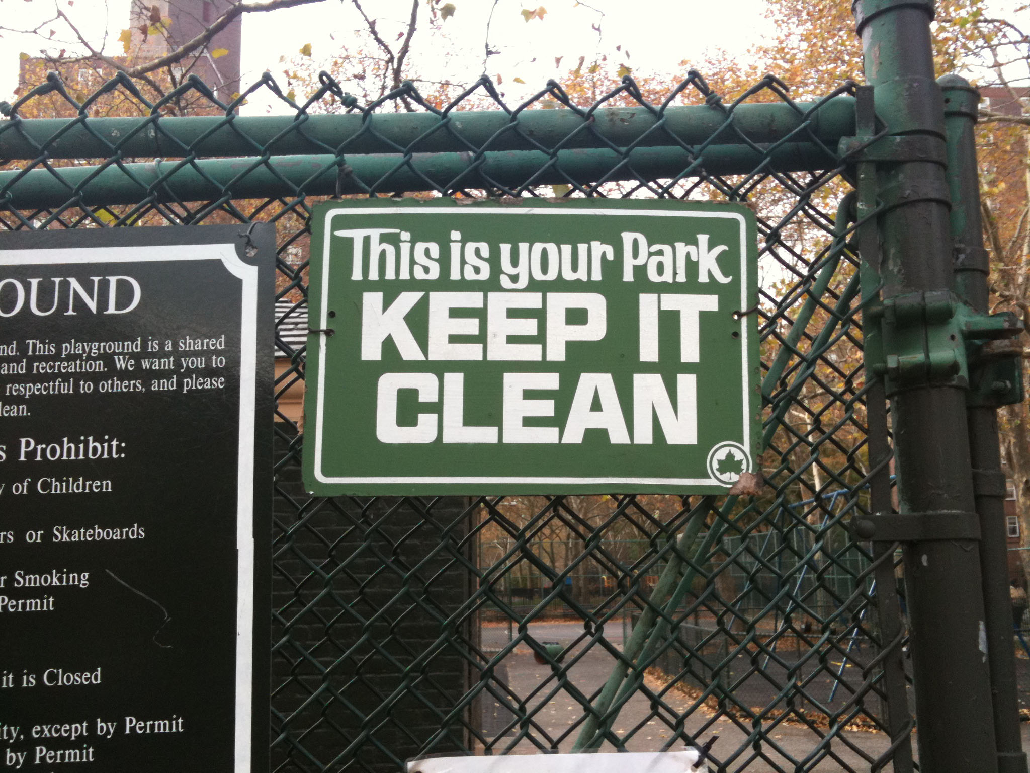
This is your park. KEEP IT CLEAN OR ELSE

Full alphabet of Harlemite.
And that’s where the current Alphabettes header came from. I added another boing to the ‘e’ because I can and like all the weird boings in the shapes. It’s like they were adding anomalies from the brush, but in a stencil? Or maybe they were just being sloppy. Or maybe other people like random boings too.
Around this time, I was accepted into Type@Cooper’s second extended program. After the first insane semester, I thought I’d take the Christmas break to make another alphabet (see above evidence of insanity). Again in a junk shop, I came across some old sheet music, this time from Cold Spring, NY. I’d never heard of this formerly-famous ditty, but when I researched it, I found that it had been covered by hundreds of performers, and that it spoke of a pretty dire time in America and the rest of the world. The flu pandemic killed more people than World War I, which was happening concurrently. So it struck me as especially interesting that such a hopeful, nonsensical song should arise at such a devastating time. I made Jada, the first and only of the Imaginary Alphabets to be drawn with font software and to function as a typeface, albeit a limited one.
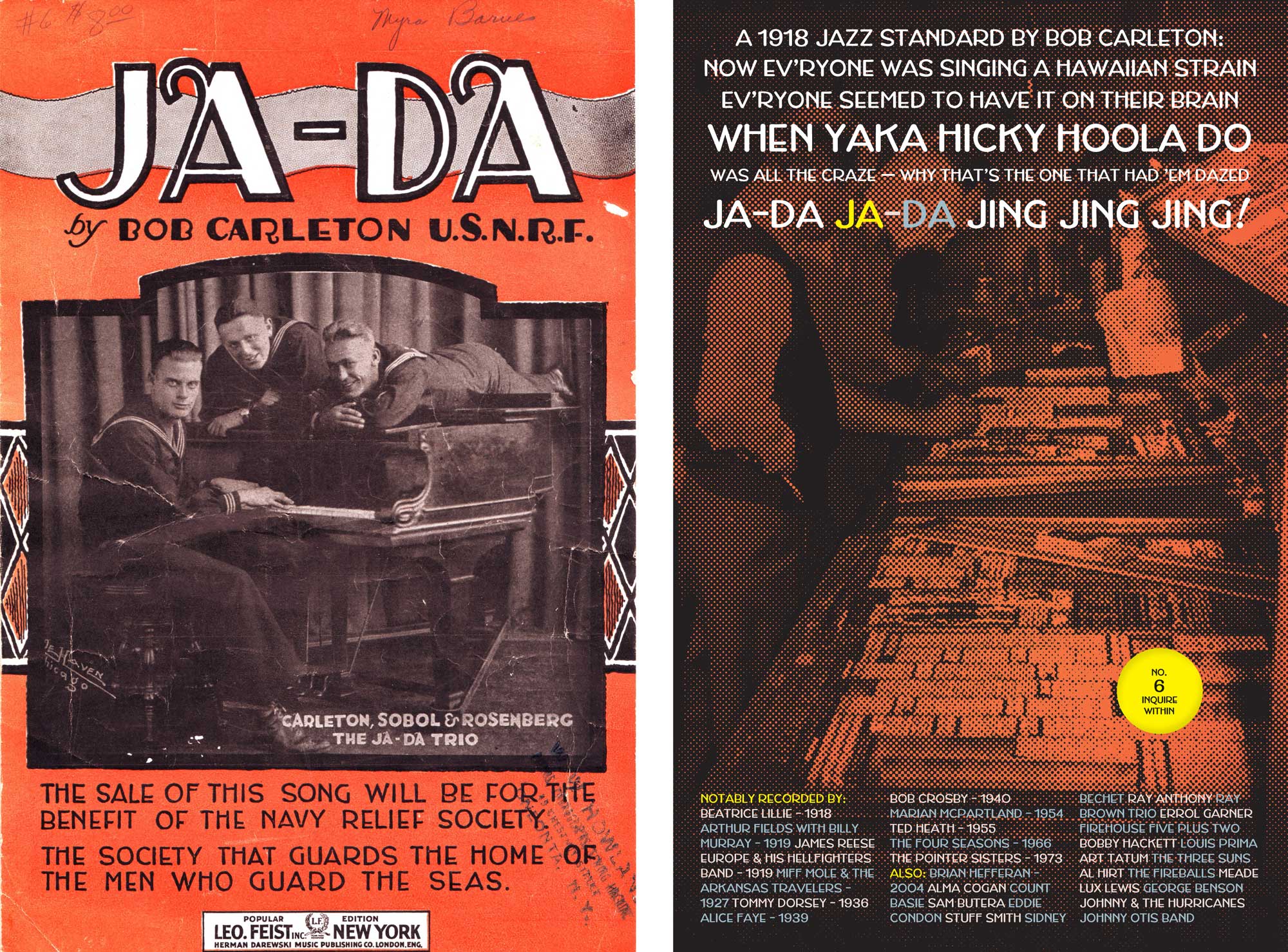
Left: original source, found in an antiques shop in Cold Spring, NY. Right: the fold-out poster for Jada, the typeface.

Left: the Jada fold-out booklet posters hot off the press. Right: a little specimen I passed around to tons of people who didn’t want it.
That was the end of Imaginary Alphabets for me, though I did use it as a project for my students. I’ve found it’s an excellent way to help students look around their environments for weird and neglected letterforms, and to try to breathe new life and uses into them. It also encourages research into the environments and times those letters originated in. There’s an endless number of possible outcomes, and there are so many letters that could use new homes.