
It seems slab serif typefaces are taking over the market. In 1990, PMN Caecilia proved that it was possible create a slab with a more humanistic approach, a style that could work, not only as a display typeface, but for running text as well. In the last decade the diversity in slab designs has grown. The constructed shapes of the serifs adapt to the pixel grid, and they usually work well on screen. We have many different options for slab text typefaces. Some, like Ernestine, include several scripts, while others, like the recently released Equitan, are a part of large families. The rather squarish appearance of classic Egyptians, coexist today with more rounded lettershapes in new slab designs.
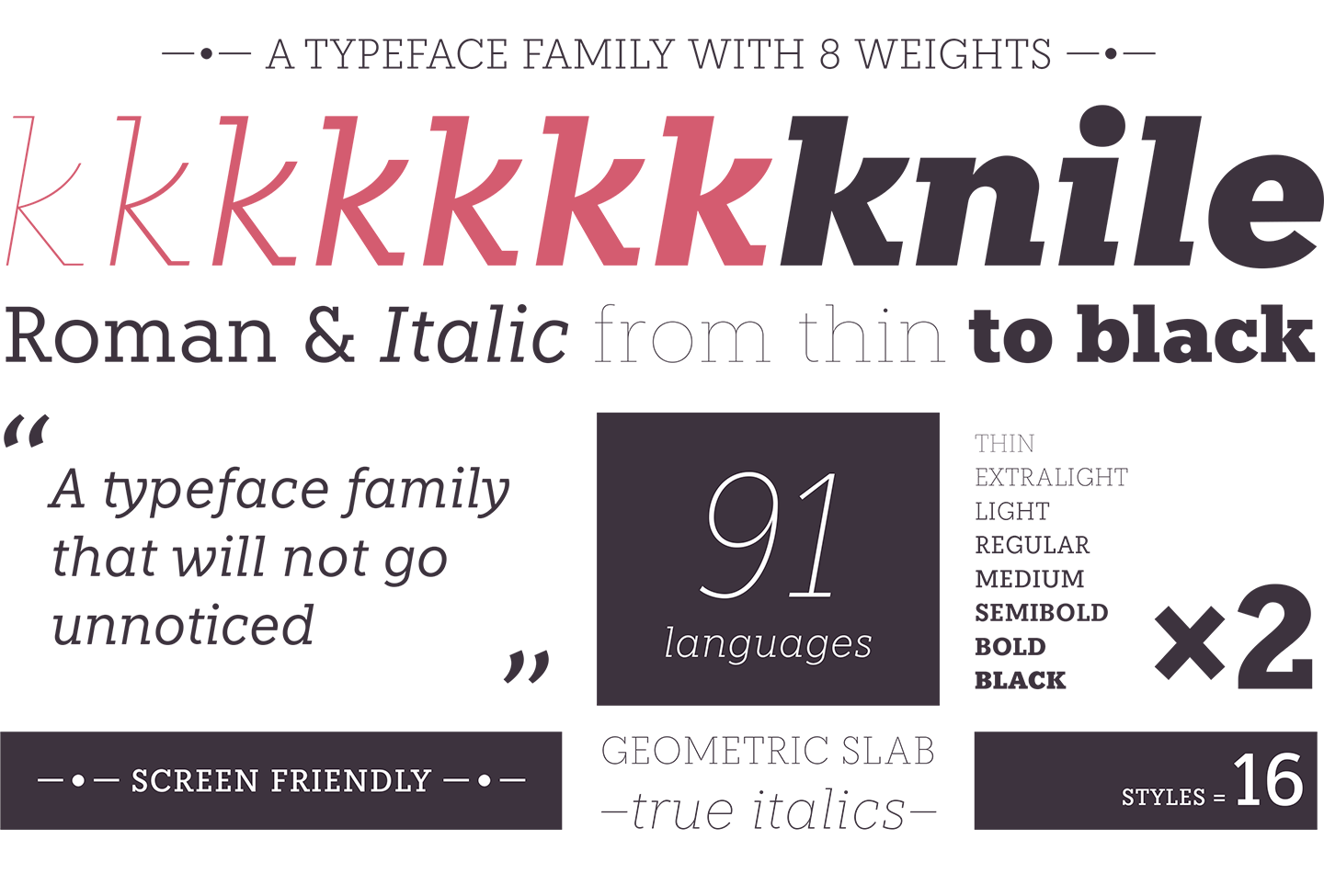
Knile is a newborn within the genre. It is a collaborative project with the Spanish design studio Atipo. The original idea was to create a slab counterpart for the existing typeface family Geomanist. Slab serifs are not just sans with added terminals; they have intrinsic design peculiarities. As far as we wanted the typeface to be functional as a text typeface, many changes were necessary and the design evolved into a typeface family with its own personality.
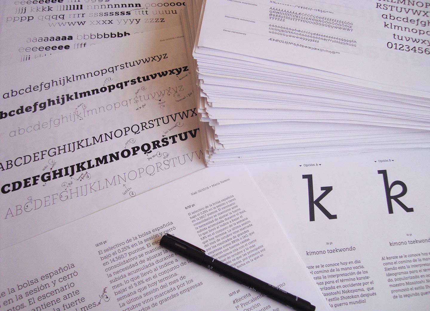
Printing tests made during the design process
Knile includes eight weights, from the stylish almost invisible thin to the heavy black. Uppercase letters play with conventions and use classic proportions. The italics include humanistic features without loosing the geometric essence of the family.
Knile reads well in small sizes and works as a screen typeface. The variety of weights gives the user the opportunity to play with them and create different textures in the layout. As you may know I like to put single characters under the spotlight. I want to feature the lowercase ‘r’ in Knile.

This letter was particularly difficult to design. We needed to create a good balance between the heavy serifs and the short straight top terminal. The terminal is longer in the lightest weights, and it is slightly inclined in the heaviest weights to gain smoothness.
Have a look at more samples in knile.net and give it a try.