
Mr. Sharad Deshpande has been a prolific copywriter for 50 years and an intrinsic part of Setu Advertising, Pune. Mr. Deshpande maintained many diaries documenting his writings and what made them extra special was his beautiful, neat handwriting. It was when he suffered a mild paralysis attack, that he lost the ability to write, a couple years back. It was disheartening for a copywriter who was so proud of his writing, to not be able to continue doing what he loved so much. But his sons decided to gift their father something very unique on his 76th birthday – his handwriting. His son, Rugwed saw great potential in converting his fathers handwriting into a font and approached me with this project proposal. This gesture was extremely overwhelming and it’s been a humbling experience to be a part of this project.
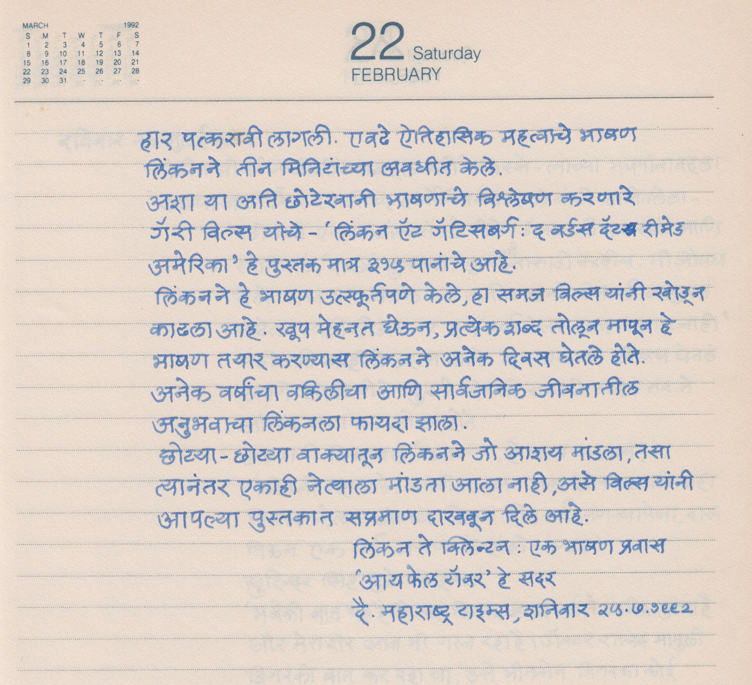
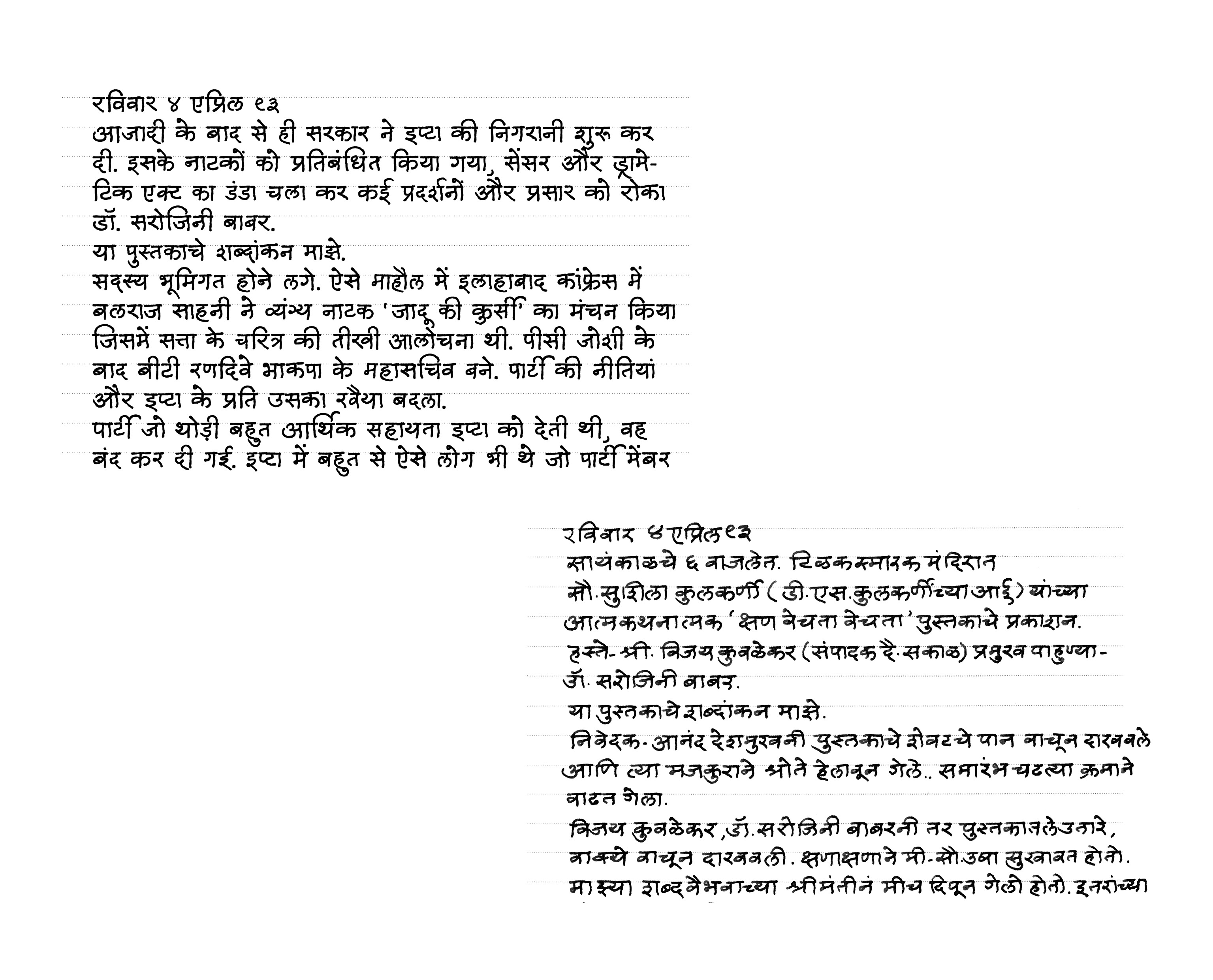
Scan of the handwriting from Mr. Deshpande’s diary.
Being a copywriter, Mr. Deshpande had many diaries filled with his writings, so we had many samples to look at before starting the project. His handwriting is very neat and at times even resembled printed text. But the nature of handwriting is such that no two letters are ever exactly alike. So I printed a lot of these samples to carefully study and understand the defining characteristics of his handwriting which were:
– The shirorekha is disconnected
– The shapes of letters are round and open
To keep the nature of the handwritten text intact, I decided to include alternates of each letter instead of selecting just one. Handwritten fonts without alternates look too uniform; so the illusion of realism is lost. There are many Latin typefaces which have been created the same way but I had not come across a handwritten Devanagari typeface that has been published the same way. Modern font engineering and OpenType technology gives the ability to display a number of versions of the same letter, in a seemingly random order, so the resulting text can look similar to an authentic handwritten texture. But even though it’s possible to have multiple variations of a letter, too many would complicate the project and push the limits of font files.
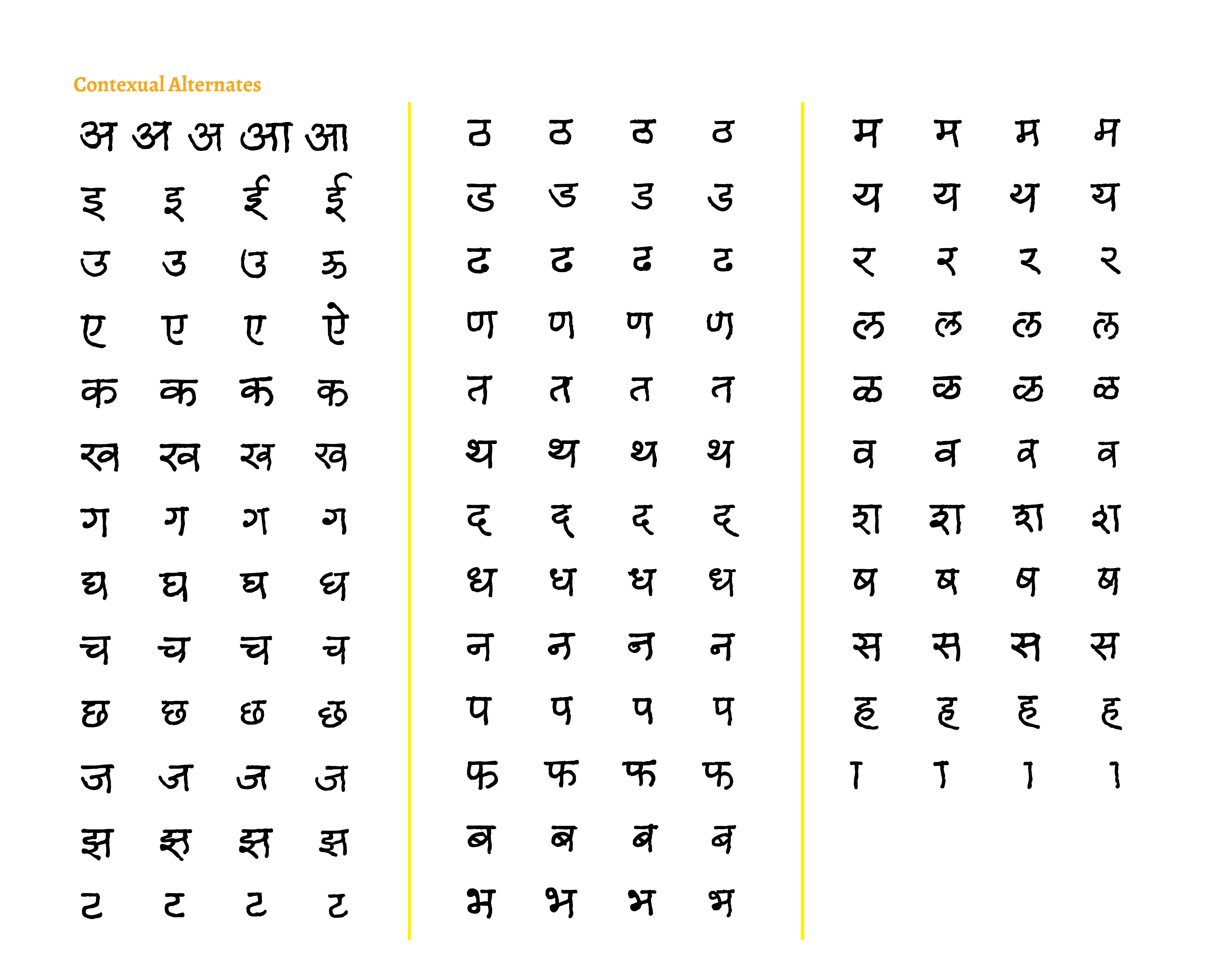
The numbers of alternates were based on the frequency of the characters appearing in Marathi text – so the letters that occur more often have more versions to keep the handwritten nature in the text. The main vowels and consonants, vowel signs, and marks, each have four alternates, while some of the less frequent conjuncts and numerals have two alternates.
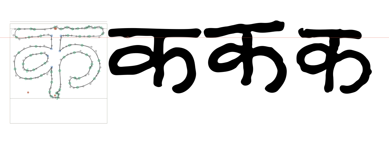
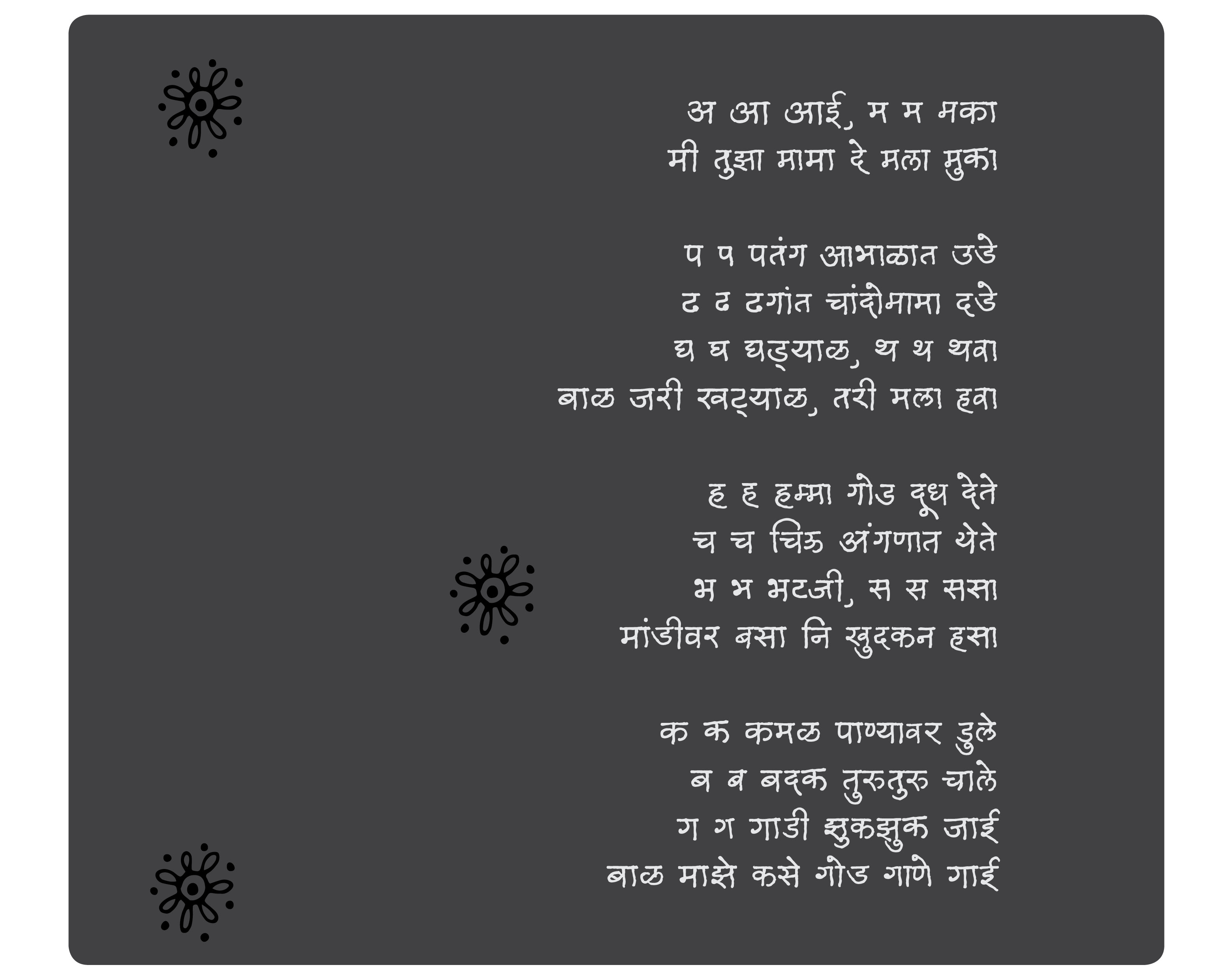
 Sharad Typeface next to a scan of the handwriting.
To replicate the feel of the handwritten text as much as possible, it was imperative to keep the right amount of irregularities intact: the shirorekha is disconnected and not always aligned, some letters are darker than others to mimic uneven ink distribution, and the spacing is slightly uneven. Adding these nuances makes the digitally typeset typeface render incredibly similar to the handwritten journals.
This project was one of the most gratifying typefaces I’ve worked on. The challenge of designing a handwritten Devanagari font with alternates, something that is one of its kind, was a thoroughly exciting process and I am extremely humbled to be a part of this project.
Hi Kimya, I’m curious: how did Mr. Deshpande react to the typeface? Was he happy about it? How about his sons? It’s a great project, thank you for sharing it!
Hi Amy, thanks for your feedback. The sons were thrilled with the font, and Mr. Deshpande was happy too. They were mostly amused with the alternates I think. Even though they are an advertising agency, they were not really aware of OpenType possibilities with Devanagari, so it was nice to have them understand more standardised formats and their potential use. I made a pdf specimen that is available with the font, explaining how to activate contextual alternates in order to see the various versions of letters.
Can we publish your blog on our Dnyandeep Foundation website http://www.mymarathi.com with link to your site?
I had written some blogs (http://dnyandeep.blogspot.in) on Marathi character recognition for people living outside Maharashtra, who find it difficult to teach Marathi reading and writing to their children.
I shall be happy if you send your comments and suggestions. I plan to prepare android and iOS apps on the theme in future.
Hello Mr. Ranade, sorry for the delayed reply, and thank you for showing interest in my post. I have emailed you, so that we can discuss details. Thanks!
Is the font available on net for downloading,else what is the procedure to get it? Or you do it on contract basis after people send their article to print in this font?
The font is open source and available to download here: http://www.setuadvertising.com/sharad76/
Dear Kimaya,
can you please share your contact details? I have much similar requirement. Please do respond as early as you can.
Hello Mihir, you can email me at kimya@motaitalic.com. Thank you.
hi kimya…
the font looks simply amazing….i have downloaded it.
would like to know if there is any keyboard layout for the same ?
and how to use it