Type designers take joy in the little things. We obsess over our &s and †s, we toil over the ear on a double-story g, we include oft-forgotten characters just for fun, and we inject all of our personality into %s and #s. As a fledgling type designer, I’ve found the most joy in interpolation.
When I took Typeface Design with James Montalbano for the second time at Parsons, I was determined to learn how to make a face with more than one weight. And I knew there had to be a way to do it without drawing each individual weight by hand–I’d heard whispers of something called Superpolator and I definitely knew from experience that type designers are nothing if not efficient.
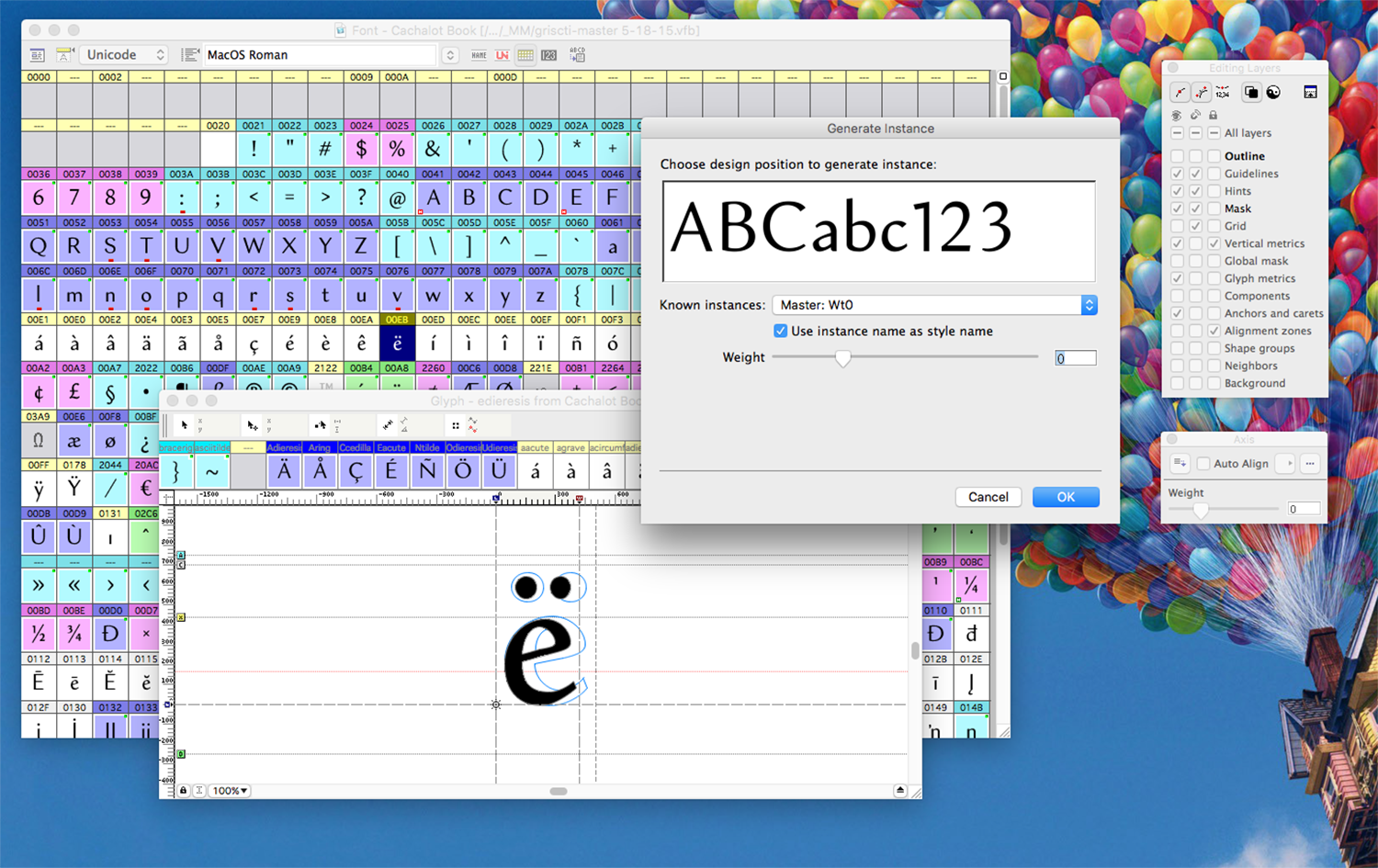
So under James’s careful tutelage, I drew two weights of my latest typeface, the thinnest and the thickest, and set to work carefully matching all of my anchor points and contour directions. We worked in FontLab, so it was their Multiple Masters tool for me rather than the elusive Superpolator. Slowly, character by character, I assigned my masks, defined a new axis, and applied all of those carefully placed masks into the Master.
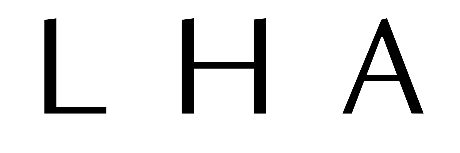
Seeing the interpolation in action, I learned a lot of about the different techniques I used to beef up my letters to bold. Some grew totally to the left, some both ways, and others expanded down.
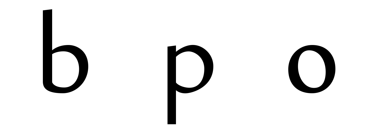
Of course I had some glitches:
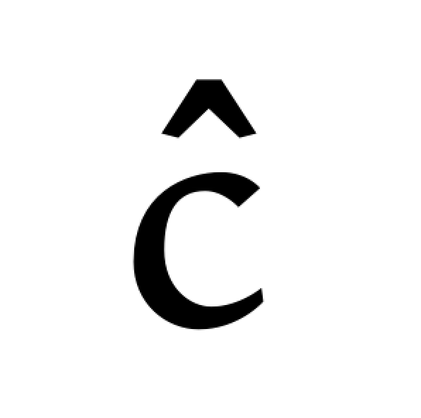
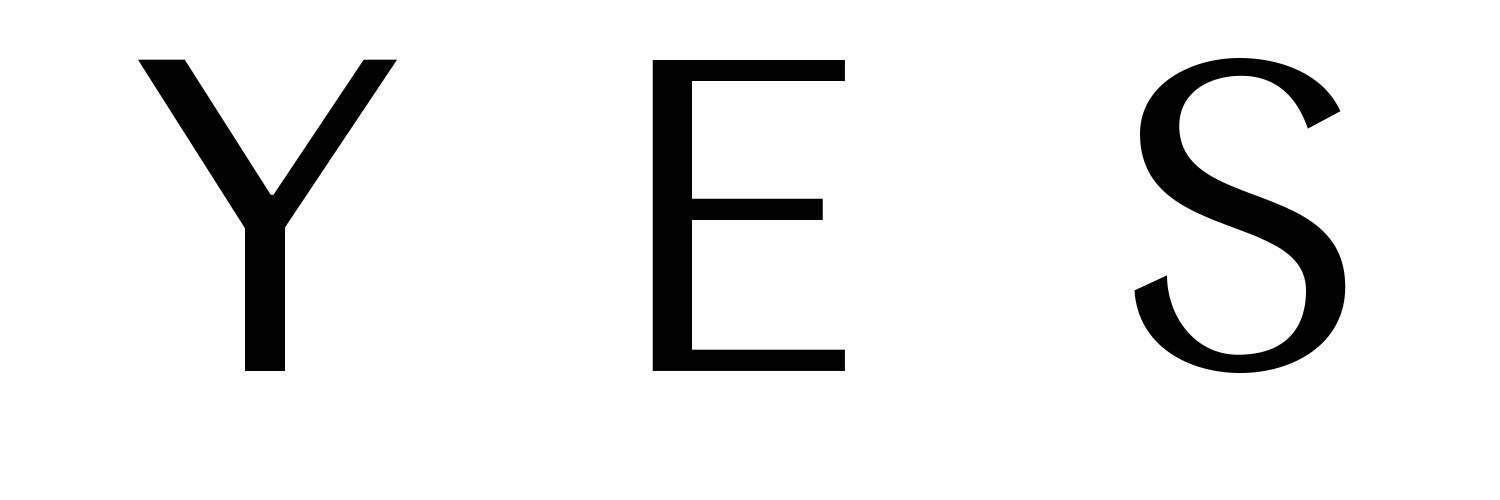
But I met a new favorite character too.

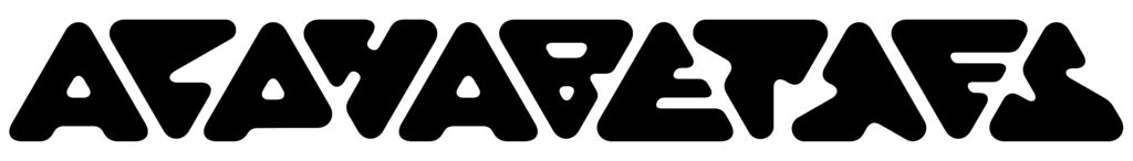
See the full undulating Cachalot specimen here.