Koralle by Schelter & Giesecke, Leipzig, is a breath of clear fresh air after the surge of gnarly grots and artsy spawn of recent years. Neither totally geometric nor too hyggelig humanist, it combines simplified letterforms — e. g. its signature lowercase a — with traditional proportions for good readability. (What I used to tag as “trans-sans”?)
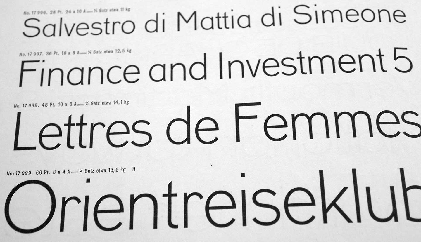
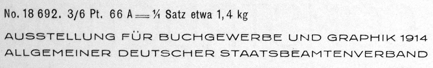
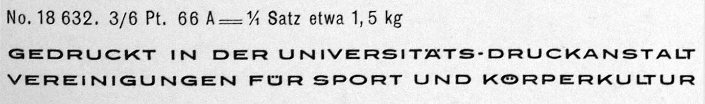
Very rarely is a typeface claiming that it shines in both, large sizes as well as small, but Koralle totally does. Just look how the Orientreiseklub makes you want to pack your bags immediately and rush out while tiny 6 pt internationale Weltausstellung exhibits itself so legibly even with line spacing this tight, no leading. (Alt-click-open-in-new-window to zoom in.) The uppercase letters manage to be high and low-waisty at the same time and make for good-looking all-caps settings. Think door signs, title pages, business cards et al. But accolades aside, I do have to deplore the bad if not totally absent kerning (F emmes???). Similarly, I hope the well-nigh alien ‘ch’-ligatures or ‘LT’ were implemented as discretionary ligs.
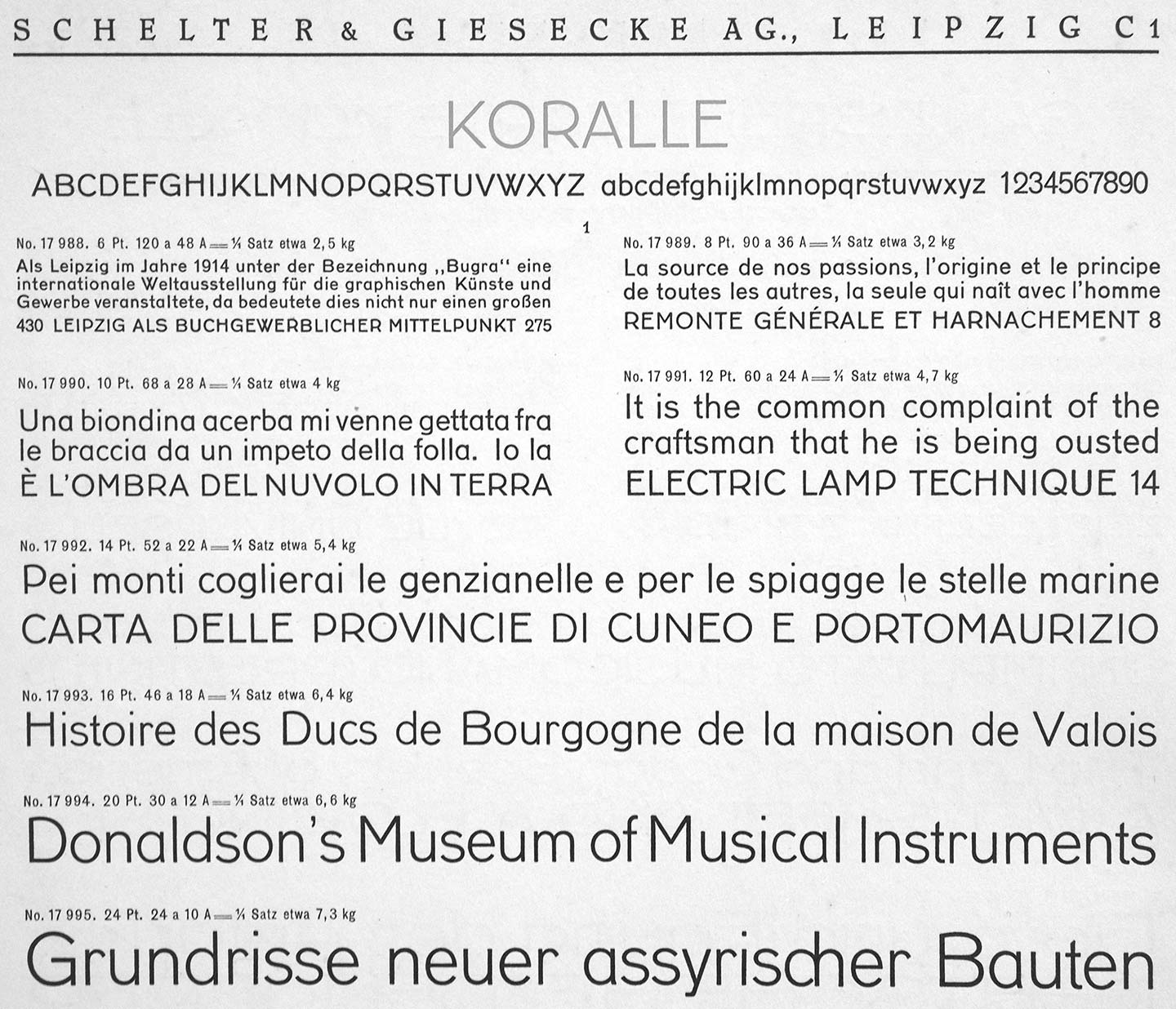
Nevertheless, Koralle is a promising geometrish sans and my favourite release of the year. The new regular style nicely complements the two previously released wide variants which are available in even ridiculouslier small sizes (down to 3 pt!) I hope it will not be the last in this series from the Leipzigers.
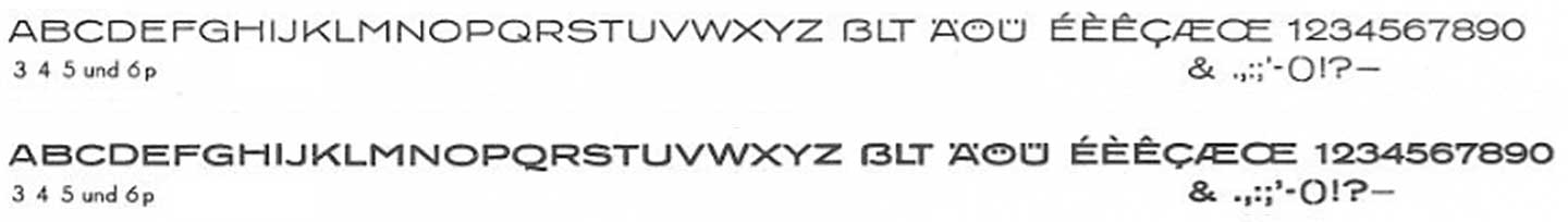
(No, they don’t mean BLT’s. Koralle is also the, presumably, first typeface to proffer a capital ß … Let’s see how fast an idea this weird will make it into official German orthography.)