
If you have been following my interview series here on the blog, you might already know that there is a well-defined structure for those conversations. Today, I want to share an interview done in a different way. It will be quicker, a bit more friendly and not any less personal. Carolyn recently published a typeface and a book, and those two were good enough reasons to sit down and enjoy a virtual conversation about the process.
LLT: Hi Carolyn, I am so excited to be chatting with you today!
CP: Hi Liron! It’s great to chat with another ‘Bette!
LLT: Let’s start from the end: the book is out! How are you feeling?
CP: It is a bit surreal, to be honest. Between the font and the book, I’ve been working on the project for 15 years. I’m busy with book promotion and marketing, so it might not sink in for a while that the book is done and out in the world.
LLT: I am so curious to know when would be this moment of realising this. I would assume that you’ll see someone on the train reading it, or in a bookstore.
Since there are already many reviews of the book, I would rather ask you questions about the process and type. Our readers will surely appreciate getting this glimpse of the background. But let’s start with maybe one or two sentences about the book?
CP: Last week, a friend sent a photo of the book in an airport book shop. That was fun to see!
The book weaves together two stories: The first is the modern-day story of the development of a connected cursive typeface, which was based on beautiful handwritten letters I found in an antique store here in Minnesota. The letters were written in French, a language I don’t speak, but for the purposes of the typeface that didn’t matter since an ‘a’ in French looks like an ‘a’ in English.
The second story is a history-mystery about the letters themselves. What I didn’t know when I bought the letters is that they had been mailed from a German labor camp in 1943/1944. After having the letters translated, I became obsessed with finding out what happened to Marcel Heuzé, the man who had written the letters: Why was he in the labor camp? Why had his letters been for sale in a store in Minnesota? Was he ever reunited with his beloved wife and daughters?
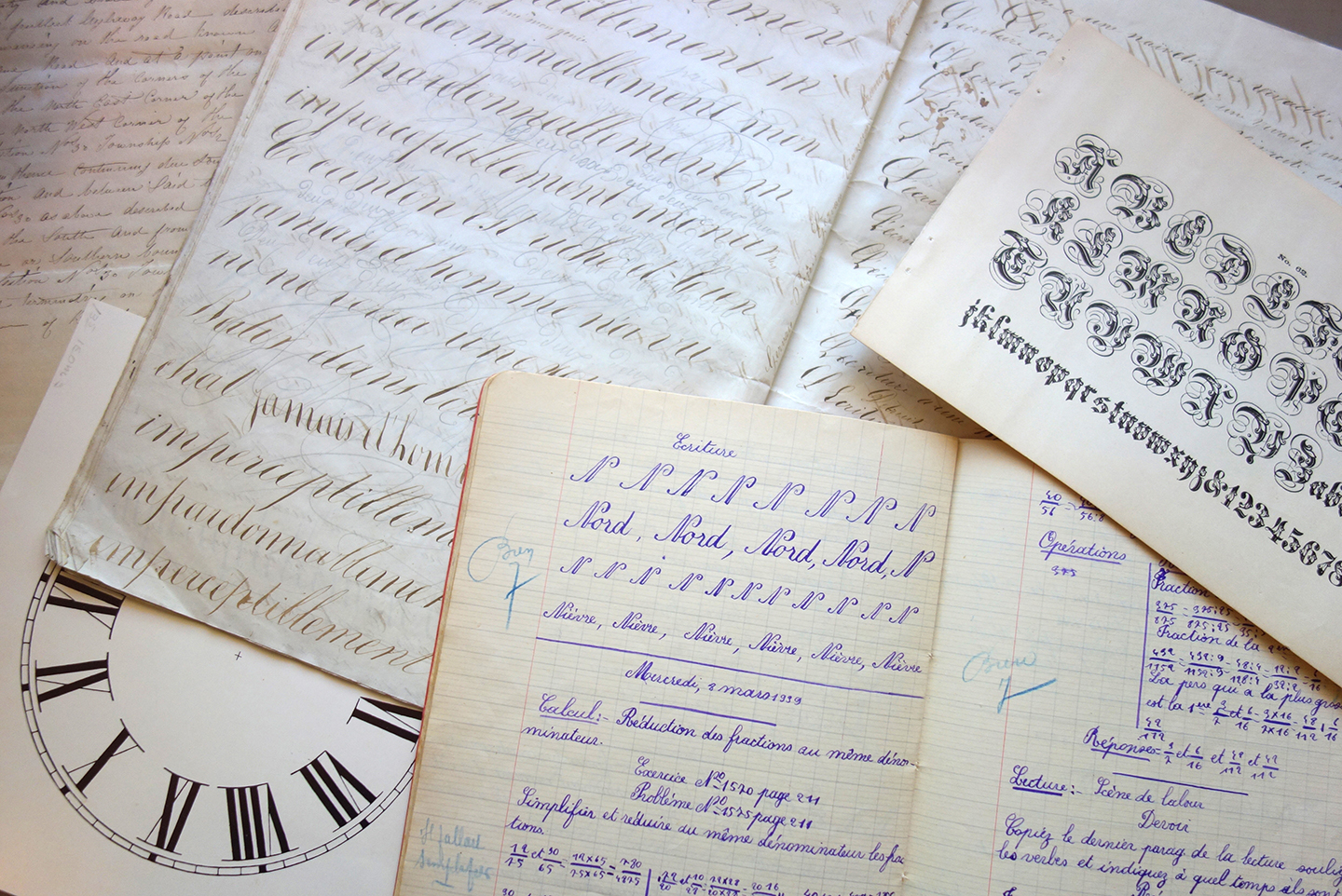
Carolyn’s old type specimens. Here, a 1939 class workbook, a letter from 1838 and an old clock face
LLT: I can secretly admit that the story is so captivating, and every other page holds a new piece of information that becomes crucial.
15 years is quite some time! After both a typeface and a book that took so long to finish, how would you describe this process? What have you learned about patience? About deciding that the project is done?
CP: You may be amused to hear that when I first started the project, I thought it was going to be a quick and fun little side project! Since the typeface is based on someone’s handwriting, I assumed it would be easy to trace his writing, then turn those letters into a font. I work full-time as a graphic designer, so I initially just worked on it evenings and weekends. At times — either when I got really busy with life/work or frustrated with the project — I’d put it aside, sometimes for weeks at a time. But, I always felt the pull to come back and continue working on it. I don’t know if it was patience or just plain stubbornness, to be honest.
How does anyone know when something is done? With letterforms, there is always a curve that can be tweaked, or a glyph that can be added. With writing, there is always more editing that can be done. At some point you need to release it into the world.
LLT: So when was this moment?
CP: With the book, I had a hard deadline from my publisher. That helped. Deadlines always seem to help. Being “done” with the typeface was a harder thing to identify. I guess it came down to the old saying “perfect is the enemy of the good.”
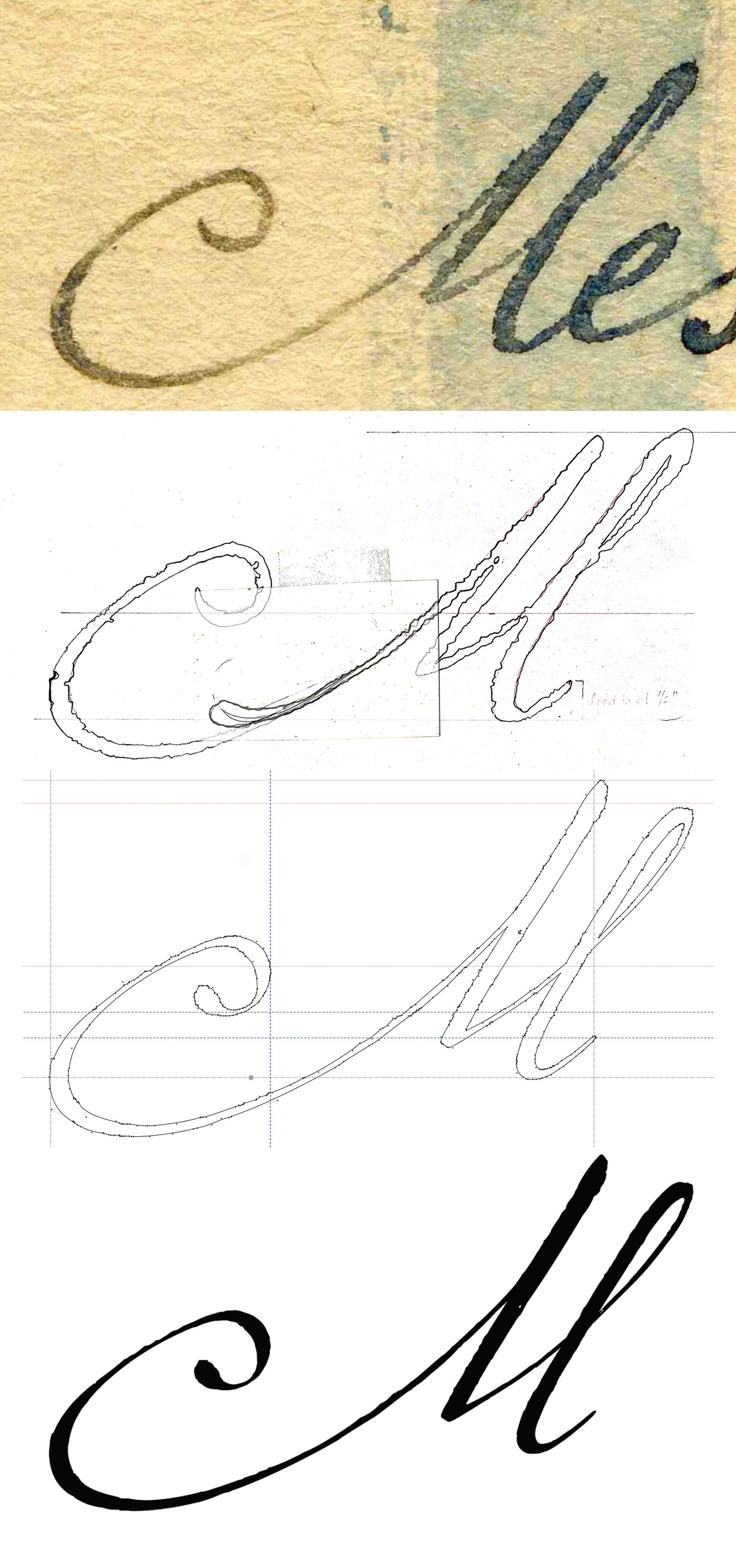
Enlargement of Marcel’s original handwriting
LLT: I always find this stage to be the hardest. The notion that the book and the typeface were all side projects is astonishing and inspiring. I am sure many readers have their own side projects, but I can say, personally, that those are really hard to find time for. What was is like, working on this personal project after a long day?
CP: Well, you have a toddler, so I imagine time for side projects does not exist! For the last few years, I can confess it has not been very healthy. I’d work from 8:00-5:00, then walk the dog and have dinner with my husband, then I’d work on the book from 7:00-midnight. Weekends were often consumed with writing/editing. Sometimes it just was not possible to clear my head to write, unfortunately. So, I’d take a day or two off, then get back to work.
LLT: And did you manage for it not to “bite” from your 8:00-5:00 workday?
CP: For years, yes. But, after having Marcel’s letters translated, as the search for answers intensified, it started to eat into daytime hours (I’m self-employed, so at least I wasn’t accountable to an employer). Initially, all the writing was evening and weekends. Once it got close to publication, though, I told my clients I needed to pare down hours temporarily until the manuscript was submitted. Thankfully they were very understanding.
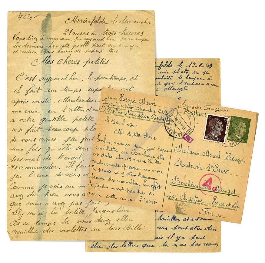
Marcel’s original letters
LLT: This is all about balances, I guess. I have another question about balances, this time relating to how you wrote about type. How was it like, finding a balance between writing about type to people who are not in the type world and still making it appropriate for the type nerds?
CP: Great question! I am neither a WWII scholar nor a type expert. One of the few things I knew for certain was that I did not want the book to be like a textbook.
For people who don’t know anything about type, I wanted to explain how someone could love the shape of letterforms. I wanted to give them a sense of what it was like to design type without going into excruciating detail. I did get too technical at one point, and my editor told me to trim the content down; he didn’t think people would care. But, I hope enough detail is there to keep people engaged who already know about type. One of the most rewarding things I’ve heard so far was when a reader told me they had never noticed fonts or type before. Now, they said, they notice type everywhere!
Similarly, when it comes to WWII, I wanted the book to be accessible to someone who didn’t know a lot about WWII history or about French forced labor. I didn’t know anything about Forced labor before I started trying to understand why Marcel had been in Berlin. So, in the case of both type and WWII, I wanted the reader to feel like they were on a journey of discovery.
LLT: I think you managed to walk on this very tight rope, and very well. I especially liked how your early calligraphy as a kid got connected to this project. Since I mentioned connections, how would you describe the connection between the typeface and the historical topic in the book, in your research and process?
CP: Marcel is the common element between the two. His handwriting was the basis for the font, and the research I did was to understand his experience as a forced laborer. The translated text of Marcel’s letters are in the book; they include surprisingly detailed descriptions of life inside the camp, yet I needed to do more research to understand the context.
As I was searching for information on his fate, I’d have to say I did not think about the research process. I was searching for information for me — to satiate my own curiosity about his fate. At the time, I had no idea it was going to become a book. If I had, I certainly would have approached the research in a more methodical way.
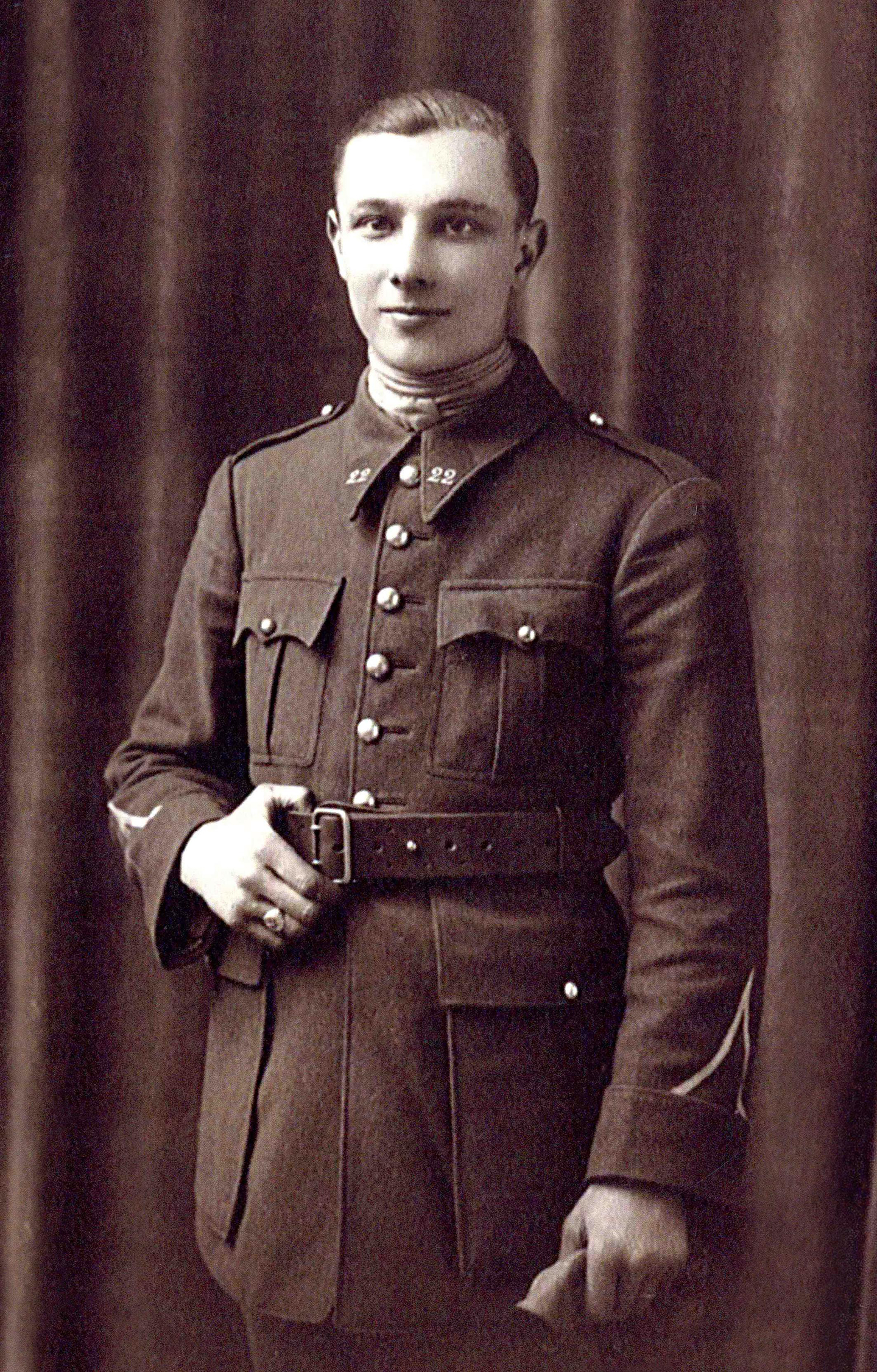
Marcel
LLT: As a researcher myself, I am very curious about your documentation process. How did you remember what you worked on each day? Enough to write about it, I mean.
CP: Another great question! When I started writing, one of the biggest tasks was to recreate the timeline of events: What did I learn when? When did I establish contact with specific individuals? When did I read a specific book or article? When did I send each letter to the translator? It took more than a month to piece together emails, phone records, letters, delivery slips, receipts, photos, etc. to recreate a detailed timeline. That timeline was then used to frame the story.
LLT: And how was the writing like? Was it done after the typeface was ready?
CP: There was a bit of an overlap. It took a year to secure legal permissions to be able to print the contents of Marcel’s letters. During that year I finalized the typeface. The typeface launched in February of 2014. By then I had the permissions I needed, so after the launch, I transferred my time and energy to the book.
One thing that made the project easier, perhaps, is that by the time I started writing I had already “lived” it. So, my focus was on the thoughtful retelling of events.
When it came to the structure of the book, I knew I wanted it to begin with the translation of the first letter, and I knew how the story ended, so it was more a decision of how to structure all the things that happened in between.
LLT: I’m sure this was a huge journey for you, and for everyone around you. I love this process that combines practice with phrasing it, and the detective work you have done.
I want us to end with a challenge for you! Since Alphabettes is a place for type, I think it will be funny to try and tell us what the book is about, again. But this time- without using ‘typeface’, ‘font’, ‘type’, ‘letters’ ‘typography’, ‘writing’ or any other words from our world.
Good luck!
CP: Yikes. OK… I’m up for a challenge. The book is a story of love and longing, and of taking the opportunity to tell someone how important they are to you. It’s the story of doggedly pursuing creative curiosity, and being open to unexpected discoveries.
LLT: With this great ending, there is not much more to say besides thank you, Carolyn!
You can purchase the book here or check out Carolyn’s website
If you love letters in all forms, this is the book for you.
CP: Thank you, Liron! It was a delight chatting with you!