Exploring the first multi-style Hebrew typeface family
Lost
Hebrew was the language of the Israelite and Judean people for over 1,300 years when around 200 BCE, it died as an everyday language and was confined to religious use.1 This affected the Hebrew script heavily, since it only developed those attributes that were necessary to present specific religious texts. Therefore, Hebrew is lacking the typographic tools that would have evolved and developed from an ongoing secular use. Moreover, the Hebrew script was considered sacred. The scribes that were permitted to write manuscripts were concerned with preserving the letterform appearance, even at the expense of the ease and speed in which they could be read.2
Hebrew was reintroduced as a spoken language in the 1880s. Since then, it experienced an accelerated process of revival. The shift from the written form to movable type was a hastened and interrupted one and did not allow for refinement and distillation of the letterforms.
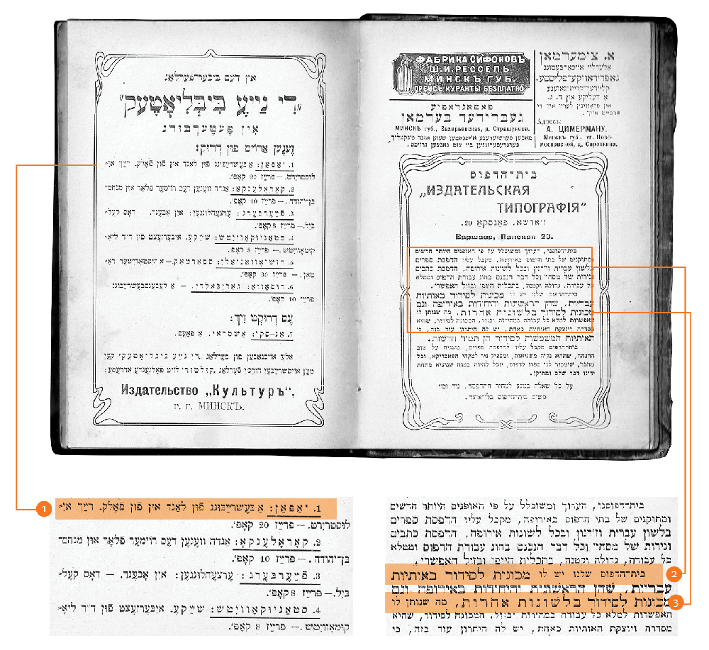
Setting type in the Hebrew script was and still is a frustrating experience. Not only there is a shortage in typefaces which sufficiently address specific Hebrew script issues, but the few that are available mostly consist of a single regular style, accompanied by a small number of weight variations. So, what is a Hebrew typesetter to do when trying to create differentiation within a text? I remember how pleased I was when I found a book published in 1905 in Minsk. In it I spotted one spread that seemed tailor-made to answer my question. The typesetter used different typefaces, different sizes, increased letter spacing and underlining. These were amongst the popular typographic solutions throughout the 20th century.

A spread from the book printed in 1905 in Minsk showing the various ways to handle word differentiation and emphasis without a typeface family: 1. Underlining a word. 2. A different typeface, in a different size. 3. Increased letter spacing.
As I carefully flipped through this old book, my thoughts took a less encouraging turn: is it possible that nothing has significantly changed in Hebrew type for over a century? Should it have changed considering the technological advancements surrounding us? Or perhaps in light of the history and the cultural contexts a change shouldn’t be expected at all?
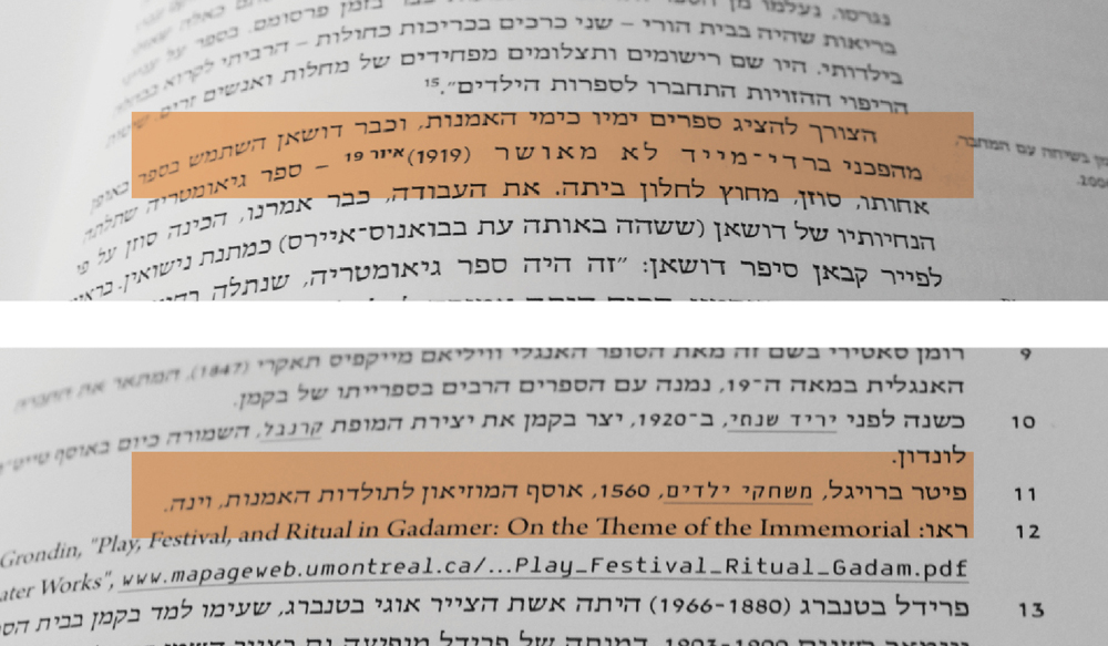
Exploring contemporary Hebrew publications shows Hebrew typographers today use the same type-acrobatics that were used long ago in an attempt to make hierarchies clearer to their readers. Without the existence of comprehensive type families, one uses the available types and combines them, be it metal or digital.

Examples from contemporary Hebrew publications, using a similar approach to word differentiation and emphasis as the book from 1905 (Tel aviv museum of art, 2008, 2011).
Found
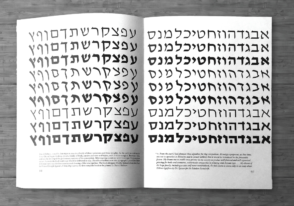
It was during my MATD year in The University of Reading when I first saw this image. It was mind-blowing. I was rubbing my eyes and pinching my arms. I double checked and the caption defiantly said: “David Hebrew … a family of three variations and three weights.” And so my research began.
 The original ink drawing of the David Hebrew typeface family ca. 1953 as printed in the book “The work of Ismar David” (Brandshaft, 2005. p66–67).
The David Hebrew typeface family was designed by the prolific calligrapher, artist, designer, architect and educator Ismar David. In 1932, David emigrated to Palestine from Germany.
With his knowledge of, and familiarity with, the richness of the Latin type, he conceived
the first Hebrew typeface family. The design process spread over two decades, during which Ismar David researched the origin of the Hebrew script and experimented in search of innovative letterforms.3
David carefully negotiated the tension between the old and the new, and created an accurate, well balanced typographic solution. He did so without forcing the features and characteristics
of the Latin script onto the Hebrew, but by applying a well informed design approach. Despite the limitations of the Hebrew script and the destitute conditions in Jerusalem, David completed his typeface family. It was partially cast for machine composition by the Intertype Corporation in 1954. Around that time, David relocated to New York where he pursued his creative career. (For more information and a visual analysis of the David Hebrew family, the dissertation is available for download on TypeCulture)

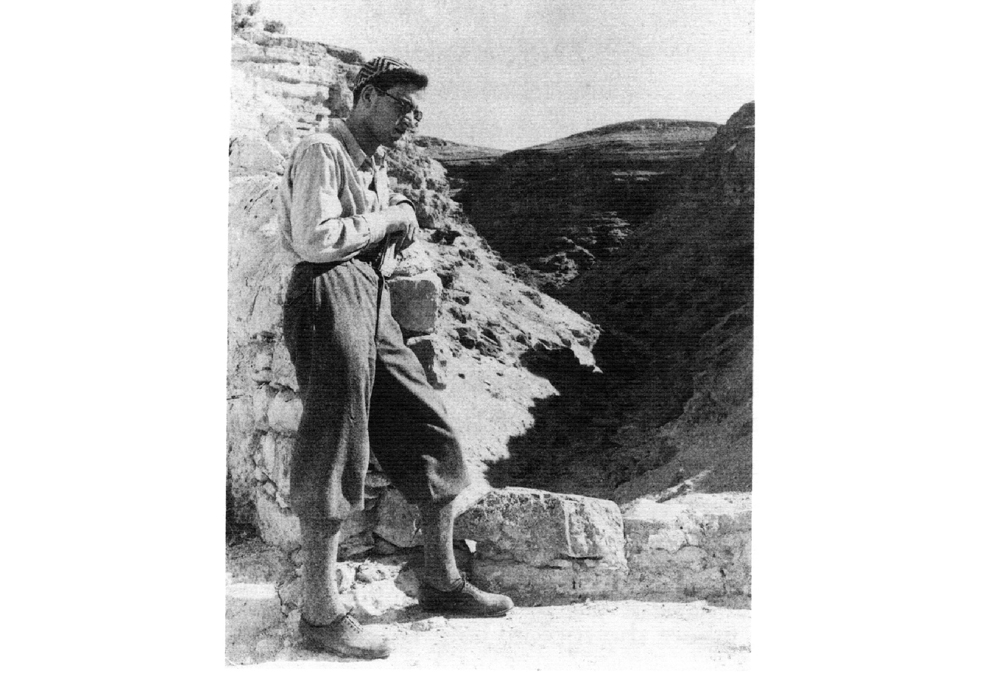
Ismar David in Palestine, ca. 1935. From the book “The work of Ismar David” (Brandshaft, 2005. p20).
Lost again
The regular style of David Hebrew
Meanwhile in Israel, the regular style and its weights gained great popularity, offering both high technical performance and relevant atmospheric values. In those days Israel was still in its early stages as a state and David Hebrew answered the demand for new Hebrew typefaces needed to support the increasing production of Hebrew documents. Unfortunately, over the years through phototypesetting and the development of digital type, the innovative features dissipated. The original outlines were distorted and deformed by various versions of the typeface and the popularity of the regular style slowly declined.
The italic style of David Hebrew
The italic style was rejected by the local typesetters soon after its release in 1954. Instead they demanded additional sizes and weights of the regular style.4 Typesetters preferred weight emphasis to stylistic differentiation and the use of the italic as a secondary style never became conventional in Hebrew typography.

Example from a contemporary Hebrew publication using a different typeface in a heavier weight to differentiate a name within the text (Israel museum, 2015).
The monolinear style of David Hebrew
The monolinear version was not produced along with its family members in 1954, the reason for it is unclear. Later in 1980, the typeface was issued in Israel by Transfertech which produced dry rub-down transfer sheets. It seems that this technique of production and the fact that the sheets were used to set text in large sizes only, allowed David to add new members to the family: styles for headlines. The new regular and the italic styles were published under the name David and David Italic, each in three weights. However, the headline monolinear style was rejected by Transfertech. According to them, this monolinear version was too “strange and unusual”, no one would be interested to buy it and use it.5
Afterthought
In 2012, the Monotype foundry released the David Hadash typeface family through an exclusive license with Ismar David’s estate. Helen Brandshaft, who had worked with Ismar David for many years, restored and redrew the typeface family with great acuity and accuracy. Now, the entire typeface family is available for digital typesetting, and for the first time, it includes the more calligraphic version of the monolinear style.
Although the regular style is recently regaining some of its popularity, (particularly amongst typography students in Israel), it is still rare to find the comprehensive type family in use. This raises many questions for Hebrew type designers, none with definitive answers. Should we aim for more use of secondary styles, similar to the Latin type setting? Should we accept the conventions as they are and try to innovate within their boundaries? Is it even possible to innovate when there seems to be no market for it? (For more on this “Vicious Cycle” watch Liron Lavi Turkenich’s talk from TYPO Labs 2017)
Throughout my research I keep being inspired by Ismar David’s design. While learning from his work process I find his achievements a unique case study that proves it is possible to innovate and improve the experience of reading Hebrew texts.
Considering David succeeded in doing so in times of social and political turmoil, with scarce resources and technology that is now perceived ancient, shouldn’t we (at least try to) do
likewise today?

A rare contemporary example of using the regular style for the main text, the cursive style for word differentiation and the bold weight for headlines (Fachhochschule Köln, 2001).
 The Hebrew original ink drawing of the letter Alef, in regular, italic and monolinear the styles (Brandshaft, 2005. p66–67).
References
1 Fellman, Jack: (1973) Contributions to the sociology of language [csl]: the revival of classical tongue: Eliezer Ben Yehuda and the modern Hebrew language. De Gruyter Mouton, The Hague. P. 11
2 Tamari, Ittai: (1991) Decipherability, legibility and readability of modern Hebrew typefaces.
Morris, Robert A., André, Jacques (ed): Raster imaging and digital typography II. Cambridge University Press. P. 134
3 Brandshaft, Helen, Pankow, David (ed): (2005) The work of Ismar David. RIT Cary Graphic Arts press, New York
4 RIT Cary Graphic Arts Collection. The archive of Ismar David 1.6.pdf. p4. A letter from A. Cogan, the representative of the Intertype Corporation in Israel, reporting the very little use of the italic style and asking for more weights and sizes of the regular style
5 From a conversation with Sam Bleier, owner and CEO at Technomark Ltd. (Transfertech)
Thank you for posting this summary of your research. I wonder if you have thoughts on the political and cultural context of the David types? One of the things that strikes me about them is that they are the first specifically Israeli types, as distinct from various European diaspora and gentile types, and also the some of the first Hebrew types that exist independently of religious publishing. I wonder if is part of the key to their rapid popularity in the early years of Israel? [One of my favourite novels is Linda Grant’s _When I lived in modern times_, which awoke me to the modernist aspect of Zionism in that period.]
Thanks for your comment John, you raise a fascinating point! I would say that part of what led to the popularity of the David typeface was the fact that it represented the spirit of a new generation building its new homeland. It was designed at a time when immigrants were trying to shake off their old image and were writing a contemporary narrative for themselves as more secular people. They sought to portray that image in every aspect of their lives, including in the design of typefaces. The other part that contributed to the popularity was the growing production of printed secular matter in the Hebrew Language at that time, and the fact that the available Hebrew typefaces were still extremely limited and did not cater to the needs of typographers.