
I do promise there is more than one influential Hebrew type designer, but after a long research process, my mind is filled with stories that were covered in boxes until now.
I am referring to Henri Friedlaender. Last time, I wrote about his design process, and today I wanted to share two typefaces that were simultaneously designed by him for the Bank of Israel in the 70’s: One serif style to be used for banknotes and one (semi-) sans, for coins. Those two were supposed to act as a family, and indeed, Friedlaender based them both on similar skeletal forms.
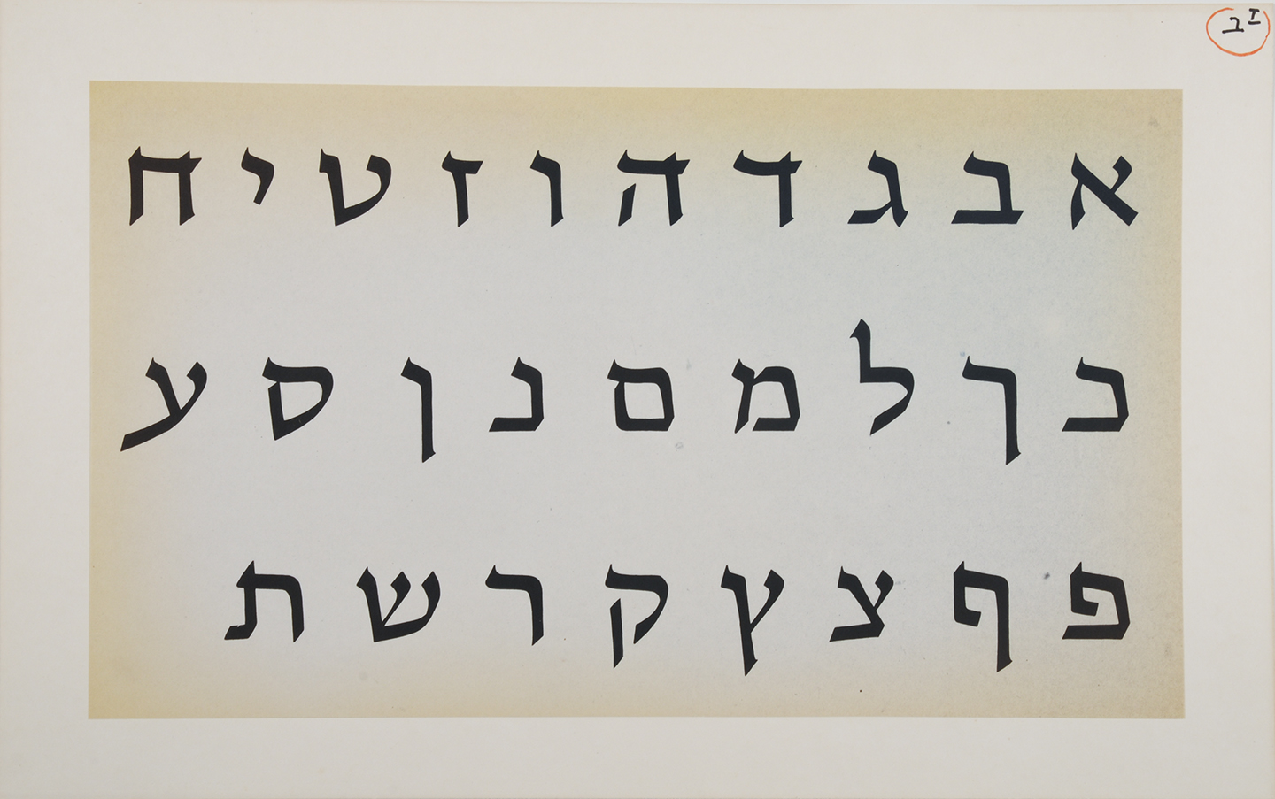
the banknotes typeface
He defined the one for banknotes as a calligraphically inspired, “curly and complicated” and the one for the coins as simpler. For the calligraphic style, Friedlaender used the Spharadi hand. The typeface for the coins had gone through several variations, from prominent to barely noticeable “serifs” (in Hebrew- Tagim) before settling on the final letterforms. Despite being almost monolinear, this typeface has subtle modulation in the joints, and so much rhythm.
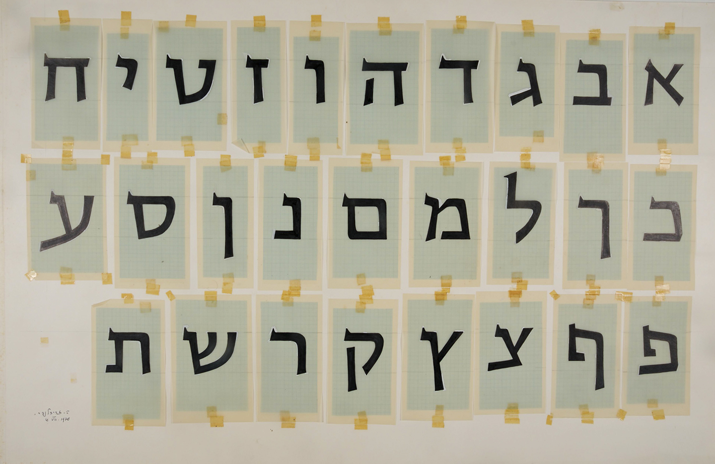
one of the first sketches, the coin typeface still with “serifs”
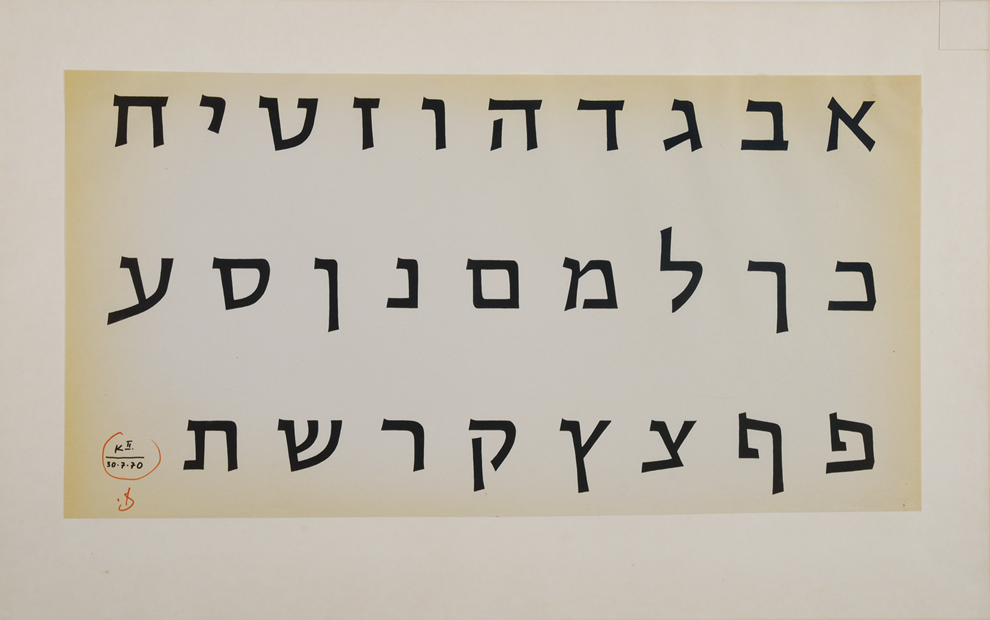
the coin typeface, in its (probably) finished version
The unfortunate end of those designs is that they were not really used anywhere, at least not in the form that Friedlaender designed. I found no evidence of use of the style for the notes, and the style for the coins which was used on a Commemorative Coin (issued for a special event but not in the regular circulation) was so distorted that it’s perhaps better to say that it was not used either. Friedlaender himself felt that though the letters maintained their basic structure, all the nuances were gone along with their beauty.
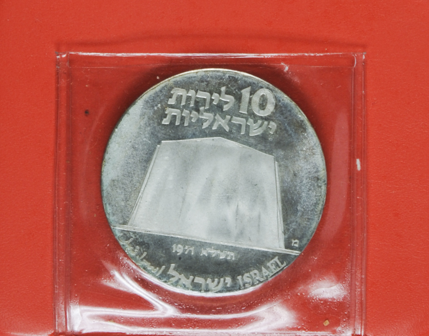
the unfortunate outcome on a coin
I will not go into analysing and describing those typefaces (I have done it already in the Hebrew version of this book), but will conclude with a thought that is relevant to us type designers.
The work was done, Friedlaender was paid and gave up the rights for the two typefaces. Does he (and by he I mean We) have any control on what will be the outcome (especially when the product is physical)? Does his right to comment ended once he submitted the typeface? And what happens if he feels that his original typeface was being abused?
With those questions I end, but will leave comments open so we can share thoughts on this complicated matter.
This post may not be money related par excellence, but rather uses it as a starting point. It is a part of the My 2¢ series. See the other posts here.
(photographs in the post by Eli Posner, the Israel Museum)
Thanks Liron for this article and the raised question. I fear that the type designer has very little control over the execution of a physical product. Usually many limitations of the tool apply. Ideally though, in a custom project, such limitations are taken into consideration during the design process if at all possible. I can only assume that minting has many constraints. I think that the commemorative coin you are showing is badly designed and executed in general, what is that gigantic flat tomb? Friedlaender would have done well to distance himself from it anyway.