
Set by Sharon Chu
The fall semester started that week. Someone mentioned in passing that there’s a lot of rain on the way as a hurricane was building. I call Houston my home since 17 years and have lived through a couple of stormy situations, so, my thoughts were focused on projects just handed out to my senior graphic design students, more than on whether rain would cause us any harm.
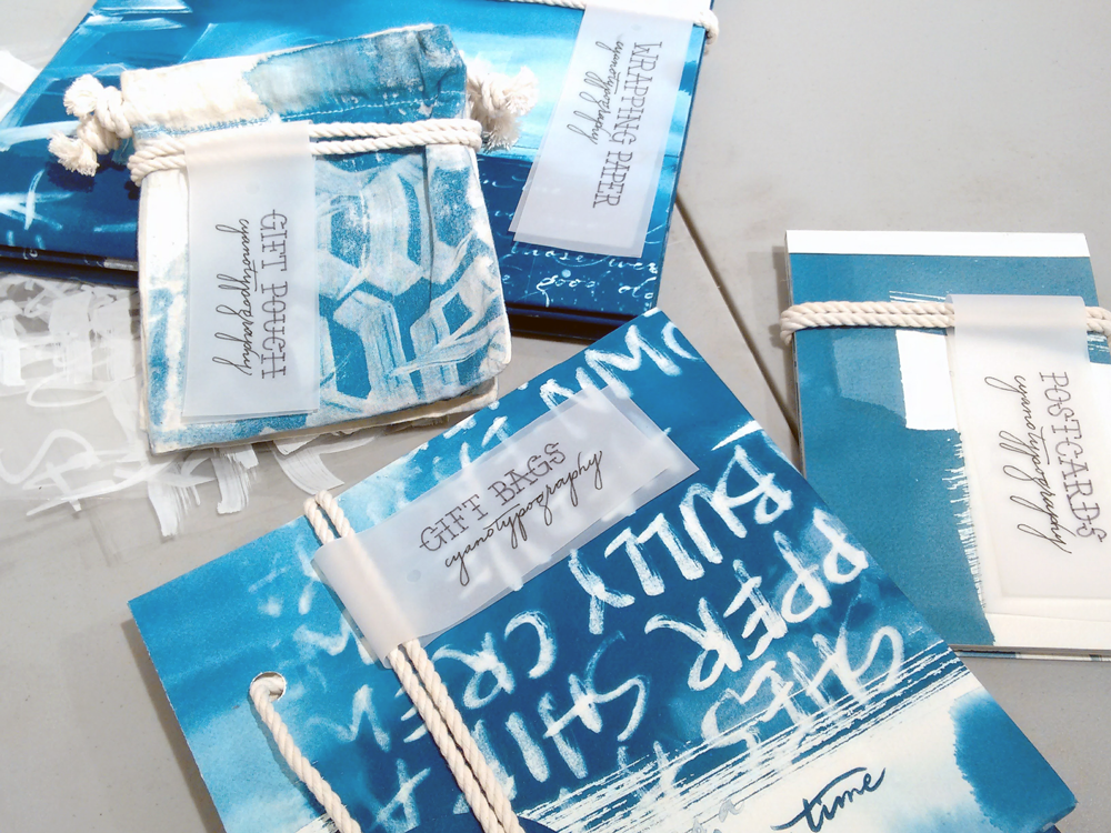
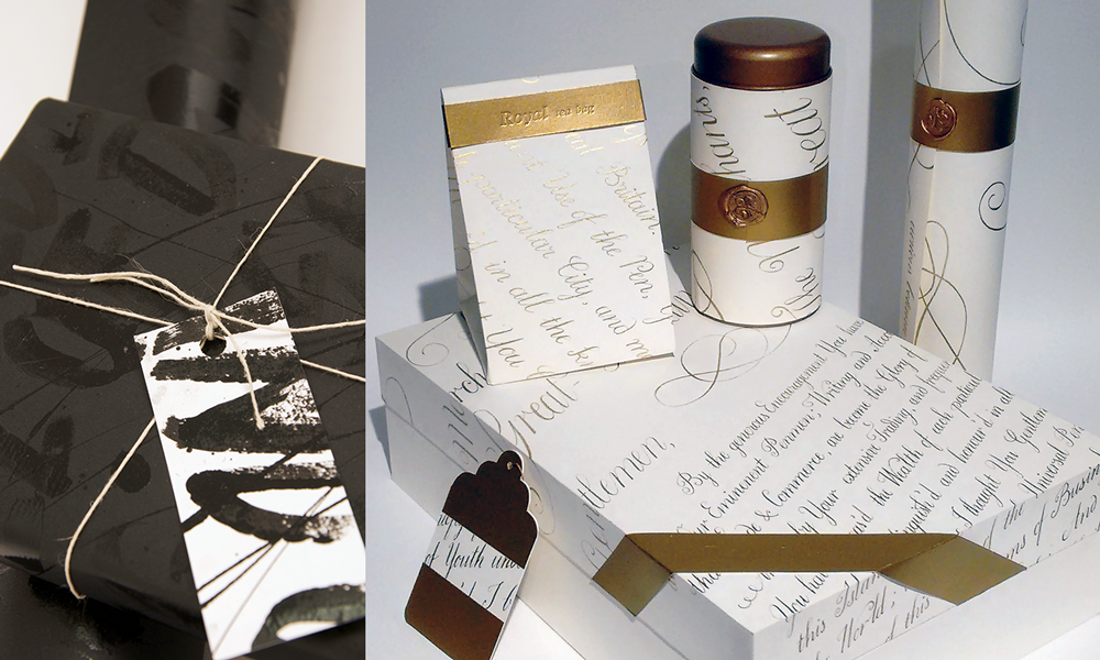
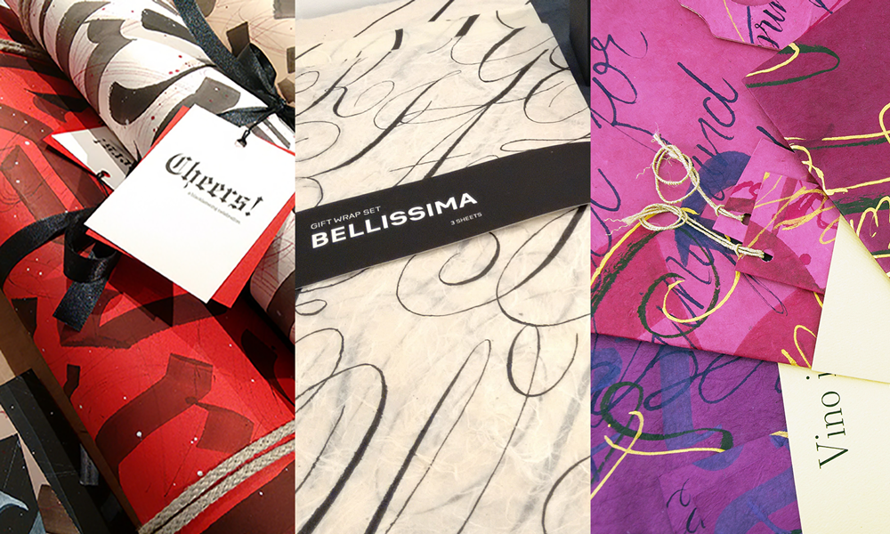
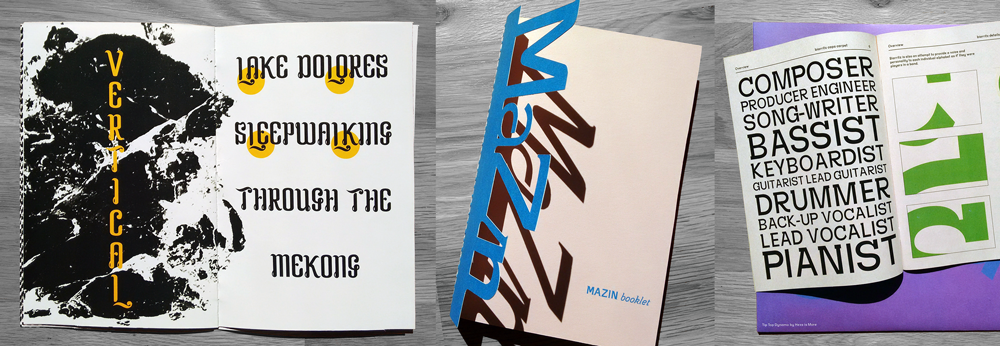
We started out with an assignment titled The Sound of Letters is the Face of Letters. The premise was to exercise the writing of the Humanist historical script, then move into experimenting with contemporary scripts and lettering, while developing a concept for unique wrapping paper, cards, bags, etc., themed for a special purpose with the intention to coax the students into producing large scale calligraphy and lettering. Getting on with the first part, the students got up close with letter construction, anatomical proportions, and stress while exercising writing with a broad nib pen. We made it through two studio classes when Harvey stalled over the city.
Sets by Erick Velazquez and Nadia Tran
It was Sunday daybreak when I got out of bed stepping on wet floor. That’s when I learned that water isn’t knocking on the front door before entering; instead it seeps in through walls and collects slowly raising. Things came to a halt. Boats went by on my street and non-stop helicopter rescue operations were unfolding overhead.
Yet, after a week off, classes resumed with students and faculty struck by various degrees of trauma. The seniors presented their sketches and in the not quite normalcy of the situation, we almost too easily forgot that our lives became burdened with the aftermath of a disaster.
As time went on the seniors refined their conceptual ideas for their calligraphy and lettering applications, as they defined fictitious uses for their one-of-a-kind created sets. They explored and experimented unencumbered formal writing with tools of their choice. They worked large and frenetic, and much enjoyed themselves as the process also provided some therapeutic benefit. I was in awe of their efforts and project engagement.
Wrapping paper sets by Julio Aguirre, Lucia Delgado and Alwyn Brownewell
The weeks after the storm were characterized by mountains of debris stacked in front of every affected and gutted home. It was utterly devastating. Streets became deserted and eerily empty as people left behind their homes uninhabited. Friends nearby, who were the only ones left non-inundated on their street, became concerned about break-ins. The distinct mismatch between ghostly neighborhoods with homes folded inside out, contrasted by Texas’ blue sky, resulted in backdrops difficult to align in these particular circumstances.
As the semester progressed, I handed out project two, Digital Type for Analog Sound. The proposition was to design an LP album cover for a personal favorite music artist. As for the album’s typography, the students were tasked to create their own typeface consisting of the minimal amount of alphabetic glyphs, punctuation and numbers, predominantly used on the album to identify the record through the application of type and image. Each student presented their choice of music artist and shared a sound bite with the class. Typefaces are charged with characteristic connotation and the students were to investigate in ways of expressing a specific sentiment by presenting comparable mood boards, consisting of visual material that went along with the expression of the music’s genre and emotional associations. The students were encouraged to use these visual pointers to loop back to type, considering letters’ defining form, anatomical features such as serifs, contrast and terminals.
Trucks circling back and forth, loaded to the brim with debris became a normalcy with people wondering when their front yard will be next in line to be cleaned off. The truckers came from far and raced each other to secure job sites; still it took some time and piled-up mountains of furniture and household items contaminated by the floodwaters nevertheless created some pick-up tourism. Plastic bags deposited at curbs were torn to get at some more discarded things. Kids’ stuffed toy collections ended up spilled and scattered over front lawns and driveways. The intimacy of personal belongings was suddenly exhibited and laid bare in public. I kept wondering, where is all this stuff going?
It came time when the seniors were taken on a trip to visit NYC chaperoned by two faculty colleagues. They had a great time and also stopped by at TDC to see the exhibition of work of the 2017 class of the Type@Cooper Extended Program. They came back inspired and a little exhausted. The album project moved along as we spent time critiquing the fine art of combining freshly designed type and image.
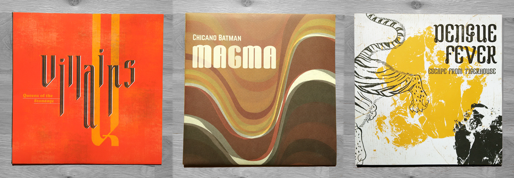
LP album covers by Julio Aguirre, Lucia Delgado and Miguel Guerrero
By now realtor signs have shot up like mushrooms in neighboring lots. The home remodeling business is booming and so is housing development. Houston is built on a swamp, and as the amount of land water can seep in is being diminished, it has nowhere to go. With climate change advancing we can expect more flooding, bigger storms, and more disasters to strike.
Specimen booklets by Miguel Guerrero, Linh Hoang and Bruce Chao
My students finished the semester with participating in the 45 Symbols project. In line with system thinking of this fall’s semester, they developed 45 symbols responding to different topics, categorized under #resist, #imagine, and #connect; all keywords that were very much on my mind throughout the last couple of months.