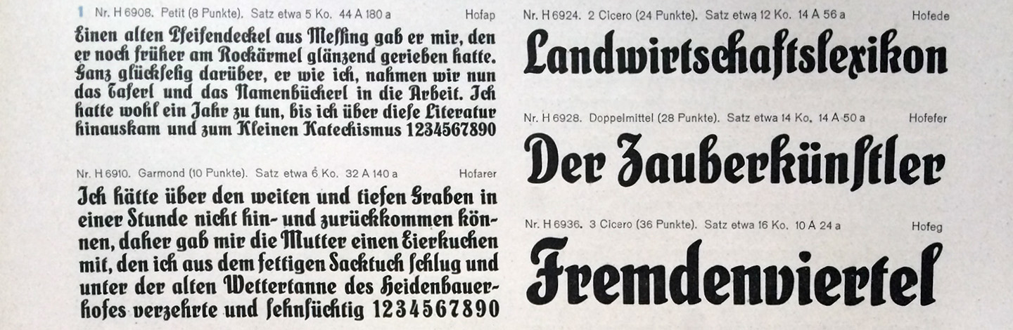
If you judge its look by the sound of its name, Schmalfette Sensation would be the Humpback anglerfish of typefaces. This name makes images of freakishly deformed bizarre caricatures of letters pop up in your head, even if you are used to the crudeness of spoken German.
But once you get past the brutal naming you will discover a true antiheroine. Admittedly this bold condensed typeface is not the most delicate of all designs but the good people of the Schriftgießerei Heinrich Hoffmeister succeeded in keeping it in line with the rest of the family: Schmalfette Sensation is unpredictable, informal, and perhaps even more tongue-in-cheek than its more graceful companions Sensation and Fette Sensation.
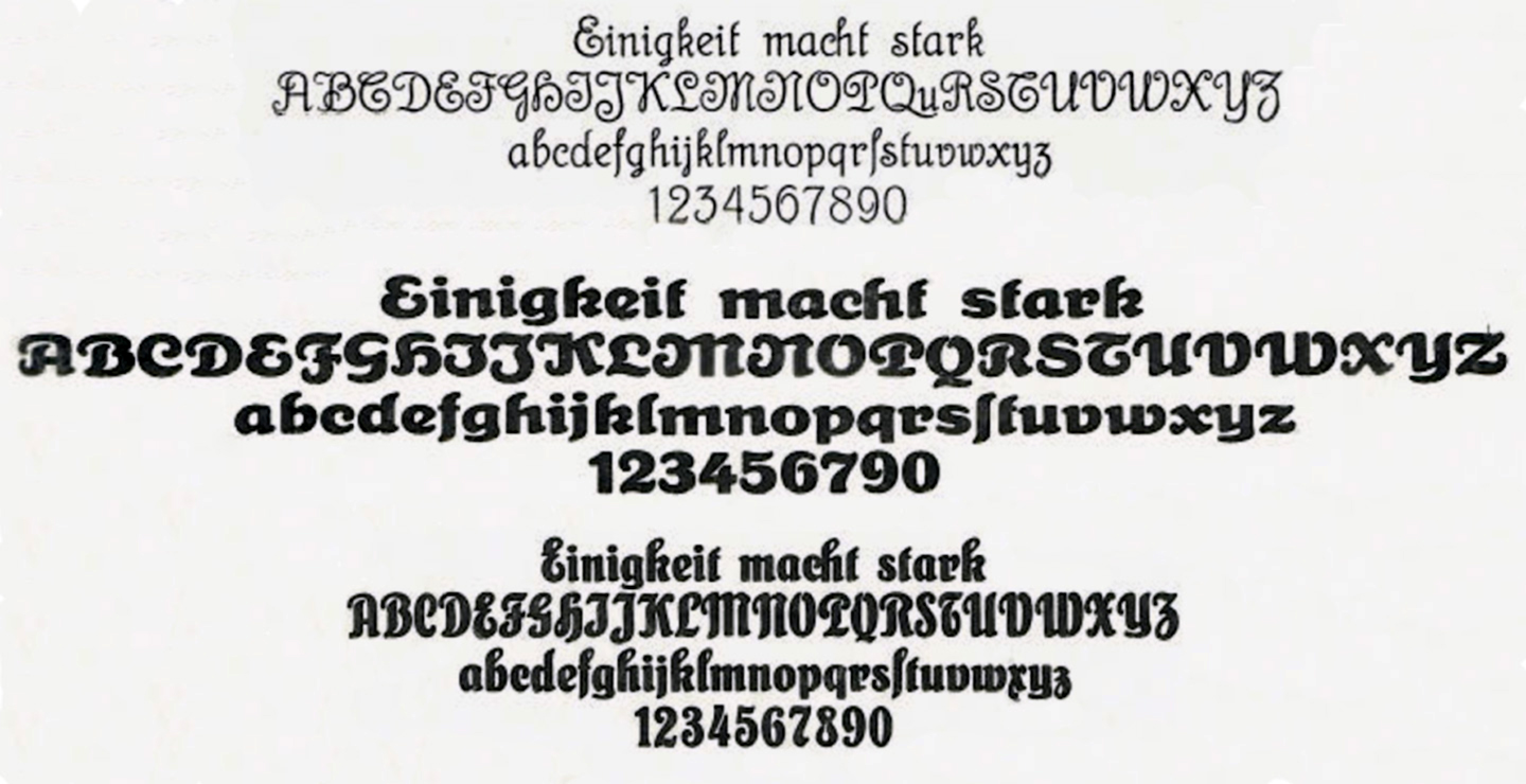
Somehow it manages to connect blackletter-like sturdiness with frivolity. Its flamboyant caps and outrageous alternates oppose a sober, dark rhythm. You catch yourself staring at it every now and then from the corner of your eye, waiting for one of the two personalities to break through.
There’s something to these letterforms that just keeps reminding you of that impulsive, easy-going, slightly bonkers childhood friend of yours who was game for anything.