At the end of June, I was lucky to attend the new Centre for Printing History and Culture (CPHC) conference ‘Script, print, and letterforms in global contexts: the visual and the material’. Organised at the Birmingham City University in the UK by the talented Sahar Afshar, Vaibhav Singh, and Darryl Lim, the conference set out to explore the ‘plurality of engagements with, and interpretations of the printed and written word in various writing systems and artefacts’.
Maybe it was the anticipation of attending a conference’s first edition, or the large range of fascinating topics on the conference schedule. Or perhaps it was the idea of visiting the ‘Brummies’ in Birmingham, with its beautiful industrial terracotta buildings. Whatever the origin, I was already excited about this conference long before it even started. And I can confirm that it totally lived up to my expectations.
It’s the smallest conference I’ve ever attended, and probably the most eclectic. With a crowd of roughly 50 attendees and speakers, its ambition was no less than that of a larger conference. Bringing together scholars and practitioners from various disciplines such as book history, printing, publishing, type design, typography, and print culture, the conference aimed to start conversations from different points of view on print ‘in the diverse linguistic contexts of the world’.
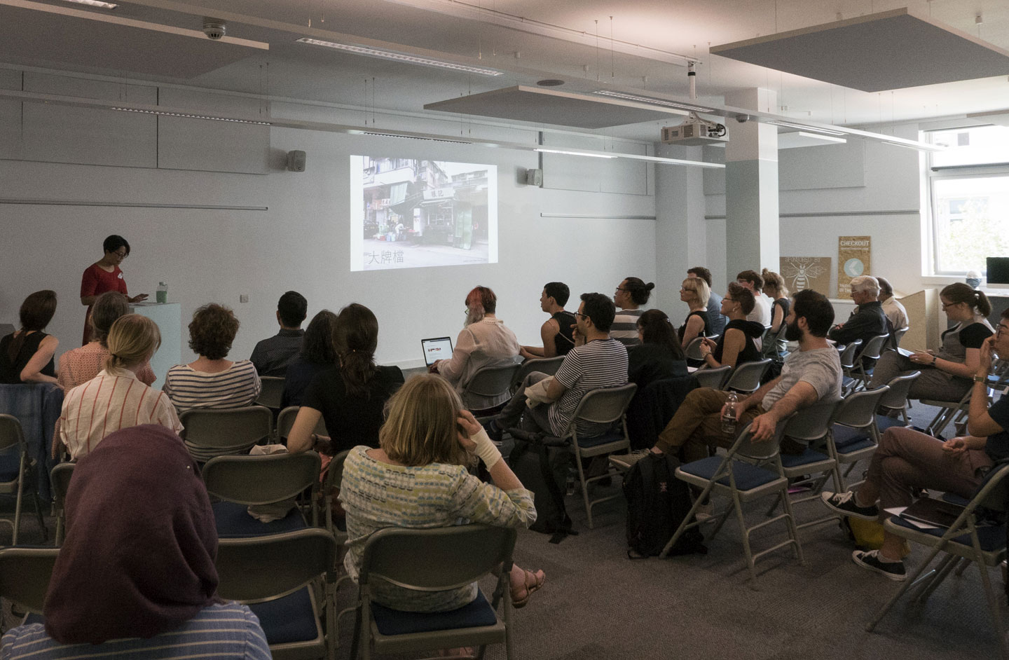
Script, print, and letterforms in global contexts: the visual and the material. Vivien Chan takes the stage.
Spread over two days, the range of topics discussed was exhilarating. Thursday kicked off with one of the keynote speakers, Lucie Ryzova, with her flea-market discovery in Cairo: a box full with historical artefacts that previously belonged to a young man named Hosni in the 1940s. Ryzova used the collection of photos, letters and notebooks to reflect on the social landscapes of print and print history in colonial Egypt.
Jumping to another part of the world, Arina Stonescu presented Romania’s typography during the communist period 1948–1989, focussing on its influence on the education of typographers by analysing newspapers and type specimens. My fierce Dalton Maag colleague Naïma Ben Ayed brought us to North Africa to discuss the multi-script typography and calligraphic heritage of Maghrebi letterforms, as well as the unfortunate trilingual collisions between Arabic, Tifinagh, and Latin script. And before breaking for lunch, Gerry Leonidas provided food for thought with typeface design as a social enterprise and the primitive and technical restrictions (Western) document structures. He provided the example of font editors that still today seem to focus on Latin vertical metrics, rather than providing flexible (multi)script settings. Hear, hear!
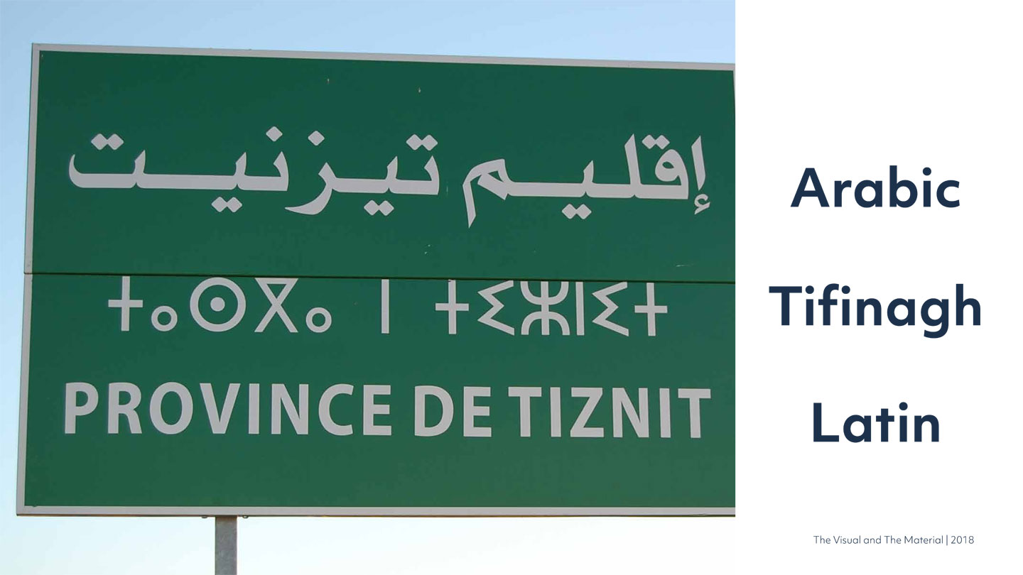
Naïma Ben Ayed, Maghreban specificities, past and present: a closer look at typography and calligraphic heritage in the Maghreb.
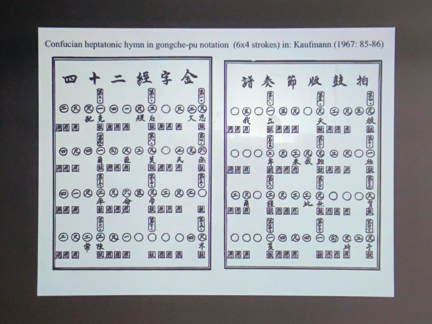
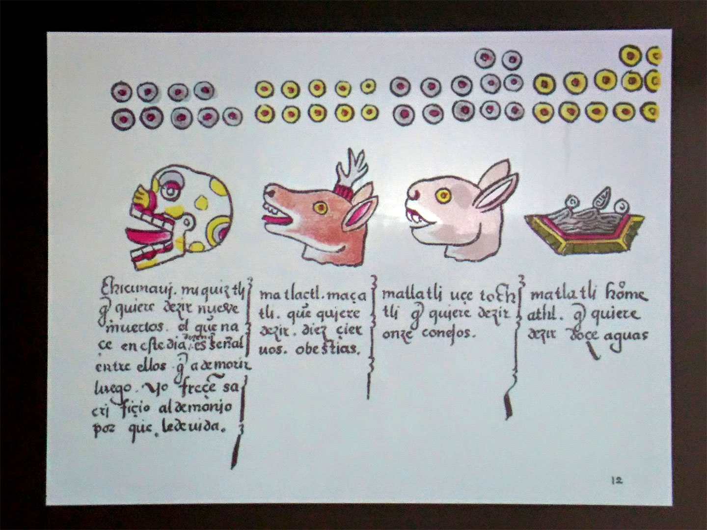
Towards the end of the first day we travelled with Tobias Klein through the world of elaborate Chinese musical letter notation systems, accompanied by some beautiful complex methods such as the Gong Chi Pu. Jesús Barrientos presented Mexican flavour (literally guacamole and tortilla chips!) and the renaissance letters of Mesoamerica scribes in the 16th century, after which the second keynote speaker Graham Shaw spoke about the brief yet powerful Japanese involvement in the Indian freedom movement. One way of distribution were leaflet ‘bombs’! Who would have thought bombs could also serve a different purpose?
Friday I woke up in India and got submerged in its printing history and the connection between technology, social change and politics with keynote speaker Robin Jeffrey. I then found myself having lunch at a traditional Hong Kong ‘Dai pai dong’ food stall with Vivien Chan as we were introduced to their typical shop layout and the endangerment of these stalls due to the reorganisation of the city.
As an energiser, there was the lightning aperitivo investigating woodblock reproductions in France with Svenja Miche, followed by a delicious Turkish dinner of changing scripts in the late Ottoman Empire hosted by Juliette Cezzar, then a shared dessert with Dr. Fiona Ross and her reflections on typographic history and textual representation in South Asia.
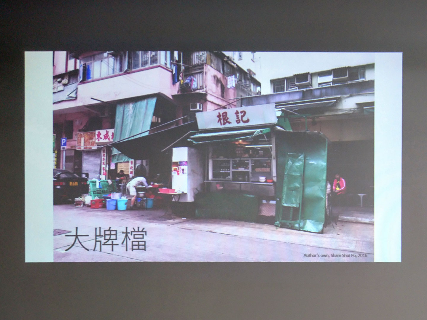
Vivien Chan, Colour and lights: the politics of traditional Chinese script in Hong Kong’s urban landscape.
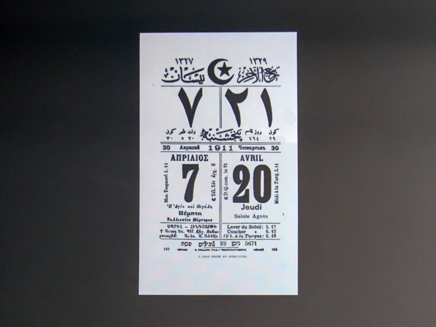
Juliette Cezzar, Movable type, multiple scripts, changing alphabets: design, technology and literacy in the late Ottoman Empire.
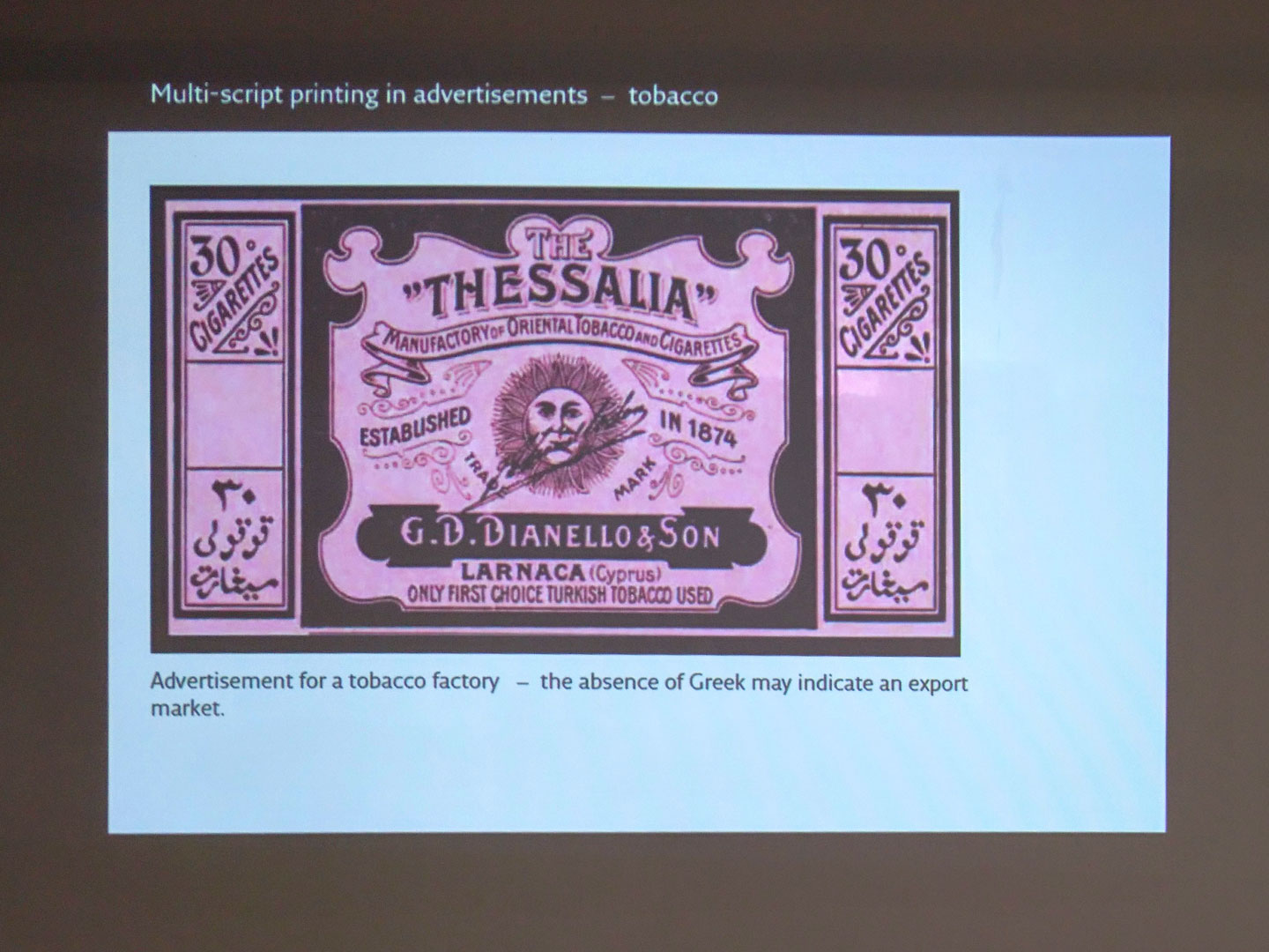
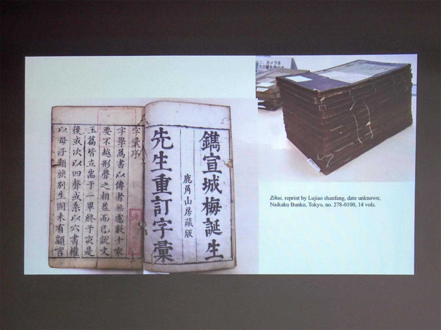
One of my personal favourites of Friday was the talk by Niki Sioki on multiscript printing in the late 19th and early 20th century in Cyprus. Focussing on the period of the British arrival and Turkish script reform in 1928, Sioki showed multi-script advertisements with Latin, Greek, and Arabic letterforms that were charming and triggered my interest. Another fantastic talk was by Zhenzhen Lu who presented the Zihui, a Chinese dictionary, printed in 1615 and divided in 14 volumes. It is considered groundbreaking, user-friendly, and innovative for its ordering system by radicals and stroke-order.
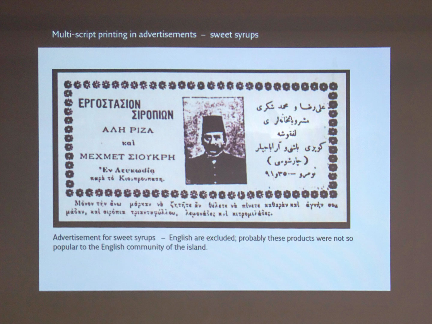
Niki Sioki, Neighbours on paper: multilingual documents and multi-script printing in late 19th and early 20th century Cyprus.
Final keynote speaker Ulrike Stark gave her reflection on missionary printing in 19th century rural India. To avoid the missionary tracts ending up as kites (which also sounds like fun!) and to ensure the books were read, Stark shares with us the solution: not to look like a Christian book. The missionaries provided pocket sizes and enhanced their design with decorated borders, illustrations, and lively colours. Perhaps this is where my natural attraction for small books comes from? Turns out it’s all a conspiracy!
The ‘Script, print and letterforms’ conference also included so-called ‘lightning talks’: 10-minute presentations to spark interest, after which the topics could be discussed further during breaks or after-hours mingling. This is such a welcoming variation from the longer talks, as it keeps the attention span fresh and functioning for attendees.
Since this is an Alphabettes post, I want to shine a light on gender equality during the event. There was a substantial presence of female speakers at the conference (out of the 21 talks, 14 were held by women), which I’ve never experienced before. It was shocking to realise this as it was so obviously different compared to the usual male-speaker dominance at type conferences, and it was truly inspiring to see so many interesting and smart ladies taking the stage. For this I want to give a big bravo to the organisation for using an unbiased ‘blind’ selection method (removing all bio information) and only reviewing the submitted abstracts. The full list of speakers and talks can be found here.
All in all, it was a real pleasure to discover the many linguistic wonders of the world. The conference left me feeling super inspired, and hopefully there are many more editions to come! I’m already looking forward to it.
Postscript
For next year’s edition: I highly recommend adding a day to explore Birmingham’s coolest neighbourhoods. Browse the creative district Digbeth for hidden type gems (if you’re lucky, with a Type Walk organised by Geraldine Marshall!), and the Jewellery Quarter for a visit to the Pen museum, which unravels Birmingham’s role in the history of writing and the pen.

