
Fourth interview, wow! It is now starting to feel like a series, and with each one it is becoming more wonderful to read about these inspiring ladies. Although I am not the one choosing the interviewees (except for the first time), I am loving the choices that go around the globe and around different typography-based occupations.
This time, Mariko chose Shelley Gruendler. I was waiting for this to happen and I knew it would at some point — I have been wanting to ask Shelley many questions for a long time. So here we are, approaching the end of 2015 and this seems like the perfect time to grab your guilty pleasure, may it be a sweetened drink or a heavy slice of cake and enjoy Shelley’s thoughts, being written so openly:
The warmup
Write three sentences about you
– I am a typographic educator who is as happy watching a cat video as I am discussing typographic theory.
– I have an MA and PhD in Typography from the University of Reading, but I’ll only make you call me ‘Dr’ if you’re pissing me off.
– All I ever wanted to do, and confidently knew that I would, was to teach and to travel; what I taught and where I travelled was secondary, as long as I could do both throughout my life, I knew I’d be satisfied, and I am.
What is your soundtrack while working?
I simply cannot listen to music while designing or writing. No, not even ambient music. I find it entirely distracting. However, I must admit that a friend of mine gave me a Japanese CD of crickets chirping at night that I totally love and use to relax after long Type Camp days. The sounds transport me to the steamy summer nights from my youth in the American South, whether in my neighbourhood or on a Girl Scout camping trip. I remember them creating a wall of sound in the darkness that to me was always soothing, not terrifying.
Name three locations: a current location, a location you love, and a fantasy location
The beaches around Beaufort, North Carolina. It’s an area protected from the ocean by barrier islands, so the beaches are pristine and the estuaries are endless. I connect to the land, water, and air and am perhaps more myself there than anywhere else in the world. It is unbearably hot in the summer, but always breezy, with plenty of southern fried food to keep you going.
The house I grew up in. It was a creaky 2-story house, built in the 1950s and painted yellow, and I still have dreams, mostly happy ones, that take place in it.
Chennai, India. I had travelled the world in my 20s, but still wasn’t prepared for the wonder that was India when I first visited there in 2004. Thanks to the brilliant Dr Rathna Ramanathan, it changed how I saw culture and context, community and design. It remains my happy place, although that could be due to the coconuts?
A favourite typographic application and the least favourite?
I absolutely love designing resumes and often volunteer to do them for my friends. I know that sounds utterly nuts, but it’s true. They are quite fiddly, hierarchy is crucial, and the visual language and tone can make or break the reader’s perception of the subject. The information is rarely consistent so you’re always examining and analyzing and hammering it into a consistent text. Perhaps it’s the fact that they are challenging that attracts me? That one never finishes with them — the minute something new happens in your life, you have to reconsider your design. My CV is at a ridiculous 9 pages. If I even sneeze next week, it’s going to have to go up to 10.
Now that I think about it, it isn’t so strange after all. I was introduced to typography in my High School Commercial Art class but I truly became a typographer, not during my Graphic Design undergraduate experience, but afterwards, when I was a full-time book designer for a well-known academic Press. We often joked that nobody other than the author’s mother and a random scholar or two would ever see our designs, but the editorial staff was strong and I still encounter some of my designs 20 years later. I learned how to manage complex structures such as multiple levels of headings, footnotes, extracts, drop caps, and part openers. At the time, I thought I was a better cover designer, but deep down, I think I always wanted to do the interiors.
As for least favourite thing to design, it’s less what it is, but what it includes. I used to adore working with color, especially with my book covers. Now, it’s just not as interesting to me. Color and photographs and those other things that were so much of a pull for me before, are now just superfluous. I see typography and typographic structure as the most important element in designs with text. If the typography doesn’t work in simple black and white, then color and photos are irrelevant. Advancing further in typography changed me from a colorful graphic designer to a black & white text-only woman.
A favourite part of teaching and the most challenging part?
My favourite part of teaching typography is, without a doubt, the second-to-last day of my college-level Typography 1 class. I adore teaching Type 1 as strong careers need strong foundations, and upper level students don’t necessarily need my teaching energy (and reassurance!) as much.
This particular class is when they all split into groups, armed with their own red pen, and help each other with their typographic layouts. They should know by then that it is about helping that person to strengthen their concept and not about inflicting the designer with their own opinions. What I love about this is that I reassure them that I’ll be there, ready to answer any questions, but I’ve never once been asked a question in this particular class. This is how it’s supposed to be. After this journey, with all of their inquiries and exploration, they don’t need me at the end because they know what to look for. My priority with both my college classes and Type Camps is to help them develop a typographic eye, their own typographic perception, so that they can make their own decisions and not depend on mine. It seems to have worked so far.
Most Challenging: I abhor grading! I didn’t list uninterested students here as I rarely encounter them. It’s my job to get them to notice, and then to care about, typography and I’m pretty good at doing it, too. The talented students aren’t as much of a concern as the average ones — if I can raise them up to above average or even excellent, then I know I’ve done my job.
What is something you did that you are proud of?
I am truly proud of helping others to become better designers and better people. My Vancouver students often called me their ‘life coach’ as so much of what I was doing was helping them as they were growing up into their true self and only along the side, becoming professionals in their career.
I still have relationships with many of the people that have attended Type Camp or my University and College classes over the years. I am truly impressed at the people that they have become. I’m not taking credit for who they are today, but I hope that my time with them might have contributed to their future in one way or another. It’s that whole pay-it-forward concept — I certainly did not get to where I am on my own! I am the result of many wonderful people contributing their time and efforts and imparting their information, both typographic and life-related. If I can pass that along, then my life will have been worth it.
I am also quite proud of my MA and PhD in Typography from the University of Reading, although both were a struggle to achieve. A PhD is a lonely and frustrating journey and, had I known this in advance, I might not have embarked on it. But now that it’s done, I’m glad I did for it pushed me in ways that I never thought possible and certainly exposed me to an entirely new world.
The visual
A photo of your favourite beverage, and something to eat with it
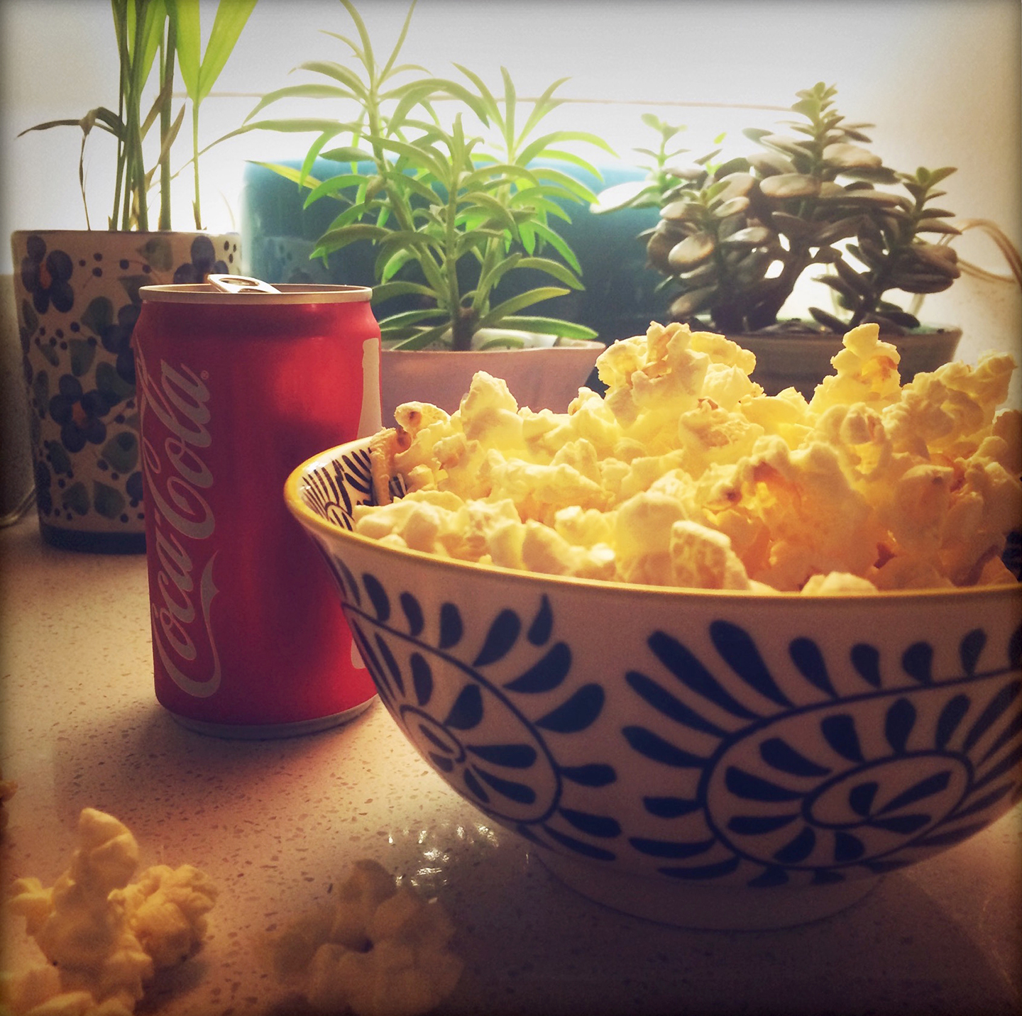
As a southern woman, of course Coca-cola is my favourite drink, and as a non-cooking woman at that, popcorn is my favourite meal!
A photo from your house
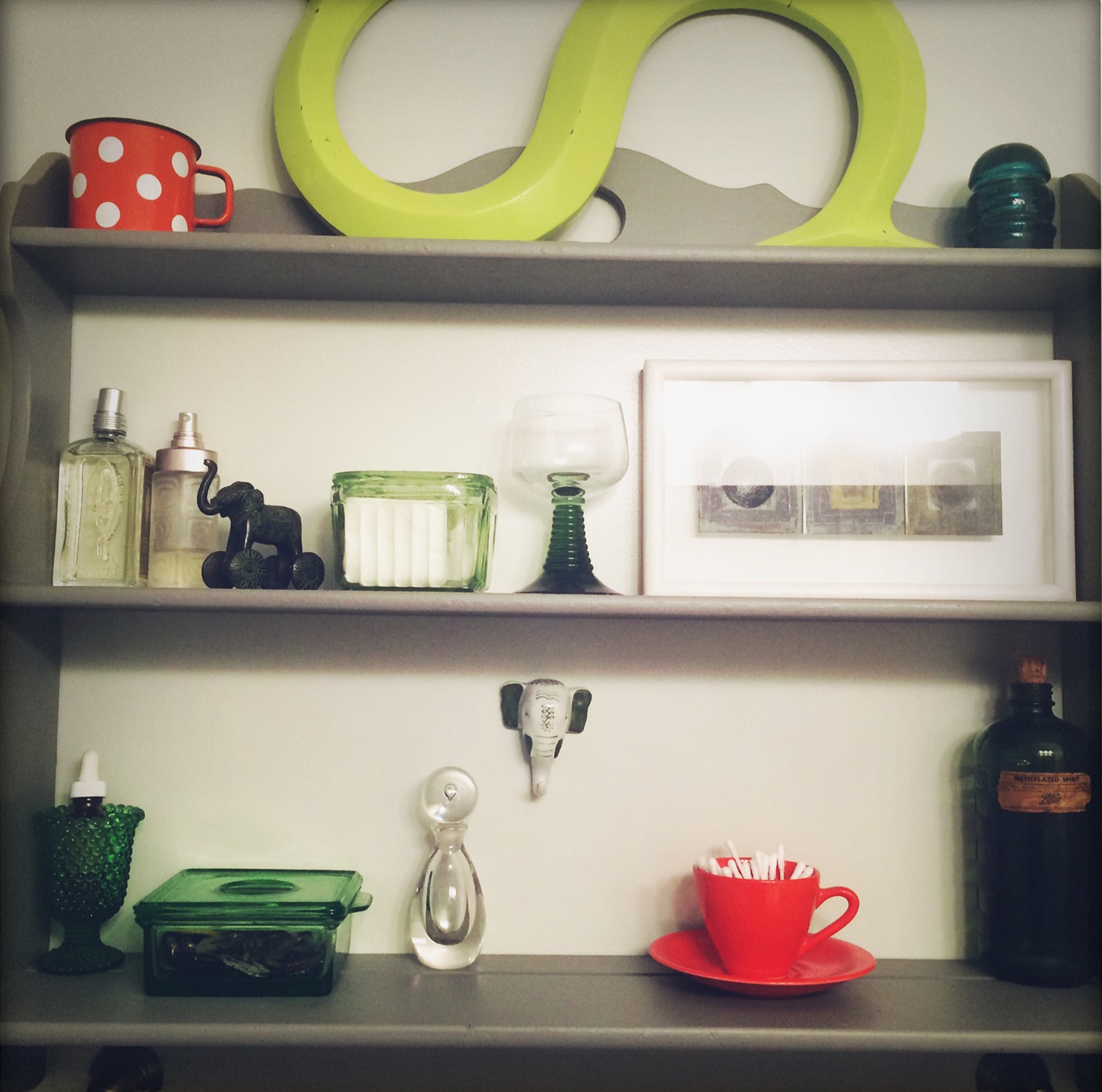
Here’s a peek at my bathroom shelves (I know! Seems strange but my bathroom is one of my favourite rooms in my apartment. Really!) as they are an indicator of my eclectic taste. I love objects and I collect a variety of things, each with their own significance. I could spend hours happily rearranging all of these items and then adding and subtracting more and less. I adore composition and it doesn’t always have to be letterforms.
The sentiments are often emotional, such as the polka-dotted tin cup that I loved from my childhood, the porcelain elephant head from India, the electrical insulator and the german wine glass from my great grandmother’s house, or the painting from Martin Andrews, a Typography Professor from the University of Reading. Other objects are admired for their color, the orange cup and saucer from a thrift store; their form, my grandmother’s perfume bottle; or their history, the vintage medicine bottle from a boot sale in Reading.
A photo of you!
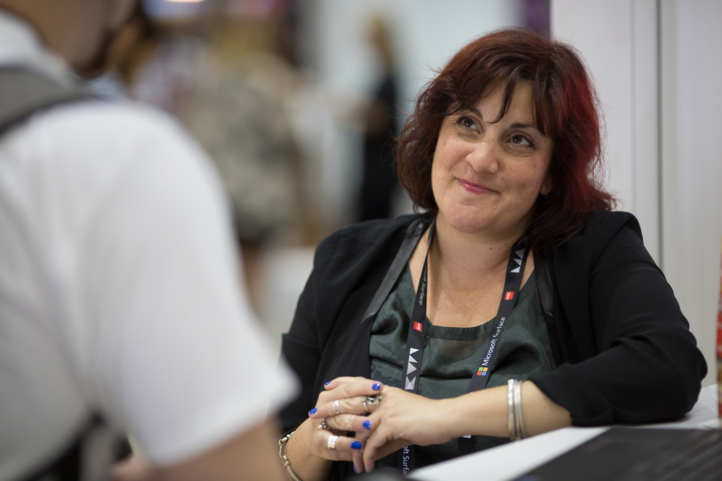
Photograph by Mik Milman. AdobeMax LA 2015.
A pile of books, both professional and others
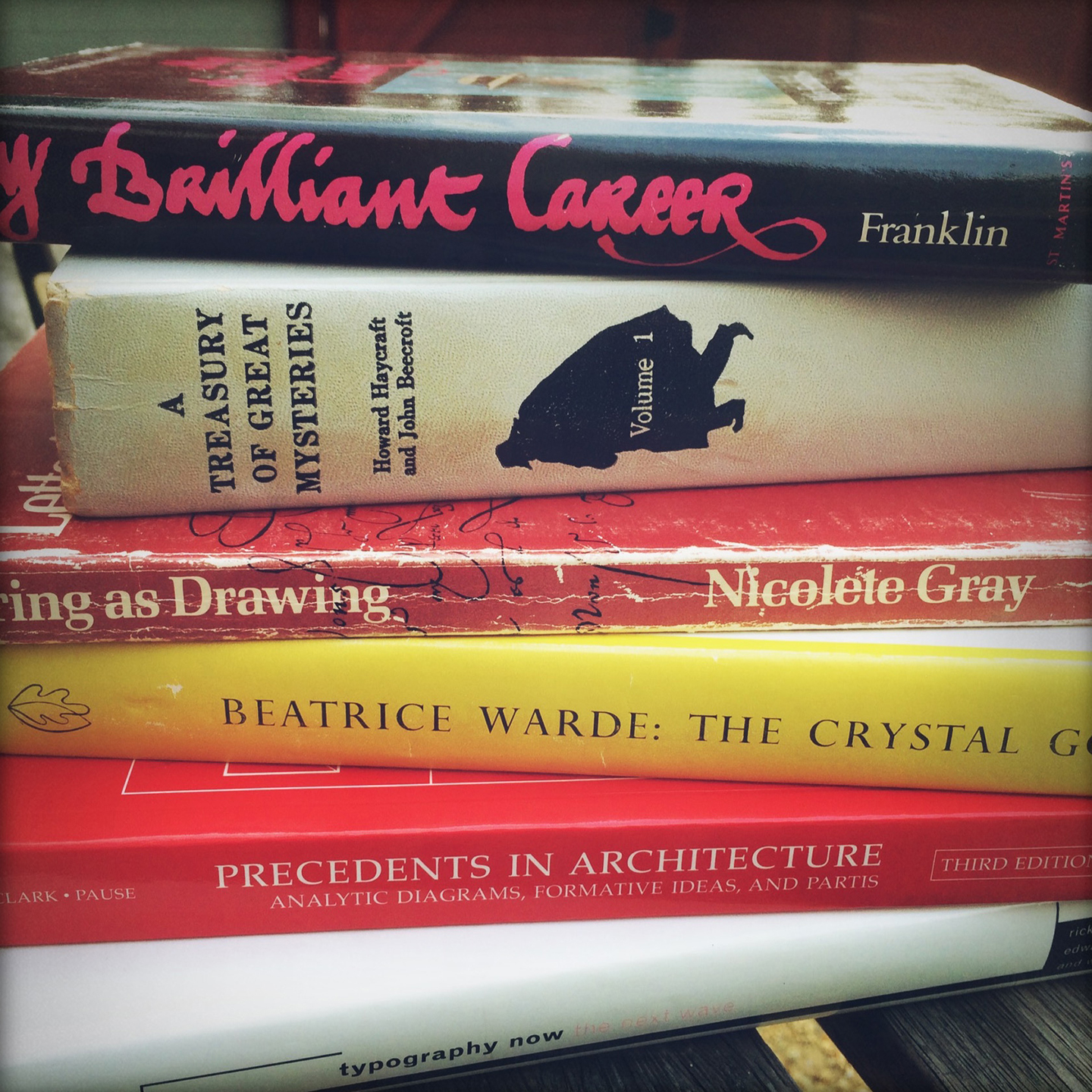
Miles Franklin. My Brilliant Career
I was a precocious child and my group of young friends were equally so. While still in elementary school (!) we all went to see this movie, an early Gillian Armstrong creation, and discussed it at length. It is based on a book that involves a woman deciding between her writing career and marriage – she chose her career. Even at so young of an age, we all agreed with her choice. Perhaps this was a clue that we would all grow up to be feisty career women?!
Howard Haycraft & John Beecroft. A Treasury of Great Mysteries
I swiped this a few years ago from my mother’s bookshelf because I remembered this wonderful spine from my childhood. I wouldn’t say that it influenced my decision to become a book designer, but the fact that I was so intrigued by it as a kid certainly influenced my decision to pursue ‘commercial art’ as a teenager. I love horizontal spines and by adding a spy silhouette, it is book spine perfection.
Nicolete Gray. Lettering as Drawing
I purchased this book after travelling to Rome with the Typography Department at Reading. The trip opened my eyes to what typography and lettering could be, as well as inspired me to develop opportunities where typographers could travel and learn simultaneously. I still marvel at the information in this book and the images remain a major source of my typographic history talks.
Beatrice Warde. The Crystal Goblet
Of course I included this book! I dedicated 7 years of my life at the University of Reading to it. When I first read Warde’s essay, as a 19 year old graphic design student from Greensboro, North Carolina, during at the height of the grunge aesthetic, it changed how I looked at communication design. I wanted to learn more about the woman that wrote it, and I did, and I’m proud of it.
Michael Pause. Precedents in Architecture
Written by my mentor and best friend, this is an innovative book that can help one get out of creative ruts and can open one’s eyes to design structure. An excellent teaching tool for Intro to Design classes, too.
Rick Poyner, Ed. Typography Now
I purchased this book after attending a workshop around 1993 by Andy Altman at my school. I had never seen anything like the content or the layout before, and flipped through the pages for hours on end. It was the first time I realised that a layout could be typographically dominant as well as innovative and didn’t have to be the Swiss or the grunge approach (neither of which I could do!). I was hooked and was determined to move to Europe to see more of it. I still have an intellectual crush on Rick Poyner.
The longer bits
The first question is from Mariko:
“From my perspective of a typographer and educator (and as it seems that we have many things in common), I would like to nominate Shelley Gruendler. I am very curious about her motivation to found Type Camp as an alternative concept of teaching typography.
My question to Shelley is: Have you met at the Type Camp a genius in type design or typography? If yes, please share the story.”
I hesitate to answer this, Mariko, for the primary reason that I don’t want anyone that attends a Type Camp to feel that they have to strive, or achieve, or prove themselves to anyone. While I’d love to take credit for any camper’s success, I know that it was always within them, perhaps attending Type Camp just gave them the confidence and reassurance to take a jump off that cliff?
There are many brilliant people that have attended a camp, discovered a new part of themselves, and then changed their lives in some way as a result of both. Some have attended graduate school in Typography, some have quit their job and travelled around the world, some have changed their career; but these aren’t necessarily a sign of achievement or success. It’s just as impressive when a person is able to press pause on their life and attend a camp just for the sake of learning and exploring. Regardless of the circumstance or outcome, if someone can stretch what is possible in their thinking or in their lives and gain a bit more confidence about what they do and who they are, then they are most certainly a genius.
A few weeks ago you said that you’d “rather chew my arm off than design a typeface!” What makes you so drawn to typography and to teaching it? and how would you describe the difference between designing (type) and teaching, in your view and according to who you are?
Did I really say that? Oh my…(but it’s true!).
I’m fascinated by how language works, visually and structurally. I am starting to think that I’m a linguist hiding in the body of a typographer? While I value the precision in letterform design, I certainly don’t have the patience for it. I know that I’d be bored and frustrated within minutes for it’s just not how I roll.
I am a typographer that thinks in words and lines of text, not in letterforms. I learned typography as a book designer and that, coupled with my voracious reading since a young child (what else can one do when one has no siblings?), means that the idea of how people receive and process information is fascinating to me. I am extremely interested in how typography communicates a history or a culture, as with ephemera, so even though I am a typographer, I am not as interested in type design conversations as I am in typographic culture or historical ones.
I have two different type design projects that I teach, one in my Type 1 college class, one in the week-long Type Camp. With both of them, I rarely declare any of their designs correct or not, but instead encourage them to decide for themselves. I care less about the outcome than I do about them exploring what is possible and learning how to see. They will eventually figure it out in their own way, so who am I to declare success or failure? Yes, there are rules and many of them, so to me, allowing the learners to discover on their own why the rules exist and how they apply is far more valuable than having me constantly bark the rules at them.
I value the learner’s experience and knowledge with how they learn. I consider myself a facilitator showing them different doorways down different corridors that they might not have known previously existed. It’s their choice as to whether or not they step in those numerous rooms. I don’t actually teach anybody, I just help them learn!
I’ve seen that lots of people asked you about the inspiration behind Type Camp, but I am interested in how it started out — first Type Camp, and the whole setting up of such an alternative teaching concept.
Basically, I got hacked off. I spent a decade of my life trying to assimilate into the Vancouver design education field and I just never quite fit in. I was working at a prominent school and had just been notified that I would not be hired as a full-time instructor. Marian Bantjes, a close friend, was told the same thing. We were both very active instructors and students were constantly asking us to teach private classes. After discussing the possibilities with some of my students, she and I came up with the idea of a summer camp concept.
We knew that the structure of the school was limiting how we could help them learn, so what would happen if we just obliterated that traditional framework? I had been toying around with alternative learning methodology for some time, and it seemed that everything just came together as a frustrated reaction to a static and outdated curriculum model.
I’ve done everything wrong at some point or another in the nine years that I have run this company. The business side of things has been a fierce learning curve where my only aim these days is to not make the same mistake twice. However, I do the best I can and hope that it is worthwhile to someone, somewhere. What I’m trying to achieve has never been done before, and it is often discouraging, but there have been 49 camps since 2007, and the 50th will be in Mumbai, India in January. I must be doing something right?
You are teaching students, and teaching campers in Type Camp. What are the differences between the two for you as a teacher?
Regardless of how much Type Camp grows in the future, I hope to always teach at least one college class a year, mainly to keep me grounded. The community college classes are opportunities for me to stretch out a bit, to plant a lot of seeds, tend to them, and then watch them grow. Oftentimes, these are students that don’t have the ability to take time off work or travel to another country for Type Camp or even pursue an education beyond the reach of student loans. They deserve the best education just as much as anyone else. It is a challenge trying to ‘sell’ typography to students that are only there because it is a required course; but I rarely walk away from a challenge. I’m constantly rethinking my metaphors and updating my explanations — not necessarily to appear more hip (I’m far from that!), but more to make sure that the information is as accessible as possible, and remains entirely relevant to a generation that is not my own.
On the other hand, Type Camp teaching is equally luxurious, for I am able to reconstruct a specific progression of absorbing and experimenting. I don’t have to manage grading and attendance and mid-terms and all of that stuff that gets in the way of learning. The Type Camp projects have to hit strong and hard as our time is limited. I’m constantly fluttering around trying to keep the energy up so that they will have filled their head to the brim with new creative ideas and can then return home and dump them all out and sort out the ones they wish to pursue. I want them to have creative choices, not limited ideas. Type Camps are all about managing sparks while with the college classes, it’s feeding a slow burn.
You are a very friendly person, with tons of energy. While doing some public speaking and teaching, you are also writing — which I find as a different kind of activity from being “out there”. How do you feel about those activities? Are they completing each other for you? Is there a certain type of work which you prefer?
I need both energetic time with people, along with contemplative research and writing time, equally as I think I’d become quite bored if stuck with just one.
I was an only child extrovert raised by a single mother introvert. While I’m more balanced these days, I still feel a switch ignite when I’m around people. It’s as if I’m just so filled with joy being around others that I simply cannot keep my mouth shut or else I will just explode! People are brilliant and funny and charming and I am often grateful to be surrounded by such excellent folks. I guess I’m still an only child excited to have type-siblings!
I don’t know that I have ever feared giving talks at conferences or public speaking, but I do get nervous when being filmed. My TEDX experience was a challenge and I don’t plan on repeating that any time soon. Put me in front of hundreds or thousands and I won’t break a sweat. Pull out a camera to film me and I turn into a blithering idiot. Don’t even ask me why.
As I’ve grown older, I find that I need a recovery day or two after all Type Camps. I love the intense energy that happens when all of these seemingly disparate people gather together for their love of one seemingly unusual topic, but I also love being alone and surrounding myself with books on typography and exploring and researching different concepts. My time at Reading was extremely challenging and I quickly found that libraries and collections surrounded by dusty papers and books were my safety zone. Researching allowed me to journey within my thoughts to new places and it still feels comfortable and nurturing and invigorating.
You previously wrote that it’s hard to teach typography well. Could you share with us one of your methods? Did you compile your way of teaching on your own? Do you follow a specific method?
Perhaps the most influential person in my life, along with my Girl Scout Leader, is Dr Michael Pause, my first Design Professor in college. I learned more about learning during my time in his class than I had learned up to that point in my entire life. (Note that both of my parents were University professors, so that says something!) I had never been as challenged as I was while in his classroom and he still challenges me today.
Although now retired, he was an Architect with a PhD in Design Education from MIT and focused on first-year learners, knowing that strong foundations support great careers. He helped us students learn how to believe in our decisions, how to work together as a team, and how to explore design in our own way, all while stepping back and letting us figure it out. The core structure of how to learn at Type Camp is based entirely on his approach.
I am not similar to him, one of the most intelligent people that I know, for where I require 3 pages to explain something, he can do it in 3 words. (Yes, I’m totally jealous about this.) He always sums up new ways of thinking in a precise manner for when I first started teaching in England, he told me to ‘teach as you learned, not as you were taught’. These wise words helped me to disregard what had been done and to look towards what could be done in typographic education. Type Camp is what it is today because of his influence and his support.
You can read more about Shelley here.
Next interviewee …
Shelley is nominating the next lady to be interviewed:
Sol Kawage
I have never met Sol in person, yet I feel confident that I want to be her when I grow up.
She is a very intelligent woman with enormous amounts of creativity, made evident with not only her Masters Thesis topic (‘User motivations in procedural instruction design: The case of sewing patterns’) but with how she parents her two sons. She is funny (making me laugh is high on my list of friendship requirements) and she is adventurous (she lives in the Alps!), and the combination of these two characteristics means that I want to share a bottle of wine (or two, or three) with her and hear her life story. On her front porch of course.
She has an interesting ethnic background (English mother, Lebanese father) and a knowledge of multiple languages (English, Spanish, French, Italian, German). I would like to know how her multicultural upbringing has influenced how she sees design, in particular, usability, such as with her thesis topic. And then, I want to know when I can come over and drink that wine with her?
On a personal note:
For Shelley, I had many questions. I was staying in the “five questions limit” but each one was composed out of a few, and I felt that if we were talking in this interview (face to face, oh how I wish for a limitless travel budget…) I would have interrupted her replies with many more questions, and could barely stay within this limit. This lady is a real storyteller. Each sentence is so vivid and visual, and makes me want to be there in the time and place she is writing about. I mentioned Shelley’s energy which is contagious, and is, I feel, really needed in our field. And I am sure I can speak for all of us while writing that we are waiting eagerly for the Beatrice Warde research to be out already! (no pressure Shelley (: )
I take those interviews as a place to ask about things that I feel connected with, and having it as a reflection for myself (Like the fact that I also love to speak and to write and how those two are combined). I am positive that each reader is finding something she/he can relate to in those mini-stories shaped as interviews. Already looking forward to what I will learn on the 2016 interviews…