
For the second interview in our series, Alice chose Sol Matas to be interviewed. (Beware, personal comment ahead) I was instantly happy – my husband is Argentinian, like Sol, and I have heard so much about Buenos Aires (and can even recommend where to eat without yet being there!) that I was super excited to hear what Sol had to say.
This interview is posted right before ATypI São Paulo, as a small tribute to the type scene in Latin America. So get yourself a nice plate of Argentinian Alfajores or German baked goods, or better yet – both, and enjoy Sol’s thoughts about two places, about type, and life.
The warmup
Write three sentences about you
– I am an enthusiastic type designer from Buenos Aires and two years ago I moved to Berlin.
– Some friends and I created a collaborative type foundry called Huerta Tipográfica.
– I have developed font projects in Latin, Cyrillic and Devanagari.
What is your soundtrack while working?
Something I discovered at my co-working studio in Berlin is “silence”. In my studio in Buenos Aires there was always someone talking, taking a call or listening to the radio, sometimes neighbors just visited to say hi and we ended having a chit-chat about life, politics… anything. Argentinian culture in co-working spaces is quite different compared to Germany.
Something I learnt from germans is their superb focus while they are working.
I have many playlists that I listen to during work, some of them are from my brother-in-law, friends, colleagues or designers that worked in my studio. I can be very eclectic with music.
During the morning I listen to folk, indie music; after lunch I need silence or some rock, pop and if I work late in the evening, I prefer techno or experimental fusion music like cumbia techno.
Name three locations: a current location, a location you love, and a fantasy location
Current location: Berlin, Germany
A location I love: Multikulti, Berlin
A fantasy location: any city in Japan, like Tokyo, Kyoto, Osaka.
Your favourite glyph to design and the most challenging one?
Favourite: The Eszett. I am surrounded by Eszetts in Berlin. You can find different versions of the word Straße (Street) in the signs and I love all of them.
Challenging: most of the conjuncts in Devanagari are totally a challenge to design. Specially if I am working in a bold or a black weight. It can be a nightmare.
What is something you did that you are proud of?
I Closed my design studio in Buenos Aires that I was running for almost 14 years with good clients and moved to Berlin. I gave myself the chance to make a turn in my career and design fonts in a new country.
The visual
A photo of your favourite beverage, and something to eat with it
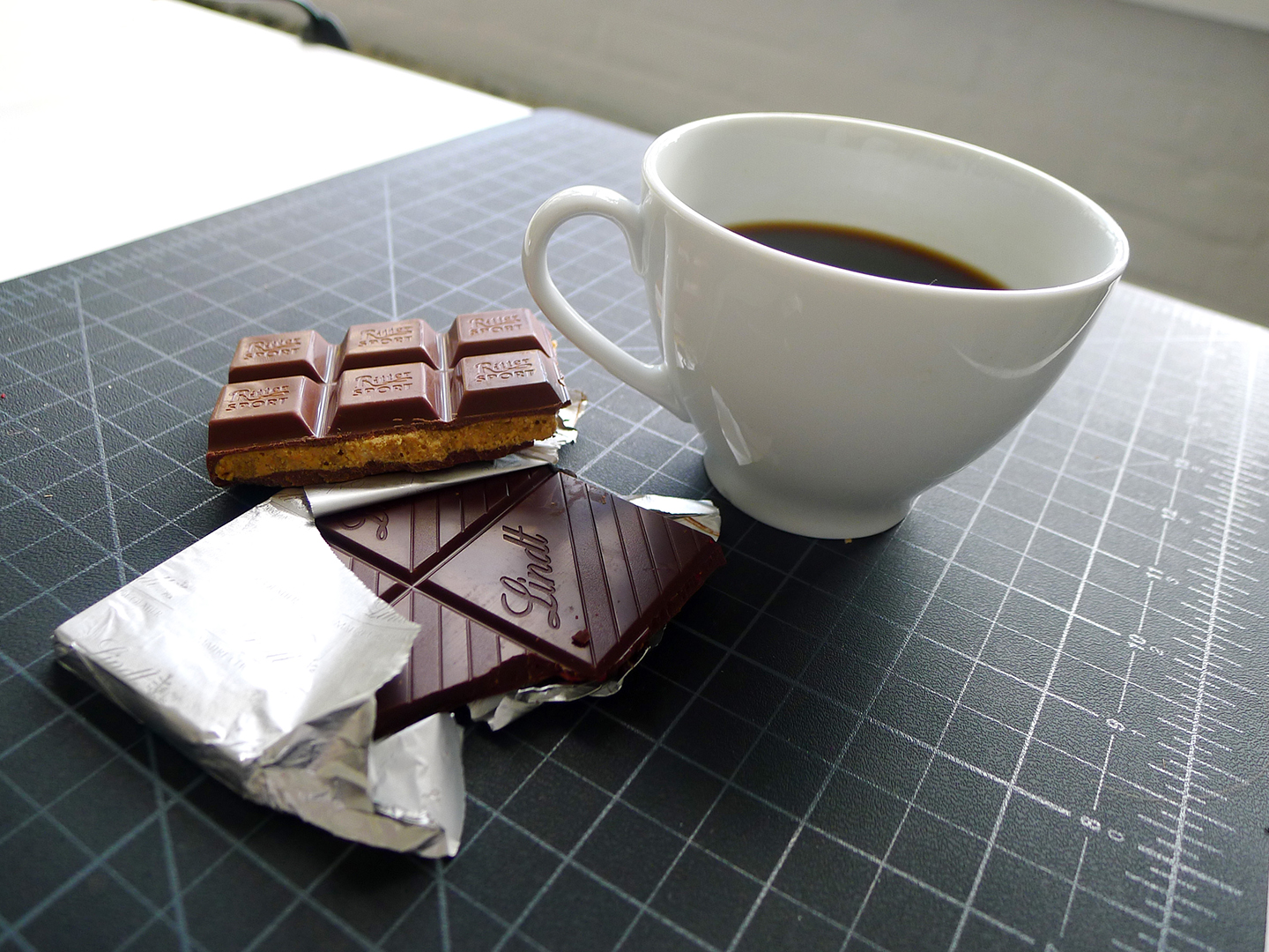
Black coffee and many chocolates
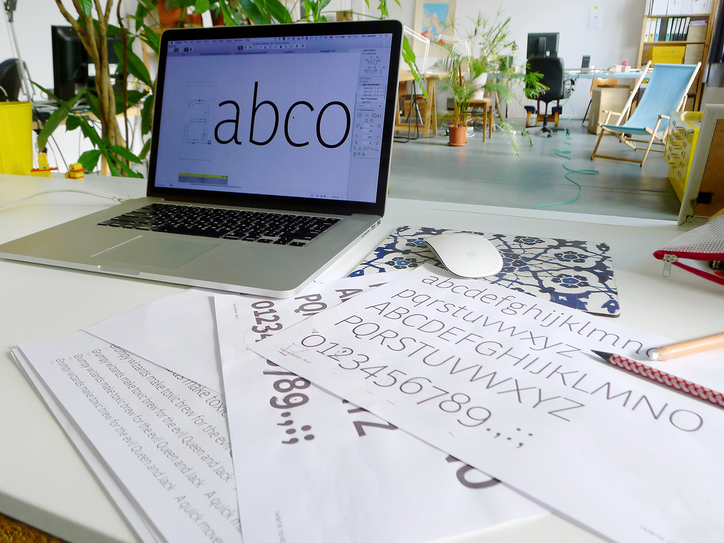
A photo of your type drawing process
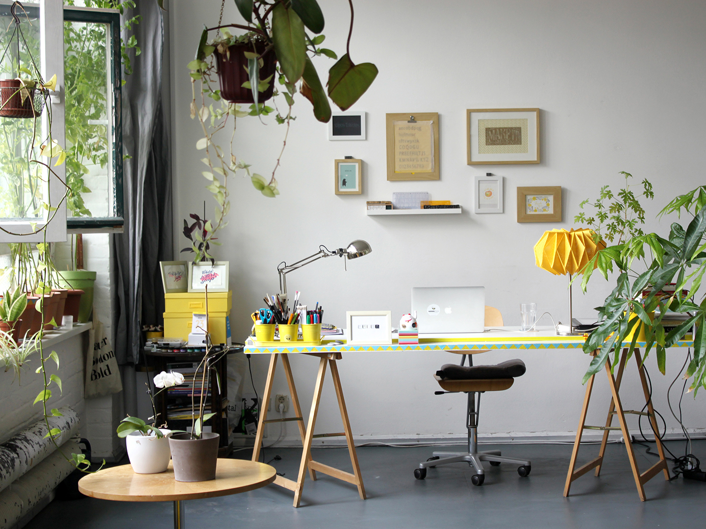
A photo of your desk, working space
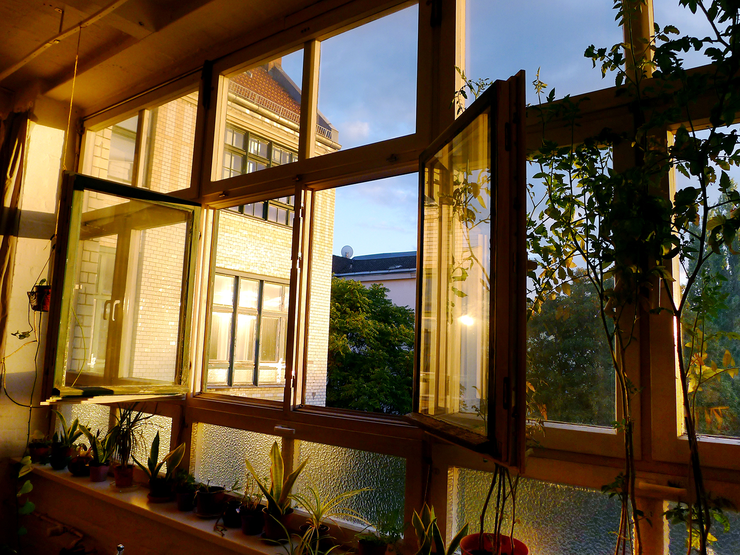
What do you see from your window?
A pile of books, both professional and others
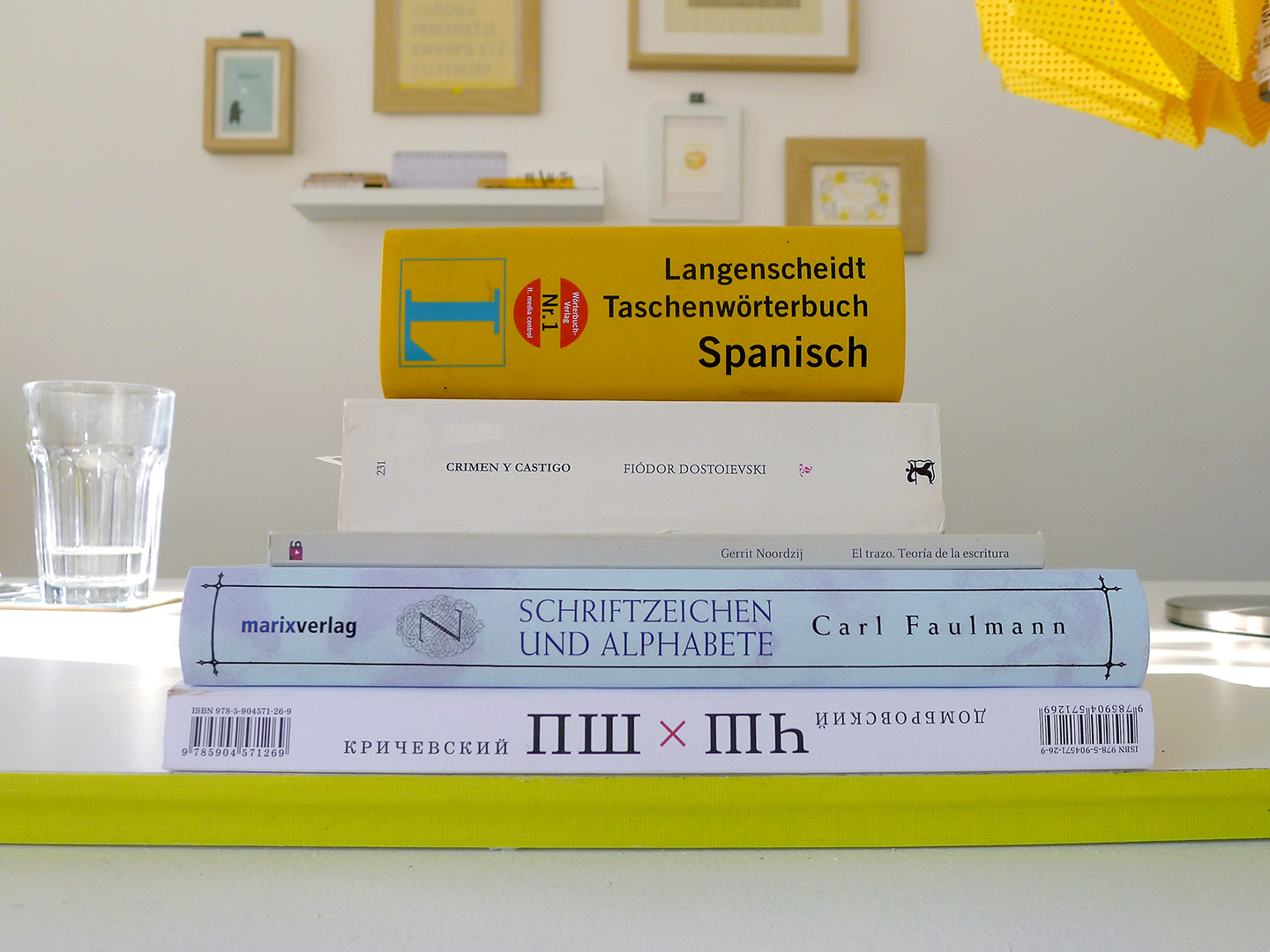
I do not have my books in Berlin, so this is a pile of those I bought in the last conferences I attended or those I am reading now. The Gerrit Noordzij’s book is the one I brought in my luggage from Buenos Aires.
The longer bits
The first question is from Alice
“It would be interesting to read a south-American perspective on the type industry shortly before Atypi Sao Paulo, and also I’d love to know what it’s like to lead a collaborative type foundry, which is 50% male 50% female, and split across two continents!”
The south-American type identity and industry is not yet fully established, even though the latin type industry has grown over the last years.
To get a picture of the situation, south-american designers had to use typefaces produced in developed countries but then the technology offered a new scenario. Specially during the last years the web and libre fonts gave the chance to increase the production, some of them with good results.
In Argentina, the market to sell fonts is small but it grows little by little. Many entrepreneurs decided to go global to expand their opportunities.
There are many people designing fonts stimulated by the type design community but most of them as lovers of type design rather than a business thing.
Today there are teachers educating not only about typography or type design. they started to talk about “licensing fonts”. This is something that I never learned when I was a student or even working in an international ad agency in the late 90s. There was a lack of awareness of the culture of font usage and because of the tradition of “sharing” most of the people just picked a font from a pile of type folders without a real conscious and I think this is a big problem in the professional practice. Luckily different schools or universities have been teaching students how to seek appropriate fonts for each need and during this process they learn about the labor behind of making fonts, becoming aware of the type designer’s work.
Nowadays there are more type design teachers than professional type designers in the region, but there is more consciousness about this amazing profession. Slowly, there are a few public institutions and private companies that have started to commission custom fonts from local designers and that encourages and motivates us to keep going.
About the 50% male 50% female, I think this enriches the Foundry.
Since this interview I started to ask a group of female friends who studied typeface design if they know women in their countries (Brazil, Chile, Colombia, Venezuela) self-publishing their fonts or starting a Foundry. I found that most of them publish their fonts in foundries founded by men, but I do not see it as a lack of opportunities but rather as a personal decision.
In Argentina you can find more self-publishing female designers but I think this is part of our culture. After so many economic crises people prefer being an entrepreneur than being employed.
I can make a list of 50/50 that you can find in the foundry and then leave it to self interpretation: men/women, Argentina/Germany, single/married with many children, born in the 70s/in the 80s, need to work during the day/like to work during the night, passional/rational or capricious/reasonable.
It is chaos in balance. Yes, it is a full contradiction but that is what defines us.
To be placed across two continents is something relatively new and is giving us a wide exposure of our work. The more complicated issue is to coordinate regular call meetings. We try to make it al least once a week.
We make independent projects or sometimes we work in pairs depending on the plan and schedule. Our office hours can be very extended, someone starts in the morning and after five hours the other is waking up and continues the work.
The creative process is a constant exercise of yielding and taking, and that is a good training for the ego. When you work with others is about collaboration, you need to work together to create a solution.
You left Buenos Aires for Berlin two years ago. How would you describe the differences between the two cities, countries, continents?
Living in Berlin is more relaxed compared to Buenos Aires and it is very easy to find a green area to lie down and take a break.
When I moved here it was summer and I started to go to a co-working place in Kreuzberg with ten people. The first month nobody was there and I thought that something was wrong with german workers! Last summer was the same, I spent many weeks alone in the studio. I was sending emails to these ten people asking if someone could come to the studio to visit me because I felt lonely!!! In my studio in Buenos Aires I was always surrounded by people. Clients loved to come to the studio and some friends were visiting me just because they were in the neighborhood.
Another difference is the traffic. It is very easy to go anywhere with my bike. Public transport works almost perfect so there is no excuse to be late. In Buenos Aires to be on time is a concept that has many interpretations. At times I was waiting for more than an hour for a client. The range of tolerance is quite singular there.
German people eat very early (I know this is healthier). It is very difficult for me when I receive an invitation for dinner at 18h. Usually I have dinner around 21-22 h! so I am trying to adjust my clock when I invite people for dinner at home.
In Buenos Aires there is a wide offer of culture events, but here you have a more international scenario. Not to mention the international type community! I love that here is very easy to meet type designers in person from different parts of the world.
How do you feel about the experience of sharing a class of 200 students (!) in the Universidad de Buenos Aires?
I studied graphic design in this public and prestigious institution and it was one of the best experiences I had as a student. During the degree course you have to attend annual classes on topic such as Graphic Design, Typography and Morphology. And you have different options of professors for each subject running at the same time. Imagine a big classroom with approx. 200 students hanging their projects on the walls and having discussions in groups. You can see many different and creative solutions for the same task. It is an enriching process with its pros and cons but for sure a very open mind learning process.
While attending the Postgraduate of Type Design at the same University we were a group of 30 people, so this was a reduced group size in a more specific area.
The next years I was invited to give lectures and to be a tutor with Alejandro lo Celso to review the final projects for a group of students but I couldn’t continue with this experience with new generations of type students since I moved to Berlin. When I visit Buenos Aires I try to go to the University and see what’s going on.
I enjoy being in contact with Rubén Fontana, the director of the Type Master, and sharing my projects, trips or experiences here in Europe with him. I consider him my first and most important teacher. Definitely he was a pioneer and thanks to him exists a wide curiosity and knowledge around typography in Latin America.
Seems like the founding of Huerta Tipográfica (the type foundry you are a part of with three other designers) was a natural process rather than a decision. Please tell us about it.
We met during the Postgraduate. The university is far from the city center and I was going by car, one day Carolina started to join me since we lived very closed. Soon Juan Pablo and Andrés joined us and turned into a carpooling. We became good friends and after classes we continued our trip to my place and enjoyed cooking and talking about type for hours. During these meetings we invited others mates from the Postgraduate to share with us their projects in a more intimate atmosphere. These typo dinners invitations were extended to our teachers or foreign type designers visiting the city like Balius or Meave.
Naturally we became a common space of exchanging experiences and we called it Huerta Tipográfica. Huerta means orchard and we joked that we were a group of hippies cooking and making fonts.
We always say that the situation forced us to make decisions to go forward with our type careers. It took us a couple of years to assume and define us as a Foundry.
To me it seems, that Argentina is becoming a centre for type design in the past few years. What do you think? What (if any) are the unique characteristics of type design and type designers in Latin America?
The space T-Convoca (similar to Typostammtisch in Berlin), the biennials Letras Latinas and Tipos Latinos have been the pillars for the production of typographic thought in Argentina. All these events emerged from the conferences «Typography for Real Life» organized by the tipoGráfica magazine in 2001.
Today in social media I read about the results of the Communication Arts typography annual competition and four designers (three from Argentina and one from Colombia) were selected. All of them studied at the Universidad de Buenos Aires.
In our country we don’t have a strong tradition of typeface design and a large production like here in Europe. The learning method in the design of letters was rather self-taught until in 2009 began the career of specialization, that today is a Master course of two years. This encouraged, among other things, the development of text fonts, a practice that requires specific knowledge that had previously been acquired by those who studied in European schools (Reading- KABK) or designers that had the urge design typefaces and tried to learn on their own. Not having the weight of tradition allows you to find an unprejudiced attitude when designing typefaces by local designers. This creates a greater diversity and richness in designs produced in Argentina.
You can see Sol’s work here and here.
Next interviewee …
Sol is nominating the next lady to be interviewed:
I would like to nominate to Mariko Takagi. Since the first interview came from the french culture, then a little bit of South America, I would like to jump to the other side of map and meet someone who can talk about Japanese/Chinese type culture.
My question to Mariko is, What do you think about western designers making Chinese or Japanese typefaces and vice versa?
On a personal note: I love to find connections, and both Alice and Sol are not originally from Germany but are currently based there. This has been discussed before, but once again – What does this teach us about type design in Germany?
Before this interview, I didn’t know Sol personally. This was insightful for me, getting to know a person by how she responds and phrases her answers. This lady has so much courage to move to a different continent, with different language and culture and start a whole new adventure. I thought that the foundation of Huerta Tipográfica was so natural and that this is such a good base to start a business – with friends. On the other hand it can be tricky and the fact that people are friends and share the same opinions still doesn’t mean that the can work well together.
Thank you Sol for your openness!