
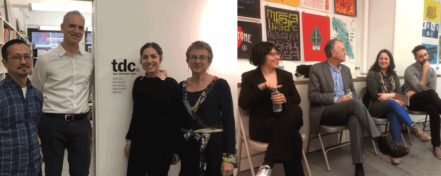
Left: The organizers! Dan Wong, Doug Clouse, Liz DeLuna, and Aaris Sherin, photo courtesy of Liz DeLuna; Right: The panelists! Juliette Cezzar, John Gambell, Amy Papaelias, Thomas Jockin, photo courtesy of Nina Stössinger
This past weekend, I had the pleasure to participate in Teaching Type: A Panel Conversation on Typography Education, organized by Design Incubation, and hosted at the Type Directors Club in New York. The event attracted a range of attendees: educators, typographers, type designers and even a few students and recent graduates. Armed with only the most comfortable of metal chairs, we set out on a 3-hour journey to explore best practices of typography curricula today.
The full recording of the conversation should be available soon on Design Incubation’s YouTube channel, but in the meantime, here are some of my takeaways from the afternoon.
Surprise! There are many ways to teach typography. Our conversation covered [at least] two distinctly different approaches. The first introduces typography from the perspective of a reader: looking at a paragraph of text and trying to arrange it in a way that makes sense for the content and the reading experience, with some typographic history, classification and “rules” thrown in along the way. The second approach begins with the letterforms themselves: honoring and analyzing the structure and anatomy, then working one’s way up to more complex arrangements of text. Is one approach better than the other? ¯\_(ツ)_/¯.
Reading matters. Well, maybe sometimes. Not always. But it should. Most of the time. Liz and Doug prepared this great question and I enjoyed the conversation that followed: What do you think is the relationship between reading, literacy, and an education in typography? Must a good typographer also be a prolific or invested reader? When is reading important to typography education and is there ever a situation when it isn’t? I became hooked on typography via an undergraduate English degree. I was fascinated with how the construction of the paragraph, the margins, the typeface itself became part of the experience of interpreting and mediating a text. Do my students care as much as I do and does that even matter? And where does writing fit into all of this?
Screen typography is just typography. Educators tend to get a bit queasy whenever the words “screen” and “typography” are placed next to each other. Why? Let’s face it: most folks teaching undergraduate typography courses these days are not the same folks making responsive web specimens or wringing their hands over browser support of the latest font technologies. And though the panel did not come to a consensus on the significance of teaching HTML/CSS as part of a typography education (I’m in the HECK YEAH camp: reveal and explore the what’s behind the curtain, early and often!), we did agree that typography educators need to stop being afraid of what they don’t know. Teaching typography for the screen can happen in many different ways. Start somewhere.
“Good” typography is a loaded term. The question surrounding what is “good” or “successful” typography stayed in the air throughout our conversation. We need to be honest with ourselves and our students when we talk about what we mean by “good” typography. Do we mean “good” as in “works well for the content and audience” or do we really mean “conforms to the aesthetic sensibilities of a hegemonic European, modernist perspective?” Are there certain rules of typography that are categorically, objectively correct? What knowledges and experiences do our students come with (language, culture, class) that might reflect new sensibilities? How can we be sensitive to their perspectives while preparing them for professional practice?
Typography education doesn’t end with one class. Full disclosure: in my 10+ years of teaching, I have never taught the class called “Typography.” But that doesn’t mean I don’t teach typography. Typography is embedded in every design class where language is represented in visual form. We teach typography all the time: when we teach web design, or senior thesis, or branding, or design history, or interaction design or even introductory classes taken prior to the actual Typography course. Our goal shouldn’t be about what happens in that one (or possibly two, if you’re lucky) courses, but rather how students apply an awareness of typography to everything else they do.
Thank you, to Design Incubation for organizing, the TDC for hosting, all of the panelists and attendees for a lively discussion that left me with many more questions than answers. To be continued…
Do you teach typography? Did you attend the panel discussion? Comments are open if you’d like to share any thoughts.