Dear Alphabettes:
Slanting emoji

Dear Bianca,
Why do some emoji slant with the text when you italicize it while others do not?
Thanks, Indra

 
Dear Indra,

Why would you italicize emoji to begin with? To convey speed? To emphasise emotion? To not have them clash with text?

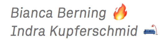
In any case, I think it’s down to OS and application you use. A quick test showed that faux italic emoji are generally available and I couldn’t find exceptions to the rule apart from Slack’s menu which gladly slants fire but not couches for no apparent reason.


As we all know faux styles happen because the chosen variation of a font is not (or not yet) available. In this case, there’s simply no italic version of your emoji (type)face. Instead of falling back onto a different font family in which this style exists (not that there is one), it pretends there is an italic by brute slanting the glyphs. The other option would be to just keep displaying the upright emoji.

Curiously, faux bold didn’t work in all my testing environments and resulted in very odd behaviour in some. Tells you a lot about faux bold algorithms.

I’m guessing it’s only a matter of time until we see the first true italic and bold emoji fonts. For better or for worse.

The future is bright.
Bianca


Do you also have a question about font fallback issues, the universe, or everything else? Tweet at us @alphabettes_org and if the answer doesn’t fit into a tweet, we may reply here.

Dear Alphabettes:
Good Arabic system fonts

Dear Sahar,
I have some stupid, noob Arabic questions. I’m trying to set a short text for Syrians. What style of Arabic do they usually use? Naskh? Or can everyone read all the different styles (not like in India)?
I’m looking for a typeface that goes reasonably well with a grotesque. From those that come with Mac OS X or other apps, which one would you recommend or do most Arabic readers regard the best?
Thanks, Indra

 
Hello Indra,
it’s not like with Indic scripts, so no worries there. All the different styles are readable to whoever knows the script. I try to avoid all those simplified looking styles. Adobe Arabic is my favourite go-to system font. It’s very clear and legible and seems to be equally liked by people from different regions.
Best, Sahar


Do you also have a question about Arabic type, the universe, or everything else? Tweet at us @alphabettes_org and if the answer doesn’t fit into a tweet, we may reply here.

Fonts from the Future 🚀⚡️

Fasten your seat belt and strap on your mind reading helmet, Alphabettes reports to you from the future with a collection of potentially visionary, occasionally dystopian, and totally unfounded predictions for the type industry, and greater humanity, in the 22nd century.

Table of Contents:

Propa by Elizabeth Carey Smith
Global Restructuring Organization for Alphabetical Neolatry by Jess McCarty
The Letter Lady by Meghan Arnold
CLARE by Theresa dela Cruz
The Pixel Museum by María Ramos
Emojiface Design by Liron Lavi Turkenich
XBH-17478-F9 by Luisa Baeta
Variable Fonts: The Film by Amy Papaelias

Continue reading

Just Getting Started

What a day! We marched throughout the world and the outpouring of homemade messages of solidarity, resistance, love, and strength has been overwhelming. Here are a few of our efforts and some amazing signs we witnessed.

Some signs by Bettes:

Briar

Victoria

Nina

Dyana

Theresa

Isabel

Marisol

Nicole

Lila

Jen

Mary

Taylor

Jessica

Dirty Bandits

Indra (after ECS)

Tânia

Caren

ECS and Naomi

Our Washington DC correspondents ECS and Naomi found some amazing signs at the big march:
Continue reading

October – December 2016 News

It’s [finally!] time to say goodbye to 2016 and we thought we’d end the year with a long overdue round up of Alphabettes-related news.

October:

The Fitchburg Alphabet project by Anna Schuleit Haber for Fitchburg, MA’s Sentinel & Enterprise newspaper wins Publick Occurrences Award for outstanding journalism. Contributors to the series included Shoko Mogikura, Nina Stössinger, Laura Meseguer, Therese Schuleit, Francesca Bolognini, Anna Schuleit Haber, Indra Kupferschmid, Geri McCormick, Catherine Griffiths, and Nicole Dotin

Barbara Bigosinska releases Mala


Continue reading

Conferences 2016

Alphabettes will end 2016 by celebrating the people who organised inclusive type, typography and design conferences this year. Your commitment and dedication to gender equality means a lot and the success of your events gives us hope that you will be serving as an example for many other conference organisers.

Here’s to you!

In order of percentage of female speakers:

57.89% Sans Everything, FR – Amiens
52.08% ICTVC, GR – Thessaloniki
50.00% Typographics, US – New York City

47.37% AIGA Design Conference, US – Las Vegas
46.67% BTS Away Days, DE – Berlin
42.55% TypeCon, US – Seattle
40.00% Encontro de Tipografia Conference, PT – Lisbon
38.46% Beyond Tellerrand, DE – Düsseldorf
37.50% Rencontres Internationales de Lure, FR – Lurs
37.50% Typofest, BG – Plovdiv
36.27% ATypI, PL – Warsaw
34.78% 7CIT, ES – Valencia
34.29% TYPO, DE – Berlin
33.33% BITS, TH – Bangkok
33.33% DiaTipo, BR – Porto Alegre
30.00% Dynamic Font Day, DE – Munich
25.00% Typo Day Köln, DE – Cologne
23.08% Granshan, EG – Cairo
22.22% DiaTipo, BR – São Paulo
22.22% DiaTipo, BR – Caruaru
20.00% Typo Day Hamburg, DE – Hamburg
15.00% Automatic Type Design, FR – Nancy
14.29% Typo Day Basel, CH – Basel
12.50% Kerning, IT – Faenza
12.50% DiaTipo, BR – Campinas
11.11% Walbaum Wochenende, DE – Weimar
10.00% TYPO Labs, DE – Berlin
5.00% Serebro Nabora, RU – Moscow


[This list is not exhaustive but a crop from the conferences we attended. If you know of one that’s missing, feel free to add it in the comments. For the %%%, we counted the persons listed on the speaker pages of the respective conferences. Award badge kindly designed by Ulrike Rausch.]

Greetings from… around the world

We’re a bit jet-lagged from our vacation series last month, but it was worth visiting some excellent local typographic treasures. In case you missed any of the destinations, we’ve created this handy map with all our stops (and links to each article). Kudos to Liron for organizing it and Luisa for creating these cool passport stamps we used to mark the series.

passports_03

You can also find all of the posts here. Happy travels!