Before They Were ’bettes

Cover spread in of “The New Wardens” in The Recorder #3. Illustration by Ellie Cryer. Additional illustrations by Ping Zhu, Ellie Foreman-Peck, Maya Stepien and Kelsey Dake.

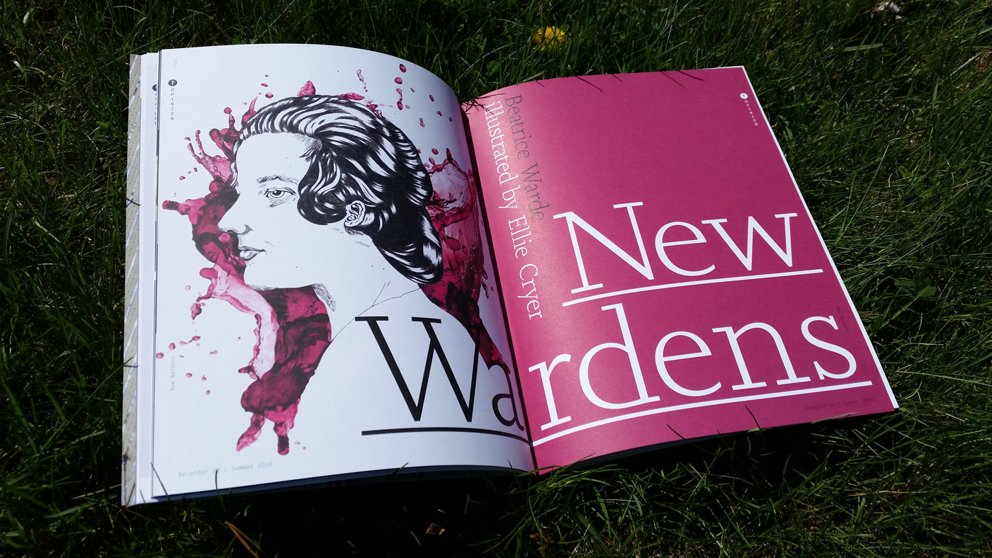
Cover spread of “The New Wardens” in The Recorder #3. Illustration by Ellie Cryer. Additional illustrations by Ping Zhu, Ellie Foreman-Peck, Maya Stepien and Kelsey Dake.

Last spring, I was approached by Emma Tucker, the editor of Monotype’s recently revived magazine The Recorder, to write an article about women’s contributions in type for the upcoming issue. I pitched a series of interviews with women who were championing type and typography à la Beatrice Warde, given her deep connections to the original publication. Besides Shelley Gruendler, I had no prior personal contact with Indra Kupferschmid, Mariko Tagaki or Elizabeth Carey-Smith. Selecting only a handful of modern-day Beatrices was challenging; my list of potential interviewees was quite long. Ultimately, I tried to gather a variety of perspectives that included educators, practicing designers, and those active in contemporary discourse. I could have never imagined, only a few months later, they would all become an integral part of this thing called Alphabettes. Before it sells out, check out The Recorder Issue 3, featuring a host of engaging articles and contributors, as well as my interviews with “The New Wardens”. They’re in great company.

Die Mode

Nothing says fashionable like Die Mode

Nothing says “fashionable” like Die Mode!

If you’re a modern bird with a flair for fashion, look no further than Die Mode: a stylish, upright script face with delightful features. Published by the German foundry Ludwig & Mayer, Die Mode is both elegant and casual, with just enough personality to make those victrola dance party invitations feel fancy and jovial. Need to dress up your Callot Soeurs frock with a typeface that matches your modern style? Die Mode has you covered, way below the knee. Uppercase characters spare no details when it comes to curves that say sophisticated and friendly. Because “Fashion Demands Longer Skirts and Waistlines” Die Mode’s connecting lowercase characters gives it a distinctive, flowing style. If Parisian and Phyllis had an eccentric cousin, she’d be Die Mode. Sure, there might be a World War happening, but Die Mode doesn’t care. Inspired by calligraphic traditions in a hot new feathered hat, Die Mode is a fresh take on a new era in post-Belle Époque script type.

Lady Speaker Sorts

Turns out, it’s never been that hard to find Lady Speakers after all

Turns out, it’s never been that hard to find Lady Speakers after all

Although readily available in recent years, it’s still worth mentioning there was no shortage of Lady Speakers in 1915. Yes, both Large Lady Speakers and Small Lady Speakers were made easily accessible and affordably priced. (Special shoutout to Meghan Arnold and Nina Stössinger for their help with finding this image in the 1912 ATF catalogue).

Amy Loves this 1950s Modess Sanitary Napkin Dispenser… Because

Built in 1953, the aptly named Old Library was the first free-standing library building on the campus where I teach. It eventually housed painting studios and since the late ’80s, has been home to the photography and graphic design programs. I love this space for all its mid-century collegial charm. The stately brick exterior is surrounded by mature honeylocust trees, while inside, built-in bookshelves from its past life flank the sides of computer labs and ample hallways. Soaring windows welcome an abundance of natural light and offer views of the grassy quad where students gather in good weather to play frisbee, sunbathe or strum ukeleles.

But perhaps my most favorite thing about the building is this original Modess sanitary napkin dispenser that lives in the 2nd floor women’s bathroom.

modess1
Continue reading

Snobs, Nerds and Maniacs

Have you ever been called a type snob? Font nerd? Typomaniac?

If you use, make or draw type / letters, it’s your job to care. I’m personally guilty of using this kind of language. However, when we act like our work is somehow above the mental capacity of typographic plebeians, are we giving ourselves a bad rap?

(original tweet appears to have been deleted)

Continue reading

’bettes, Live

Get ready for an action-packed weekend of worldwide type events. Can’t make it but wish you could? Our team of ’bettes from around the globe have you covered. Events include:

· 6et conference in Portugal
· TypoMad in Madrid
· iiitype in Paris
· Sara Soskolne at CooperType East
· and Weekly, Monthly, Quarterly, Biannual in NYC
· or DiaTipo, followed by What Design Can Do in São Paulo
with more to come.

Follow along and join in on Twitter or Instagram with the hashtag

betteslive


Lettering by Victoria, of course.

Turn That Frown Upside Down? The Project Faces Debate.

The typographic twitterverse is aflutter today. The subject? Project Faces, an iPad app by Adobe that allows users to customize the skeleton of a typeface and watch it magically change from flat to fabulous in a matter of seconds. Well, not exactly. At least, that’s not the consensus on Twitter. The application itself, demoed at Adobe Max last week, is perhaps less interesting than the ensuing discussions. Here are a few collected tweets worth sharing. Continue reading

The Ruq’ah Project by Zeynep Akay

Check out The Ruq’ah Project by Zeynep Akay, documenting the research and making of a typeface inspired by Ruq’ah, a common style of Arabic handwriting, to be added to the Google Webfont Library. It’s not always easy to allow the world to peek behind the curtain of one’s process but Zeynep is determined to partake in what she is calling “immersion therapy”.

I will open my process, my most unrefined drawings, my kookiest ideas, my most embarrassing failures to the snarkiest, most passive aggressive comments on the internet.

We’ll be right here, watching — and cheering — along.