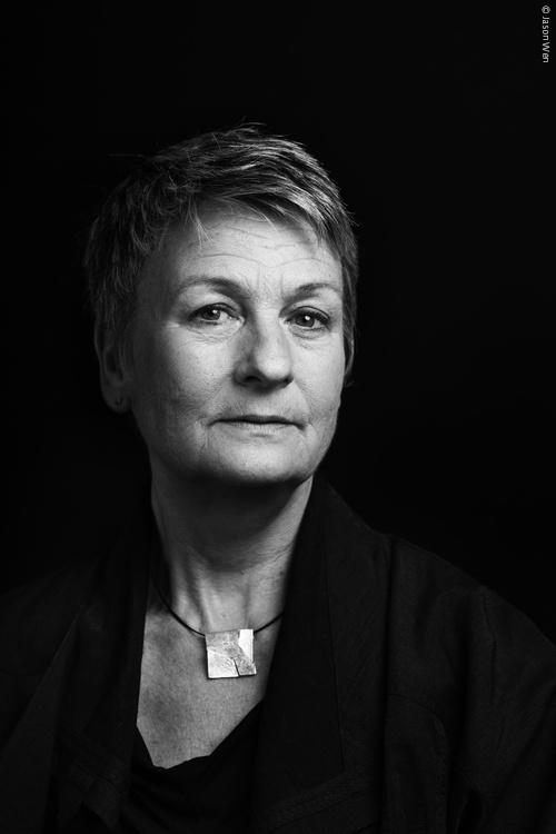
Freda Sack. Photo: Jason Wen
Freda Sack was a type designer and typographer who took an important lead in shaping the professional craft of type design and, through her work with the International Society of Typographic Designers (ISTD), helped to improve standards and to enhance educational opportunities in the field of typography. For anyone who did not meet her in person, you will almost certainly have met her typefaces, not least through the role her work played in giving typographical shape to the commercial landscapes of the UK and beyond.
A love of letterforms acquired during Freda’s time at Maidstone College of Art led her to an interview with Mike Daines, manager of the type studio at Letraset. He remembers, ‘a shy 21 year old, partly hidden by a long fringe’ who wanted to work on typefaces, but first had to gain union membership by starting as a photographic retoucher. An enduring character trait of Freda was her fiercely quiet determination and so she spent several months retouching, or as she puts it, ‘ruining her eyesight’ after which she was finally able to graduate into her five-year ‘apprenticeship’ into type design and stencil cutting.
Her freehand stencil-cutting skills and accuracy for interpretation are the stuff of industry legend. As her former colleague David Quay recalls, she had the remarkable ability to look at any letter or alphabet and say immediately what was, ‘badly drawn or too heavy, too wide or narrow within half a gnat’s whisker! An uncanny skill I have never seen in another type designer.’ For Freda, however, it wasn’t just about sharpness of eye. As she put it, ‘That would only mean I might be able to see something was wrong, but wouldn’t necessarily know how to make it right. What is important is to have the understanding of the structure and proportions of the letterforms, and the ability to know when a curve or a shape is ‘wrong’, and what is needed to correct it. This, I believe, is a direct result of an innate relationship with letterforms gained from analysis and then the physical process of creating them (hand/eye/brain). The ‘right’ shapes become learned in the process. I think that’s why I tend to still hold a pencil when art directing, or even just talking about type – the tactile memory is important.’
As her reputation and portfolio of designs grew so did her opportunities and international standing. A position from 1978–80 with Adrian Williams at FONTS/Hardy Williams Design added to her repertoire a series of text faces for the German foundries Stempel and Berthold, and also Linotype, in addition to corporate commissions for the British Post Office and Renault. Returning to Letraset in 1980, though this time working from their London studio, she was involved in the development of a range of new digital types and in the development of the Ikarus digital design software, travelling to Hamburg to work at URW with the developers to help make the systems more visually intuitive and user-friendly for type designers.