
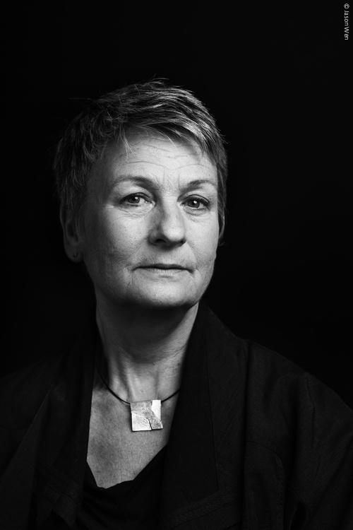
Freda Sack. Photo: Jason Wen
Freda Sack was a type designer and typographer who took an important lead in shaping the professional craft of type design and, through her work with the International Society of Typographic Designers (ISTD), helped to improve standards and to enhance educational opportunities in the field of typography. For anyone who did not meet her in person, you will almost certainly have met her typefaces, not least through the role her work played in giving typographical shape to the commercial landscapes of the UK and beyond.
A love of letterforms acquired during Freda’s time at Maidstone College of Art led her to an interview with Mike Daines, manager of the type studio at Letraset. He remembers, ‘a shy 21 year old, partly hidden by a long fringe’ who wanted to work on typefaces, but first had to gain union membership by starting as a photographic retoucher. An enduring character trait of Freda was her fiercely quiet determination and so she spent several months retouching, or as she puts it, ‘ruining her eyesight’ after which she was finally able to graduate into her five-year ‘apprenticeship’ into type design and stencil cutting.
Her freehand stencil-cutting skills and accuracy for interpretation are the stuff of industry legend. As her former colleague David Quay recalls, she had the remarkable ability to look at any letter or alphabet and say immediately what was, ‘badly drawn or too heavy, too wide or narrow within half a gnat’s whisker! An uncanny skill I have never seen in another type designer.’ For Freda, however, it wasn’t just about sharpness of eye. As she put it, ‘That would only mean I might be able to see something was wrong, but wouldn’t necessarily know how to make it right. What is important is to have the understanding of the structure and proportions of the letterforms, and the ability to know when a curve or a shape is ‘wrong’, and what is needed to correct it. This, I believe, is a direct result of an innate relationship with letterforms gained from analysis and then the physical process of creating them (hand/eye/brain). The ‘right’ shapes become learned in the process. I think that’s why I tend to still hold a pencil when art directing, or even just talking about type – the tactile memory is important.’
As her reputation and portfolio of designs grew so did her opportunities and international standing. A position from 1978–80 with Adrian Williams at FONTS/Hardy Williams Design added to her repertoire a series of text faces for the German foundries Stempel and Berthold, and also Linotype, in addition to corporate commissions for the British Post Office and Renault. Returning to Letraset in 1980, though this time working from their London studio, she was involved in the development of a range of new digital types and in the development of the Ikarus digital design software, travelling to Hamburg to work at URW with the developers to help make the systems more visually intuitive and user-friendly for type designers.
In 1983 she set up by herself and quickly made her own mark in the world of designing marks for corporate design and brand identity, designing typefaces and logotypes for many of the leading agencies and for clients such as British Airways, and Vauxhall. It was a time of collaboration too. Walter Tracy and Shelley Winter invited Freda to help them with The Daily Telegraph newspaper headline typefaces. Tracy was also a consultant at Letraset, and Freda worked with him on a range of Letraset Arabic faces, having also worked on other scripts while still with FONTS.
With lettering designer David Quay she set up The Foundry, an early independent digital type foundry. The introduction of the Macintosh computer in 1984 had changed everything. Before the Mac a type designer had to submit their designs to other type manufacturers for them to release but with the Mac came the possibility of being able to publish your own typefaces with absolute control over what you created. It is testimony to the pioneering spirit of Freda and David that they were able to simply name their new independent business The Foundry, as in 1990 there were so few others to distinguish themselves from. Classic faces such as Foundry Wilson and Foundry Sans were accompanied by experimental revivals such as the Architypes series celebrating the Bauhaus and Foundry Gridnek, a collaboration with Dutch designer Wim Crouwel. Alongside their retail fonts The Foundry continued with custom designs including typefaces for British Gas, NatWest Bank, the Science Museum, Lisbon Metro, Brunel for mainline UK railway stations, and a D&AD award-winning typeface for the Yellow Pages.
The more successfully some individuals manage to grow their business, the more remote they can grow from the grass roots communities within design. Quite the opposite would be true of Freda. The more she gained in terms of recognition and success, the more she seems to have been energized to give and to support others. Many owe her a considerable debt in terms of the example she set, and for the encouragement she offered. Former junior designers at The Foundry such as Jason Smith, who now runs Fontsmith, speak with great affection of the mentorship that Freda gave. Though Freda’s generosity also extended outside of her own business through her mentorship of many other designers new to type such as Henrik Kubel, who would go on to set up his foundry A2-Type. With Quay she was a founder member of the Letter Exchange, and she was an invaluable member too of the ISTD: Co-chair (with Quay) from 1995–9; Chair from 2000–4, President-elect in 2004 and President in 2006–10. The main focus for her efforts was on promoting the value of typographic education and through the organization of lectures and exhibitions, she did much to promote design, becoming a catalyst for the celebrated Wim Crouwel show at the Design Museum in London (2011). She also oversaw the flourishing of the student assessment and international award schemes, and was able to take her passion for typographic education abroad, something which gave her enormous personal satisfaction. She worked with students at colleges across the UK but was especially proud of having participated in the first design conference held in Karachi, Pakistan and for many years she worked with the ISTD in South Africa. Her exceptional contribution to the society was recognized last year when she was awarded an Honorary Fellowship.
She was then someone who could make things happen, though always in the most charming of ways, with her polite firmness perfectly checked by her witty congeniality. She was an incredibly accomplished designer, her skills helping to bridge the analogue and digital type technologies that gave shape to her career. She was stylish too, distinctive but never aloof. Her warmth, interest in others and accessibility were exemplary. And all achieved in a field with a reputation for being very male-dominated. Freda did not like to be singled out as a woman for her achievements, always preferring to be appreciated on the basis of merit. That I should have grown up within the design community understanding that her achievements could be the norm is, however, for me and many others, one of the most important aspects of her life and her legacy.
When I think back to the conversations shared with her it never occurred to me that one day I would be writing up a set of notes on her life following news of her death in February – she always had such a vital sparkle in her eyes as she smiled, which she did a lot. Freda always took such good care of things – her health, her work, those around her. It is a privilege to pay some very small part in taking care of her memory.
An event is being planned in the UK to celebrate her life later in the Spring.
An interview with Freda Sack by Catherine Dixon was published in issue 3 of Codex, here in PDF-form (designed by Linda Florio and edited by Paul Shaw and John Boardley).