
I recently had a revelation. I’ve been staring at reverse-contrast typefaces for the majority of my life, and the fact that it materialized during my year at CooperType was no coincidence.
As a child/preteen, Saturday mornings were spent at my local reform synagogue in addition to one weeknight at Hebrew School (which I begrudgingly attended). At that point in my life, I had no knowledge of design or typography but developed the skills of reading and writing Hebrew in both classic and cursive form. It never occurred to me that the Hebrew characters looked different from other letterforms, the only contrast (pun intended) apparent to me was the fact that Hebrew is read from right to left as opposed to left to right.
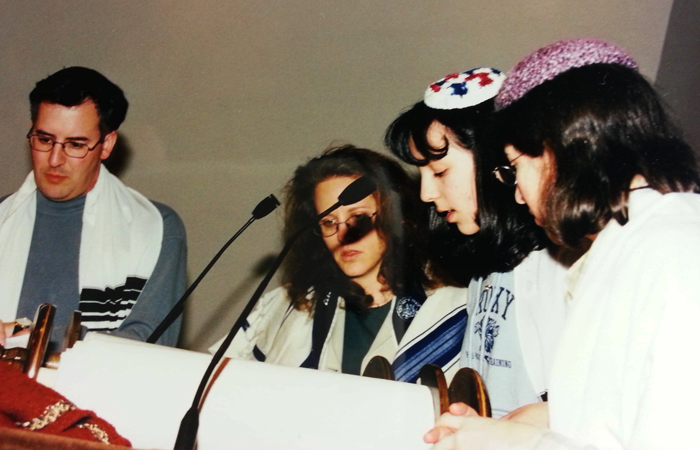
Me reading my Haftorah portion during a Bat-Mitzvah rehearsal with my aunt, uncle and cantor looking on.