
This has been one of those cases where you wish you could be in more than one place at once. But Alphabettes are not one, we are many! Thus here’s a little recap of some of the type-related events that took place around the world in the last two weeks, so you don’t miss anything, and for those who didn’t follow along on Twitter. The idea for the #betteslive hashtag came about when we realized how much was happening within just a few days. With correspondents on several continents, it was intended as a way to better document, comment, and track the events from afar.
DiaTipo / São Paulo / Dec. 4–5 / by Luisa Baeta
DiaTipo was a short and sweet conference of a day and a half (aside from the pre-conference workshops), covering several aspects of making letterforms. It has a nice structure, where talks are arranged by subject in blocks over a morning or afternoon (lettering and calligraphy, research and education, type design), and each block closes with a round table with the lecturers and questions from the audience. The highlight for me was Fátima Finizola’s talk about vernacular typography in Latin America. In a talk about research on rich imagery, she managed to find the sweet spot of not focusing on academic lingo, but not doing a show-and-tell of pretty images either: there is rich analysis, a discussion on approach and methodology, she finds patterns, makes links between tradition and contemporary practice (she mentioned Carga Maxima, who we saw at ATypI: more on that later, watch this space!). Most of all, she challenges preconceptions and actually changed my way of looking at things. Another great talk was by Marconi Lima in the type design block. Talks and round tables will be available soon in their youtube channel (most are in Portuguese, but Marcela Romero and Pablo Cosgaya presented in Spanish, and Jean-François Porchez was in English).
TypoMad / Madrid / Dec. 4–5 / by Tânia Raposo
This was my first time at TypoMad, a conference organised by Nora García and Pablo Gámez of Chulotype. The conference lasted 1,5 days, but there were a lot of activities before the conference such as workshops, exhibitions, and a type walk through the streets of Madrid.
Some of my favourite talks:
· Diego Dier sharing his experience of working as a sign painter in Madrid for 10 years.
· Jesús Morentin aka Bunkertype presenting his last project The New Call, a homage to the publication The Next Call by H. N. Werkman.
· Darío Dezfuli talking about his project Taboo Wang Xihou, which really surprised me, winning my badge of Most Interesting Talk.
· The lively Sol Matas guiding us through the growing type scene in South America as well as the history of Huerta Tipográfica.
· Sandrine Nugue presenting her type project for Le Centre National des Arts Plastique, Infini. Sandrine gave a very good presentation and it was impossible not to fall in love with her on stage.
· Jean-Baptiste Levée closed the conference with a very inspirational talk about learning to look and take inspiration outside of the borders of design.
On Saturday, there was a 30-minute round table discussion moderated by Nora García with some of us Alphabettes: Sol Matas, Sandrine Nugue, Julia Kahl, Veronika Burian, and myself. We talked about the role of women in the world of typeface design and typography, the Alphabettes group and how it has been helping its members. And about what our future plans are.
It was a really great conference and I was happy to see old friends and connect with new people, like all of the other Alphabettes present at the conference. Looking forward to the next edition!
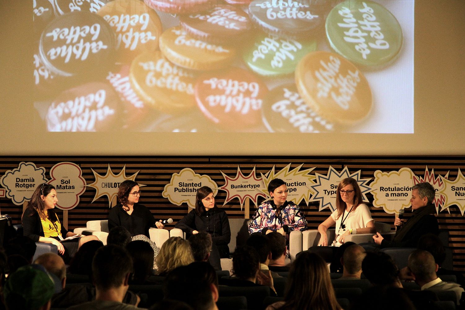
Round table discussion about women in type. Photo by TypoMad
Encounters of the Third Type / Paris / Dec. 4–5 / by Alice Savoie
The two-day conference was an exciting (and rare) opportunity to bring together specialists in numismatics, epigraphy, paleography, and type designers. This might seem an incongruous encounter, yet many scholars have very specific typographic needs beyond typefaces that cover basic character sets of various scripts. John Hudson, in his keynote address, presented a number of projects he has worked on in collaboration with scholars and publishers: his Brill types (for Brill publisher), the Athena Ruby typeface (for the Dumbarton Oaks library) and the typefaces he designed together with Fiona Ross for the Murty Classical Library of India. Joel Kalvesmaki, Editor in Byzantine Studies at the Dumbarton Oaks library, also discussed the making of the Athena Ruby typeface from the client’s perspective, giving a very insightful talk on the challenges involved in such an ambitious project. Other speakers included an interesting mix of numismatists (Marcus Phillips, Florence Codine), paleographer (Marc Smith), archaeologists/epigraphists (Morgane Uberti, Ludovic Trommenschlager), and type designers (Andreas Stötzner, Sarah Kremer, Elvire Volk Leonovitch). The discussions that arose from these presentations during the round-tables were particularly interesting. One question that was repeatedly asked throughout these two days was: where to draw the line between structure and style? While typefaces for scholarly purpose need to be comprehensive and provide a high level of detail, they also need to work as systems, and provide a mean to organize and classify knowledge. They must act as a tool able to produce graphically coherent text, without compromising on scientific accuracy. This conference demonstrated that dialogue between type designers and scholars can bring ambitious and innovative solutions to the field of digital humanities, and I certainly hope that such encounters will happen again in the near future so that the discussion can carry on.
Sara Soskolne Lecture / New York / Dec. 7 / by Elizabeth CareySmith
The double-bill lecture included the finer points of expanding Gotham to support Cyrillic and Greek as well as the impetus for the design of Quarto, an Old Style typeface with inspiration from Van den Keere’s work of the late 16th Century. Solskone’s presentation, as always, was eloquent and thoughtful, elaborating on interesting details such as stroke terminals and how they were adjusted post-interpolation to maintain those characters’ essential, geometric Gotham traits. The Gotham family comprised 16 masters and 8 heavily-edited sub-masters in their Latin character sets alone, so adding Greek and Cyrillic to the mix resulted in roughly two-and-a-half years of work. Quarto was originally commissioned for interiors of the now-defunct Portfolio Magazine, with the original designs delivered to the client in less than six months. All in all, hers was an informative and engaging lecture for those of us interested in this kind of stuff (she said at one point, “we do all this for a reason … because we are crazy”) and was likely equally baffling and intimidating to those who just went for extra credit.
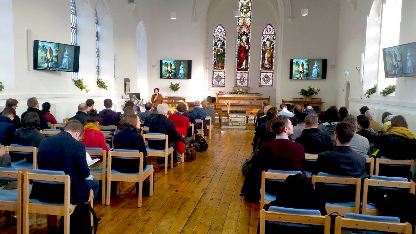
Elena Veguillas presenting at Face Forward in St. Laurence chapel on the Grangegorman campus of the Dublin Institute of Technology.
Face Forward / Dublin / Dec. 11–12 / by Amy Papaelias
It was a packed two days, brimming with voices both new and established, on topics ranging from history and theory to practice and pedagogy. The multi-track organization, despite receiving some public grumbling, worked out quite well as there was plenty of thought put into the schedule so conference-goers could make decisions with slightly less self-effacing guilt. Some highlights for me included: Elena Veguillas’s presentation of her in-progress PhD research on Truman’s lettering and corporate identity, Aoife Mooney’s presentation on the potential for expression-imbued type design, Jo De Baerdemaeker’s research into the origin and evolution of reverse italics and Sumanthri Samarawickrama’s studies into the Sinhala letter anatomy, among many, many others. Tobias Frere-Jones enraptured the crowd with his collection of banknotes and tales of typographic forgery throughout history. But the highlight of the weekend, of course, was talking, walking and sharing a pint with many new friends in type, including the largest in-person gathering of Alphabettes contributors to date.