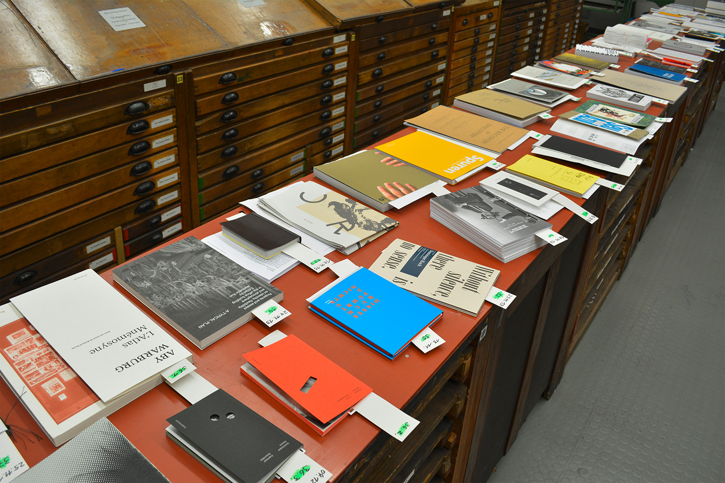
To all book designers among you — the call for entries for the Walter Tiemann Prize 2016 is open for a few more weeks, and you should consider taking part! It is one of the most prestigious and interesting awards for books world wide (I think).

Jury session 2014
“Entries must contain typographically designed texts; illustrations may be executed in any printmaking technique. Innovative designs consciously relating to the texts’ subject matter are expressly called for. The prize welcomes editions by publishing houses as well as self-published books and works printed in short runs. Unique items, handwritten works, and book concepts which are still at the draft stage are excluded.”
The award is organised by the Verein zur Förderung von Grafik und Buchkunst Leipzig e.V. (Society for the Advancement of Printmaking and Book Art, a non-profit organization with, by the way, currently 77.7% female members). The jury always includes the previous awardee, and for 2016 will consist of Nina Hug (CH/DE), Christoph Ruckhäberle (DE), Felix Salut (DE/NL), Maren von Stockhausen (DE), and Cornel Windlin (CH/DE). Main award is recognized with €5000, an advancement award with €1500.
More detailed information and the application form are available on the website.
Aside: The site is designed by Kaune & Hardwig and worth checking out and playing around with in general. For instance, it swaps the regular-width Fakt webfonts with the semi-condensed styles for small viewports and uses Fakt’s stylistic alternates with simplified, “modernist” forms for a, g, j, u, y, and so forth — totally changing the flavor of the typeface. Although the semi-condensed feels a bit too narrow and tight on the phone for my taste, I would love to see more “adapting” typography like this on the web, please! And can we have an award for innovative typography on screen next?