
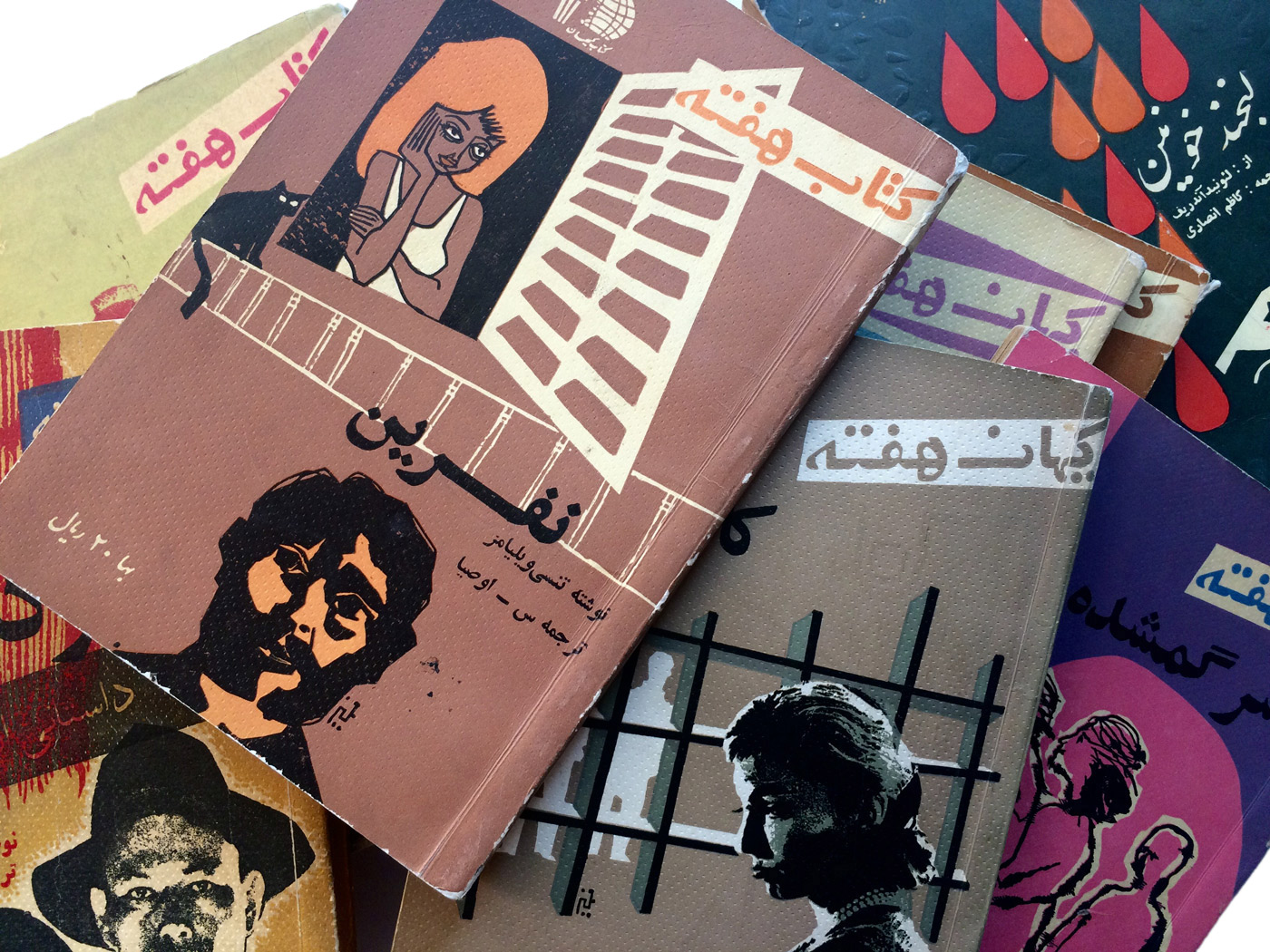
As the name suggests, ‘Book of the Week’ was a series of paperbacks that were distributed every week in Iran between the years of 1961 and 1963. A product of the Tehran-based publishing institute Kayhan, the books gained a great amount of popularity among the general public by featuring literature from established writers, as well as publishing essays on a diverse range of topics such as science, culture, society, poetry and the arts.

The influence of two prominent Iranian figures on the production of these paperbacks was significant in the reputation they gained as highly anticipated literary items. The first was the Editor in Chief of the books, Ahmad Shamloo. A distinguished poet, journalist, writer and translator, Shamloo was essential in the inception of the series, and dedicated much time to assure the high quality of the content. The second was Morteza Momayez, who is often referred to as the ‘father of graphic design’ in Iran. Momayez illustrated the majority of the artwork, and designed the layout and covers for the books.
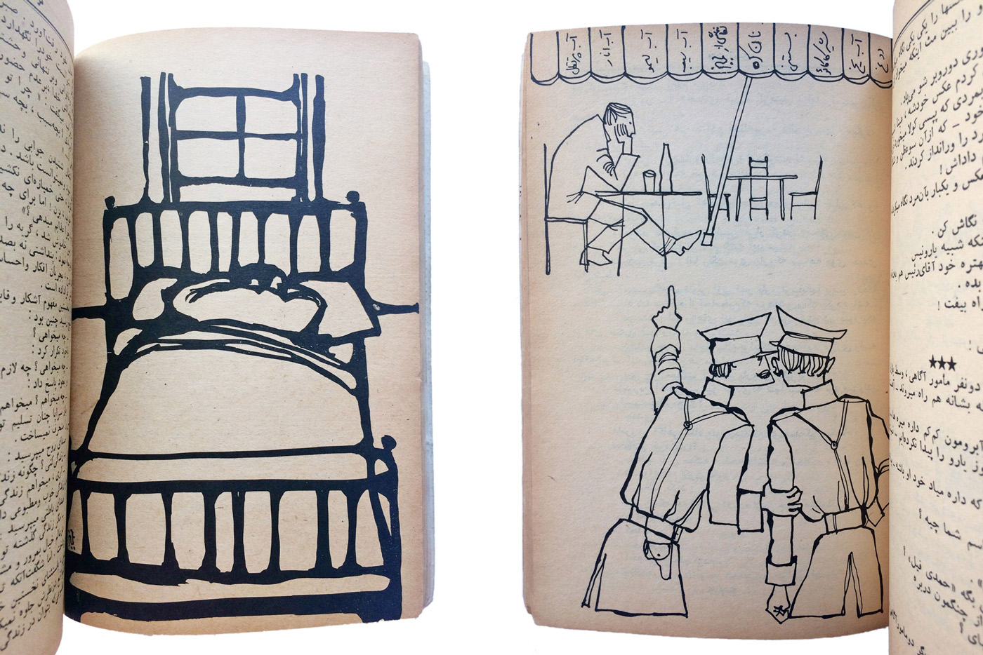
Examples of illustrations by Morteza Momayez
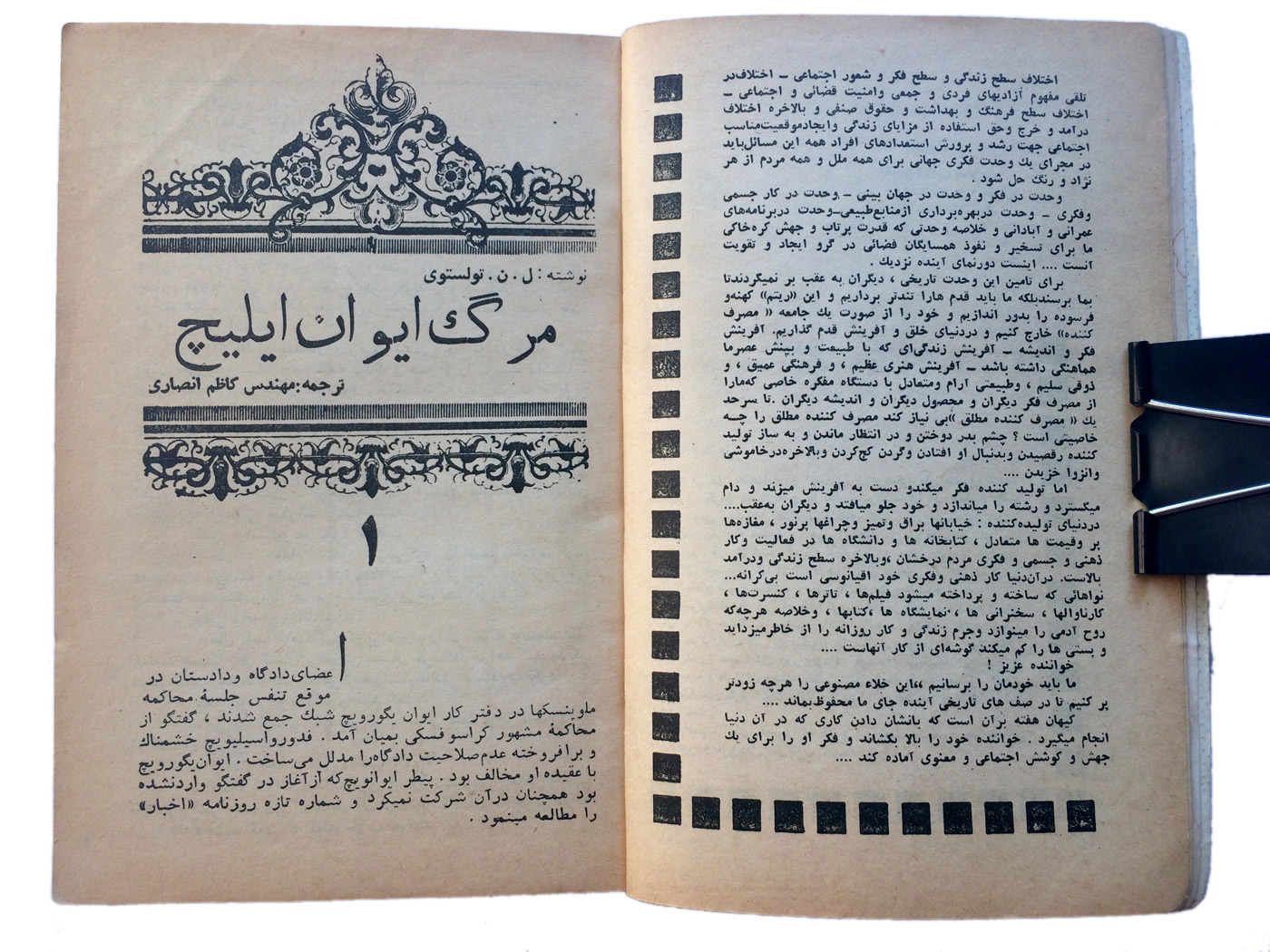
Leo Tolstoy’s ‘The Death of Ivan Ilyich’
From a typographic lens, the books are filled with little gems such as Arabic drop caps (a rarity in any connecting script), a variety of typefaces from the hot-metal era and funky headline lettering. While the majority of text is set in simplified Naskh, for headlines, what appears to be Monotype Solloss is often alternated with a Naskh outline typeface. Also noticeable from some headlines is that the typefaces often do not cater to the needs of Persian orthography; this can be seen in places where the closest character from the Arabic alphabet has been used as a compromise.
For the drop caps the first letter of the word appears in isolated form as opposed to the initial form which would then connect to the next letter
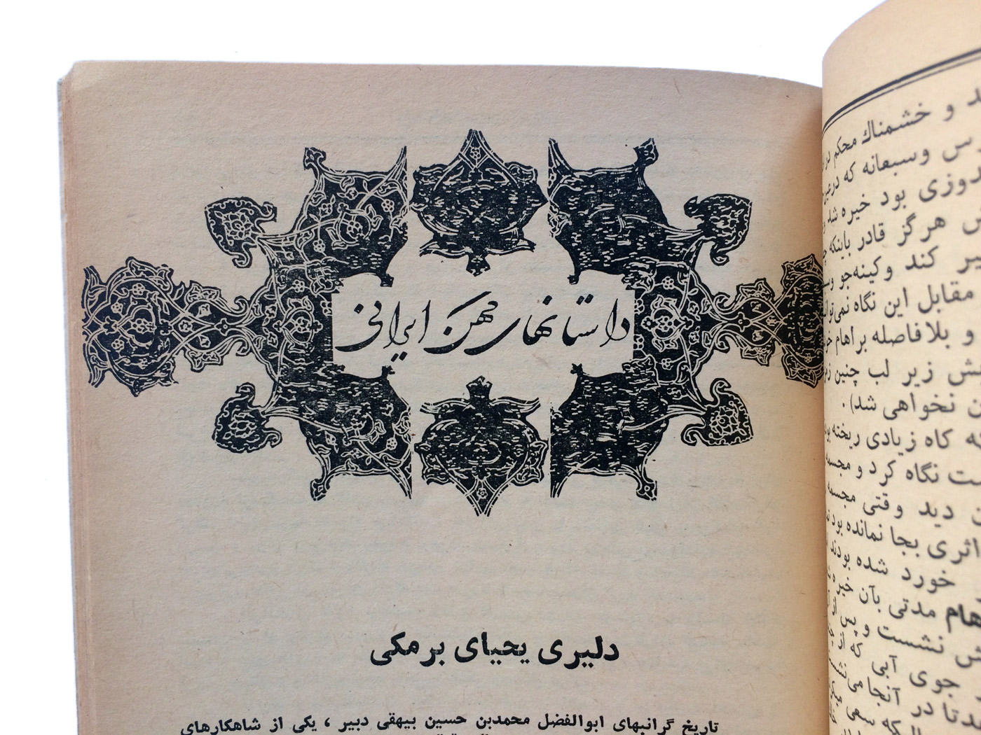
A hand written header inspired by the Shekastah Nasatliq style of calligraphy (reads: ancient Iranian stories)
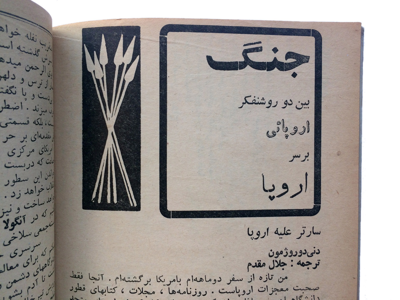
Four different typefaces used in a single header (reads: battle between two European intellectuals over Europe)
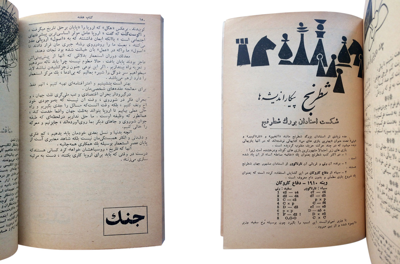
Also featured in these books are charming advertisements, crossword puzzles, reading recommendations and a weekly analysis of famous chess matches. A colleague once reminisced about how he always waited for Thursdays when a new book would come out so he could continue reading an on-going story that was being published chapter by chapter, and was often left off on a frustrating cliffhanger. I sympathized by sharing that I had to cancel my Netflix subscription for that very reason. Now a collectors item, a complete set of the books is a rarity. However, the entire set can be downloaded—albeit with low quality—here. (The site is entirely in Farsi. You’re welcome)
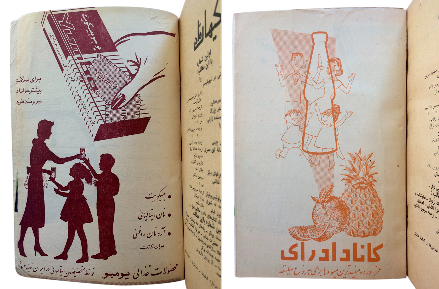
Advertisements for Canada Dry (right) and Yumbo biscuits (left)
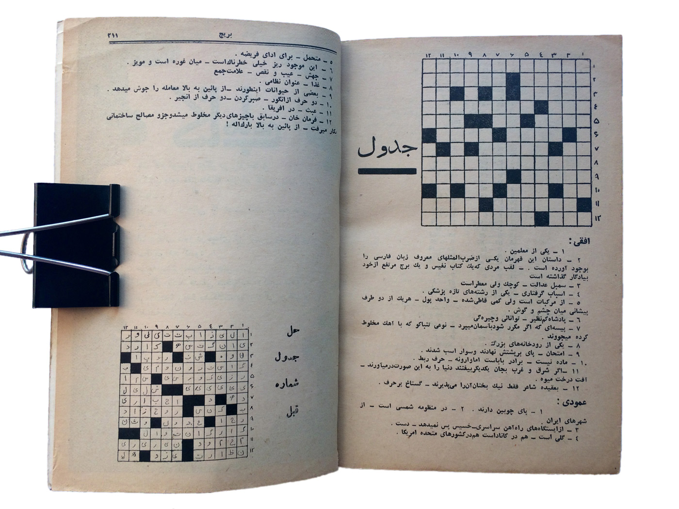
just in case you were wondering how crosswords work in a connecting script like Arabic
(left) The Persian letter gaf (گ) has been substituted with the closest Arabic equivalent, the kaf (ک) in the word جنگ (war) on the bottom right hand of the page
(right) Handwritten Nastaliq headline for a chess match analysis
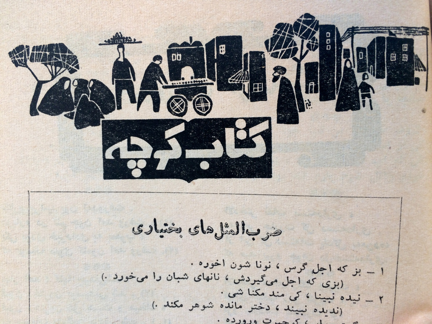
A selection of phrases from the Bakhtiar’i tribe (one of my favourites: to pluck a single hair from a bear is a significant prize)
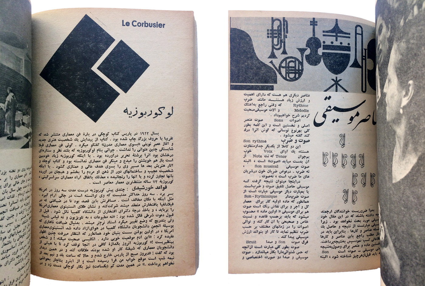
(left) Essay on the life and work of Le Corbusier
(right) Essay on the elements of music, with some attempts at Latin-Arabic harmonization