Finally done?! — Not quite yet! My new typeface Bridge is still work in progress, under construction so to say. Nevertheless, I would like you to get a sneak peek at my final project I was working on at the masters program TypeMedia at The Royal Academy of Art in The Hague (KABK), The Netherlands.
Bridge — an editorial typeface under construction.
Bridge is an editorial typeface that aims to fill the gap between optical sizes with a static headline and a perceptible dynamic text version for reading. One question I asked myself at an early stage was: Do we always have to create interpolatable typefaces only because it is possible? Or do we rather need typefaces that fit their purpose and are designed for the users’ intention?
After dealing with these questions I gave up my very first ideas as I had to admit that this rotation effect (video below) made as variable font is not a good solution for an editorial purpose.
After analyzing magazines and blogs I found myself confronted with the basic considerations: a headline has to attract attention, whereas a text version should be reduced in its details in order to guarantee a fluent reading. I defined sizes for an intended use and tested my Bridge during the process in a suitable environment. I was aiming at providing the user with something for the in-between sizes. The subheadline which is just an optical version of the headline with thicker thins and wider proportions offers a broader range of options.
Taking a look at the dimensions you can see that there is a big difference in the x-height. In order to achieve a striking appearance, the headline is condensed with a more generous x-height. For text styles, Bridge offers higher ascenders and descenders for better legibility.
Combining the styles!
Moreover, an editorial system needs italics which work well. Within the short period of my masters, I concentrated on the italic for the regular text style to give the option to distinguish with a narrower running construction that feels a bit crispier than the roman. And yes, just give me a bit more time – more italic companions to the other roman styles are already in planning.
Make it bold!
To distinguish your copy text, the regular works together with bold and a medium with extra bold as his partner which works well for inverse text setting.
Combining the different styles. Reference: en.wikipedia.org/wiki/Bridge_(music)
I don’t want to show off my character set. My fellow students were working much harder on filling the gaps there, but what I needed to test my editorial typeface in progress were small caps – at least the basic characters.
What is confident typeface?
In the beginning, I have always described the shapes I was drawing as «confident» — which in the end I had to prove somehow. The basic appearance of the typeface that gives a strong feeling is caused by the expansion contrast (based on the stokes resulted by a pointed pen. We already know that from the Bodoni model, for example).
Bridge construction
The overall aim (not only of this project!) is to fit the purpose. In this spirit I treated Bridge’s details in a different way: For example, the head got a more geometric appearance with four corners inside the counter «o» in order to attract attention. It was this mono-linear line that connects the thicks that inspired me to name the font Bridge. Even so, I decided on the text version to go for asymmetric counters that give more dynamic to emphasize the reading direction by reducing the corners inside the counters.
Dynamic serifs made with an angled top serif give a dynamic presence. The slanted italic even involves the angle of the top serif and gets more speed with that. Together with expressive tails, the italic gets that crisp character.
Details like the serifs of a «s» are treated differently to fit their usage and give the same overall feeling for the individual styles. In body text, you are easily bothered by any unusual letterforms. Therefore you will find more expressive characters in display sizes. With this, Bridge gets a confident appearance.
Giving a typeface more character can also mean to reconsider on given solutions for certain letterforms.
Münchner Eszett
There was no official capital version of the German letter Eszett until in June 29, 2017, the Council for German Orthography agreed on the optional use of this also called «capital sharp S» (see typefacts.com or typography.guru). There are four common forms in use at present: »Dresden« (1) and »Leipzig« (2) by Andreas Stötzner, »Frankfurt« (3) and »Berlin« (4) by Adam Twardoch.
Overview by Christoph Koeberlin & my Münchner Eszett
Ever since the discussion has started I was not the only one thinking about creating new forms of the Eszett, apart from the established ones.
Every time, my friend Sebastian and I go out for a beer, we end up in a discussion about typo nerd stuff. We certainly do have a different taste when it comes to letter shapes — don’t get me started on the K-connection. But in August 2017, when I was just about to leave to The Hague for my masters program, we were talking about the capital Eszett. Sebastian kept complaining how the established typefaces of the Eszett were outdated and boring. Sipping my beer, I was sketching on a yellow post it, just skeletons. And suddenly I was thinking that a «long S»* with a «capital Z» could be a better solution for a capital Eszett. This is already known as another common way to form a ligature of a lowercase Eszett. Back then we were joking about how I would design several capital Eszett forms and him writing a book about it. Well, feel free, Sebastian!
*Yes, here a recursive problem is going on. Because there is also no version of a capital «long S» except the versions of Fritz Helmuth Ehmcke. So apparently we have to think about this first.
You can see the version which I used afterwards in my TypeMedia typeface Bridge below. The aim was to create a new skeleton idea that can be easily distinguished from a capital «B» or a «3» and fits the other capital letters. During the process of reading, we are used to certain letter shapes. When these shapes are perceived as disturbing, the reading flow may be inhibited. When it comes to capital letters, used for example for headlines, this inhibition caused by an unusual letter form is an often desired effect. Therefore there should be no limits when it comes to experimenting with shapes and forms of this German ligature.
Visionary
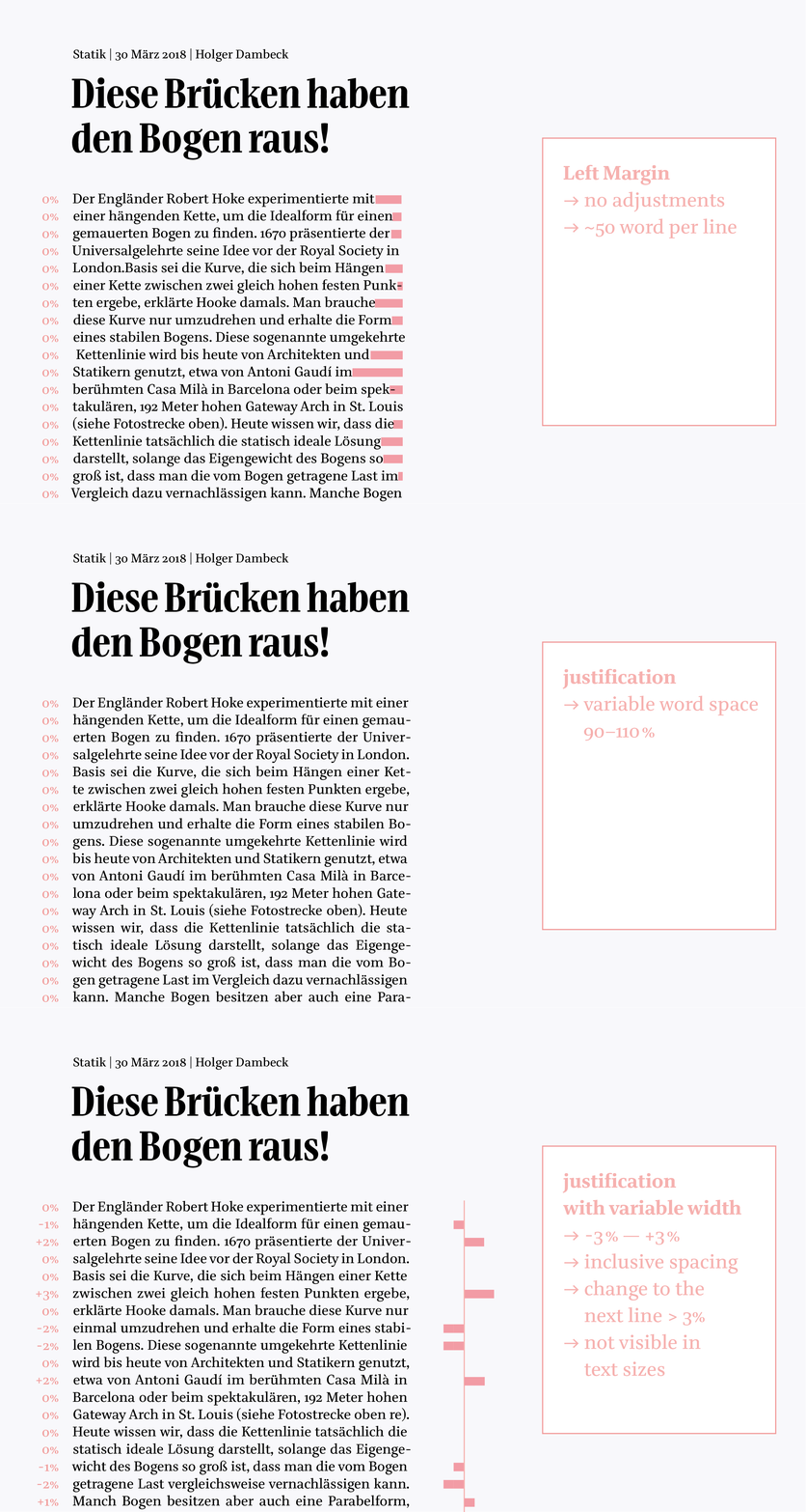
The visionary aspect of my editorial concept was the idea to create something more helpful than what the already existing typerfaces offered. Inspired by a speech by Bram Stein at the Robothon conference in 2018, I was thinking that a variable width for nicer text justification in web design could be also a nice tool for printing.
Visual methods supported by Adobe Indesign often do not guarantee a satisfying outcome. It really hurts to see text lines squished in an unnatural way. That is why I was aiming for a better solution. Experimenting with my «Bridge – under construction» I proposed a variable width that gives the possibility for better line adjustments in text sizes. I found out that keeping the same stem width but adapting the serif’s length and the tracking as a percentage brings a nice rhythm to your justified text. Moreover, you get an even grayscale or you could influence hyphenations. With a variable width of 3 % in each direction, you could tune your line length unnoticeable for the reader. Since variable fonts and the tools are in their early development, there is no support for InDesign yet (8.8.2018). I hope I can give you more input on that development soon — maybe in another Alphabettes article?

reference: http://www.spiegel.de/wissenschaft/technik/statik-der-perfekte-brueckenbogen-a-1096728.html
Standing at the seaside, missing the mountains.
I was desiring to be part of the TypeMedia program for a few years now and I have finally arrived. I have gained a lot of experience – of course in the specialization I was obtaining – but also in different fields, I could not have imagined before. Going somewhere does always mean that you will leave something behind. When I was searching for something new, I had to turn my back on things I also liked a lot. When I was happy to swim in the sea, I missed the mountains. Getting to know all those amazing people at the KABK but at the same time feeling homesick and missing your friends and family back in Germany. Apparently working on typefaces is something that really full fills me. Nevertheless, while doing so, I realized that I was really missing something – better to say: someone. Someone to work with. Do not get me wrong. There is no lack of input and constructive criticism at this masters program at TypeMedia! Actually, it is perfect. Thank you to everybody who crossed my way in this intensive period of time and enriched my working process!
Working with friends
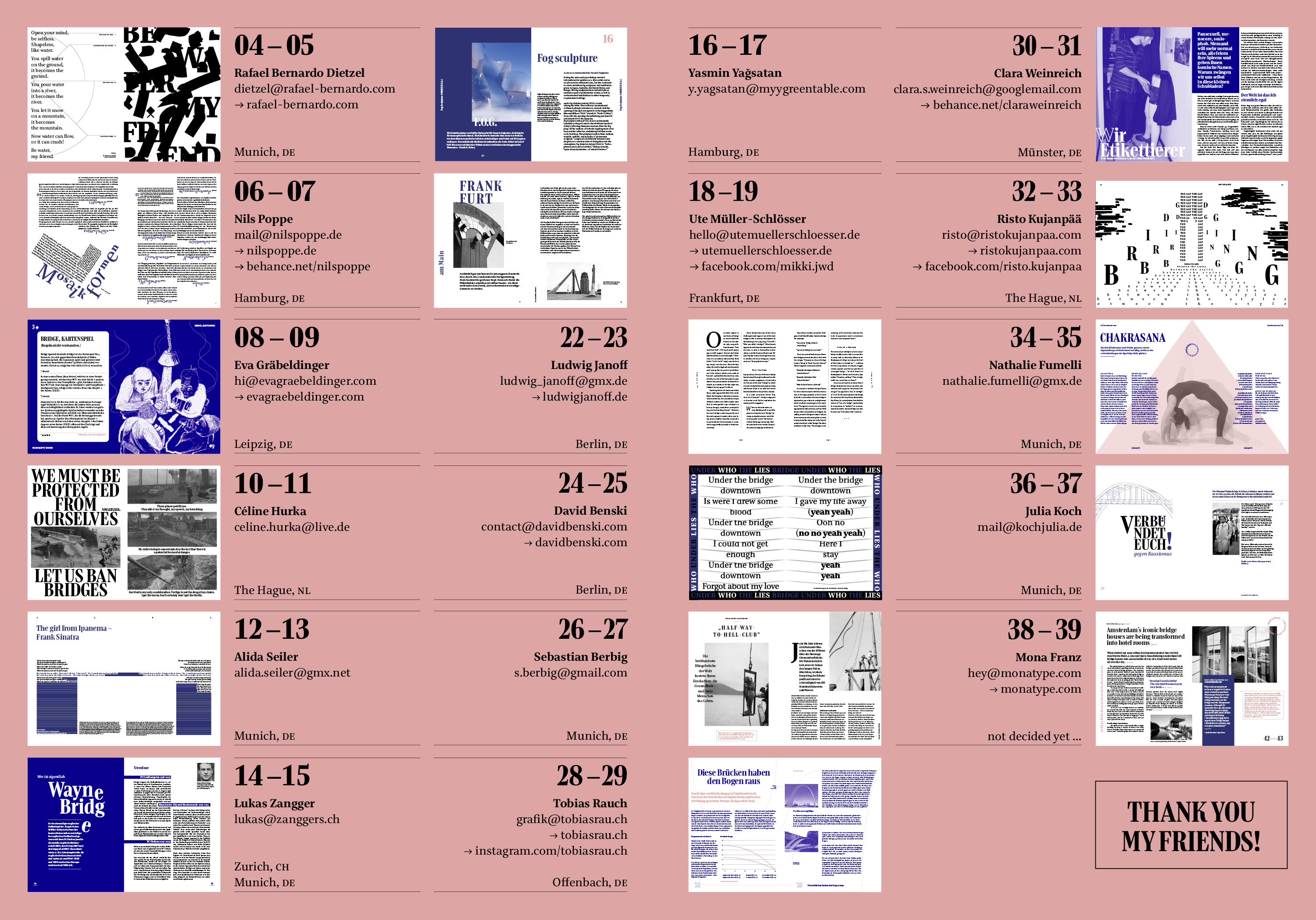
But still, what I was really missing was working together on one project with nice and talented people in a friendly relationship. That is why I built the virtual bridge between the things I love and the environment I like to work in: designing a typeface and working together with new and old friends who I admire. So for my final project, I asked graphic designers working in different fields to test my «Bridge – under construction» and show various ways how the different styles can be used. When my friends confirmed to take part in this experiment I was happy and motivated to continue with this collaboration. At this point, I would like to thank my friends for giving me feedback and bringing the typeface to life by using it in a magazine! And because bridges are connecting: you can find the overview of all designers, type testers, and friends here:

Bridge — Magazine Overview: layouts are made by friends
A fellow student asked me: «Do you do anything on your own?» — Yes, asking the right people.
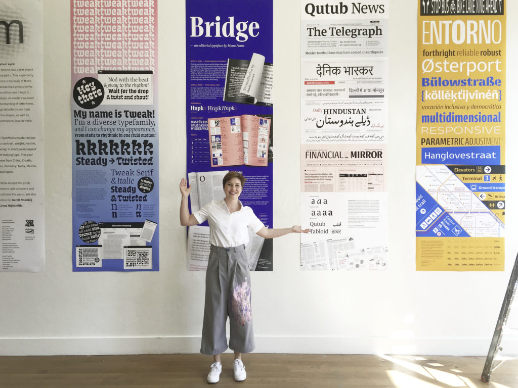
This provocative question motivated me to involve even more people into my final work. And the collaboration paid off: thanks to my good friend Fabian Streitenberger, you could already test my Bridge and thanks to StudioMeeer my exhibition poster turned out wonderful. (by the way: maybe it’s too much jumping from bridge to bridge, but the clothes I’m wearing below are designed by my flatmate Jacob Kirkegård and definitely had a huge impact on my choice of colors)

Bridge — exhibition poster TypeMedia by Mona Franz & Studio Meeer
Thank you for taking me to my Bridge!
Bridge is still under construction. This article shows the result of the final project at the MA program TypeMedia 2018 by Mona Franz under the supervision of Erik van Blokland, Paul van der Laan, and Peter Verheul.
Let’s have a look on the other side…
I am happy to announce that Bridge will be extended and updated to get released at my favourite foundry TypeMates in 2019.
Follow me to stay updated about Bridge.
This article is edited by Fiona Schiffer.
