
“The whole of man is in the alphabet.”
— Victor Hugo
“Letters have a mysterious and cabalistic quality that has been recognised at least since Roman times. As the building blocks of words, and thus of languages, their magic has inspired artists throughout the ages. The illuminated initials of medieval manuscripts, ranging from Romanesque exuberance to Gothic excess, paved the way. Here were not only biblical scenes but mythical beasts and human figures that were the direct precursors of the zoomorphic and anthropomorphic alphabets of the Renaissance and later. Ornamented letters presented historical and mythological events, romantic landscapes, trees, flowers, buildings, clowns, devils, naked figures, street cries, children and every kind of animal.”
— The Animated Alphabet, Hugues Demeude, 1996, New York
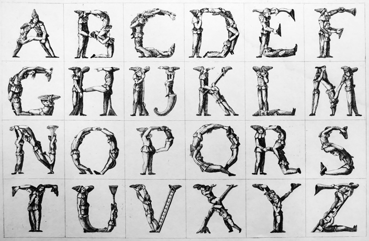
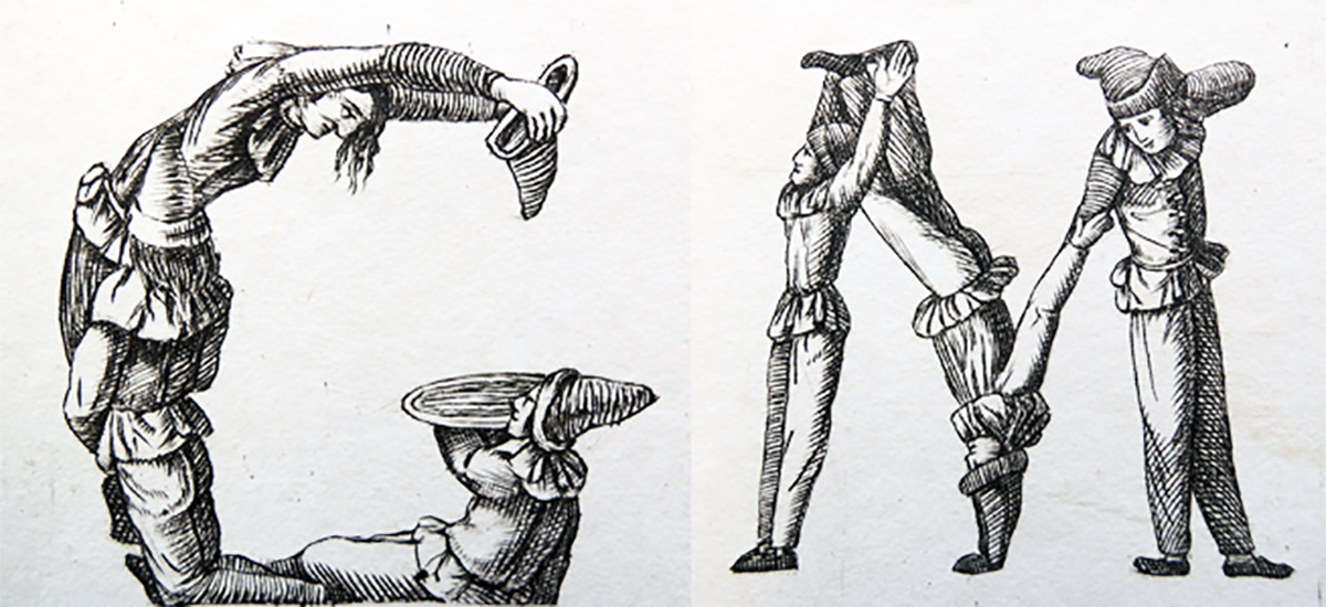
Attributed to Lampridio Giovanardi (1811-1878), Anthropomorphic or Posture Master Alphabet (Emilia Romagna, ca. 1860). 23 x 31 cm.
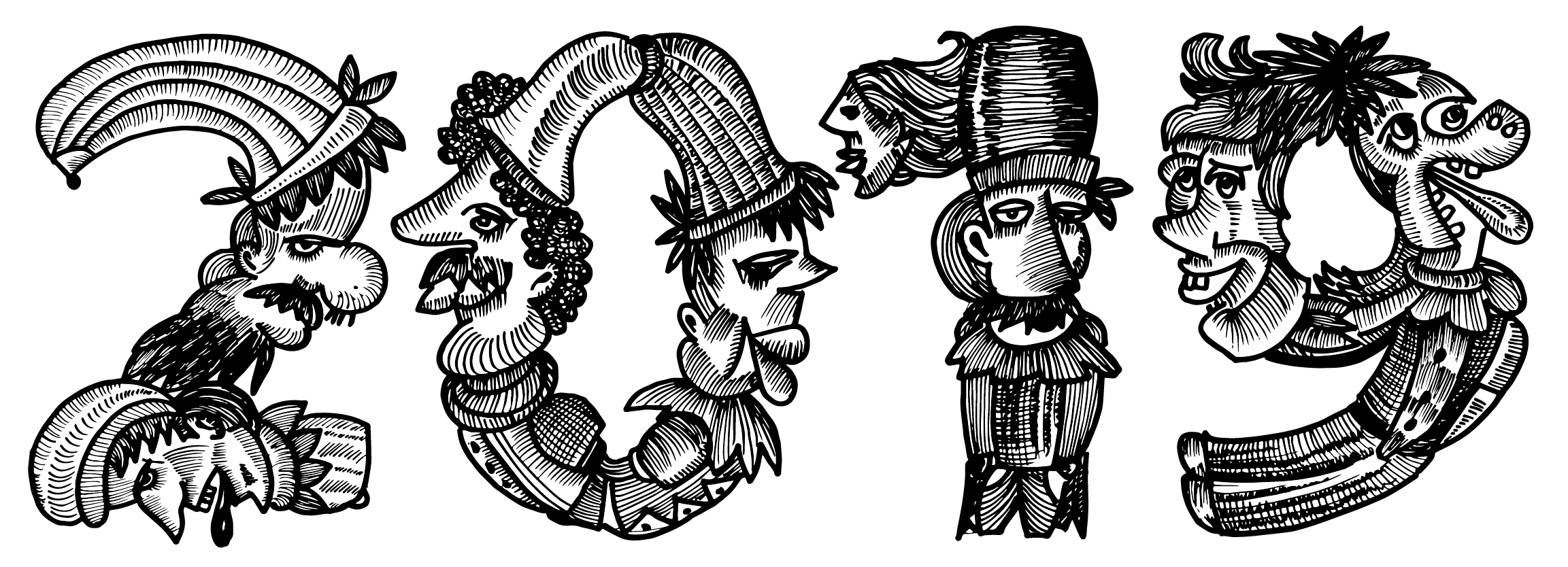
Funtoosh (done for or superb) is from my vivid letter fantasies collection which reflects my humorous nature and the amusement (intricate details) I look for in the letters. I was always fascinated by decorated and ornamentals letters. Particularly the features, volatile appearance, and intricacy which indicates the formal and informal behaviour of elements composed within the letter, bringing out the hidden meaning behind the stories they were used in. I wanted to share these sentiments for decorated alphabets so I initiated theme-based lettering workshops which I conduct every month in Bangalore and Funtoosh was the part of the first workshop. To begin 2019 with lettering projects which bring joy while creating them was the goal for the workshop. When I started drawing the letters and composing the funny figures I went into the phase of creating a story from each character and eventually, ended up with the Uppercase.

Initial sketch for the uppercase N
Later on, after conducting the workshop and receiving positive feedback about the letters I decided to create the typeface, still a work in progress.
Here is some feedback from my workshop attendees:
“Comic Letters (Funtoosh) – A workshop by Ms Zenab Bastawala, was a complete eye-opener for me. I had never realised the potential of letters to express emotion and this workshop helped me value the role of letters even more than I did. I really appreciate the structured approach Ms.Zenab took to conduct the class, slowly taking me through the journey of making letters communicate. As I saw my letters taking form, all the way laughing through the process, I felt the stress and anxiety in me slowly disappearing, giving way to the joy of seeing the letters come to life. Typography is a very powerful tool to express the innermost emotions of the soul and I would like to thank Ms Zenab for making me realise this.”
— Poornima.
“Learning to letter with Zenab is a joy. Her love and passion for letters are contagious; and the first day I attended the workshop, I had no idea I’d learn create beautiful and expressive comic letterforms in the span of a few hours. When I was asked to create the letters to reflect my style, I had a creative block. As if it wasn’t difficult enough already, she said I couldn’t look up reference pictures on the Internet. This challenged my usual way of working and made me dig deep into my visual vocabulary and create something simple, but fun. What Zenab told me about leaving one’s presumptions about the final work aside, and just enjoying the process stuck with me. ‘Comedy of Letters’ was a great way to unwind and learn to create a thing of beauty in the process!”
— Sushma J
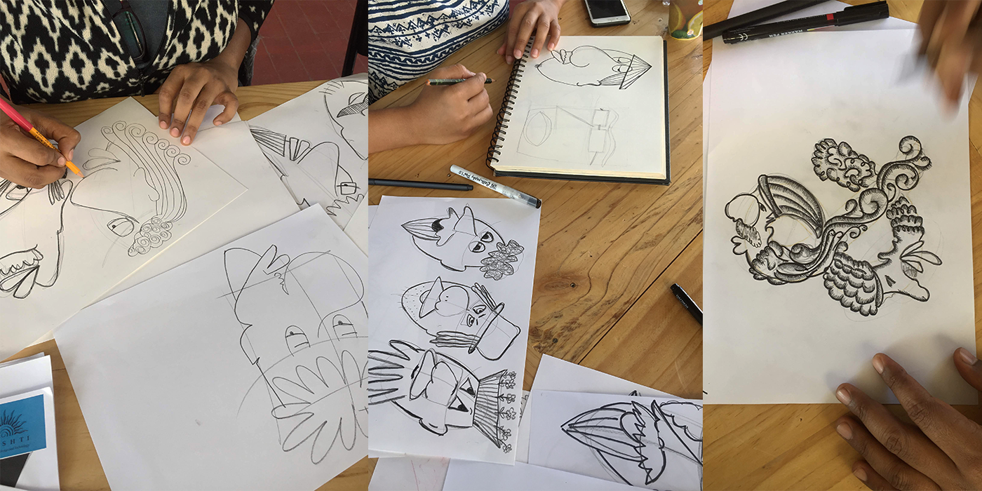
Participants learning the formation of the comic letters during the workshop, Bangalore .
Funtoosh drives inspiration on early woodcut initials from the 14th and 15th century Strasbourg, Geneva, Venice and Lyons, Ref.attached. The elves, masons, kings, clowns and saints, with their peculiar facial features which occur due to the chisel cut in the wood and creates the textures of very strong facial expression. I acquired this expression to transfer them into a humorous figure. The peculiarities of the characters are single line bodies with two heads, chasing each other, or cursing each other. Each alphabet has distinct individual characteristics which create a scene of communication between each other. The concept of each character was to create harmony: a visual language in the context of typography. To re-quote Hugo: ‘The demotic language is derived entirely from the hieratic. Every character is rooted, of necessity, in hieroglyphs.’ These mysterious letters have an empowering effect on anyone who came into contact with them: they take us on a journey into the heart of a candid and disinterested world. The letter is an invitation to dream, a promise of a strange new vision. This source and mystery has inspired — principally in the shapes of letters — their pictorial and sculptural qualities.
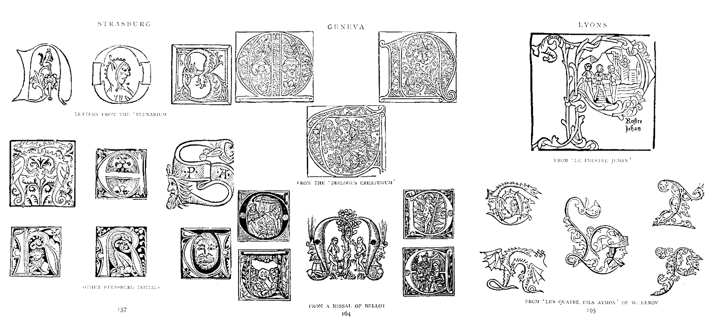
Attributed to Jennings, Oscar (1908), Early Woodcut Initials; containing over thirteen hundred reproductions of ornamental letters of the fifteenth and sixteenth centuries, London, Methuen and Co
After completing some primary characters, I thought it would make a nice and colourful Alphabettes header. So, here it is: a great way to start the day with some fun faces. It is a work in progress typeface expected to be published in 2019. Details about the typeface can be followed up on www.letteritdown.com or #letter_it_down.
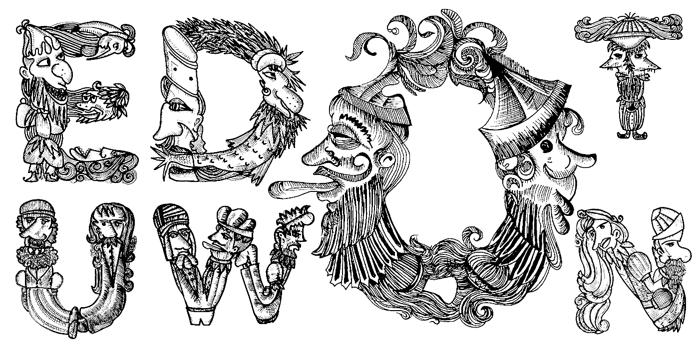
Funtoosh typeface, uppercase letters
Fragments of text and reference images taken from Early Woodcut Initials, Oscar Jennings, 1976? London and The Animated Alphabet, Hugues Demeude, 1996, New York.