
Designed by Sabrina López
Distributed by Typesenses
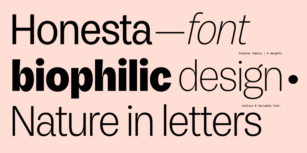
Font family: 6 weights, 2 styles (regular and italic) + variable font
This font review was originally written in Spanish, the colonial language of Argentina. Before colonization, the native people used various languages such as toba, pilagá, mocoví, wichí, nivaclé, chorote, tapiete, quichua, tehuelche, mapudungun, guaraní, vilela, chaná, among others.
English translation of the review below.
Sabrina López es una diseñadora especializada en fuentes display, vive y trabaja en Argentina. Inició Typesenses en 2009.
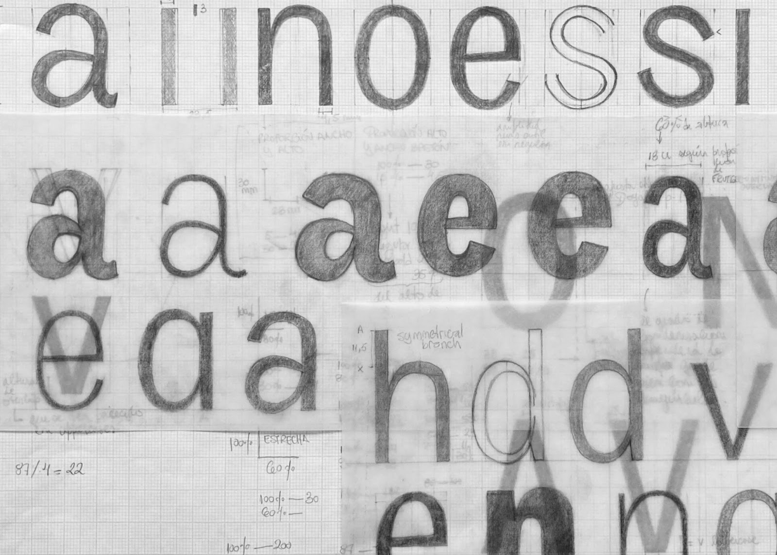
Honesta es una grotesca que se deja seducir por la caligrafía e irrumpe en el catálogo de Typesenses, repleto de tipografías decorativas, display y ligadas. Muestra el rastro de la metodología de trabajo artesanal de Sabrina López, caracterizada por la búsqueda de referentes históricos, el dibujo a mano, mucho papel calco y una gran cantidad de bocetos y borradores a lápiz.
Con este proyecto, Sabrina López se zambulle en otras aguas. Los primeros borradores son de 2021, y luego hubo varias pausas (2022, 2023); estos tiempos de reposo permitieron revisar el trabajo con ojos descansados de la contaminación de la prisa.
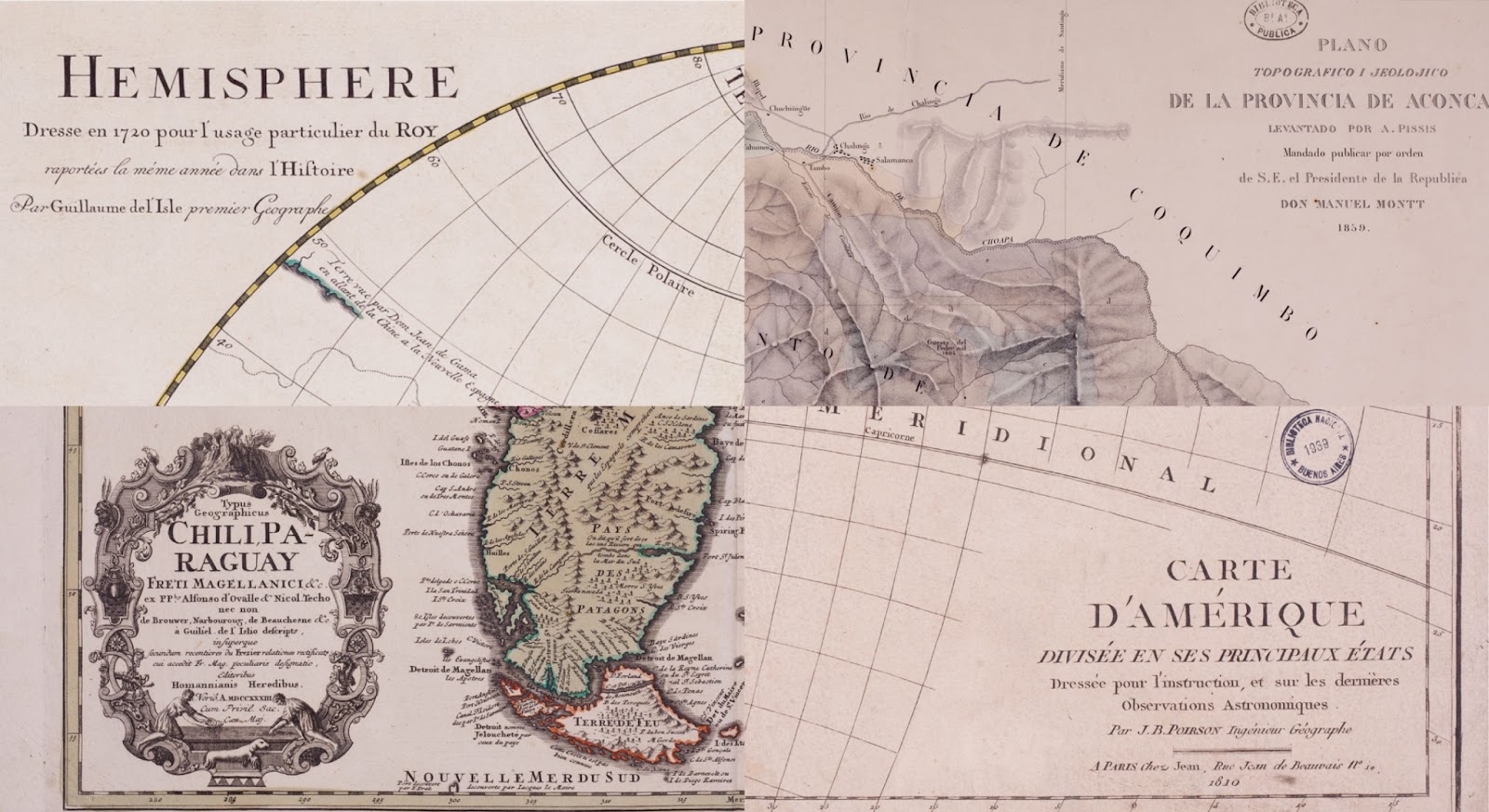
Honesta busca sus referentes en las caligrafías utilizadas en mapas de los siglos XVIII y XIX del archivo de la Biblioteca Nacional (Ciudad Autónoma de Buenos Aires, Argentina). Los bocetos comienzan observando las didonas cartográficas, probablemente hechas con pluma flexible. Esta tipografía recorre el mismo camino que algunas de las primeras grotescas, que tomaban sus estructuras de las didonas, y luego fueron perdiendo sus serifas y el contraste.
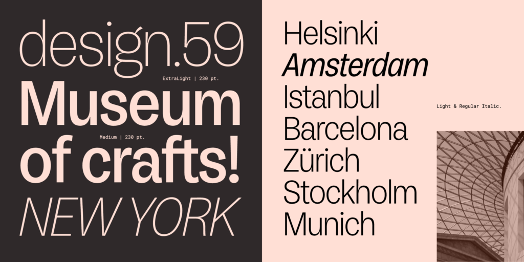
Sus formas levemente condensadas tensionan las curvas, dándoles velocidad. Los bastones firmes y bien plantados absorben el contraste que se genera cuando se encuentran con los arcos y los hombros.
A medida que el peso aumenta, crecen la tensión y el carácter display de esta fuente. Las itálicas completan la familia, aportando versatilidad y ampliando sus posibilidades de uso en espacios editoriales.
La estructura de la “a” y la oreja de la “g” son, para mí, un deleite visual y vinculan esta grotesca con la curaduría del catálogo de Typesenses que desborda gestualidad y caligrafía.
Sabrina López is a designer specialized in display fonts, she lives and works in Buenos Aires, Argentina. Typesenses was founded by Sabrina Lopez in 2009.
Honesta is a grotesque font that succumbs to the charm of calligraphy. It breaks into the Typesenses catalog, which is filled with decorative, display, and script typefaces. It showcases the trace of Sabrina López’s artisanal working methodology, characterized by the search for historical references, hand-drawing, a lot of tracing paper, and a large number of sketches and pencil drafts.
With this project, Sabrina López dives into new waters. The first drafts are from 2021, and then there were several pauses (2022, 2023); these periods of rest allowed her to review the work with fresh eyes, free from the contamination of haste.
Honesta finds its references in calligraphy used in maps from the 18th and 19th centuries, found in the archive of the National Library (Ciudad Autónoma de Buenos Aires, Argentina). The sketches begin by observing cartographic didones, likely made with a pointed nib. This typeface followed a similar path as some of the earliest grotesques, which took their structures from didones but gradually lost their serifs and contrast.
Its slightly condensed forms tense the curves, giving them speed. The firm, solidly-planted stems absorb the contrast created when meeting the arches and shoulders.
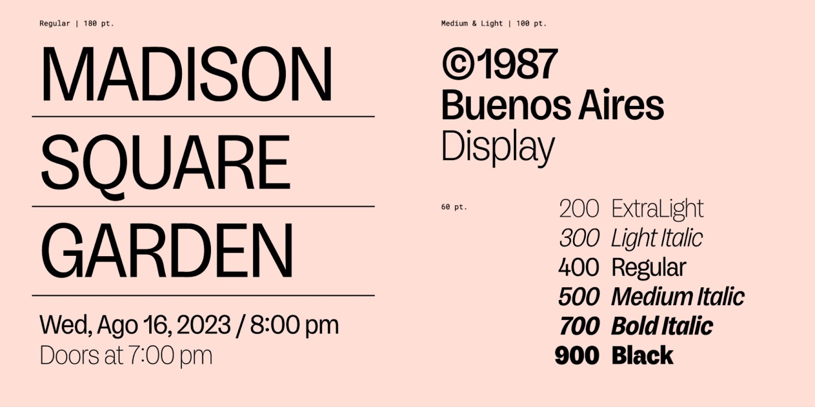
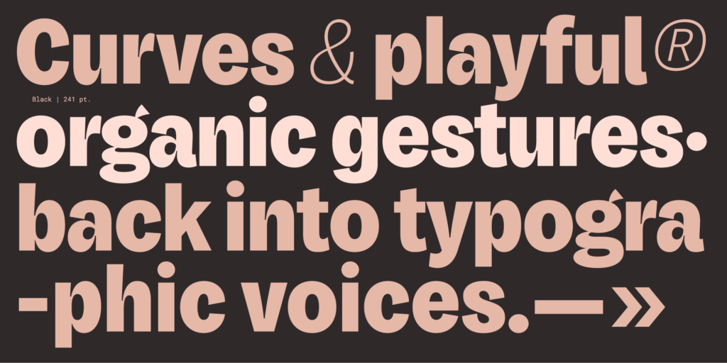
As the weight increases, so does the tension and the display character of this font. The italics complete the family, adding versatility and expanding its possible usage in editorial spaces.
The structure of the “a” and the ear of the “g” are, for me, a visual delight and link this grotesque perfectly to the curation of the Typesenses catalog, which overflows with gesturality and calligraphy.