Designed by Emily Klaebe
Mastered by Tiny Type Co.
Distributed by Order
Font family: 5 weights. 5 static fonts. Trials available
This font review was written in English and translated into Portuguese (BR—below), with over 230 million native speakers, making it the 8th most spoken language in the world.
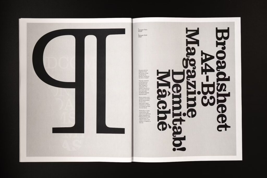
If you need a bracketed slab serif with a nostalgic feel, less contrast, and more quirks than the jaw-dropping Ionic Modern from Commercial Type, Stringer may be the perfect fit. Emily’s first commercial release, designed during the Type West program in 2022, and published by Order, is a revival from Ionics of the early 20th century—more precisely Miller & Richard’s Ionic No. 3 at 12-point—in five up-right weights, from Thin to Bold (fingers crossed italics are upcoming).
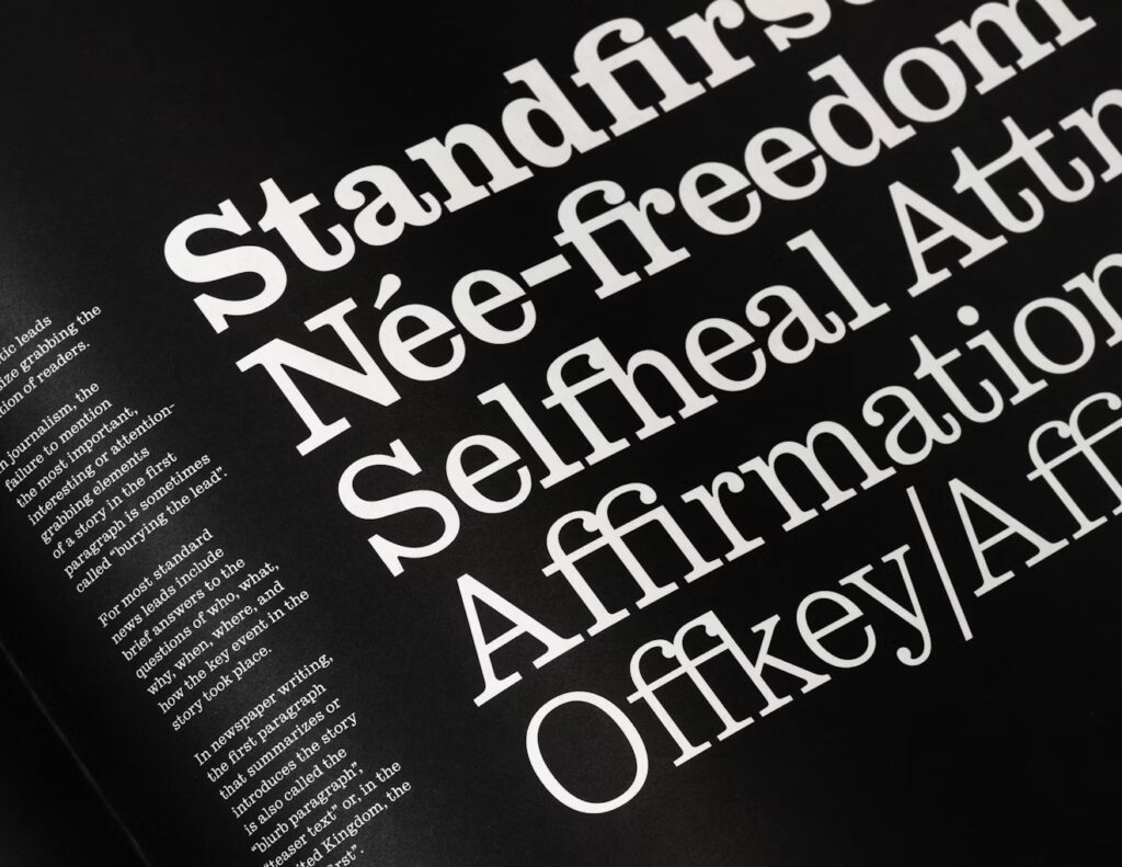
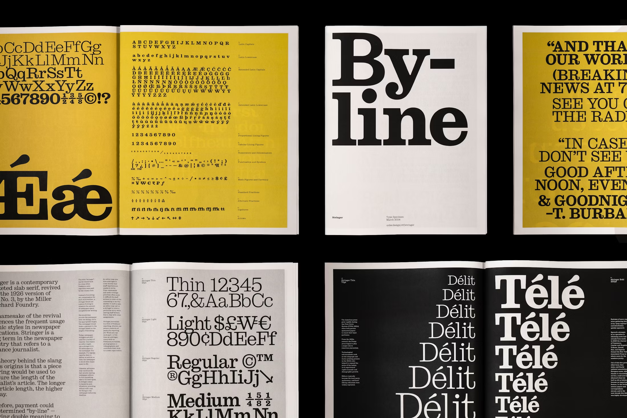
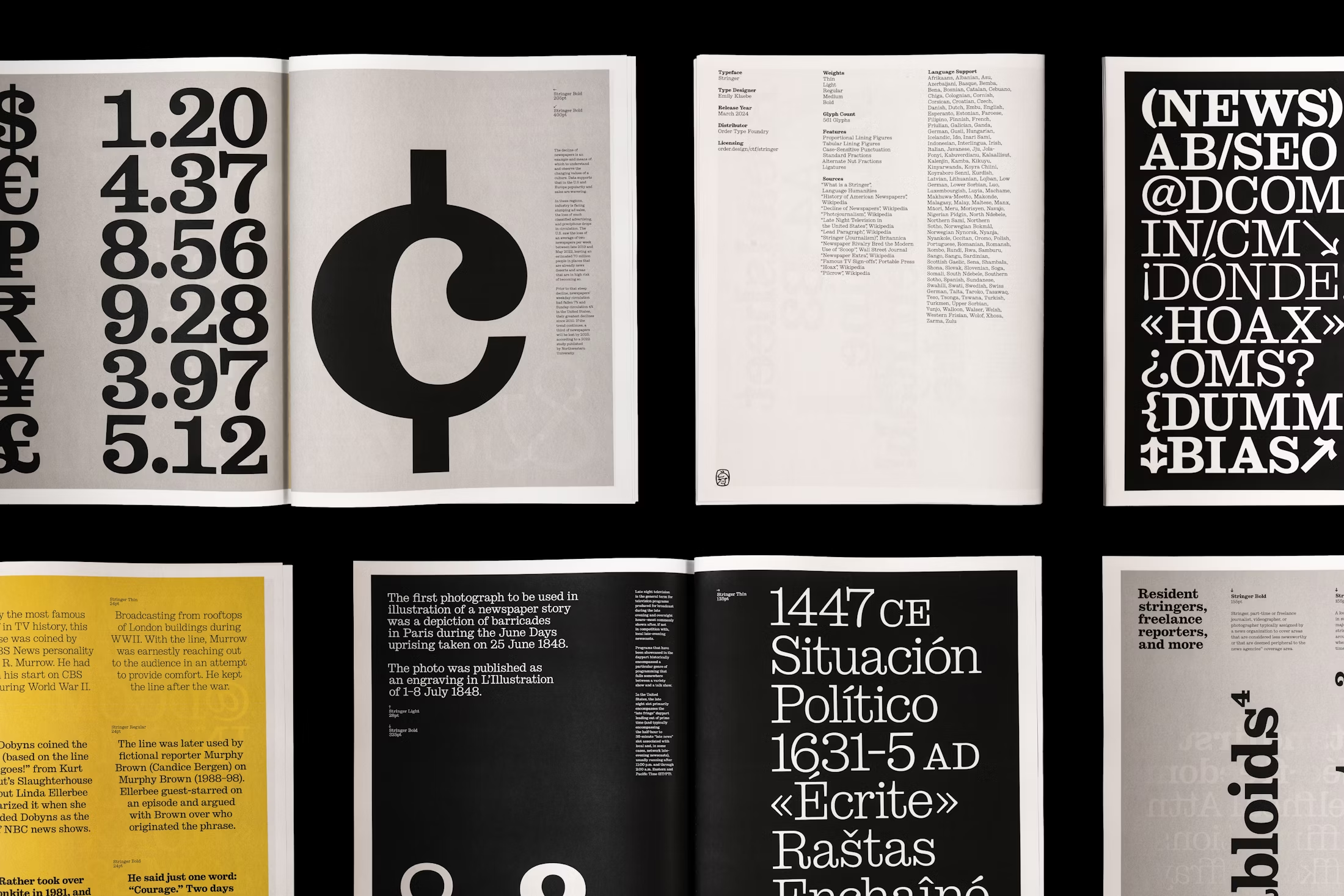
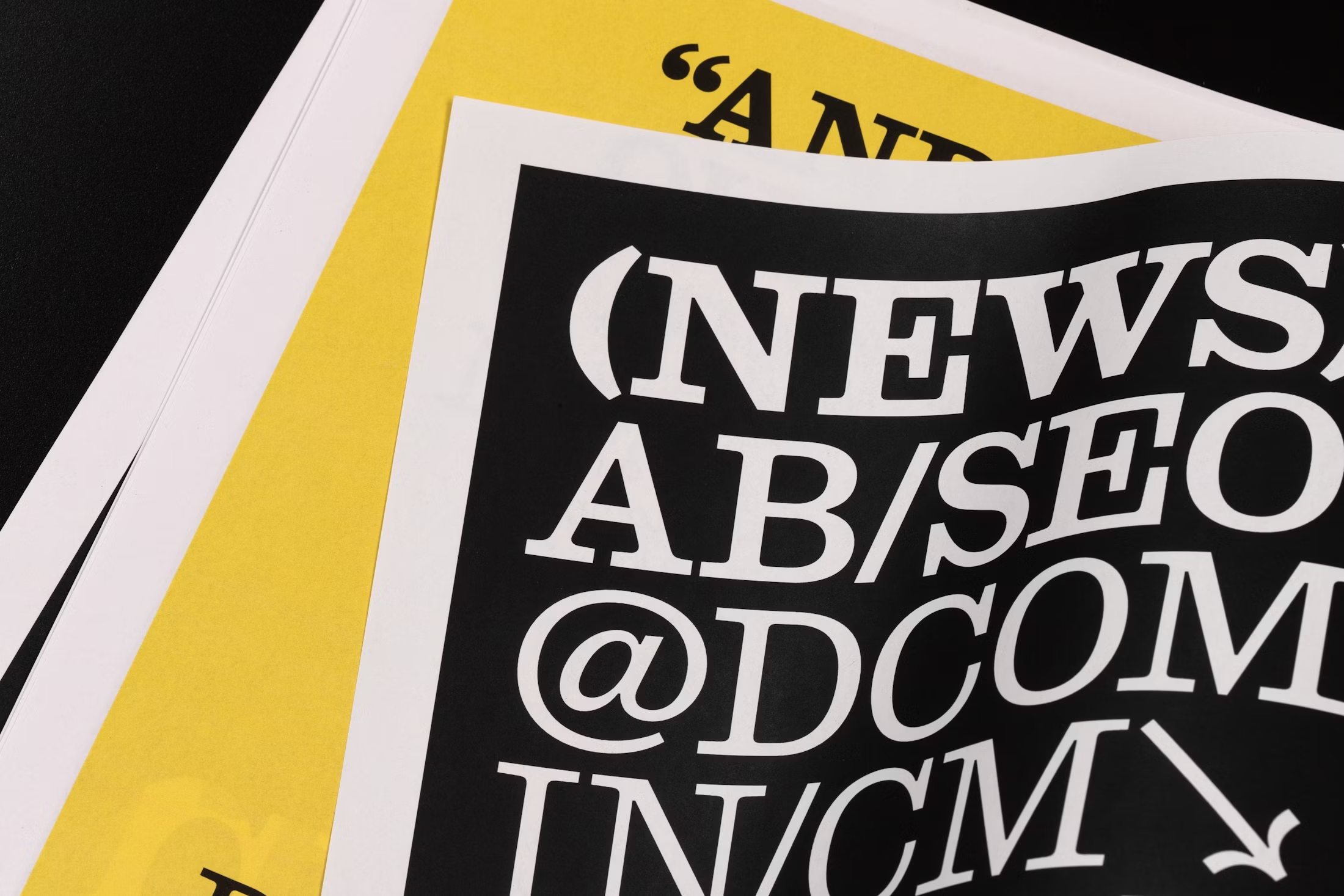
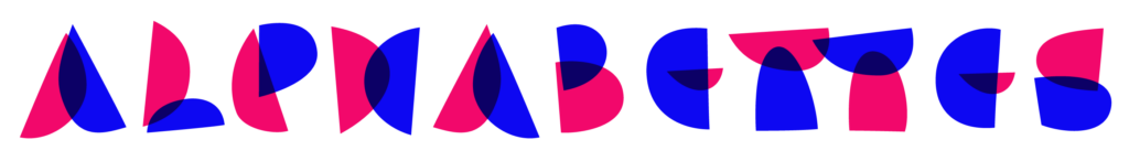
Robust and particularly legible due to its large x-height, wide characters, and long serif endings, the Ionic style became highly popular within newspaper publications, which inspired Emily to use the printed material (from a 1926 specimen), rather than the original metal type, as the source of her “truth”, intentionally incorporating distorted attributes to the design. Another input from the publishing industry is its name, “stringer” is slang for a freelance journalist. Wrapped with all essential features for editorial use, such as case-sensitive punctuation, nut fractions, localized forms, standard ligatures, and adorable arrows.
Se você precisa de uma slab com serifas bracketed, ar nostálgico, menos contraste e mais peculiaridades que a impressionante Ionic Modern da Commercial Type, Stringer pode ser a escolha perfeita. Esse é o primeiro lançamento comercial de Emily, criado durante o programa Type West em 2022 e publicado pela Order Type Foundry. Um revival das Ionics do início do século 20—mais precisamente da Ionic No. 3 de Miller & Richard, no corpo 12—em cinco pesos upright, de Thin a Bold (dedos cruzados para que os itálicos venham aí).
Robusta e especialmente legível, graças à sua grande altura de x, caracteres largos e terminais alongados, o estilo Ionic se tornou extremamente popular em publicações jornalísticas. Foi essa relação com os jornais que levou Emily a usar o material impresso (de uma specimen de 1926), e não a fonte original em metal, como sua “verdade”—intencionalmente incorporando distorções do processo de impressão ao design. Outra referência está no próprio nome: “stringer” é gíria para jornalistas freelancers em inglês. Além disso, a família vem equipada com todos os recursos essenciais para o design editorial, como pontuação sensível a caixa alta, frações nut, formas localizadas, ligaturas padrão e um conjunto de setas adoráveis.