
I really like trying to reverse engineer the ways people have taken type into their own hands. Often it’s something simple, like adding an outline to make it heavier, or adding flourishes that don’t exist in the original typeface. Sometimes it’s several things. It soothes me, like taking a simple machine apart, seeing how it works, then knowing how to put it back together. I also sometimes like to redraw logotypes and typefaces to see if I can improve upon them, for similarly cathartic reasons. I mostly keep quiet with this, because being like, “HERE’S how I would’ve drawn this BETTER THAN YOU,” while knowing next to nothing about the client, their vision, or any number of constraints that inevitably exist behind the scenes, almost always makes you sound like the biggest tool.
THAT SAID. I’ve gotta talk to someone about the logotype for the new Glossier brand, and I don’t have a therapist rn.
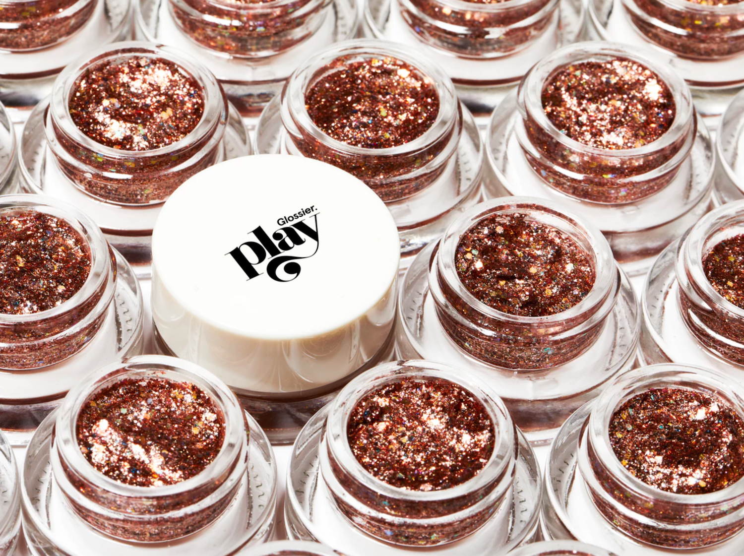
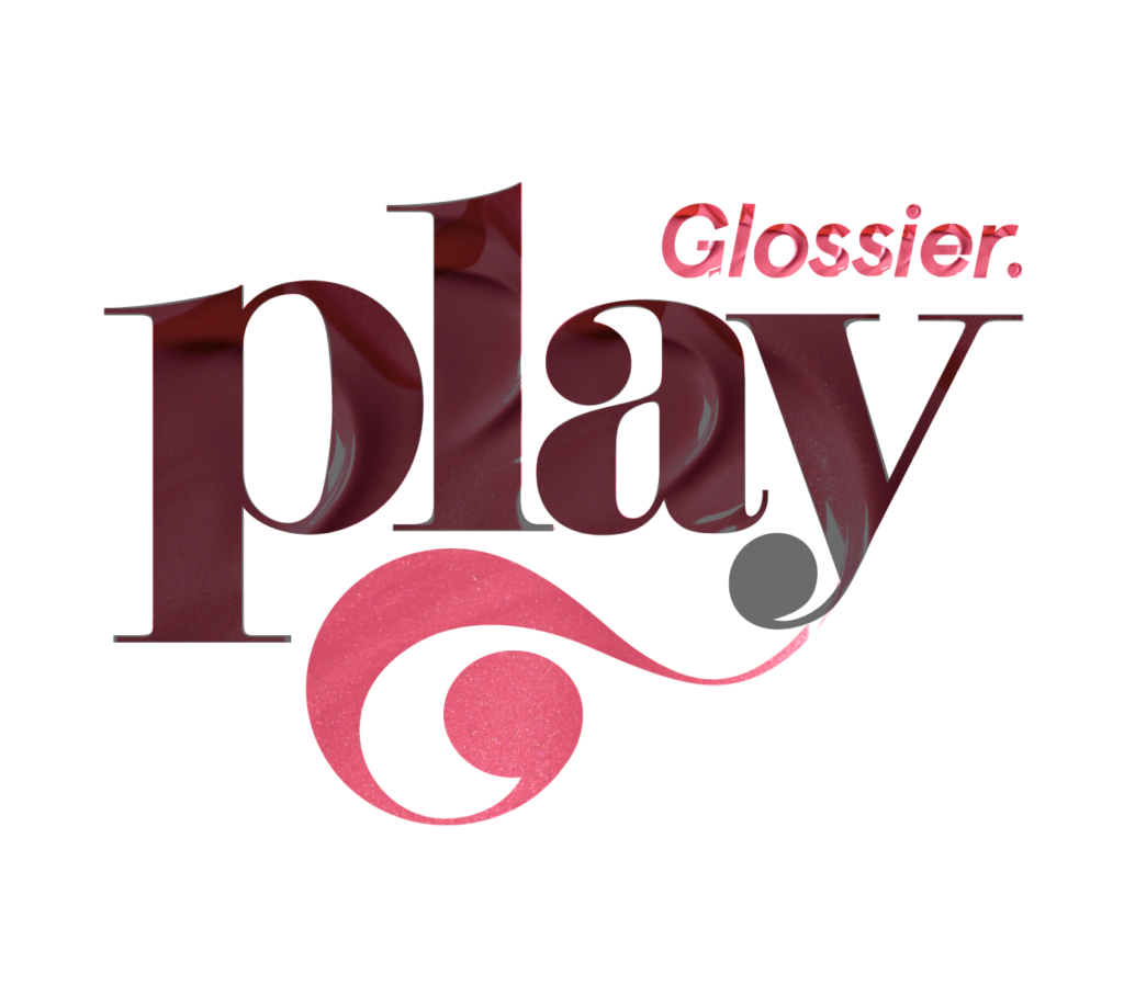
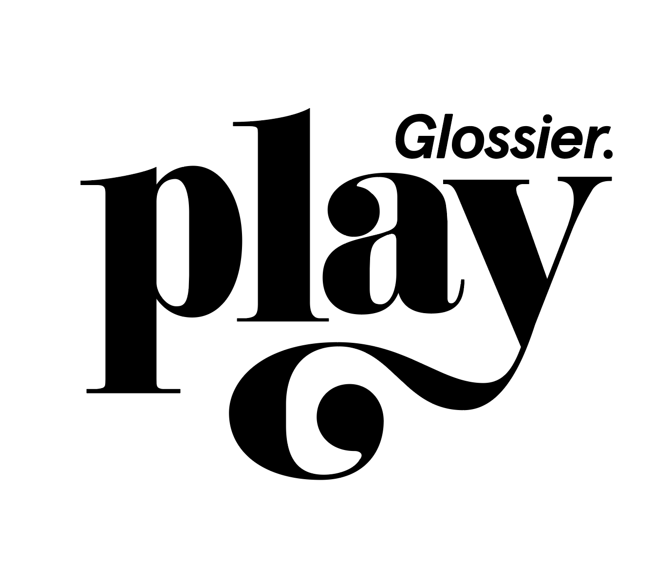
Courtesy of Glossier
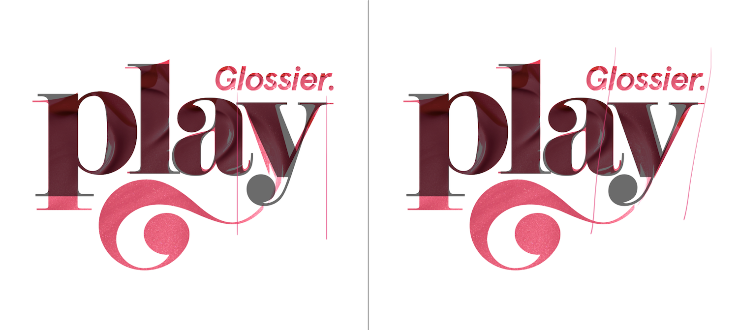
Glossier is a skincare and cosmetics brand whose makeup products are geared toward natural, sheer, subtle looks. They offer basic staples with light coverage and not-super-pigmented shades. I’ve been known to buy some of their stuff and generally have nothing but respectful fear for founder Emily Weiss and her perfect skin. Glossier Play, which launched on Monday, is an off-shoot that’s more focused on more: opaque glossy lip options, eyeliner in a bunch of colors, lil tubs of concentrated glitter gel. You’re caught up on the makeup intel du jour now. Here’s the logotype.
Courtesy of Glossier
I want to understand it so badly!! I’m glad they made it, it’s a loud departure from their (and everyone else’s) stark sans serif main branding, which I think captures what they’re trying to do with the new branch of the brand. I spent a long time trying to google who drew it, wanting any insight on their process, but got nowhere. I assume it was done in-house, but couldn’t even confirm that for sure.
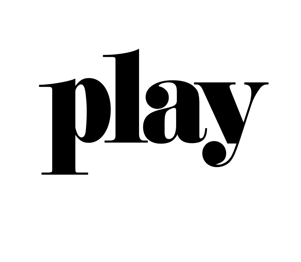
So, time to try and take it apart myself. Based on just a hunch, I think it was made using a typeface as a starting point. I searched for, uh, a while, trying to figure out what typeface that was. It looks pretty close to Poster, Pistilli Roman, Normande and Eloquent JF Pro, but no aspect of any of them is identical to the logo when overlaid.
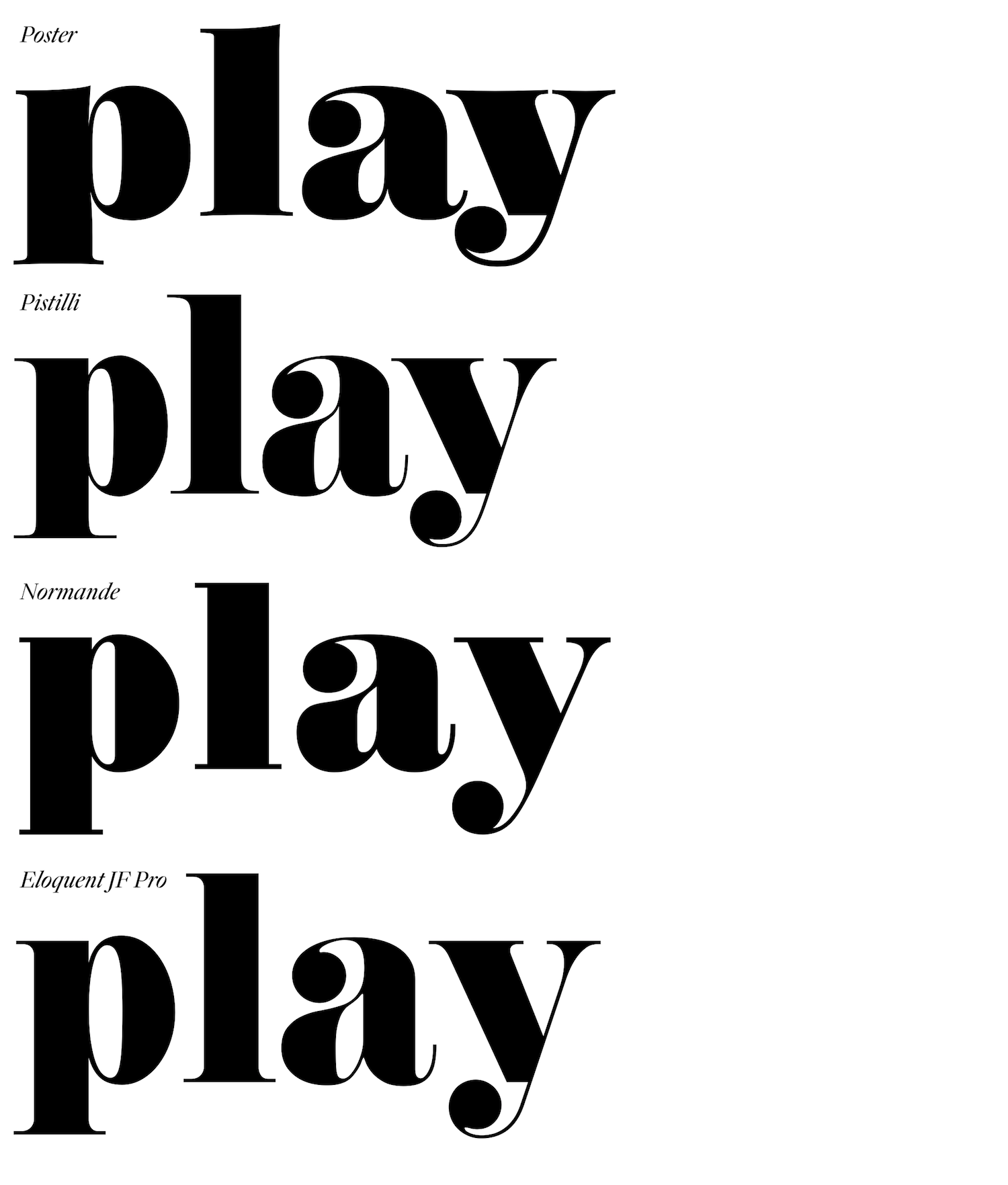
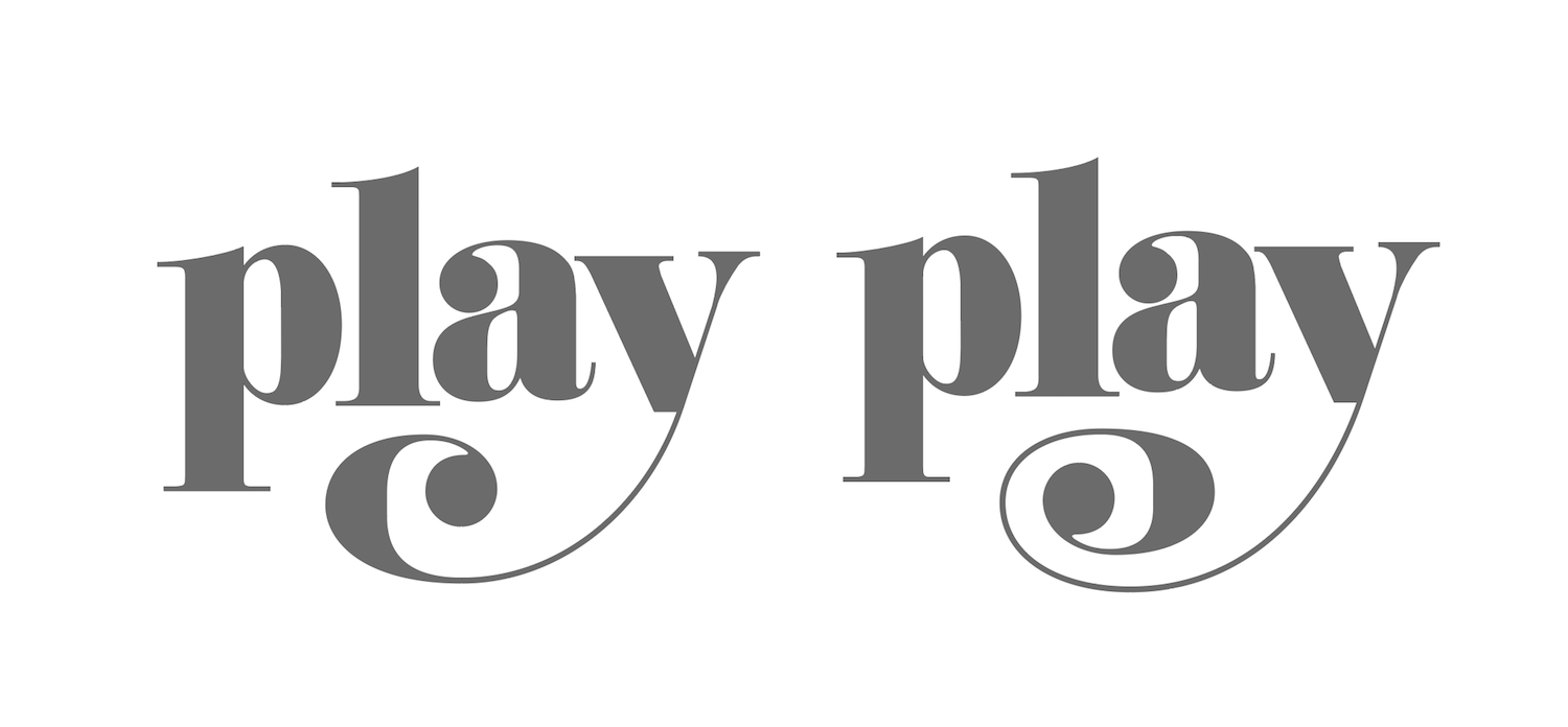
I think, based on how radical some of the customizations get, that it doesn’t have much left in common with an original typeface. My best guess is it started off as Didoni URW, based on the shape of the top contour and ball of the a, and the stem (vertical body) weight of the l. Black overlay of the typeface mine.
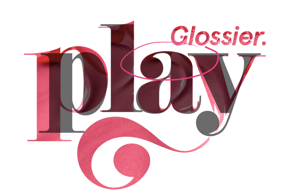
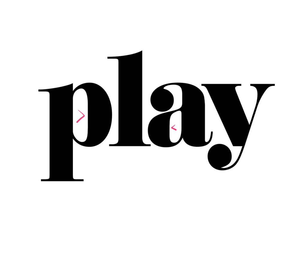
The biggest changes are made to the p and the y. The p gets scaled larger ever so slightly, and then both contours of its bowl shifted over to the right. I think this was done to evoke the same hierarchy that capitalizing the p would, without actually bringing in a capital. The thing is, having one super-open counter (white within-letter shape) throws off the black-shape/white-shape balance in the word. In a well-drawn typeface, all the counters are congruous with one another, which are congruous with the black shapes, which are congruous with the white in-between-letters shapes, and on and on. If you change one thing, everything else must change too, or it sticks out as unintentional, as I think this does.
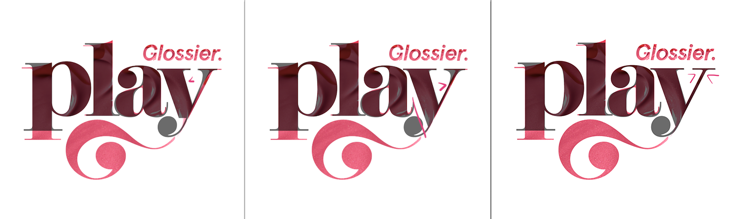
Next, the y. First, it was shifted downward; you’ll notice how much lower it looks compared to the a next door. Perhaps for a bouncy effect? Second, it gets sheared, 6° apparently.
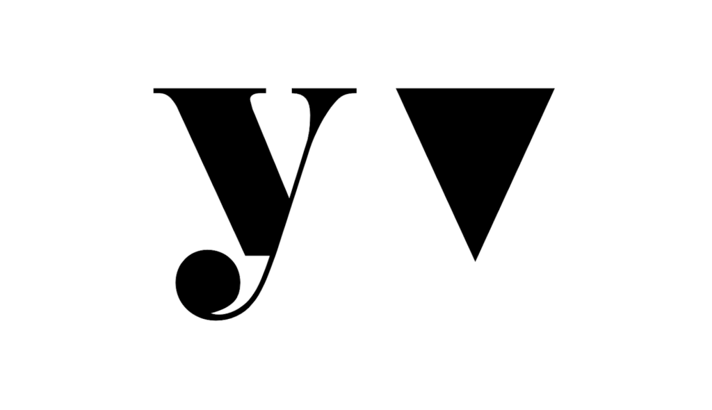
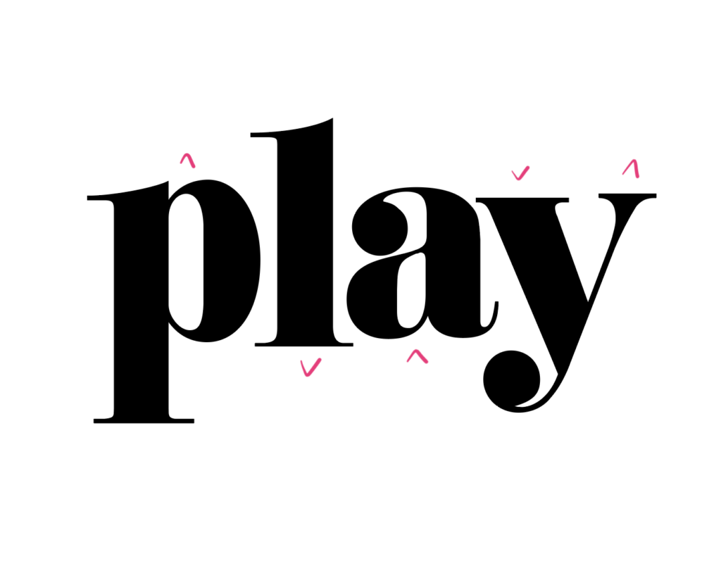
This skewing I cannot explain, but it was the first thing I noticed about it, because the outside contours of a y are visually (sometimes mathematically, but always visually) in the shape of a downward-pointing isosceles triangle, but this one looked like it was goin’ somewhere fast. Maybe it was also to make it look jaunty?
The heavy left stroke of the y then gets lightened, which I can get behind, because when something’s skewed that stroke will appear heavier, so they need to take weight out to compensate. They also get rid of the white chonk below the baseline of the y, and continue that left diagonal downstroke so it connects to the tail. This treatment is not unheard of (see Normande above), but the positioning of it can be tricky, and here it makes the y look like it’s sagging far below the baseline that the other three letters fall upon consistently. Finally, they take all the weight out of the bracketing, (the curve leading into the serif) which leaves the right side of the y awkwardly light, so they add a tad more weight to that right stroke. Not the most elegant choice, I think, but I see how they got there.
The a gets a bunch of tweaks to its bowl, no objections there, and tail, which I think was unnecessary since the out-of-the-box tail comfortably fits within the white space to the left of the y. The ball terminal of the a also gets a smooth inside contour connection instead of the sharp angle of the original type, all well and good for now, but remember this for later.
Lastly, the ascenders and descender serifs get some cute custom tweaks, also fine. It’s unconventional to see a descender get longer than an ascender as the p and l are, usually that’s the other way around, but I can see how they might want it that way for the sake of the footprint of the mark. And there you have it folks, the letters in the Play logotype! I do not get out of the house very much!
Now that we’ve taken it apart bit by bit, lemme see how we can put it back together.
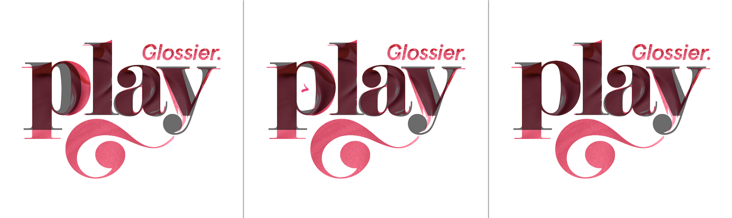
Here I’ve kept all the Glossier-custom-changes aspect above that I liked (or found inoffensive), and put back the original letter parts in place of the Glossier changes I thought awkward, namely the bowl of the p and the whole y.
I must give them some credit for doing their p enlargement (shut UP I’m SERIOUS). Looking at the results of their tweaked counters on the a, the counter of the out-of-the-box p DOES need to be opened up a little to be matchy matchy. Not anywhere near how big they had it, but still! I straightened out the right side of the counter of the p bowl, to match the straightness inside the a bowl. I also tried to space the four letters a bit more evenly from each other, while keeping the ‘60s-esque, super-tightly-tracked vibe. This is really tricky – the more you track something in, the more nigh impossible it is to make letters appear spaced evenly, but I did my best, folks.
In an attempt to channel the flutteriness in the original, I brought the p, a, and right side of the y up. I think when both the baseline and the x-height are a little bubbly like this, the way the y in the original dips below the baseline can fit right in. Bouncy!
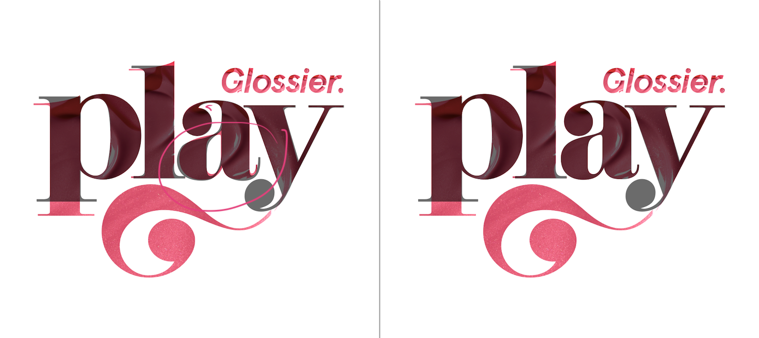
Ah, and finally, the sworl. In these letters, like all Didones, the weight is a) heaviest along the vertical strokes and light at the horizontals, and b) transitions from light to heavy very quickly. If we look at the original logo’s swirlything again, it stands out for awkwardly breaking both of these patterns. Its heaviest point is in the horizontal/diagonal, and the weight swells and then diminishes gradually along the stroke.
![]()
My first thought was that that S curve was gonna be difficult to have follow the weight pattern elegantly. I tried some simpler swirls, which I think are okay, but not really in the funky spirit of the original.
I humbly submit following flourish in the weight structure of the letters, which gives me a chance to mimic the bowl shape of the p and a, and can more naturally transition into the ball terminal as does the top of the a. For one last detail, I smoothed the inside contour into the ball terminal from a sharp angle, like I mentioned they did in the original a.
That’s it! Again I mention that all of this is speculation, I am but a person with no other pressing deadlines yesterday who saw a really big p and decided to look into it. I’m not demanding anyone change their logo on my account, nor even claiming my version would work for what the client wanted. This has been to tinker with the lil machine, to figure out the rules of its universe (and ours) that it has to follow, and which it can successfully thwart to keep ticking. Some of my typographic points I will heartily stand behind, but a lot of the little noodley bits, I think, are still up for debate. Feel free to submit your edits to my edits if you are so moved, and leave your best beauty tips too while you’re here!
Also anyone can hire me to do this kind of thing, if you want, I am just saying.
Wow. loved reading this. Twice. And, yes, i’m sure you don’t get out of the house much (nor do I). Loved your changes, and they make a lot of sense, but somehow their extra large p makes for a more of a faux capital as opposed to the p you ended up with and your final y curve seems more like an upside down question mark. Very purposeful and not as playful as theirs. Again, this is all without doing this myself which would be a hell of an exercise. Keep up the great work! I’m going to have to check out the rest of your site now.
Thanks and please do! We have fun here!
Love this tinkering! I’m persuaded. Thanks for let us tag along on your meandering through wonderland.
HI I LOVE THIS. I am very geeky about makeup and somewhat geeky about typeface, and the fact that this post exists fills me with joy. (I also love the font in which I’m writing this very comment, so thanks for that.)
So sorry for not approving this, it got lost in my spam folder for some reason! Thank you so much for saying so! The type is by Alphabettes’ very own Robin Mientjes at https://tinytype.co/info/
Hi! How much do you charge for logos?
Hi Emily! It depends on the use/application, feel free to send me an email if you have a project in mind! hello at victoriarushton dot com