
This past week Adrian Frutiger (24.05.1928–10.09.2015) passed away after a life full of passion for typography and type design. This is the second great loss for the type community this year — he followed another type legend, Hermann Zapf, who died in June. In the 1950s, when he designed the famous font family UNIVERS, he could barely imagine that today such ornamental, playful initials would be used in a daily newspaper. He accompanied my life as a designer from the beginning of my studies in the ’80s, and I always loved the rhythm of UNIVERS — even today, and going forward. Farewell and have a good last journey.
Sad news. Really.
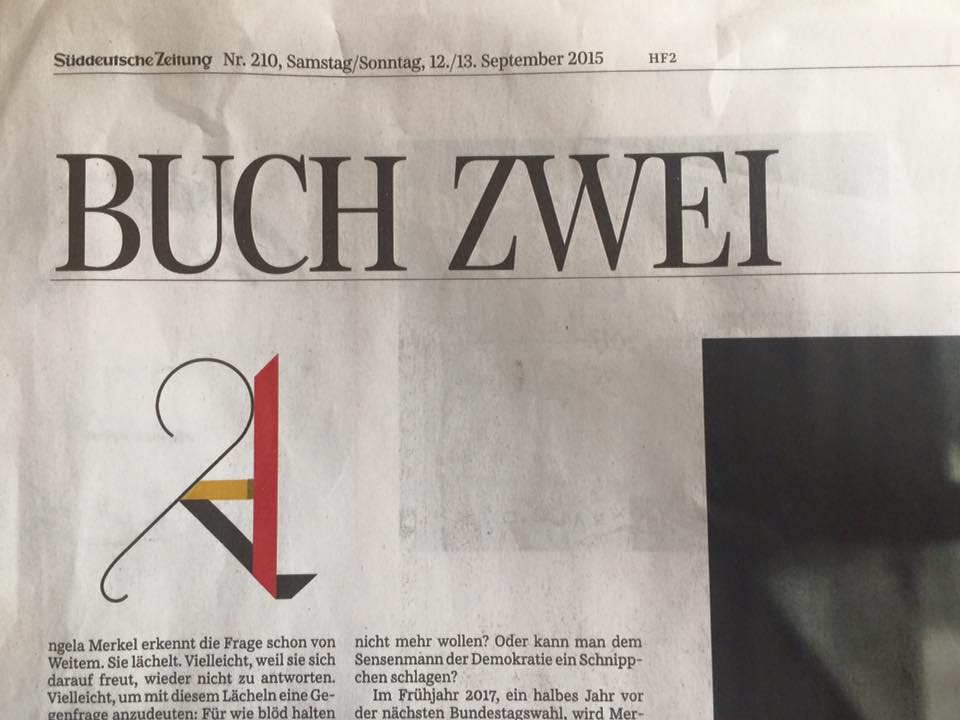
BTW, beautiful “letterine”. A recent work of Mr Frutiger ?
I know that it’s necessary for popular media to explain “who Frutiger was” with his most popular work, but — like I saw when Zapf died — I seem to like exactly the typefaces that not everyone is raving about. For instance, I never was a fan of Univers I have to admit (nor Helvetica, but a little more). It’s almost too perfect and planned out for me, just like many contemporary typefaces now that are drawn for interpolation. The more idiosyncratic, more industrial sans-serifs were always my favourites, like his Vectora — a typeface I used for all my personal things, presentations and communication for a long time — the “American Gothics” in general, or Monotype Grotesque. But it also totally has to do with the overuse of his most popular faces. His Frutiger for me turned from a good, pleasant typeface into a huge pet peeve because every single signage system and thing has to use it these days (really has to because of the ever increasing pressuring on legibility from all kinds of institutions and what else could you possibly use if you want a legible typeface?). Anyway, sad to know he’s gone now, but he seems to have had a wonderful, rich and filled life, with a fantastic body of work which I encourage everyone to explore beyond the well-knows parts.
I love the letterine too… What is it?
Sorry for the late answer, I didn’t realize that there are comments open. But I don’t know who did this initials in the essay – perhaps a designer working at the »Süddeutsche Zeitung«. It was only a coincidence that I was reading this article and the web was full of messages about Adrian Frutiger.