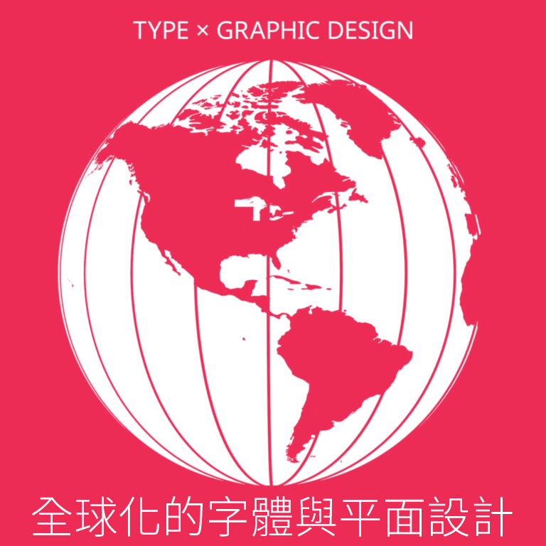
Last month I had the honor of creating the graphics for Designing without Borders, a three-part lecture series hosted by AIGA NY and the TDC. The design process was a collaboration between myself and the event organizers; Caspar Lam, Juan Villanueva, and Lynne Yun, which led to an ambitious undertaking of designing with a dozen languages. This experience was equally rewarding as it was challenging. It inspired me to continue pushing my understanding of typography by going beyond what is linguistically familiar.
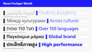
After establishing the key visual of an animated emerging globe, the next step was to find the right typeface to accompany the graphic. Since two of the event organizers, Juan and Lynne, have ties to Monotype, the logical next step was to begin looking through the site’s immense library of typefaces. Within minutes, I came across Neue Frutiger World. With its over 150 languages, this typeface embodied the aspirations of the lectures. It helped me realize that it wasn’t fitting to limit the graphics to English when we were talking about a global topic, at an event with speakers and organizers from various cultures around the world.
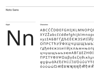
Upon more research, it turned out that Neue Frutiger did not support CJK (Chinese, Japanese and Korean) characters, but instead had to be paired with accompanying typefaces, meaning we had to license four typefaces instead of one. At that point, we decided to pivot, and the search for the right typeface continued. We briefly considered using IBM Plex, but their CJK typefaces are still in development. With Chinese having over 50,000 characters, this is no quick feat. Upon Juan’s suggestion, we ended up going with Noto Sans, a free typeface released by Google and Monotype in 2016, featuring over 800 languages and 100 writing scripts.
With a typeface selected, I set out to translate the event title to at least ten different languages. Google translate was never an option, because if you’re multilingual and have tried to use it between your languages, you’re well aware that at their worst google translations are humorous, at their best they are rarely accurate, but the majority of the time the translations are awkward and not reflective of how native speakers actually communicate.
Instead, I reached out to a dozen friends who spoke a language other than English. It was interesting to see that every single person I asked sought out a second opinion on their translations from a parent or friend. My native language is Spanish, but my dominant language is English, and I too asked a friend for the translation because I did not feel confident about my Spanish, especially when it came to finding the right words to differentiate between “typography” and “typefaces.”
It’s important to note that a language and a script are not interchangeable. A language is a means of communication, and a script is purely a writing system. For example, the English, Spanish, French, and Portuguese translations for this project were all typeset in the Latin script. And, to the surprise of many, the Vietnamese translation was not typeset in Vietnamese, but instead in the Vietnamese script of Chữ Quốc ngữ.
The event organizers created a spreadsheet where we could all share and proofread the translations. By the time the translations were finalized into a ten-second animation, we had help from over 30 contributors. It was a beautiful exchange of cultural knowledge and was incredibly rewarding to hear from immigrants and bilingual designers how much it meant to them to see their languages represented in this project.

When it comes to typesetting, each script requires its own set of considerations. For the Mandarin Chinese header, we had the options of traditional and simplified. The Arabic presented the options of Kufi and Naskh. We ended up going with traditional Chinese because it allowed for a more accurate translation, and Naskh Arabic because it was the preferred style of the native speaker who provided the translation.
Chinese:

Traditional

Simplified
Arabic:

Kufi

Naskh
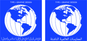
The capabilities and limitations of the Creative Cloud programs also played a major role in the process of this project. Since I am always designing with Latin characters, whether it’s in English or in Spanish, it did not occur to me that other languages required adjustments to the program settings. I began adding the copy to the animation by simply copying and pasting the translations from the spreadsheet into After Effects. Although the translations were accurate on the spreadsheet, a few became distorted once they were pasted. The Bengali had missing conjuncts, and even a few of the characters were ordered incorrectly. The Thai accent marks were shifted over placing an emphasis on the wrong parts of the title. But the most notable error appeared in the Arabic.
Bengali:

Incorrect

Correct
To someone familiar with the languages or experienced with these scripts, the errors would have been glaring, but one of the challenges of multiscriptual typesetting is that inconsistencies like these can be easy to miss. A few weeks before the first lecture, I posted the animation for the event on Instagram. Less than ten minutes after posting I received a series of messages from my dear friend Dina, and my former creative director Wael, kindly letting me know that what I thought was the Arabic translation was not Arabic at all. Arabic type is based on the handwritten script and functions only when the characters in each word are connected with ligatures. Copying and pasting the Arabic from the spreadsheet produced a beautiful but unreadable set of disjointed lines. This was a result of a settings issue that had to be adjusted not only in the cloud settings but in After Effects and Illustrator individually as well. When designing across languages mistakes are inevitable, but if the process is collaborative, each mistake becomes an invaluable learning opportunity.
Arabic:
Technology has its limitations when it comes to designing globally. Google translate has yet to capture the warmth of conversational language, and Adobe’s language settings are cumbersome and far from intuitive. However, these setbacks should not deter us from multiscriptual typesetting. Instead, they present opportunities to seek help and create directly with designers who come from different cultural identities than our own. I believe design is our universal language, but universality does not equate to singularity. As designers, we are often accustomed to working individually even when we are part of a team. Multilingual typesetting is a great catalyst to break free of that mentality. As design continues to shift to a more global approach, I believe we will be seeing more and more multiscript projects in the coming years, and I am eager to see how we will continue exploring design beyond our individual cultural limitations.
The second Type x Graphic Design: Global Typography event takes place this Thursday, November 21, 2019 in New York City. Purchase your tickets here.


