This font review was originally written in Spanish. English translation below.
En el mundo de las tipografías, hay fuentes que intentan imitar la escritura a mano, pero pocas lo logran con la naturalidad y el encanto de Playpen Sans. Diseñada por la española Laura Meseguer y el equipo de Type-together encabezado por Veronika Burian y José Scaglione, esta fuente no solo captura la esencia de lo orgánico y lo humano, sino que también ofrece la precisión y versatilidad de una tipografía digital profesional. Playpen Sans es una solución ingeniosa para quienes buscan un equilibrio entre la espontaneidad de la escritura manual y la consistencia de lo digital.
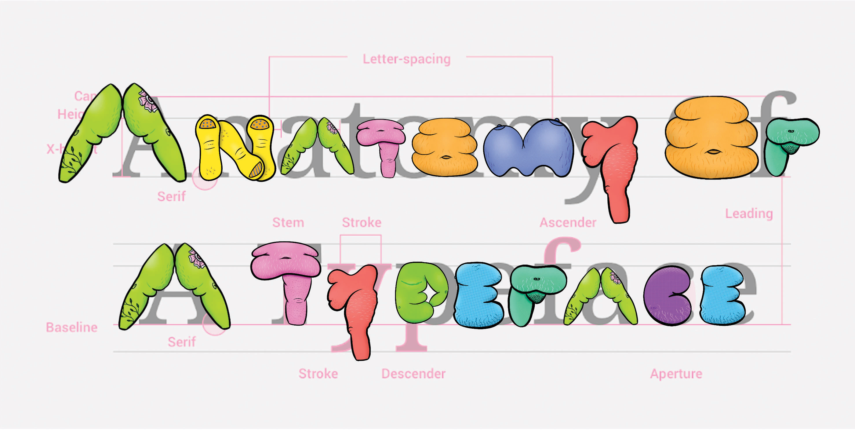
Above: Brooke Hull. “Overlay of Fat Letterform Illustrations on Type Anatomy Guide.” 2023. Type Anatomy guide image via Material Design. “Understanding typography.” nd. https://m2.material.io/design/typography/understanding-typography.html#type-properties
How can we disrupt design canons & fight fatphobia intersectionally through embodied typography?
This research began as I discovered and accepted my own fat, nonbinary body for the first time at the age of 23-24. I was in graduate school having to not only expand my knowledge about the systems within the world around me but having to understand how those systems impacted my own body. As a person who has been fat my whole life, I never accepted this reality until I learned about the system of oppression known as fatphobia.
Fatphobia, as defined by Dina Amlund, is “the name of the structure and the social hierarchy that place people of size, or fat people, beneath slender people” (2017).
Fat people face proven discrimination at work, in relationships, in healthcare, and in the media (Cooper Stoll 2019). Fatphobia, like all other systems of oppression, is intersectional (Crenshaw 1989), further harming folks who embody multiple systems of oppression, like race, gender, sexuality, and disability. While learning about these intersecting systems of oppression, I wanted to use design to relate these systems to my own body and bodies like mine. This is where the idea of fat typography began.
Reflecting on the past year, we can say the number of new typeface releases was remarkable. The type market has become more diverse and competitive than ever, with new fonts hitting the scene every day. Both amateur and professional designs are eager to be in the spotlight so they can really be seen. In this hectic landscape, we find it valuable to offer insights that help identify excellence and merit within the crowd. This includes evaluating proficiency in crafting letters, the overall quality of the font, and the contributions that a new typeface brings to the table.
This font review was originally written in Spanish. In Colombia alone, there are more than 43 million native Spanish speakers. English translation below.
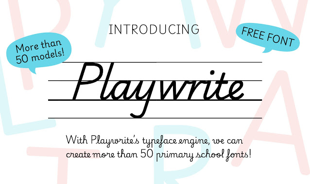
Las fuentes tipográficas suelen pasar desapercibidas, pero su impacto es profundo. Como demuestra Playwrite, pueden trascender su función estética para convertirse en puentes educativos. Detrás de cada trazo de lápiz hay un mundo de conexiones neuronales, memoria y creatividad. Aunque vivimos en una era digital, aprender a escribir a mano sigue siendo un pilar formativo esencial. El desafío surge cuando cada región del mundo enseña este arte con estilos y métodos distintos. La solución llegó de la mano de Playwrite. Diseñada por Typetogether y disponible en Google Fonts, Playwrite es más que un conjunto de letras. Es una herramienta pedagógica que se moldea a las particularidades de más de 40 países, desde la cursiva vertical de Francia hasta la escritura simplificada de Finlandia.
This font review was written in English and translated into Dutch, a language spoken by about 30 million people worldwide.
Giulia B. is a multimedia designer based in London (UK), focusing mainly on type, graphic, and web design.
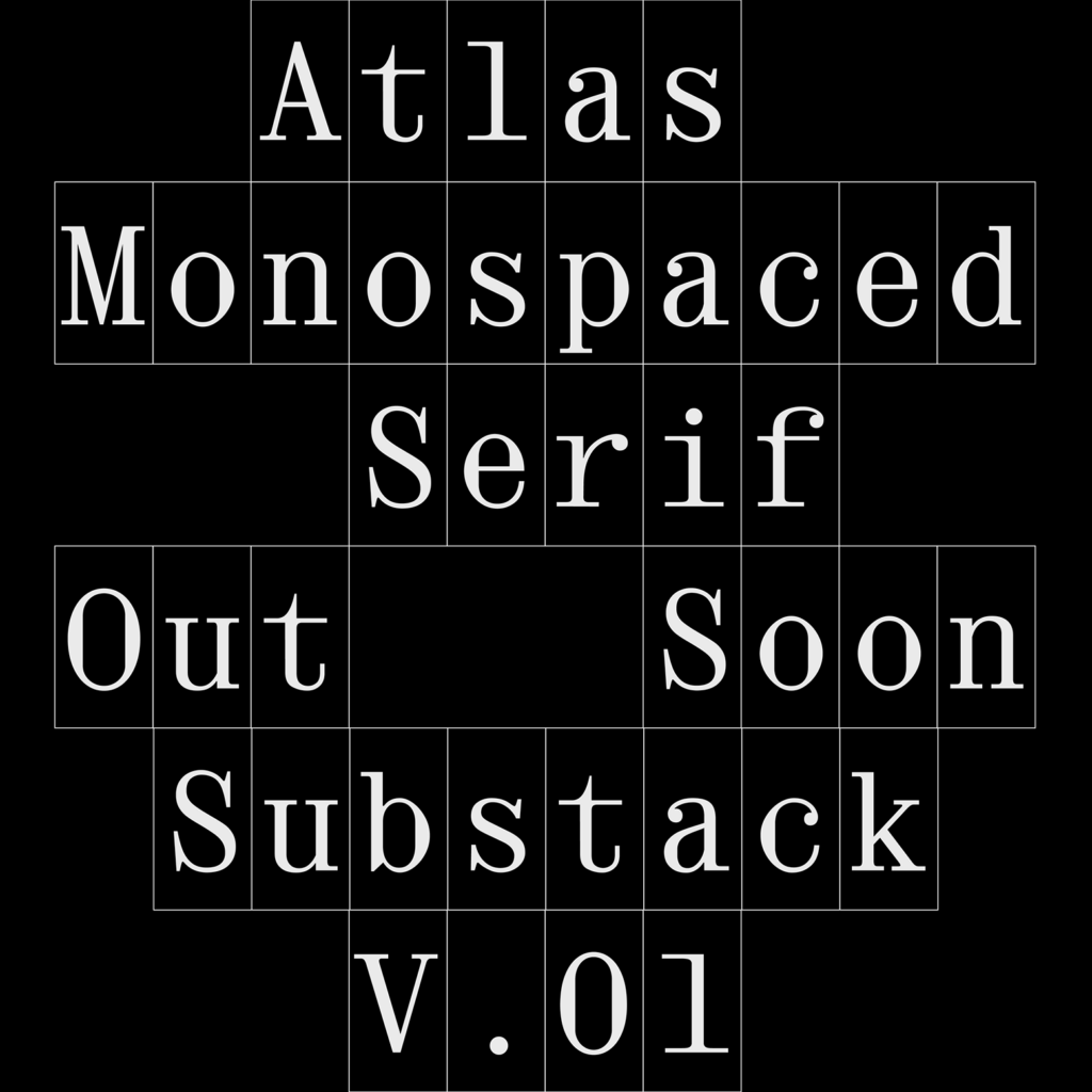
Monospaced fonts are a personal favourite and I had to shine a light on this editorial fixed-width for our Alphabettes Font Reviews 2024 segment. Sometimes, it seems that typefaces these days are by default superfamilies, covering every possible weight, width, style, optical size, and taking on any possible typographic application they face. Well—let’s flip that coin for a second and focus on this striking single-style design.
What time is it? It’s time for our annual tradition: the Alphabettes 24-Hour Hangout to celebrate International Women’s Day! ⏰ From March 8, 2025 at 12:00am ET / 05:00 UTC to 11:59pm ET / 04:59 UTC 3/9, stop by for conversations on type, design, lettering, the universe, etc. Some times may be more spontaneous and chatty, other hours might be filled with activities and presentations.
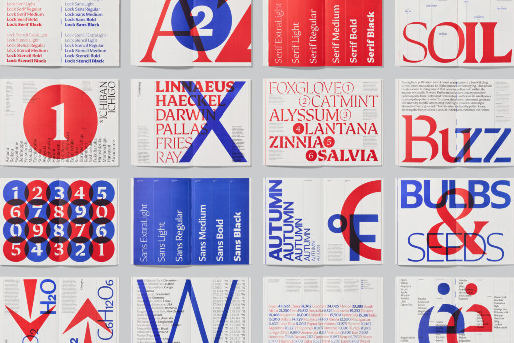
Designed by Mark Bloom and Diana Ovezea Distributed by CoType Typeface family: 4 sub-families, 6 weights. 24 fonts
This text was originally written in Romanian, the official language of Romania and Moldova, spoken by 25 million people. The English version of the review is below.
Lock, creat de Mark Bloom & Diana Ovezea, este prima superfamilie tipografică în catalogul CoType Foundry, îmbinând stilurile serif și sans-serif, alături de varianta stencil.Conceput ca un sistem unitar, și nu ca stiluri separate, Lock echilibrează contrastul și coeziunea, fiind o alegere versatilă pentru designerii care caută flexibilitate și impact vizual.