
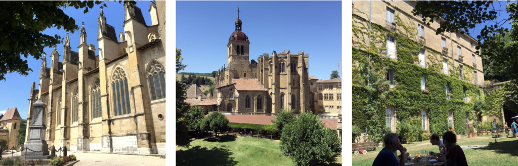
In August, I was fortunate enough to travel to Saint Antoine l’Abbaye (France) for the third time for a six-day Roman Capitals calligraphy course with Keith Adams.
The retreat started with a presentation of the course and student introductions. As usual, there were students from many different countries and the course was run in French, combined with English, Catalan and Spanish.
Tuesday August 8, 2017
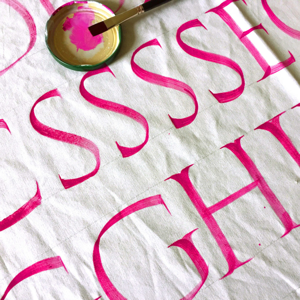
We jumped straight in to Brush Roman Capitals on fabric. I hadn’t used a flat brush for a while so it felt really stiff at first, but after a few hours the letterforms started to flow and the soft-hand feeling of the brush was really therapeutic.
The fabric I started with was an old bed sheet from the abbey. The fabric was quite thin and the strokes were pretty challenging to control. Of course, you don’t want to start with the letter S, as your life can become a looooong and painful journey… I guess, that was the hard way to warm up my hand for the rest of the week.
Every year I share a room with another student from the course. This year I met Sattva, a great human and a fantastic yoga teacher who I connected with instantly.
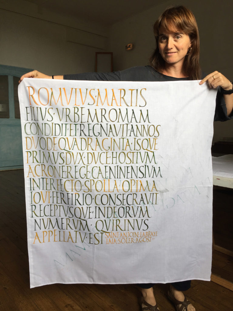
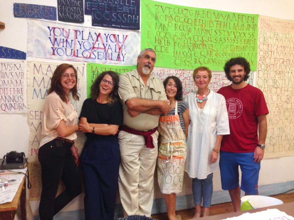
There were many familiar faces in the class, as a bunch of us became obsessed with calligraphy and addicted to Saint Antoine l’Abbaye a few years back! This year, I had the opportunity to share this Roman Capitals calligraphy course with my friends Sonia Beroiz, Ingrid Marquès and Laia Soler featured below.
In my experience, the calligraphy retreats at Saint Antoine are a brilliant excuse to learn; eat French food; be surrounded by pens, brushes and ink for six days straight; and be inspired by great teachers and amazing professionals in the industry.
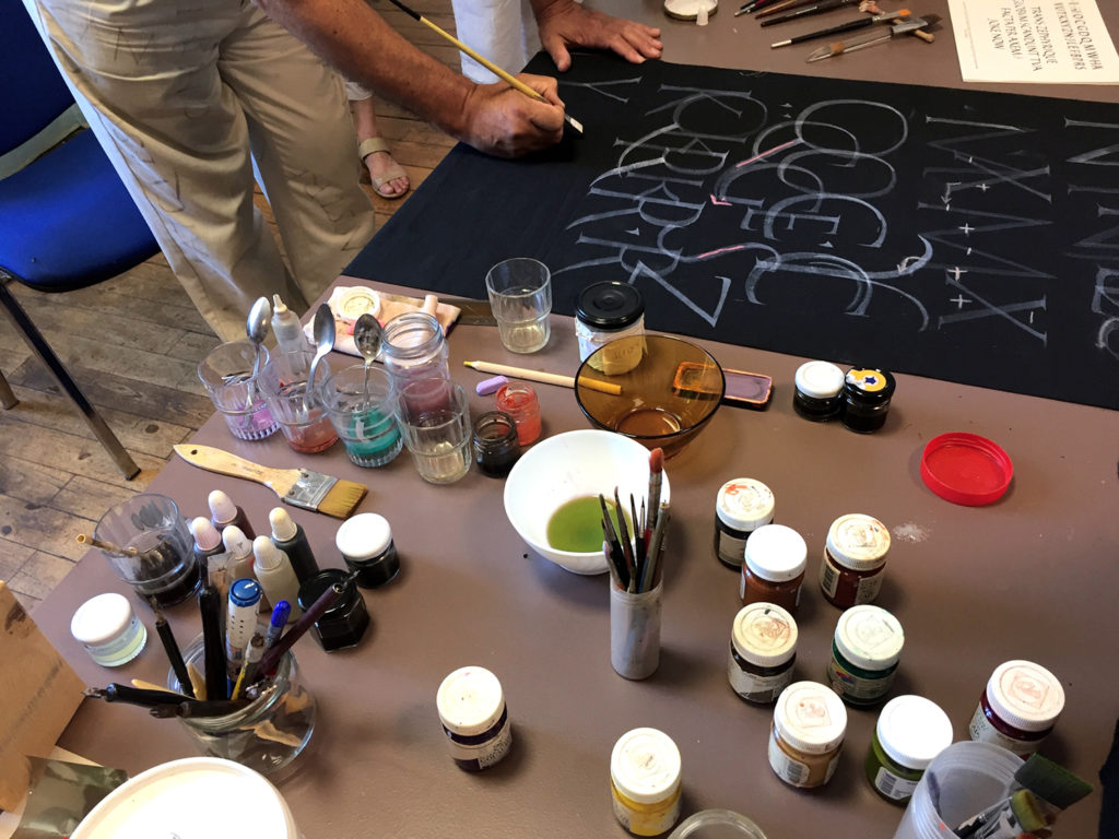
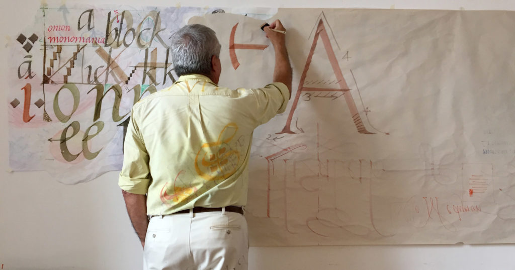
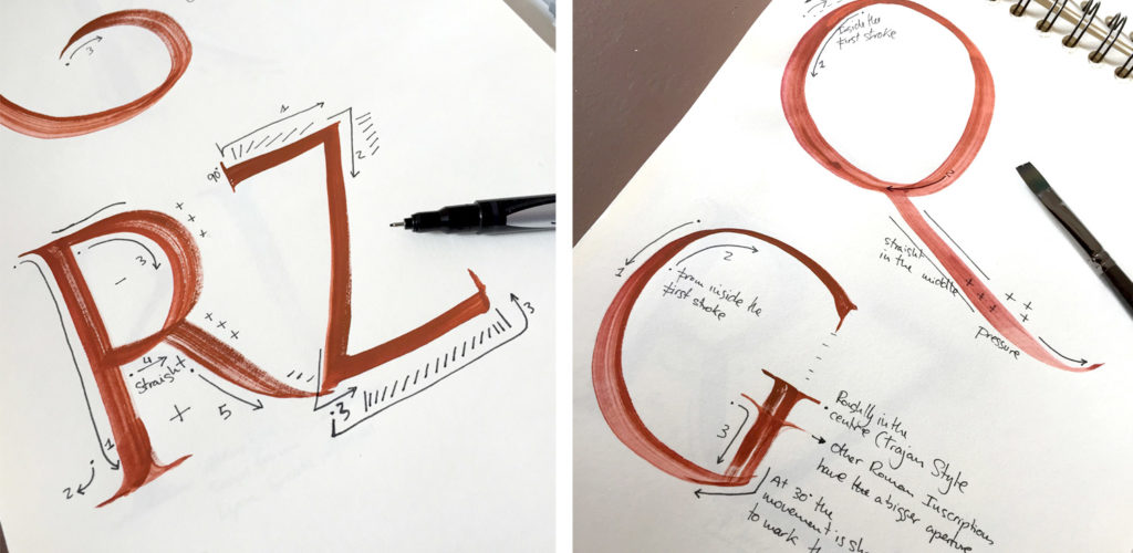
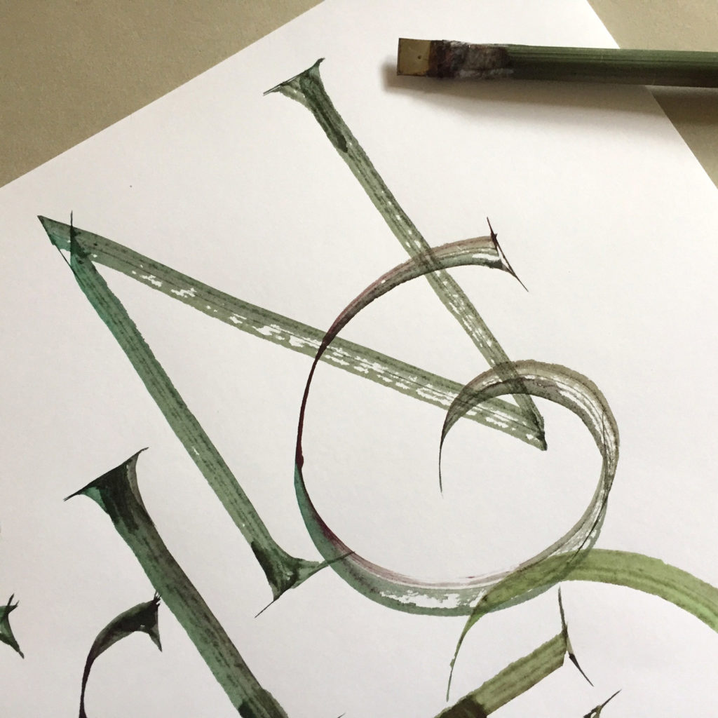
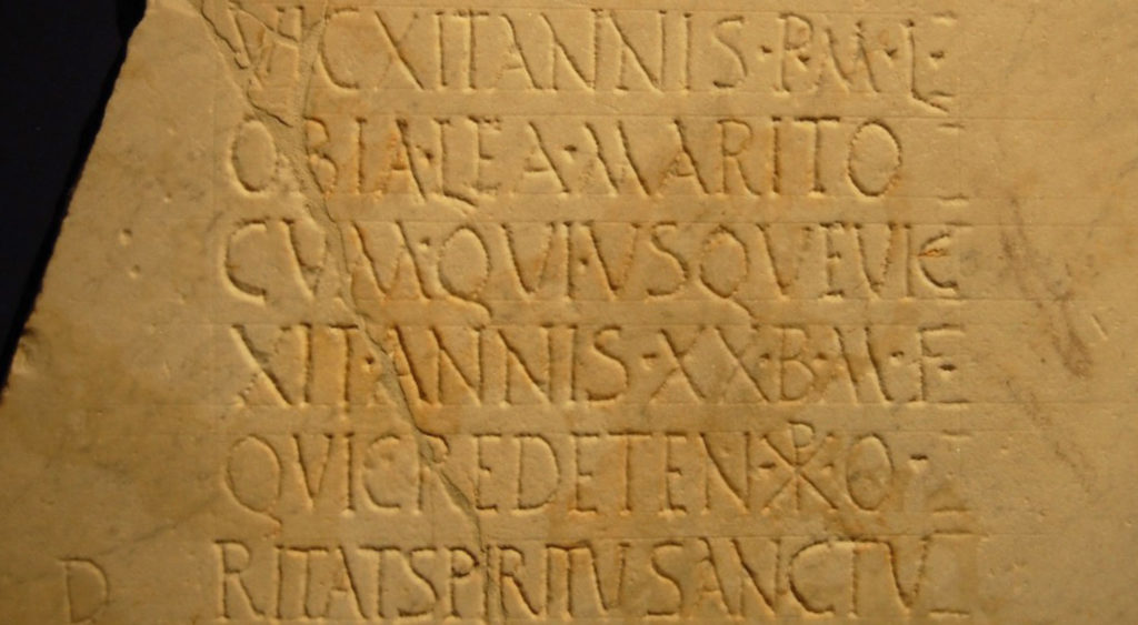
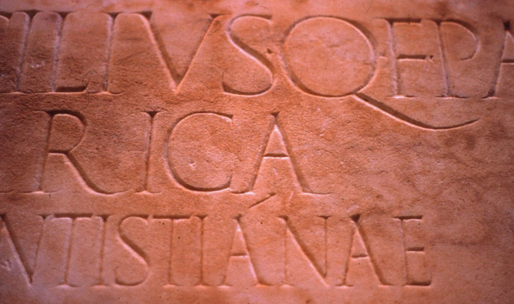
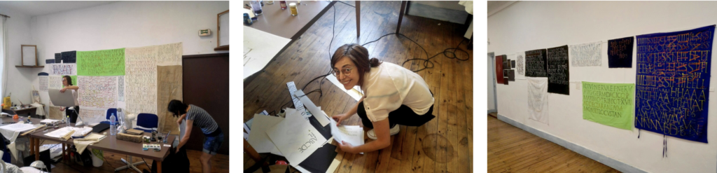
Image above and below: Roman Capitals on fabric by Keith Adams.
Wednesday August 9, 2017
We kept writing with a flat brush and experimenting with different types of fabric. I realised that the more resistance/friction between my brush and the surface of the cloth, the more control I had over my strokes.
I brought various types of fabric and I started to use one called “loneta” meaning thin canvas. The fabric was huge so I folded it in half and started writing.
Yesterday, I had started with a bigger brush – Milan number 18– and today I decided to switch to a smaller one called Iris 8451 Pebeo number 4. Changing the scale of my letterforms made a difference. I felt like I was more in control but after a couple of hours I switched back to the bigger brush again. I was really enjoying the feeling of my brush against the thin canvas so I kept writing and mixing colours along the way.
The inks I used were a mix of walnut ink and gouache paint. Getting the right amount of gouache and paint consistency on the brush is key to solid letterforms and defined serifs.
After dinner, we returned to the classroom to learn more about Roman Capitals’ historical context and to observe different types of inscriptions based on different locations and dates. The history of each script is one of my favourite parts of these calligraphy retreats.
Thursday August 10, 2017
I started to use my flat brush on paper and it was much more difficult to control my strokes on a smooth surface. I wanted to take notes on the movements and the rotations of the brush for each letter.
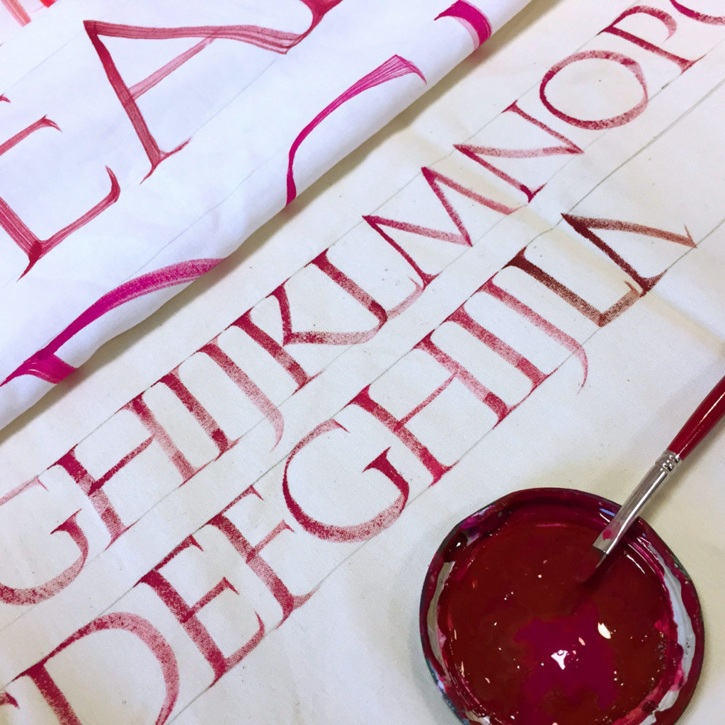
After three days with the brush, my hand was warming up so I decided to change fabric and attempt an actual calligraphic art piece in Roman Capitals instead of just practicing. I chose earthy colours and a vintage fabric made of 100% cotton. The texture was really beautiful and the colour combination matched really well with the characteristics of the cloth.
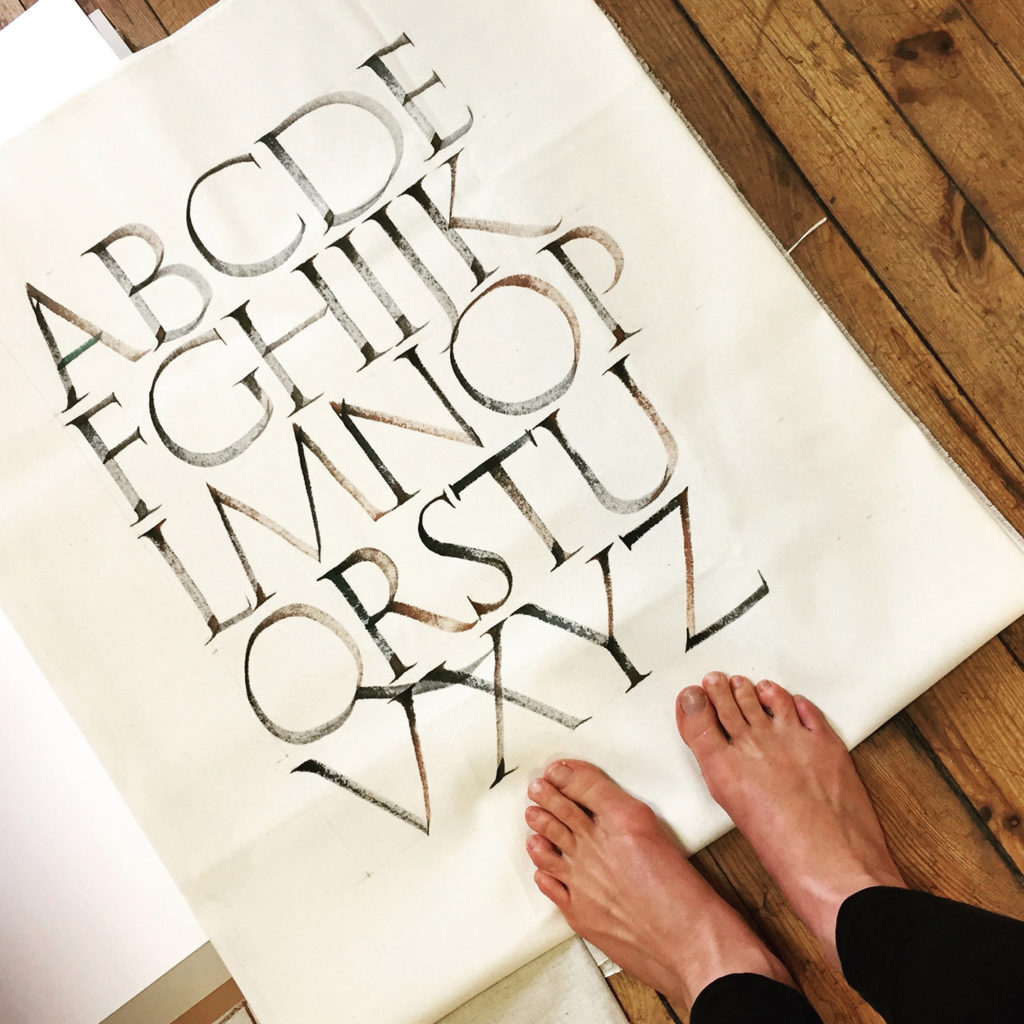
The letters were quite big so I used my own feet to show the scale of the piece.
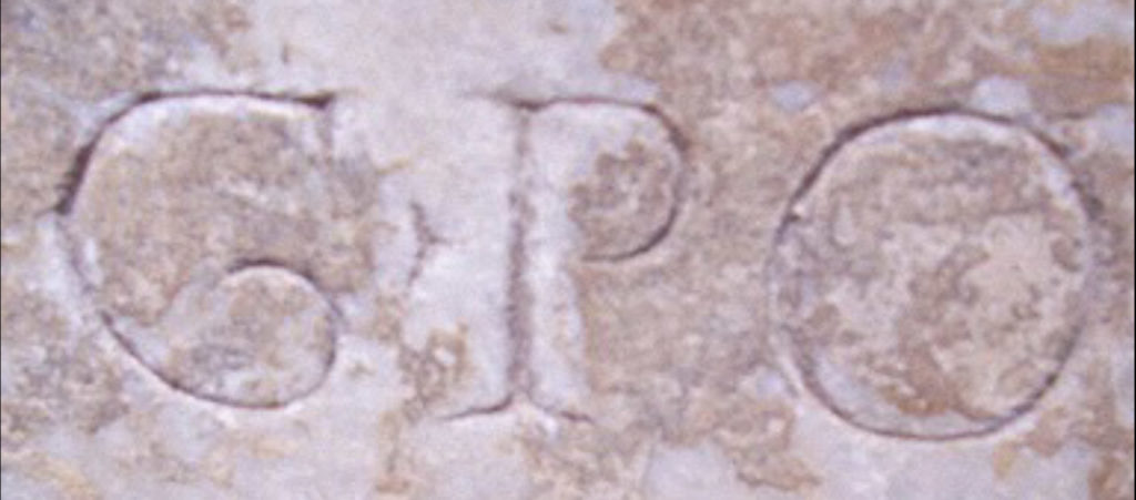
We studied the work of the Renaissance scribe Bartolomeu Sanvito. We grabbed a Brause & Co nib and studied Sanvito’s calligraphy. Changing from a flat brush to a metallic nib felt weird after so many days with a soft tool.
Image source: British Library MS Kings 24 f. 115
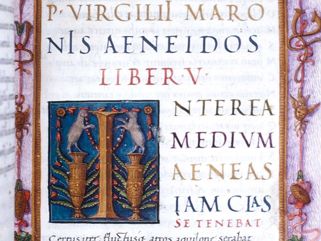
Sanvito’s capitals are very different from the Trajan Column that I was used to look at. The letters seem to be dancing, especially the A and V. Other letters like N and M have flat tops which makes the personality of the alphabet very different.
Friday August 11, 2017
Keith cut a bamboo pen with a metallic broad edge for each of us so we went back to paper.
A while ago I bought an Automatic Pen but never spent enough time using it, so I thought of giving it a go. I wanted to create a personal interpretation of the Roman letterforms, something closer to a modern typographic structure. I borrowed the Greek shape of letter Y and a rounded G from an inscription located in Mérida.
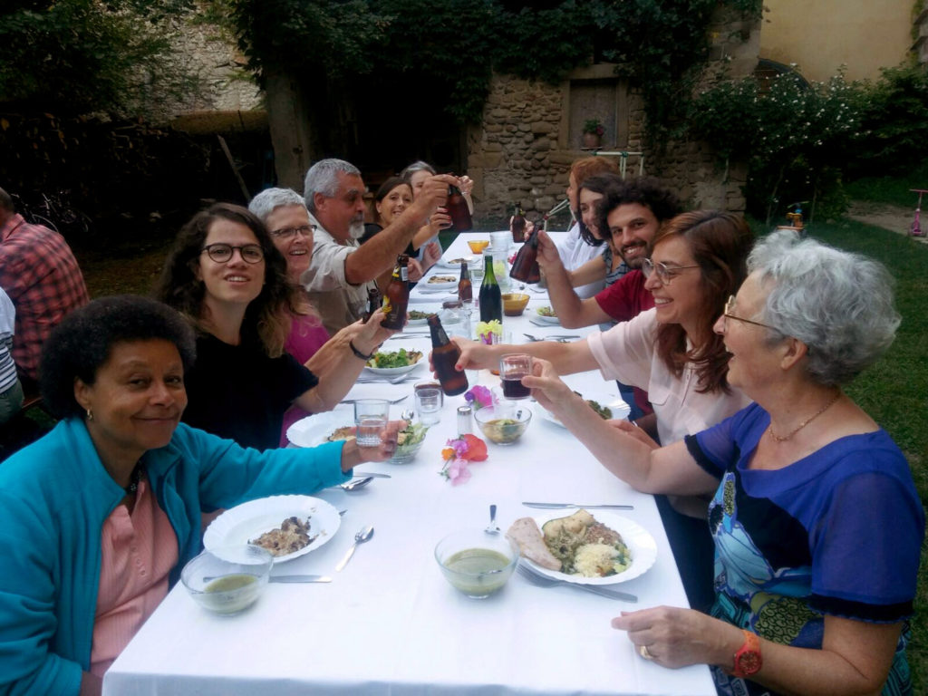
Our calligraphy retreats at Saint Antoine l’Abbaye include food and accommodation. You don’t really need to think about anything else but writing. Mobile phones are not welcome in the abbey, so it is a great excuse to have a digital detox.
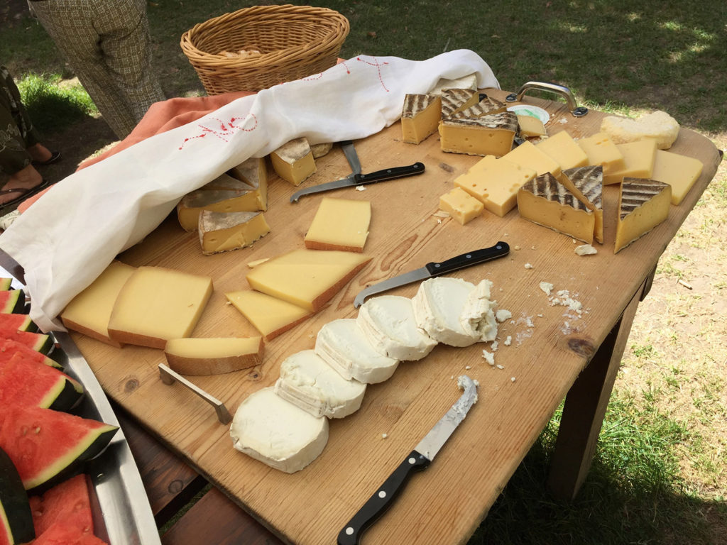
All food provided at Saint Antoine is vegetarian and grown by the residents of the abbey. Almost every day at lunch time we have an amazing selection of French cheeses. I LOVE all types of cheese so, lunch is a feast for me.
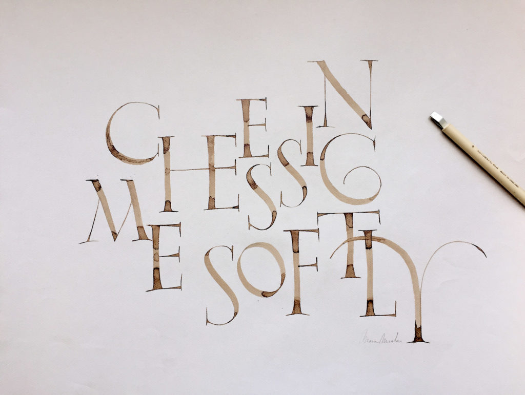
“Cheesing me softly” (or “formatejant-me suaument” as Keith Adams said) is probably not a proper English expression but that is how I felt during that week in France.
Saturday August 12, 2017
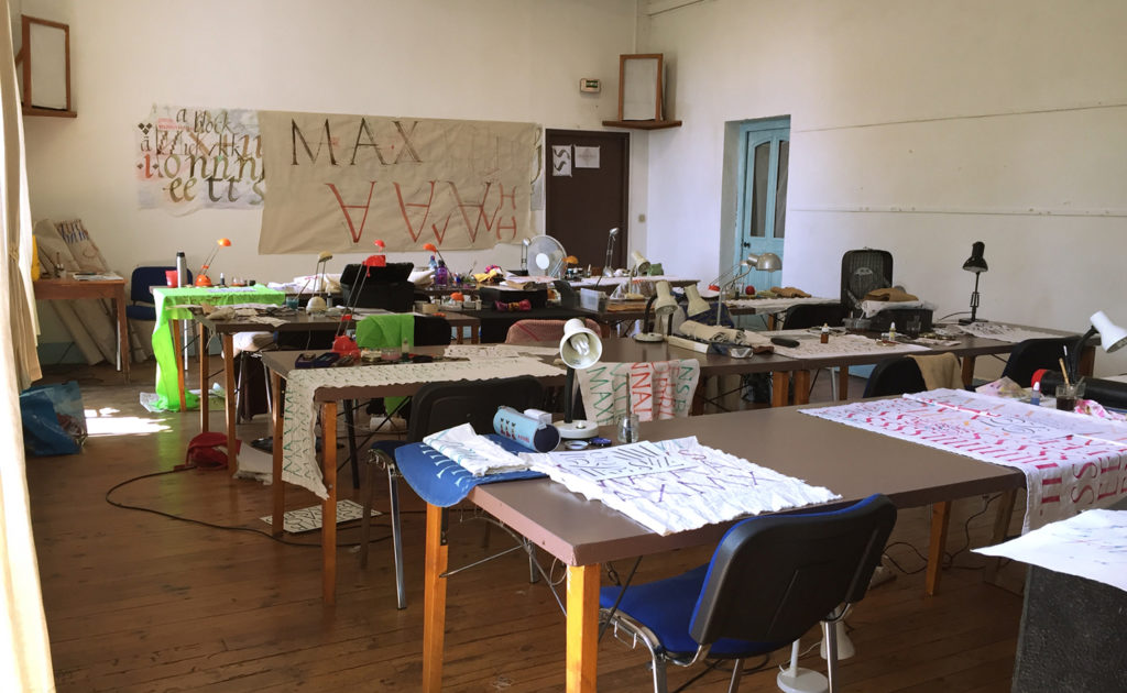
The last two days of the workshop are focused on creating a final piece for the exhibition, which is Sunday evening.
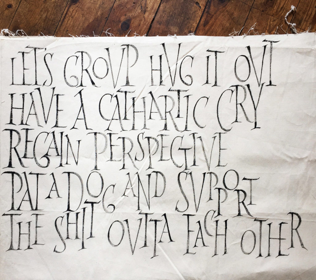
During the week, we also studied Rustic Inscriptional letterforms. These letters had abandoned the old-style proportions to become condensed sharing a similar width all along the alphabet.
I wanted to explore an expressive piece inspired by the inscriptions that Keith showed us. I wanted to keep the rustic personality of the A and M but exaggerate all the serifs.
The content of the piece is from a very talented colleague of mine called Kate Pullen:
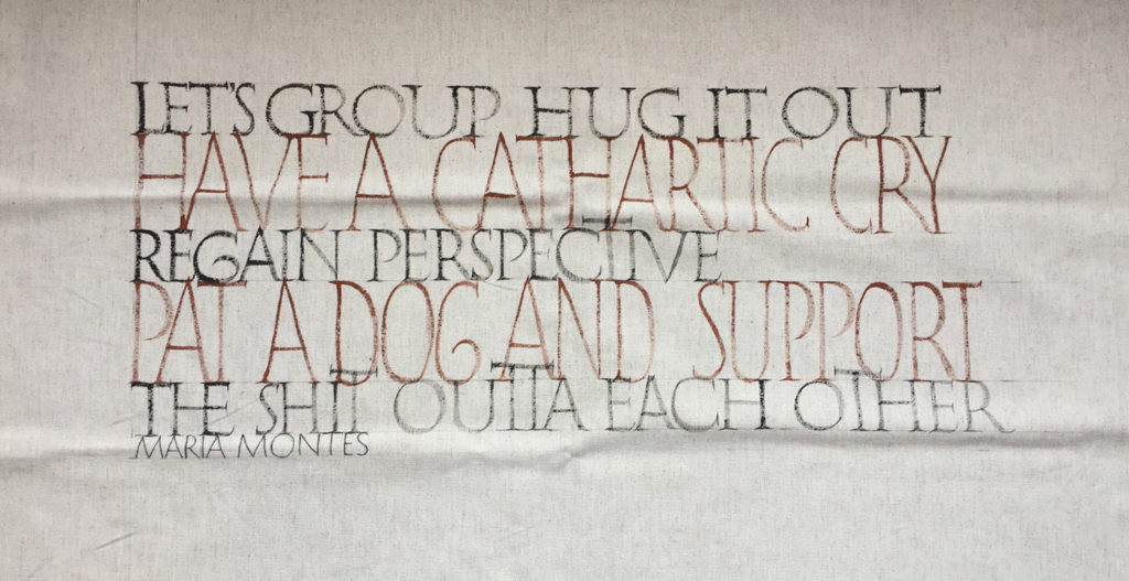
“Let’s group hug it out, have a cathartic cry, regain perspective, pat a dog and support the shit outta each other”
After the piece was finished, I decided to repeat the same text with a quieter, less dynamic piece to explore the differences.
After dinner, we had another history session observing more Roman inscriptions. These night sessions were very informative. For the first time I was seeing inscriptions that were not perfectly executed, inscriptions where the proportions of the letters were way too wide, or way too narrow, or the letter spacing was completely off.
I realised how narrow-minded my idea of Roman Inscriptions was. I naively assumed that all Roman inscriptions were as amazing as the Trajan Column, without realising that throughout the Roman Empire and the centuries they ruled, many different artists were executing these inscriptions, and obviously, many different letter styles and proportions were applied.
Sunday August 13, 2017
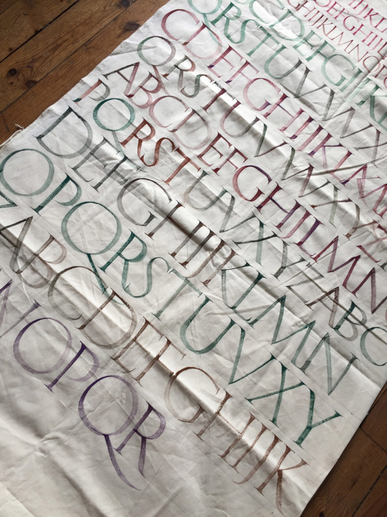
On Sunday, we spent the whole day finalising our pieces and preparing the room for the exhibition. I went back to the fabric that I started the course with, and decided to fill it in completely. The fabric is about 1×2.5 meters long. I never thought that this exercise that I started on day three would ended up being one of my final pieces but the effort was totally worth it.
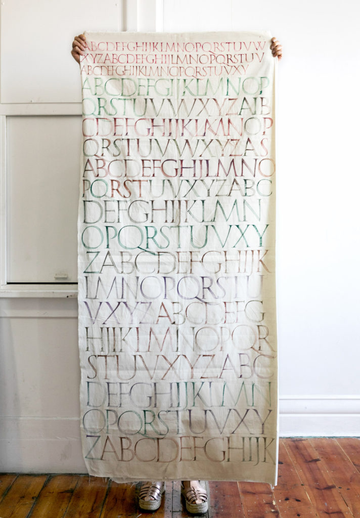
Not every single letter on the fabric is balanced and harmonious but the colour combination and the visual effect worked.
The last day of the course is always a mix of excitement –for sharing my work with everyone else– and sadness as the week, as always, had gone way too fast and I realised I was not going to see my teachers nor my colleagues for at least another year.
This year I met a great new bunch of friends.
My six days in France were an amazing experience, surrounded by a great creative community, gaining perspective, sharing the passion for letterforms and feeling the love everywhere.
If you are thinking of attending a calligraphy course in France, new dates for August 2018 are now published. See you soon Saint Antoine!
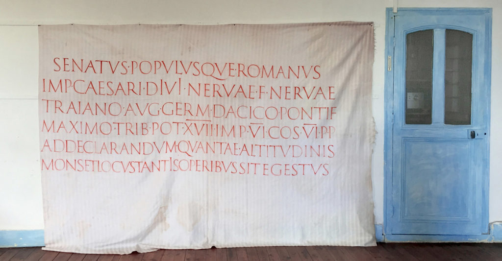
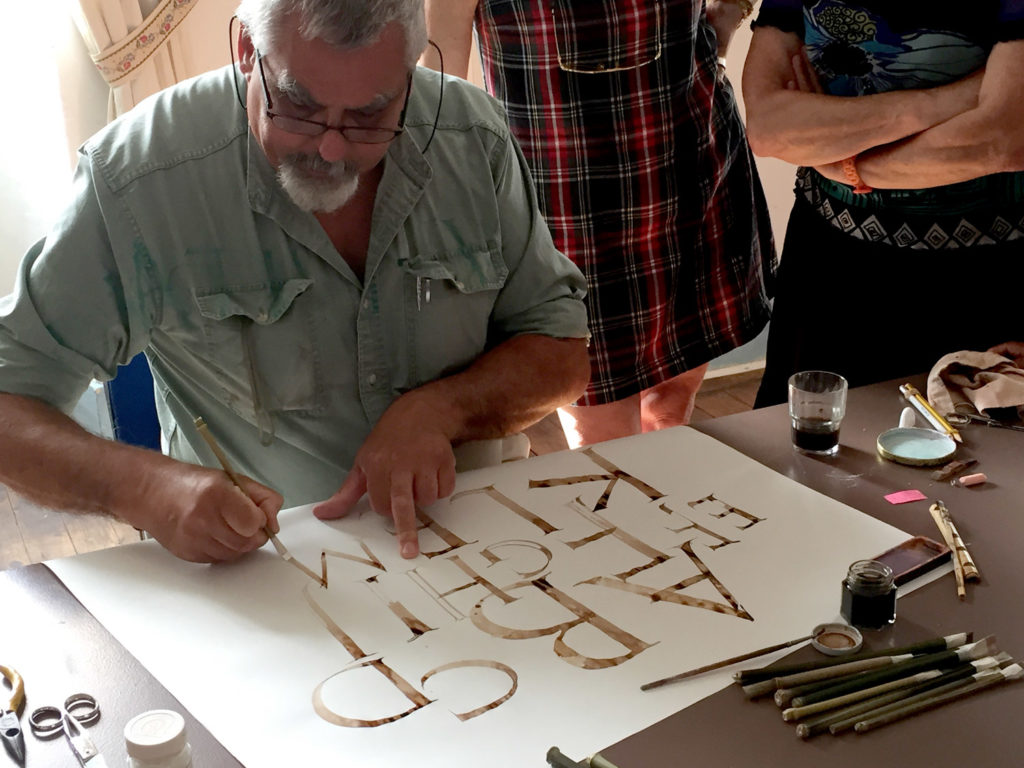
Image above: Calligraphy by Keith Adams.