
Let me tell you the story of how I learnt to appreciate my left thumb. In the summer of 2017 I had the privilege of receiving the RIT Cary Graphic Arts Collection summer research fellowship.
This fellowship is offered yearly to scholars so that they can come and use the collection in person. I spent one heavenly month studying the archive of Ismar David, the designer of the first comprehensive Hebrew typeface family.
The Cary Graphic Arts Collection (aka: The Cary) is a rare book library on the history of the graphic arts. The original collection was assembled by Melbert B. Cary, Jr. during the 1920s and 1930s. Cary was the director of the Continental Type Founders Association, a former president of the AIGA and the proprietor of the Woolly Whale Press. He collected printers’ manuals, type specimens, and books on the art of printing. In 1969, his collection of some 2,300 items was presented to the RIT. Today, it houses around 40,000 volumes, manuscripts and correspondence, on bookbinding, paper making, type design, calligraphy and book illustration.
One of the exciting things about The Cary is that although many of the items in the library are rare, access is given to visitors. With the supervision and assistance of the staff, the resources can be examined and studied in the reading room, in very LOW temperatures. So, after making your appointment, be sure to bring a sweater and you can enjoy the rare items and be well preserved with them.
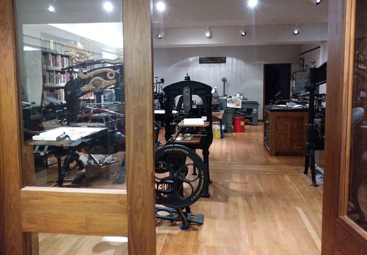
Another thrilling aspect of The Cary is that it is not only a collection of printed matter, it is also a collection of the technology used for its production. The Arthur M. Lowenthal Memorial Pressroom holds some historic printing presses including a 1874 Columbian press, an Albion press that was once owned by Goudy, a Vandercook press from the 60s and a William Morris’ Kelmscott Press. All the presses are functional and regularly maintained. Complementing the presses the collection holds various kinds of metal and wood typefaces.
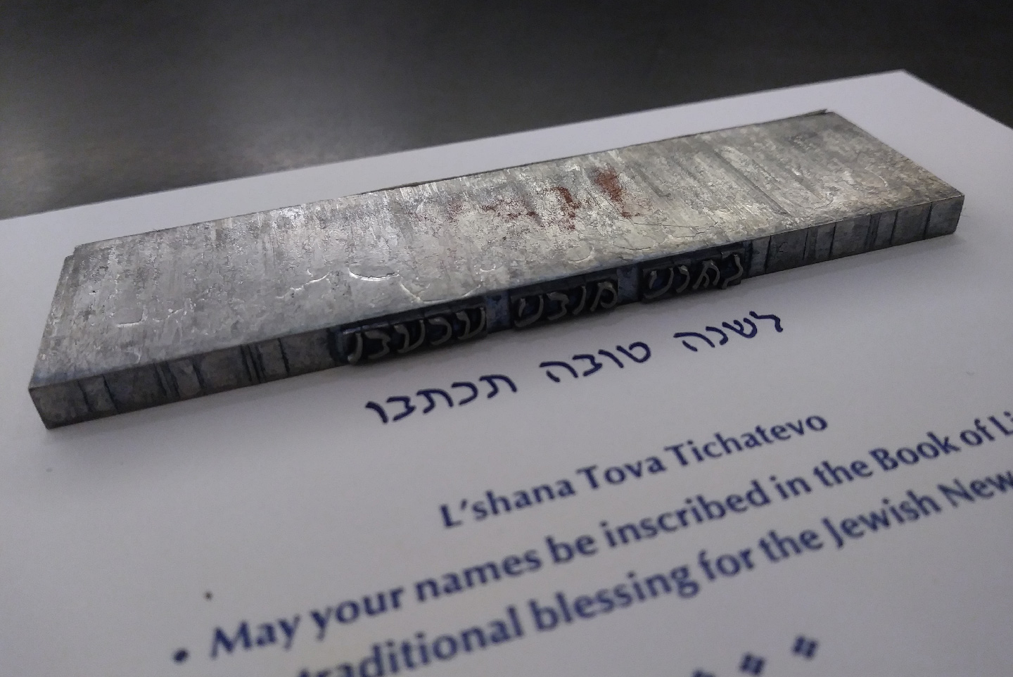
During my fellowship, every day held new discoveries. However, there was one day that was particularly exciting for me. It was the day I opened box 82, folder 1087 and uncovered the Linotype slugs of the original David Hebrew typeface:
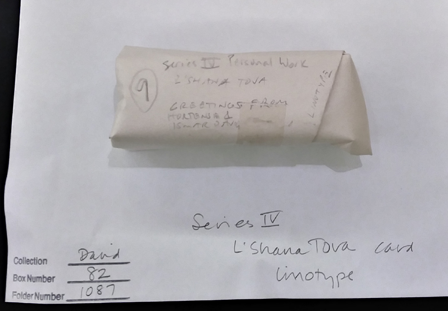
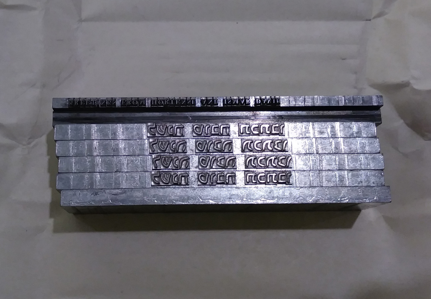
The original Linotype slugs found in the Ismar David Papers, RIT Cary Graphic Arts Collection.
All this time I have been researching this typeface I had never imagined I would be able to hold the original metal slug in my hands and examine it. Not realising that things are about to get even more exciting, I asked Amelia Fontanel, the Associate Curator and the Master of the pressroom: “Do you think we can print with this?” Amelia took a close look at the slug, inspected it with her loop, and answered: “Yep, it’s in pretty good condition”. And just like that, the very slow and eye-opening adventure started.
Ismar David ordered this slug sometime after 1954 for printing of a Jewish new year card. The text is the traditional Hebrew blessing that wishes that “Your names be inscribed in the Book of Life”. (According to the tradition, on the new year a person’s name is inscribed in one out of three books: the book of life, death and in-between. Those who have been sinless are written in the book of life, those who have been evil are penned in the book of death, while the ones whose ways have been ambiguous are given ten days to set themselves on the correct path.)
In the box were 12pt slugs of the David Hebrew regular style and the italic style.
Ismar David used the regular style for his new year greeting card:
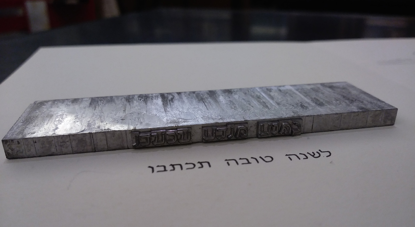
The Hebrew blessing “L’shana Tova Tichatevo” (Your names be inscribed in the Book of Life) from Ismar David’s greeting card.
I could not resist printing my favorite italic style, although I am still wondering whether
the fact that David chose to print the regular style meant that he found some fault
with the italic slug? Planning the content of my print was all about presenting the 12pt italic slug at the top of the hierarchy. That meant that any additional text would be set in a smaller size.
A very small size. Like, 8pt small size. Since letterpress printing is a process driven by pre-existing metal objects, choosing the faces means looking at catalogs and carefully opening old
drawers in the hope of finding what your heart and eyes desire. I knew I wanted a sans-serif face, in a small size and in two weights. What was available was Optima 8pt and this is how Optima 8pt was chosen.
Coming after a year of studying at the MATD in Reading University, I was no stranger to letterpress. However, I had never handset individual type, (Let alone 8pt type), never held a composing stick, and never learned the hard lessons and the consequences of a lazy thumb.
As I was VERY slowly getting familiar with the letters in their tiny mirrored shapes, and trying to memorise the location of each letter in the case, I could not help but imagine the “dance” typesetters must have done, moving with the paragraph upside down, left to right. I pictured in my head how these movements must have been automatic to them and the job case become part of their bodies.
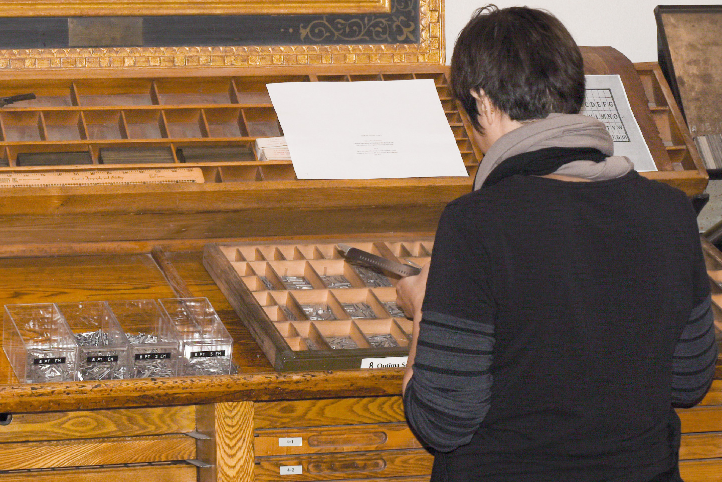
Getting familiar with the case.
With Amelia Fontanel’s wonderful help it took me about 4 days to complete the planning, setting, proofing and printing of a few dozens copies of 5x5cm, one sided prints, containing only 6 sentences. It was slow and therapeutic, it was dirty and frustrating at times (Lazy left thumb: if you don’t keep your thumb inside the stick, supporting the type and sliding each type into place, it will fall apart). The physicality of the process was overwhelming for me. It is as if I learned something through my hands that my theoretical knowledge could not provide. I read in length about the letterpress process, I knew the technical terms and understood their function. And yet, this experience left a deeper impression (pun intended!).
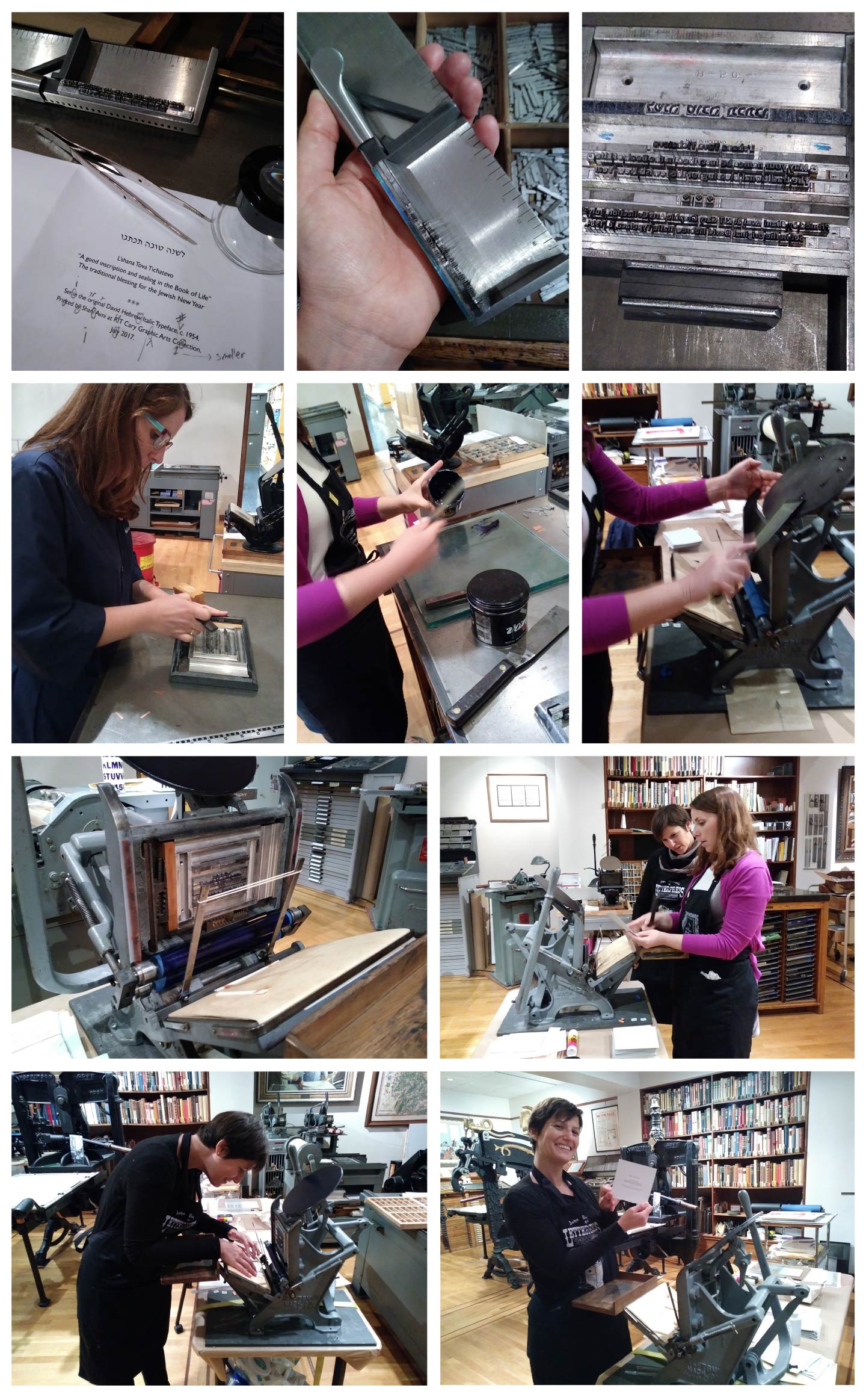
Planning, setting, proofing, printing with Amelia Fontanel.
The card printed from the original Linotype italic slug found in the Ismar David Papers, on a Craftsmen table top platen press.
Now, when I open a software, a glyph’s bounding box “feels” three dimensional. The width of a certain letter has its “physical” memory. After I held an 8pt Optima o, I know how its width should “feel”. When I use kerning, I’m thinking of thin strips of copper and brass.
The slowness and tactility of the letterpress process has left me more perceptive of type and typography. This staggering experience has changed the way I use and appreciate both past technologies for their ingenuity and present technologies for allowing these processes to happen in a blink of an eye. Moreover, it has reminded me of that magic moment that motivated and inspired so many people in the past and has yet to lose its charm: the moment when the type kisses the paper, and words come to life.
You are exactly what the Cary Collection exists for. I was pleased to meet you at the Cary, but when you shared your joy of accomplishment at printing what you had set, your exuberance warmed my heart.
You have written so well that your article places the reader at the Cary. Nice piece of work.
I wish you continued success and thank you for sending me this link. I hope your celebration of Hanukkah was rewarding.
–Ray Czapkowski
The Old Comp.